Field trip post

Img Of illustration


Information about the illustration

The reason i chose this illustration is because it depicts something i relate to which is working to death or my fear that possibly the only reason we’re alive is to work. This is to me represents my lower middle class struggles and what the reality of these industries make us feel like. Blue collar working from his death bed because it never really ends . The Artist who created this piece is Pete ryan ; he created this piece for the washington post and it is called “How to prevent working to death” .

pete ryan is an amazing artist and what intrigues me most about his work  is focused on concepts and metaphors. There is some literal representation of storytelling and satire in this piece for me and I personally feel like His visuals are tricky , bold and graphic.

Jennifer Chung Field Trip Post

Gracia Lam is an award-winning illustrator. She was born in Hong Kong and raised in Toronto. She became an illustrator because she found how you can communicate and bring stories into the light to the audience. Her goal is to visually communicate with the audience and to uncover hidden treasures every day. Gracia Lam designed what I found interesting at the museum. She designed art for Real Simple Magazine and it’s a scene where you can either think it’s a couple, friends, family, etc, sitting on a bench in the rain and the woman seems to be holding an umbrella but the umbrella represents as a waiting text bubble. This icon usually means either someone is waiting or the person is texting or complete silence.

This design stood out to me because I thought to myself how I relate to this design. What I got from this was waiting for a text from your loved one and not getting a response. However, the meaning can go in many different ways. I research an article relating to the art on realsimple.com and the article talks about disagreement with others. The article basically summarizes how if two people disagree, we shut them down and don’t connect with people who don’t see the world as you do.

Overall, I think the art shows a clear statement to the audience. She used great colors and textures to express darkness and the mood in the art. The two people show clear body language and the idea to have the umbrella act as bubble icon is really creative.

Society of Illustrator Society of Illustrator Society of Illustrator


20 thumbnail concepts

Coyote ugly the musical

Coyote ugly is one of my favorite movies and its about a shy girl who find her voice by singing along with a jukebox in the bar she started working in which is called coyote ugly. Coyote ugly is a term created for a deunken one night stand you wake up to that is so ugly you rather chew your arm off then wake them up. It is also the name of this bar.

These sketches are for the coyote ugly musical

These thumbnails include stage presence, coyote hats , beer jugs, juke box symbolic to the movie and solo microphones

Idea web and first page of sketches

The musical basically breaks down themes of the movie -and significant scene and symbols

This image requires alt text, but the alt text is currently blank. Either add alt text or mark the image as decorative. This image requires alt text, but the alt text is currently blank. Either add alt text or mark the image as decorative. This image requires alt text, but the alt text is currently blank. Either add alt text or mark the image as decorative.

Field Trip Discussion Post

  • SPIDER-MAN AND 12 VILLIANS 1989

The trip was actually really enjoyable since I kinda thought we were gonna stand in one place all day until the end of time. But it was a rather interesting find looking at all the award-winning Illustrations on display. But what caught my eye specifically was the Stan Lee section on the 3rd floor of the Museum. Sure I may not be a particular fan of Marvel anymore since I feel like it’s been oversaturated. But what really think stands out about it other than the actual artwork is the inking. I myself want to be a Manga Artist, so I would mostly work with ink and sometimes even color in my panels. Which working with color is a lot harder since I don’t have a full enough grasp of color shading with markers, pens, and other materials.

The specific piece I saw with Stan Lee (Writer) and John Romita Sr called “Spider-Man and 12 Villains” created in 1989. I particularly like the line and stroke difference in the cover. After doing some research on it I found out that Romita didn’t really want to draw Spider-Man, according to an excerpt from Comics Alliance.

The only reason I did Spider-Man was because Stan asked me and I felt that I should help out, like a good soldier. I never really felt comfortable on Spider-Man for years. I had felt at home immediately on Daredevil. On Spider-Man I felt obliged to ghost Ditko because — this may sound naive, but I was convinced, in my own mind, that he was going to come back in two or three issues… The only reason it wasn’t better was that I couldn’t ape him any better.

So it was a surprise to find out that this cover to that Spider-Man comic really only existed as a sense of a sense of helping a friend like Romita said, which I think is a nice sentiment.


Jasneily Matos Field Trip Discussion Post

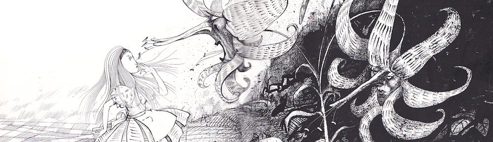
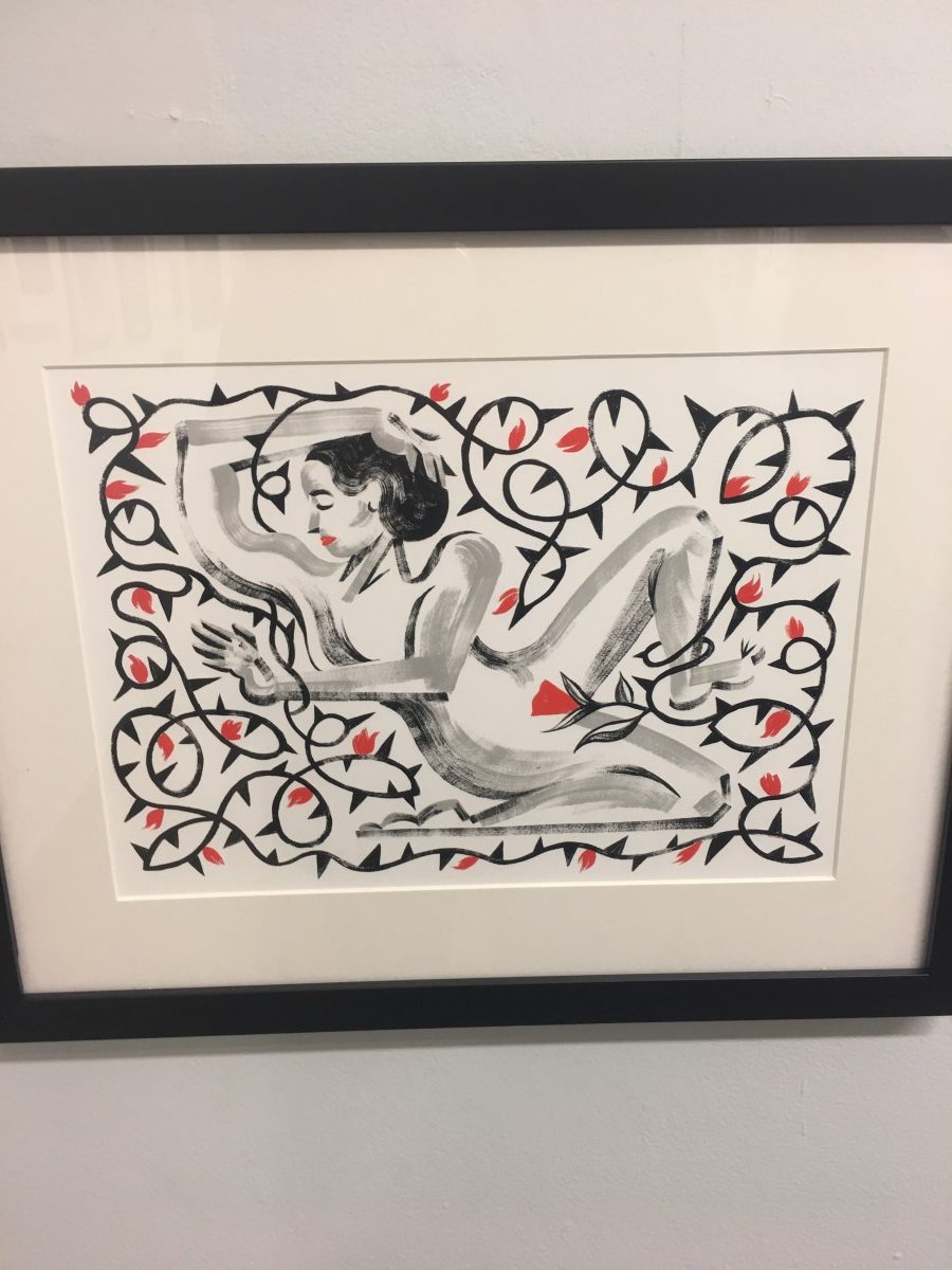
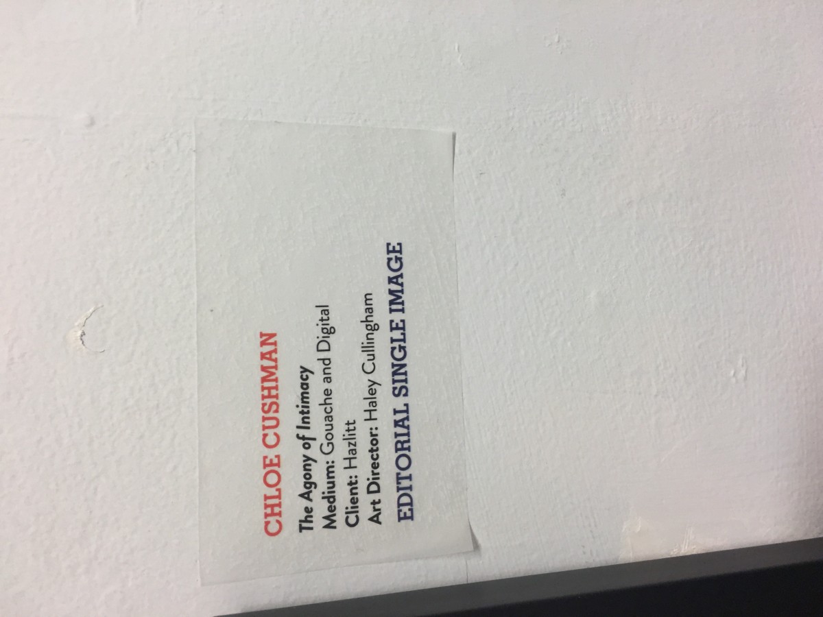
The Agony of Intimacy by Chloe Cushman 

I found Chole Cushman’s illustration particularly amazing the moment I saw it in the gallery. This illustration contains thorn flowers in a motion composition around the drawing of the female body made of black and grey scale. The illustrator used a medium of Gouache and Digital. I found this illustration interesting because I like connecting the female body with nature, so I personally enjoy visuals that describe a story with flowers, leaves, or water; along with a female body. It expresses poems or quotes through drawings that several people can relate to.

Before I researched what inspired Chloe to create this amazing illustration, what I found interesting was the use of motion and how she didn’t illustrate nature in a beautiful and pleasant way, instead, she demonstrated her concept in a painful way. She placed thorns around her body wrapping her arms and legs physically hurting her, except for her most intimate part. First, I thought that the concept of the illustration was self-worth and how women should intimately love themselves. After my research about this piece of art, I learned that the artist emphasizes her illustration The Agony of intimacy for her client Hazlitt.

 Hazlitt was a woman that struggled with a chronic pelvic pain disorder known as Vulvodynia, which affects between eight and sixteen percent of women. The women who experience this disorder feel internal rug burns along with small blades splitting every woman’s most precious intimate part. Any internal vaginal pressure can trigger this pain, the slightest touch, period, even when they sit down. Hazlitt was afraid of sexual intercourse, it was the most traumatic experience for her. She didn’t know how to be intimate involve with her partner of 6 years, any type of affection in the relationship she would reject. She didn’t feel comfortable with her body, mostly with her most intimate part. Apart from all the different doctors she visited, her partner forced her to go to a clinical sexual health trial, where she found a treatment that changed her whole life.

After Chloe captured Hazlitt’s story she decided to illustrate her client’s pain and desire in this illustration by placing the woman body as the focal point. The artist illustrates the concept of physical pain with thorn around what it seems, Hazlitt’s body.  After a rough journey of pain, the biggest, healthy and beautiful flower with leaves placed on her intimate part communicates how she’s finally free.


PROJECT 2 – UPDATE!

Featured

Hello Class-


Some really WONDERFUL work on the Thumbnails for your poster designs.  I am loving the different directions this project is taking!


I am making an important change to what you have due next week, Tuesday the 12th.  Instead of drawing the next stage of the project ( 2-3 Concept Sketches) on your own for homework, please come prepared to WORK IN CLASS on this next stage of the assignment.   This means you should have the following with you:

  • All your thumbnails for in class critique.
  • Reference material for drawings, see below!
  • Tracing paper for helpful draw overs!
  • If you prefer working on your own tablet, feel free to bring it.  We will be working both traditionally and digitally.

DUE TUESDAY:

  • Create a library of reference images and inspiration for your project.  I recommend using pinterest and creating a many boards as you need to, so that you are organized.
  • In your Sketchbook, DRAW Visual imagery you are likely to use in your project, FROM REFERENCE.  At minimum 4 pages, but the more the better!  For example, if your thumbnails feature lots of water, try drawing waves in your sketchbook from reference photos, and create a pinterest board of both photos of water, and of different ways it had been portrayed by artists you like.

See you guys Tuesday ready to work!