Reading on Value


This is a transition screen in the game Persona 5 done by Shigenori Soejima. This illustration is a simple depiction of Tokyo at night. Everything in the foreground is dark gray, everything in the mid ground is white-gray. As it pulls away from the midground the tone shifts darker until it hits the sky which is sort of black. I thought this was an interesting work because immediately my eyes go to the mid ground because it’s lighter than the foreground but the lights on the buildings bring my eyes towards the background. Overall it has a way of making you look at the whole piece rather than just the lightest area.

Discussion week 5

The artist of this is Dan dos Santos.  I chose this because it is very legible and highly detailed even though everything is just grey and black. It has a lot going on in the picture but everything is pleasantly readable. This piece uses Black to separate the man on a horse from the background image.  Everything else is a light shade of grey which allows your eye to see every detail and tell each object apart from each other, still keeping the main focus on the man and horse.

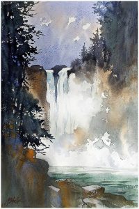
Thomas W Schaller

I chose this watercolor painting because its simple but descriptive at the same time.  The waterfall is clearly painted just like the trees, river, sky, cliff, and splashing water. This watercolor painting is well structured and organized with different tonal values. It contains good use of contrast with the foreground and background, giving the middle ground a focal point.  The waterfall has excellent contrast because its white and helps it pop with the dark trees and desaturated purple sky in the background.


reading on value response

value is used to pull out saitama from the background. Saitama has the most range of  values ranging from the darks on his boots to the highlights on his suit. In the background the shockwaves fade from gray to white the further you get from saitama. The artist is Yusuke Murata

Reading on Value Response

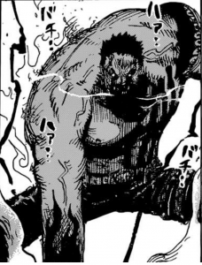
I feel that this illustration has a strong use of value tones and organization. The artist is Echiro Oda the manganka for One Piece. The way he uses vale on this panel in particular is how he makes it look so intense. The darks on his pants, face, and arms make the grey emphasize how big his body is and the whites on the background and his breath also add to the intensity. You focus on his body because its grey but the gradual increase in darkness makes this picture a geat example of value.