COMD 2313 Illustration 1, SP2017
Just another City Tech OpenLab site
The OpenLab is an open-source, digital platform designed to support teaching and learning at City Tech (New York City College of Technology), and to promote student and faculty engagement in the intellectual and social life of the college community.


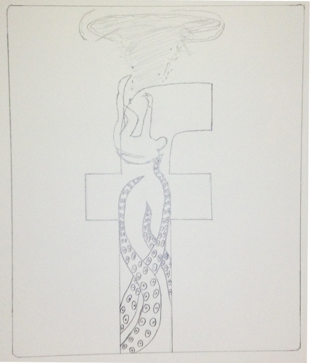
Pamela – Looking good! I like the icon combining with the tentacles.
In the final sketch you must work on the silhouette of the drowning person… its not accurate yet. use a sheet of tracing paper so you can also move it around a bit and play with the composition. for example would it look better higher up giving the whole thing some breathing room?
I’m not sure if the whirlpool helps. You haven’t considered it while working on value so its difficult to say.
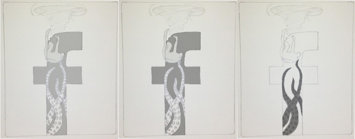
The value studies are not complete enough… keep working on them. Look for lighting through water. Deal with the background too. How would this look with a gradient of darker on the bottom? you dont know unless you try it out.
Good work keep going.