Sketches reference
Reply
Sketch References:

Reading 1: How Next Level Design Is Driving the Beer World
Funky Buddha’s past labels have been quirky and full of punny, yes punny, imagery, from a goat making a getaway by water to a statue of Buddha chilling out on the beach watching the sunset. I wanted to evoke the same kind of feeling with my own brand of quirk and keep the momentum of fun labels on the bottle that drinkers would expect to see.
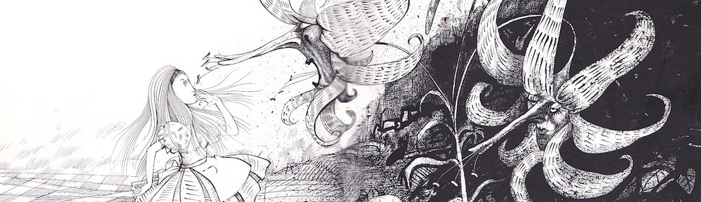
Reading 2: Jillian Tamaki on Idea generation
One strategy I use a lot that Tamaki mentioned is collecting media. I have a cork board wall in my room that I use to paste pictures I’ve cut or print out, separated into either random inspiration or for a specific project. Whenever I come across something on any medium such as my phone, laptop, or magazine, I make a note/cut/screenshot it. What I find usually inspires my work right away or in due time, and what I look for specifically aids me in reference I need to tackle a project.
The intention of my label design is to make the person looking at it wonder what kind of weird fantastical drink is in the can. I want people to think the drink is so good maybe a were wolf would rip the can apart for it or a wizard made this drink. I tried to use a simple design to show the appeal of the drink through illustration.
I normally collect media that I am interested in, I have folders on my hard drive and use websites such as Pinterest to collect images of things I like. I also like to take source material seriously. I try to read the original book or view the original work to see what the creator had in mind. While reading a book I tend to become focused on certain concepts and then collect images on it. I like the idea of staying true to source content, even if some changes are made.
I find that when illustrating or designing, that I step 2 (collect that media) is always a part of my process. I’m always collecting images that have design elements that I’m intrigued by on my phone. I’ve sorted these images into albums so that I can have a reference whenever I’m on the go.
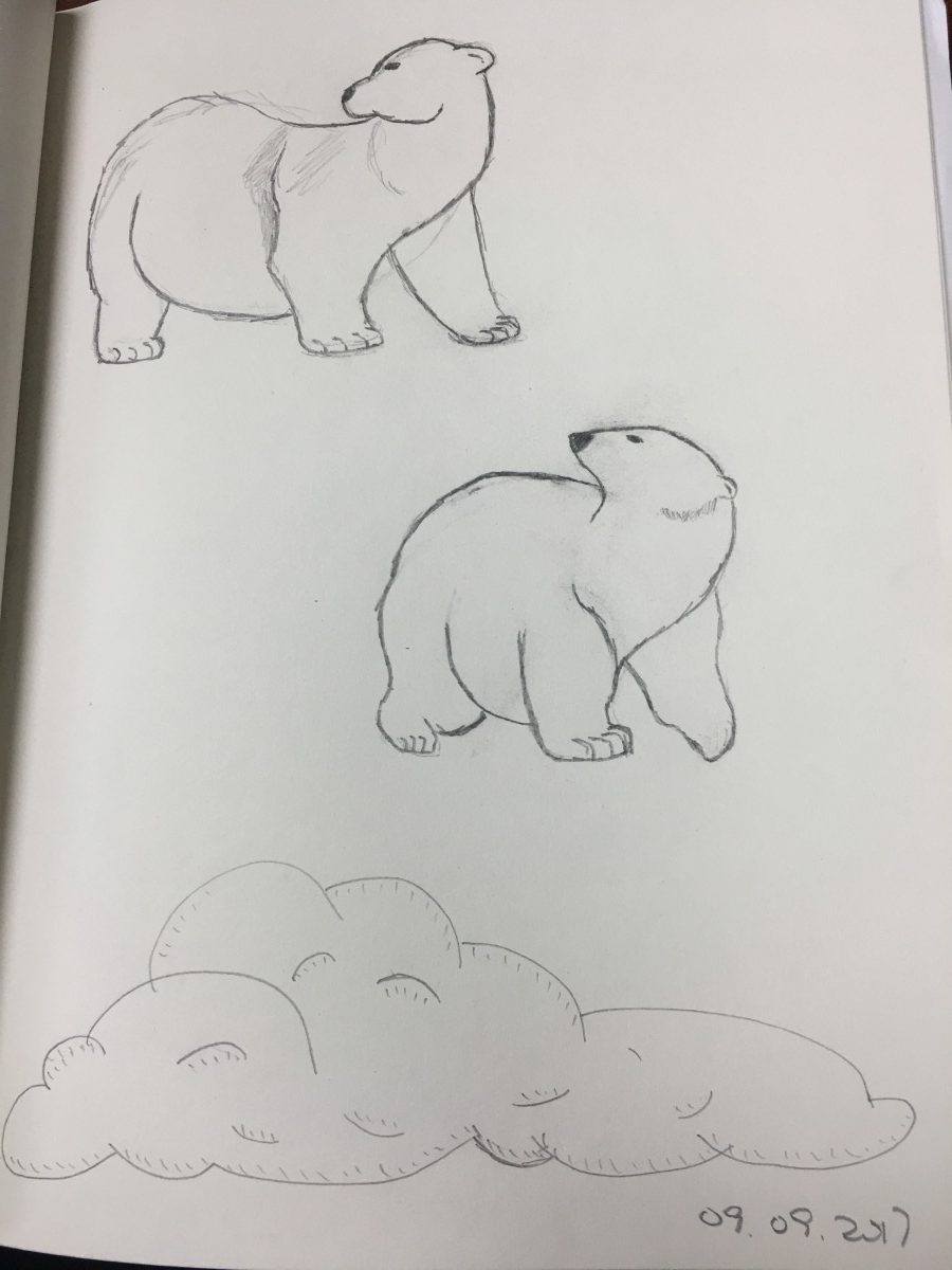
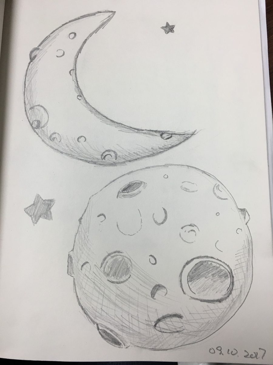
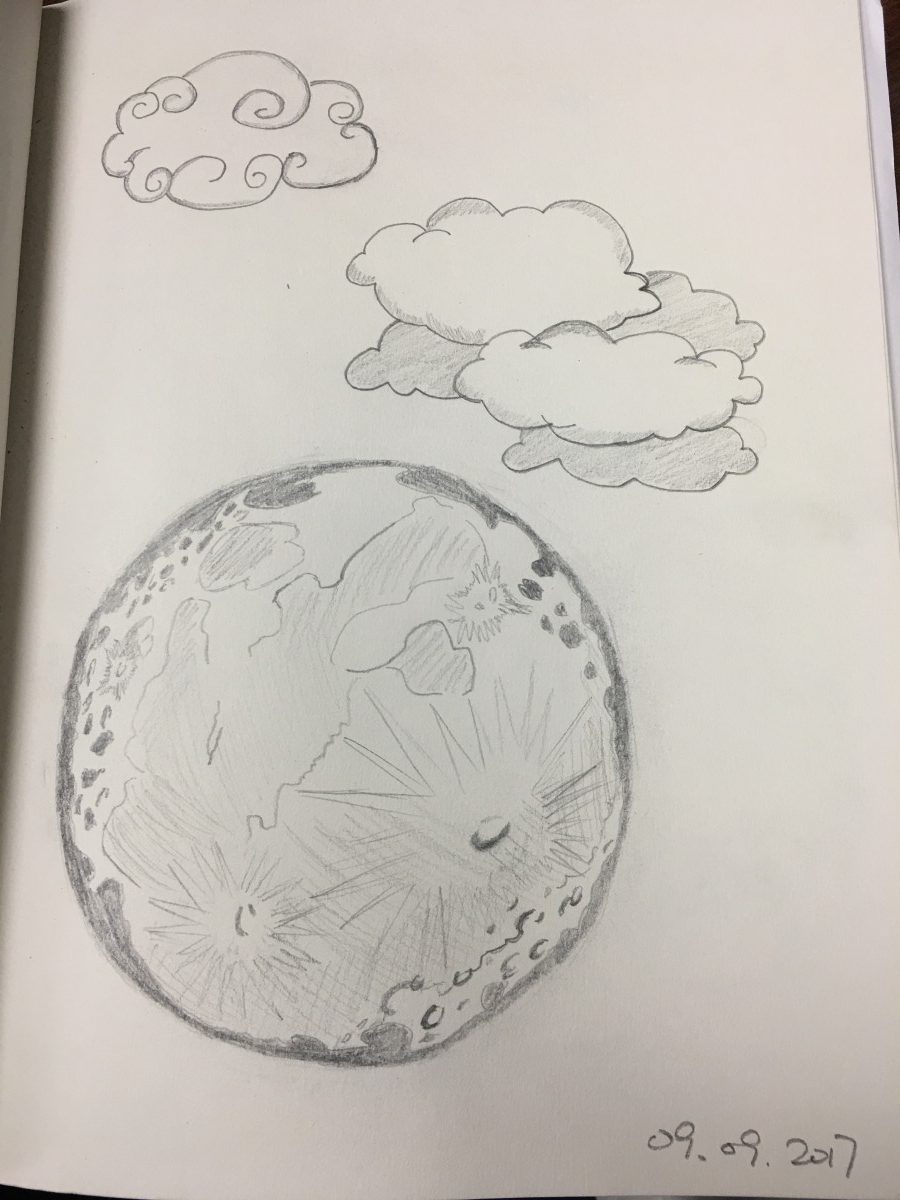
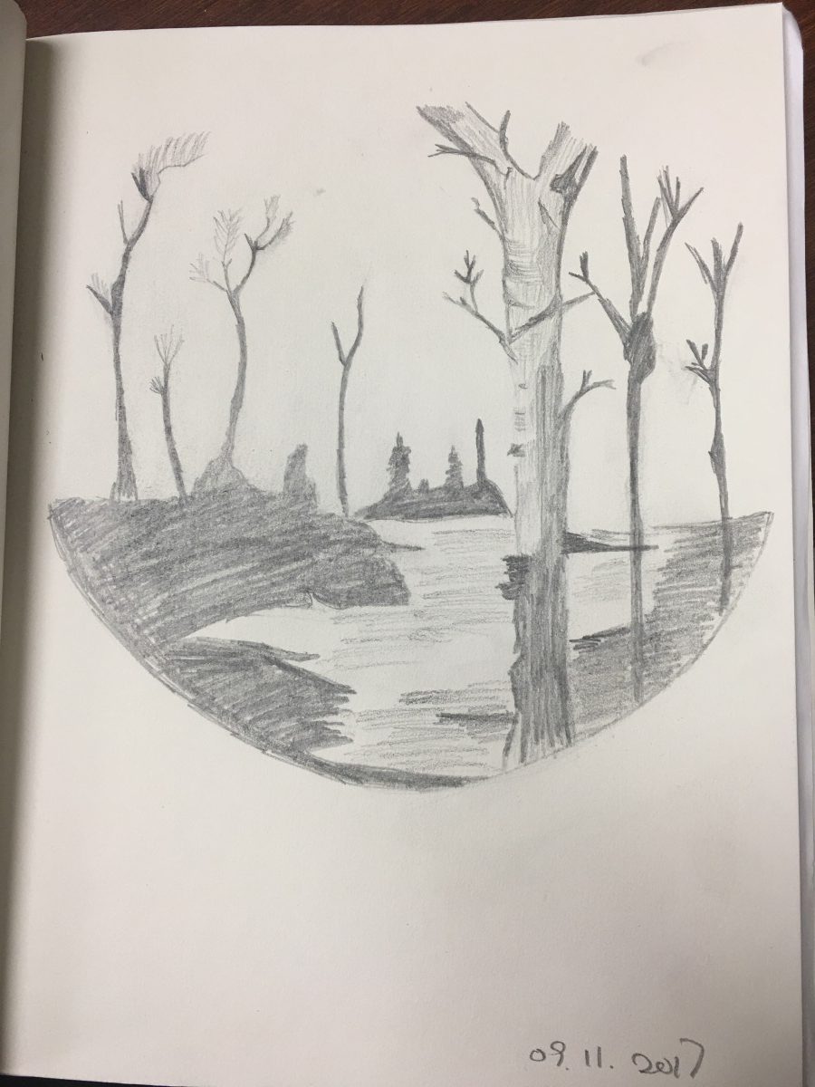
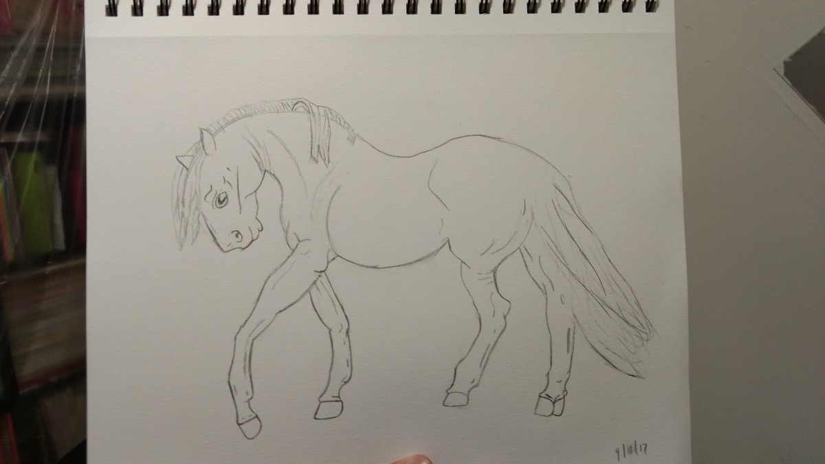
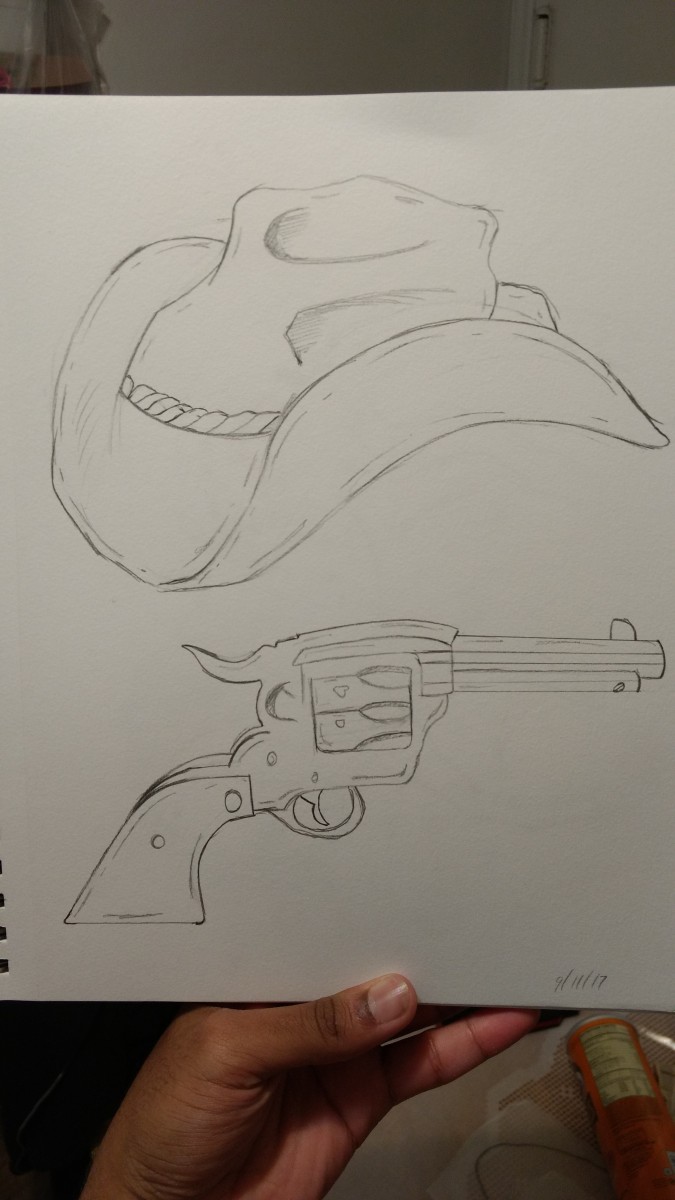
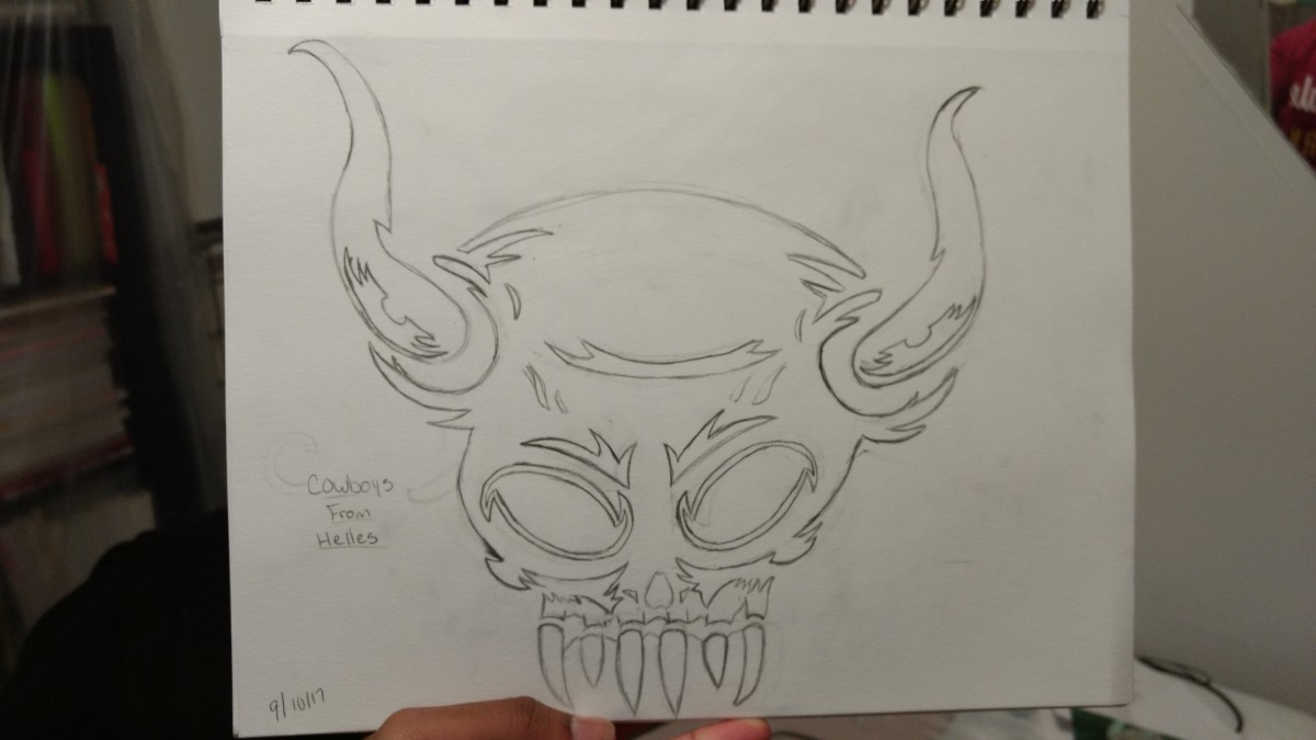
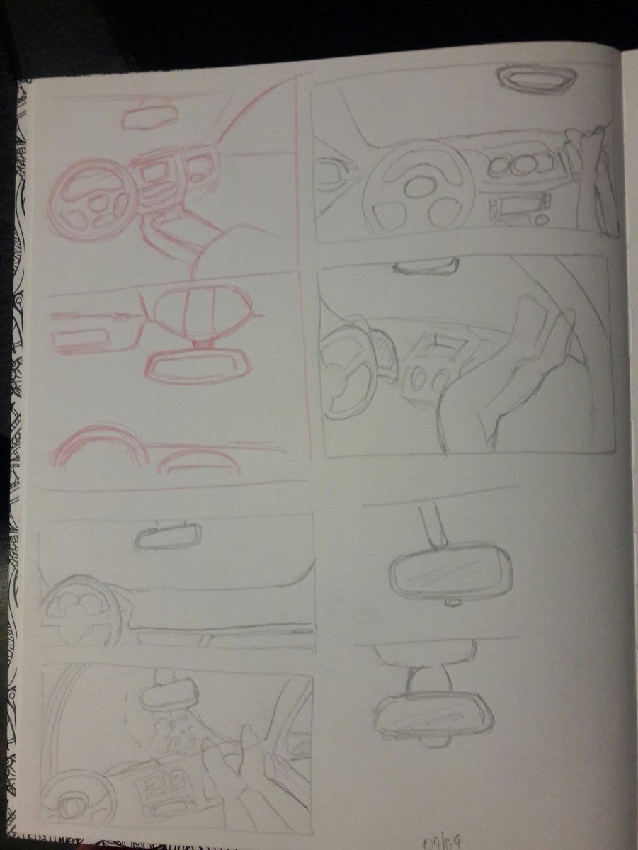
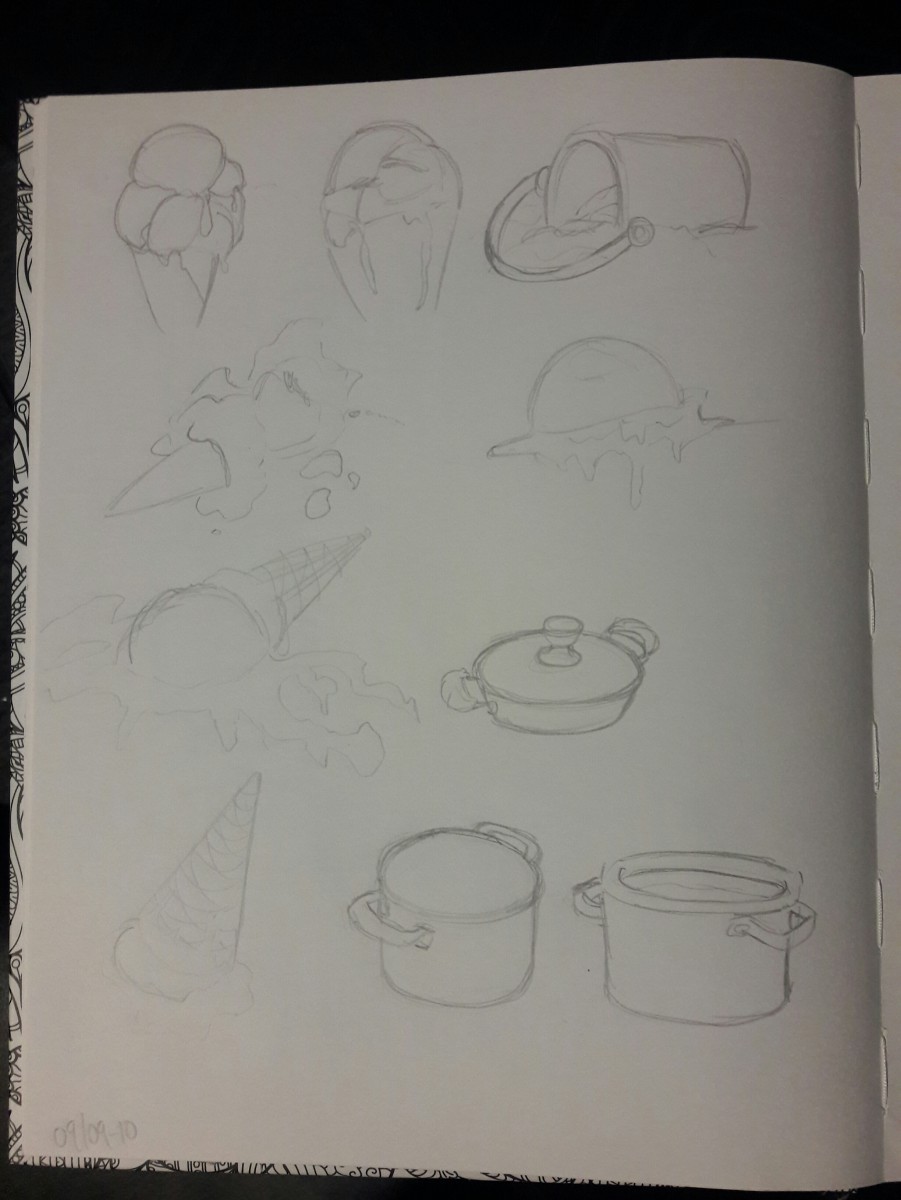
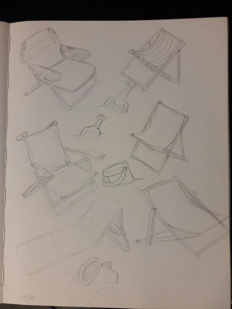
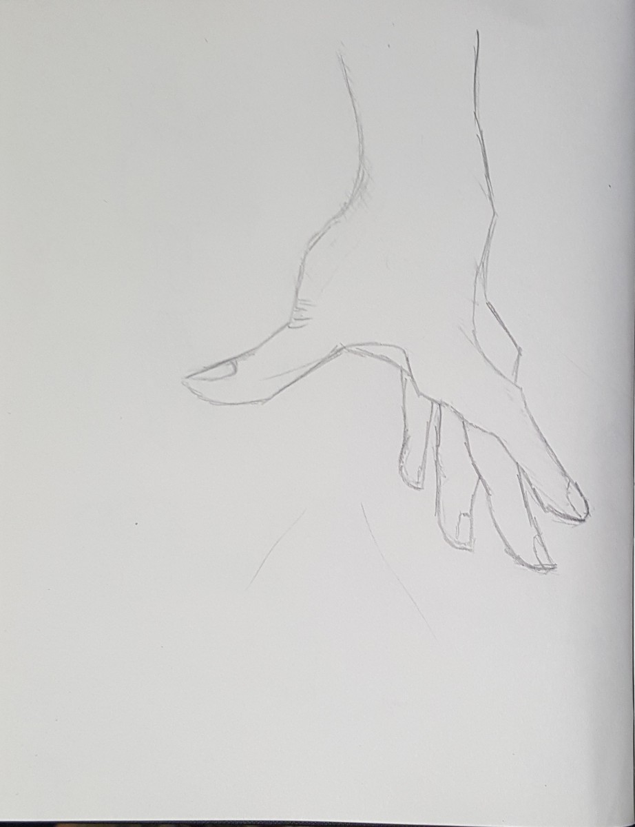
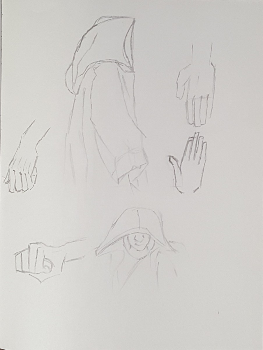
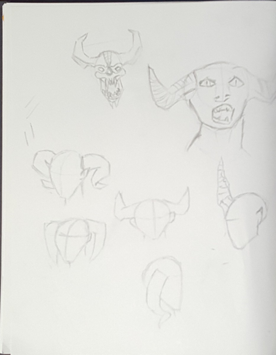
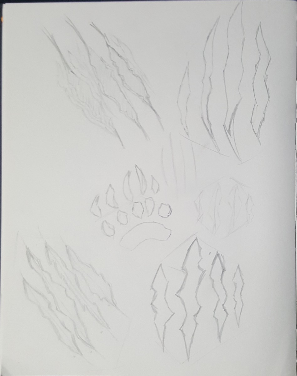
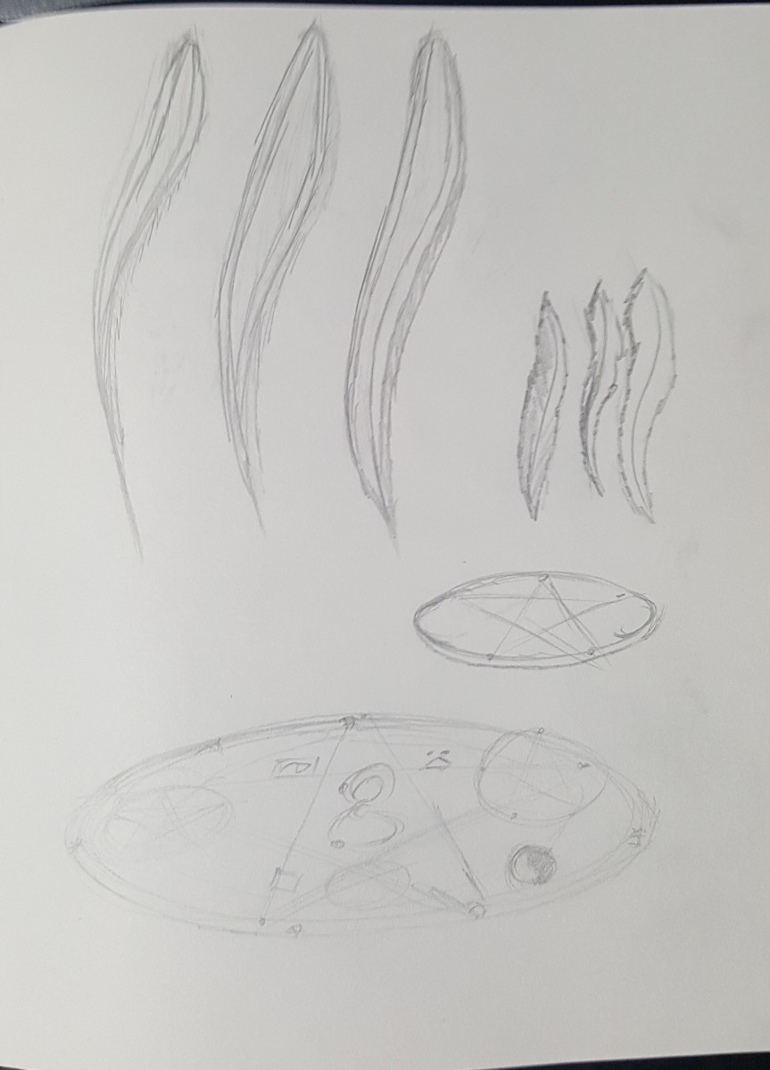
Fill your 4 pages by drawing careful studies design elements that factor into your final art. For each of you this will be different. The important part here is that you SKETCH FROM REFERENCE. For each design element try several sketches and points of view. Consider these studies towards the final art piece.
Just a reminder, here are your Sketchbook Requirements :
For this course students are required to keep an ongoing sketchbook which will be utilized a minimum of 1 hour, 30 min per page, for a total of 4 timed sketchbook pages per week.
MORE DETAILED INSTRUCTIONS & Helpful Hints:
Preparing your Chosen Concept Sketch:
TRANSFER your concept sketch carefully onto the FINAL WORKING SURFACE using the SARAL Transfer Paper.
FINALIZE your concept sketch onto the FINAL WORKING SURFACE.
Designed by Quantum Graphics.
Using illustration to show objects of everyday life.
The OpenLab is an open-source, digital platform designed to support teaching and learning at City Tech (New York City College of Technology), and to promote student and faculty engagement in the intellectual and social life of the college community.

