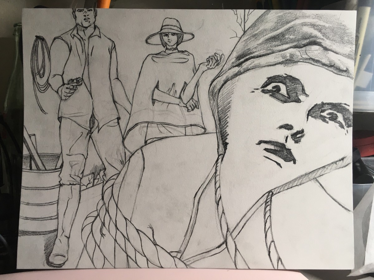
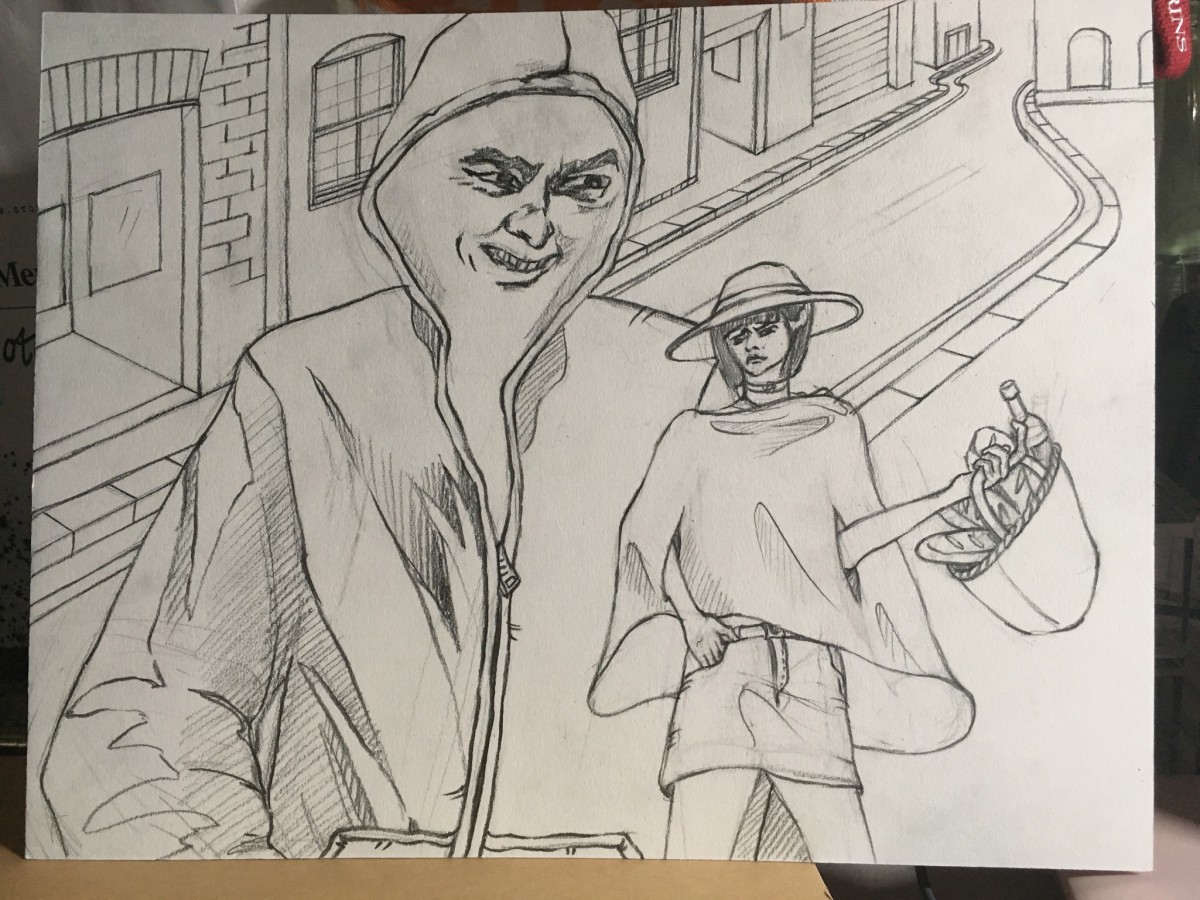
As Howard Lyon mentioned on his blog post, mostly my work is going to be combination of Photoshop and transitional drawing skills. In other words, on the value study stage, definitely I will use Photoshop, and on the detailed sketch stage, I will grid off my concept sketches and draw again on the 11*14 paper using the grid as a guide since I did concept sketches on 8.5*11 papers by mistake. It’s because if I just scaled them up and print them out, the result can miss a lot of little touches. Obviously my final result will be used transitional painting skills : watercolor mixed with white and black gouache or acrylic paint.
<Revision of Concept Sketch>
When I saw Scott Brundage’s selfies for his paintings, he just add some photos of him onto his painting directly using Photoshop. So I decided to put my reference photos onto my concept sketches and add some comments for textures(fabric), brush stroke, color palette, and overall style.
<Color, Brush stroke and Materials Refs>
Material : watercolor mixed with white acrylic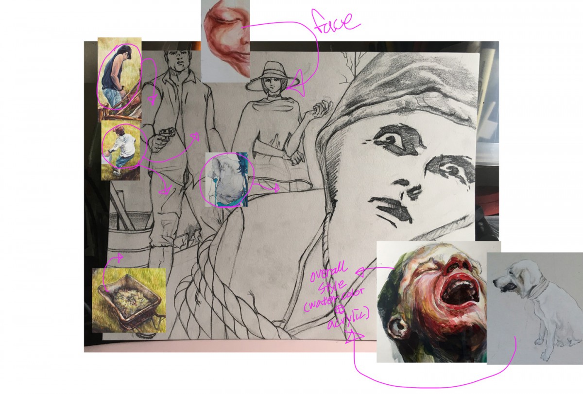
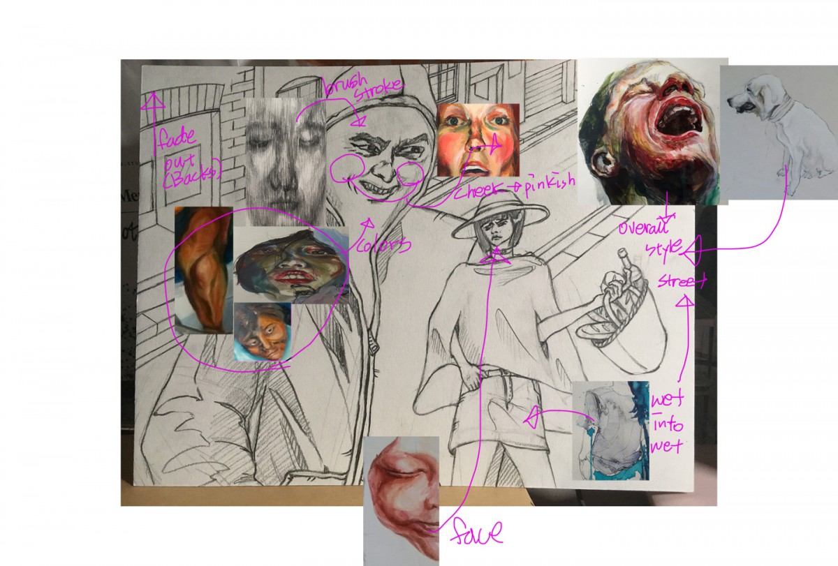
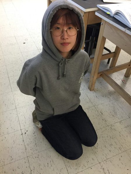
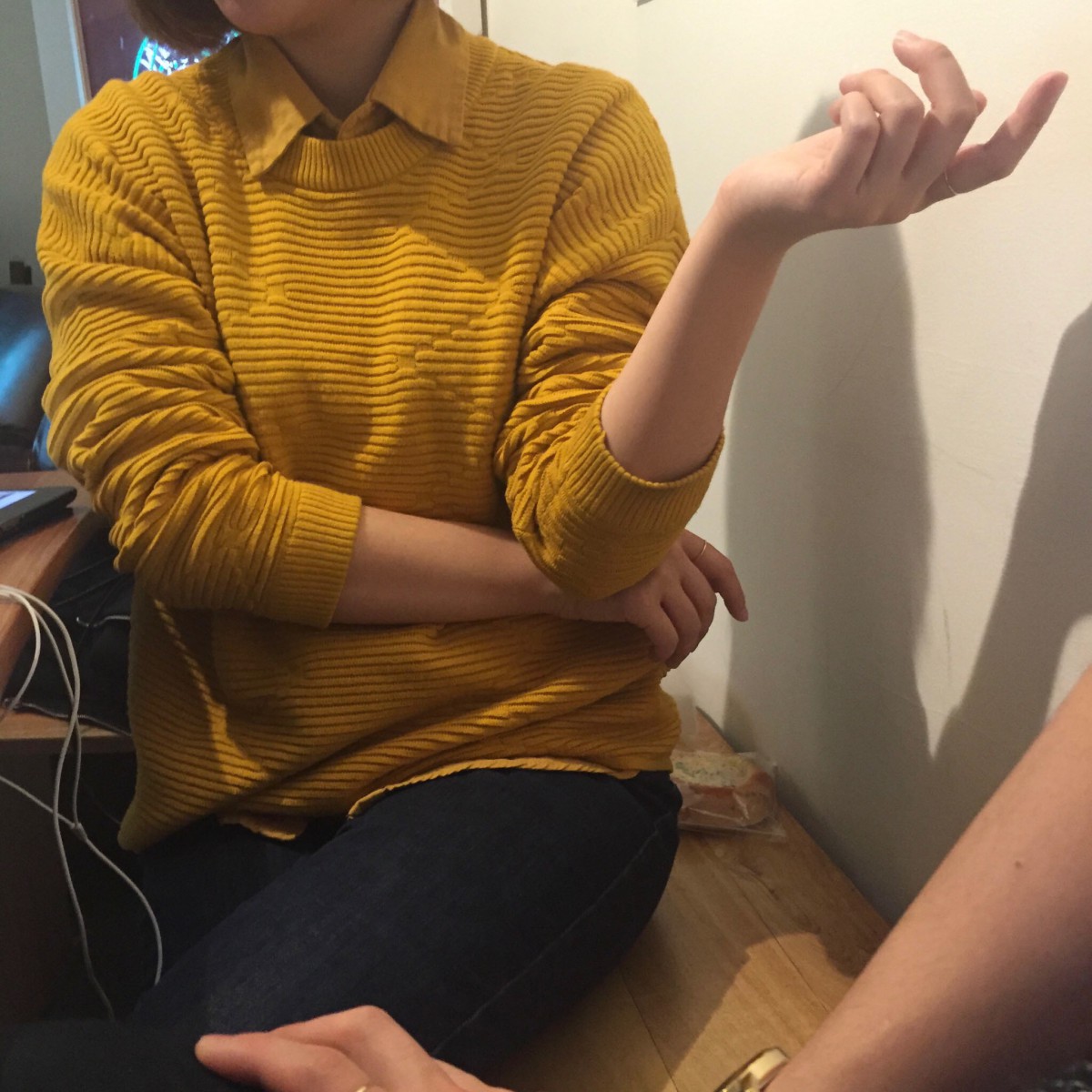
Also, for my figures and backgrounds, basically not only I found bunch of images from Google, but I took a lot of selfies, and referred some tutorials.
<Figures(face expression) and background Refs> 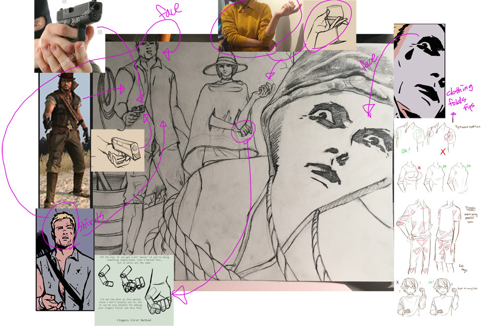
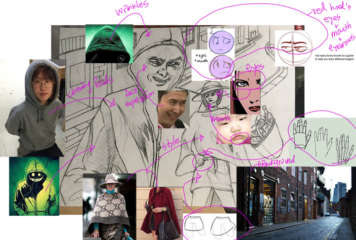
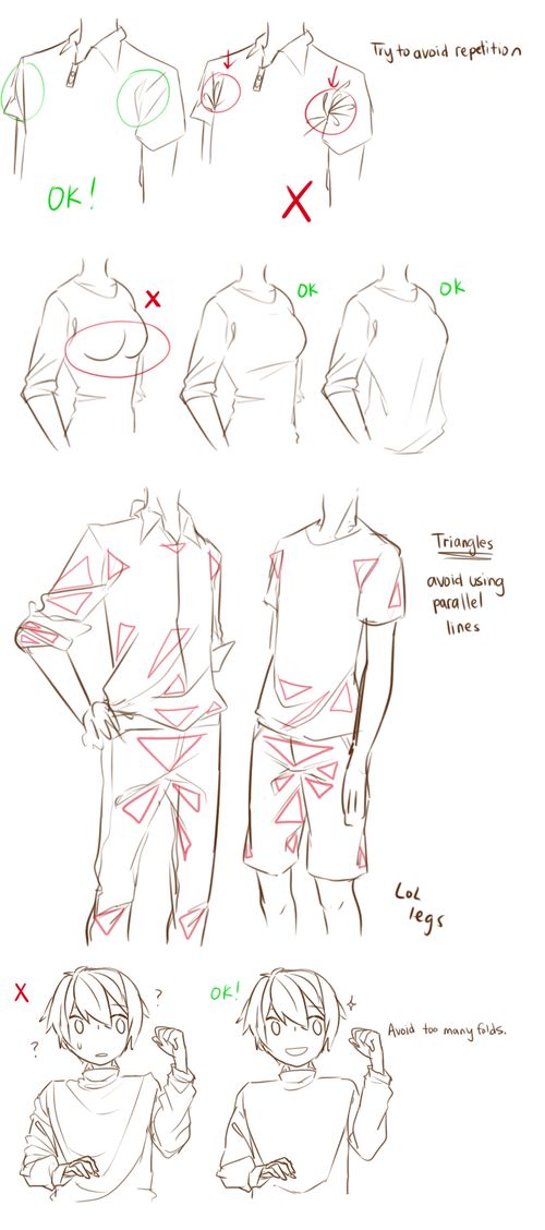
Mostly I found about creases on clothing.
<Tutorial : Clothing folds(Wrinkles)>
<Tutorial : Clothing folds(Shirts)>
https://www.youtube.com/watch?v=RbHFC-P9n4A
<Tutorial : Drawing Hoodies>
<Tutorials : Rope Drawing>

