Hall, Sean. This Means This, This Means That: A User’s Guide to Semiotics, Laurence King Publishing, 2012. pgs 21-67.
Questions:
- How has language shaped design historically?
- Can visual design accomplish things that language cannot? Why?
- How are signs, signifiers, and the signified employed in visual communication? Provide examples from contemporary or historical advertising.
- How are non-literal devices used to convey meaning in advertising? Provide examples from contemporary or historical advertising that use simile, metaphor, metonym, synecdoche, irony, lies, impossibility, depiction, or representation.
- NOTE: Please use historical or contemporary examples, not just those from the readings.
Response
After taking a look at “This Means This, This Means That ” by Sean Hall along with normal text readings of Avant-Garde Manifestos I can conclude that design of any kind can be determined by anyone’s mind in his or her way. Meaning that anyone and everyone could see things differently. The first design was used as a means to pass the time and tell stories with the images themselves. To my knowledge, hieroglyphs and cave paintings were early examples of people trying to tell something without words. Later over the many years we today use the term “design” as a way to accomplish many things as a way of understanding for people of all kinds. An example of using visual design accomplishing something language cannot is a general understanding of the rules of the road. Where signs guide you to which turns you can or cannot make along with that lies ahead. You could even argue that sure the “Stop” sign is language but its design is obvious to notice and brings attention to itself.
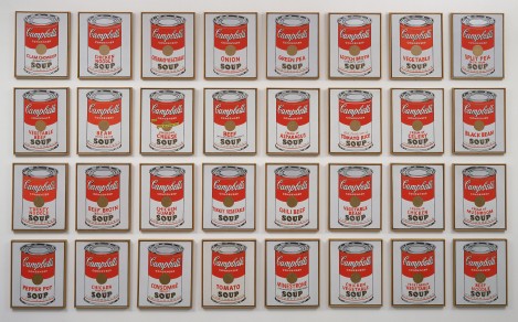
Another example I would like to bring up is an art piece called “Campbell’s Soup Cans” by Andy Warhol. When seeing this first hand you may be either confused or impressed depending on your opinion of art. My first thought was “wow this guy must like soup” and you know what that is the reason for him designing something this out of the ordinary. Although art is subjective and open to interpretation, there would be people that think there is some hidden meaning to it or ask questions like “Why are there 32 cans of soup?”. When using visual design the mind is open to a lot more ideas than just words that say what they are about.

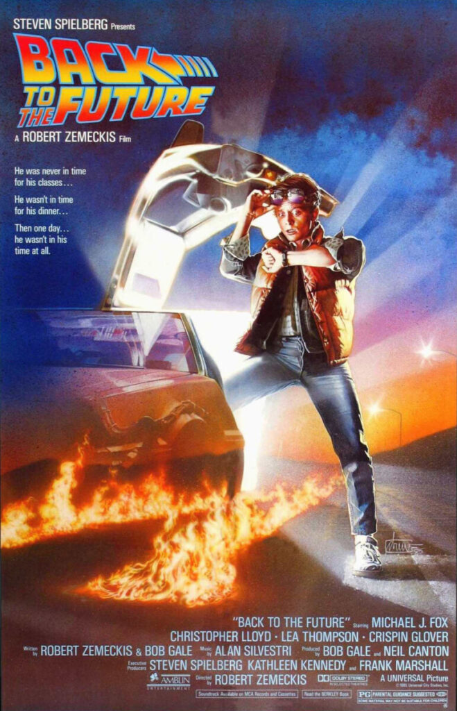
As for the case of non-literary devices in advertising, you know what objective to portray with these works. Instead of artists making whatever they want and letting people interpret it however they want they now have to give a general understanding for which the consumers can comprehend. Look in the case of this movie poster for 1985’s “Back To The Future”, now the poster has a checklist of things it needs to achieve. This includes the title, actors, production companies, and now a design to encompass the feel of the movie. A lot of movie poster designers do this today with the main character and elements from the movie and this is shown here. With the main character Marty in the front, the car is a big factor, and the fact that he is checking his watch shows that time will be important in this movie. This is how when designing advertising for a company there are now goals that need to be achieved.

Annotations


Recent Comments