Katherine McCoy and David Frej “Typography as Discourse” 1988 pgs 81-83 found in our main text Graphic Design Theory: Readings From the Field by Helen Armstrong.

While some previous graphic design eras were all about being anonymous and objective, postmodern graphic designers used uneven disorganized styles for their typography elements. Rosmarie Tissi’s direct mail folder for Anton Schob printers 1981 is associated with postmodernism of the 1980s because her design has a lot of colors and her letterforms aren’t standing straight up instead, they are all flipped on their sides and they’re all different sizes. She plays with how much space the letters occupy. The letterforms also combine and overlap.
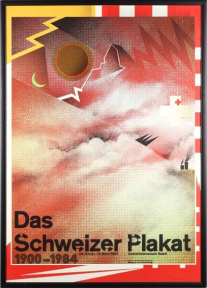
Wolfgang Weingart’s “Das Schweizer Plakat” 1984 is associated with postmodernism because there is a lot going on. All of his shapes and colors are overlapping, and all his elements overlap to the point all of the space is taken up. All of the overlapping elements and bright vibrant colors fully break away from the repetitive organized grid style.
By “typography as discourse” the author means that typography isn’t meant to be looked at as just a letter anymore like it once was now it shouldn’t be plain, letters should be messed around with more complexity such as placement and direction they’re facing. When she says“…no longer are there one-way statements from designers. The layering of content,” she’s talking about when people are examining the design, they’re asking why it works and trying to understand the artist’s expression not just stating the obvious.
Annotations:
https://hyp.is/GfoYzEmnEeyw29-4ZgqIhg/


Recent Comments