Jan Tschichold “The Principles of the New Typography” / Karl Gerstner, Designing Programmes / Joseph Muller-Brockman, “Grid and Design Philosophy”
Jan Tschichold, “The Principles of the New Typography” pg35-38, Karl Gerstner, Designing Programmes pg55-61, Joseph Muller-Brockman, “Grid and Design Philosophy” pg62-63
Questions / Prompts
- How does each of these designers/authors think you should approach design?
- Include an example of contemporary typography/layout that embodies each of these three design systems or philosophies. And explain why!
Reading Response 5
Each of these designers has somewhat differing opinions on how design should be approached as for instance, Jan Tschichold believed that type should develop its form from the function of the typography. Tschichold also believed that the new typography should be clear and concise rather than stylizations and decorations. He believed that the ornament typeface of the old type style should be repressed and forgot. As it presented how little was understood about typography. Karl Gerstner had approached design from a more scientific standpoint; he created a more science-like system by having a set of criteria, parameters, and components that could go into the design solution. Gerstner believed that there is no one set solution for the design issue as it was a process that would boil down to the final solution. Josef Muller-Brockman believed that the best method to design would be through a grid system. As it has implications that the grid will provide the will to systemize and have clarity and help cultivate objectivity.
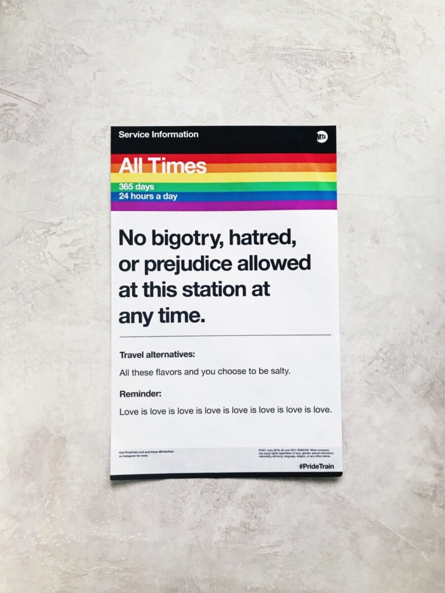
This poster from the MTA represents the system that Tschichold spoke about as it has an asymmetry to it. Its typeface does not contain a stylized nor decorative font. It is objective saying what it wants to say without an opinion behind it. It has developed its form from the function of the text.
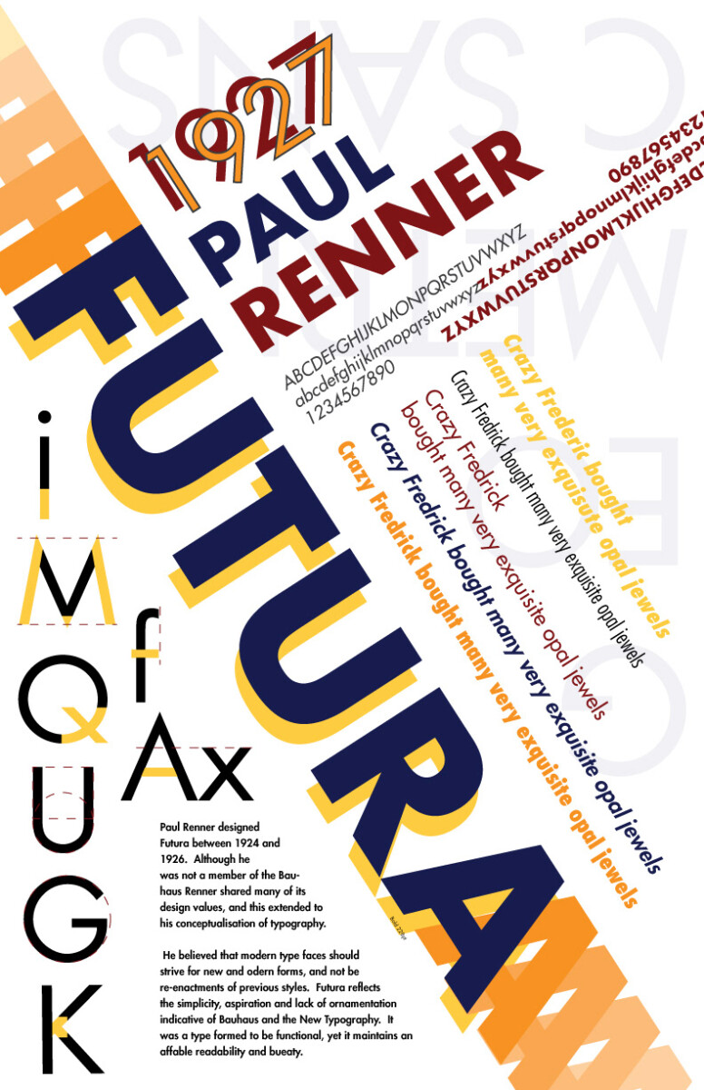
The Futura type poster feels very similar to the way Gerstner approached design as it has spacing that is asymmetric and is use of the grid is a part of the parameters that were chosen to be designed. It also feels like that it had gone through a system of trial and error and been selected.
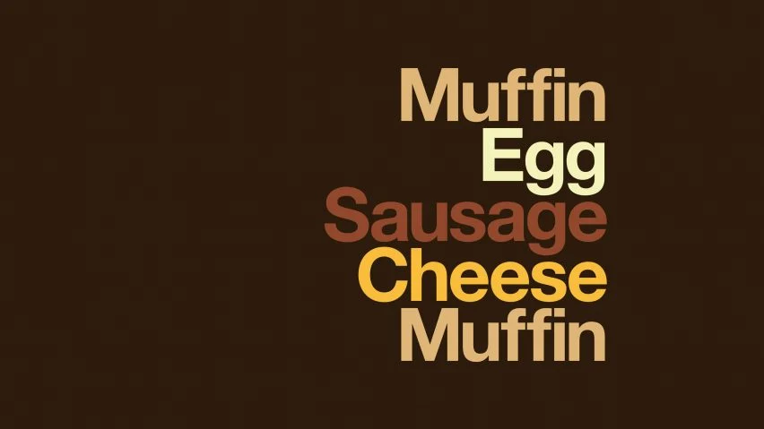
The McDonald’s ad for the McMuffin feels as if it has a resemblance to Josef Muller-Brockman design approach as it has the use of a grid present when you observe the text it is aligned perfectly horizontally as it is one above another.
Hypothesis Annotations
https://hypothes.is/a/GVKQjCqlEeysUuPZGcvxHw


Recent Comments