reading and annotating three texts written by Jan Tschichold, Karl Gerstner, and Joseph Muller-Brockman. The focus of these texts is the evolution of the International Style from the New Typography movement and the Bauhaus of the 1920-1940s to Swiss Typography and the embrace of European modernism of the 1950’s.
Read Jan Tschichold, “The Principles of the New Typography” pg35-38, Karl Gerstner, Designing Programmes pg55-61, Joseph Muller-Brockman, “Grid and Design Philosophy” pg62-63 with your classmates in our Hypothesis group COMD3504_OL08. These are found in our main text Graphic Design Theory: Readings From the Field by Helen Armstrong.
Here are the questions to which you should respond in your reading response:
- How do each of these designers/authors think you should approach design?
- Include an example of contemporary typography/layout that embodies each of these three design systems or philosophies. And explain why!
Tschichold would like us to implement simplicity and the use of less is more opposed to the used design with decorative elements. Thus letting the type stand out more by itself. In addition, Tchichold would like us, designers, to instead of being misinterpreted by the ideas of type, the form of the text is derived from its function. Asymmetry is more expressive to the eye than symmetry so it is better in the overall flow of the design. Karl Gerstner thinks we as a designer should know there is no one perfect solution to one problem but there are multiple solutions to one problem. The creative process is dwindling down to the process of choosing one solution out of many solutions. The Grid system created by Josef Muller-Brockman. is used to organize to clarify the idea of the designer and “service to general culture.” for the better.
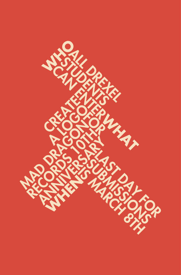
This is an example of Tschichold’s idea of Asymmetrical type since the type’s weight is equal on both sides, it’s not descriptive of asymmetry, in which one side of the design is heavier than the other. This gives the design a sense of expression and makes it visually appealing to the spectator.

This is an example of Gerstner’s work he looks at design as solving problems than creating art. In this work, he used the weight and size of the typeface to put caption within the letters. In addition to the image on the right he solve this issue placement of the text rather than around or on top of the image, he decided to put it inside the object.
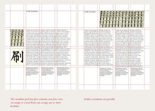
Brockman’s Grid system is used here for this book layout into three separate columns. The images on the left side as examples of the information within the text and the caption on the bottom in small print is the description of the image. The picture above explains a gird system how to use it.
Annotations


Recent Comments