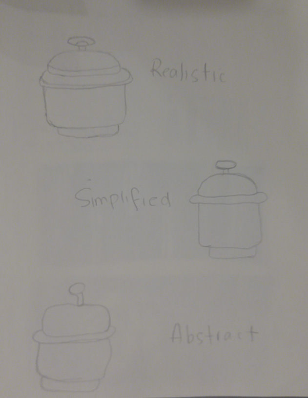
Realism to Abstraction Sketches: ( 20 mins)

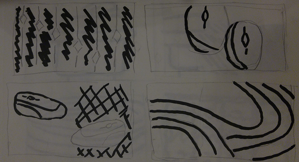
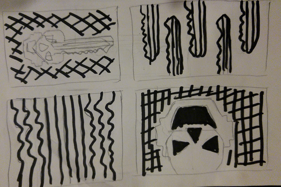
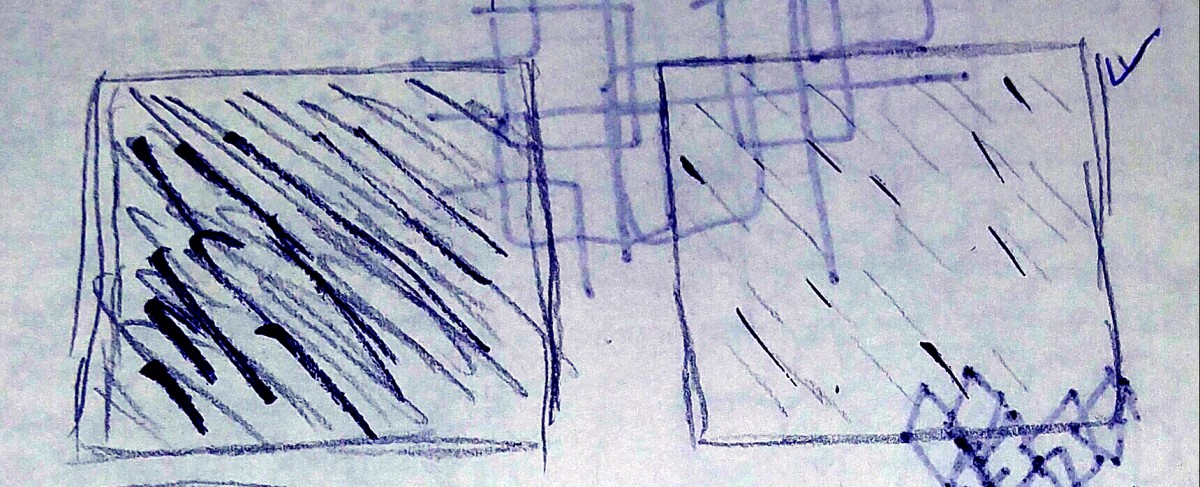
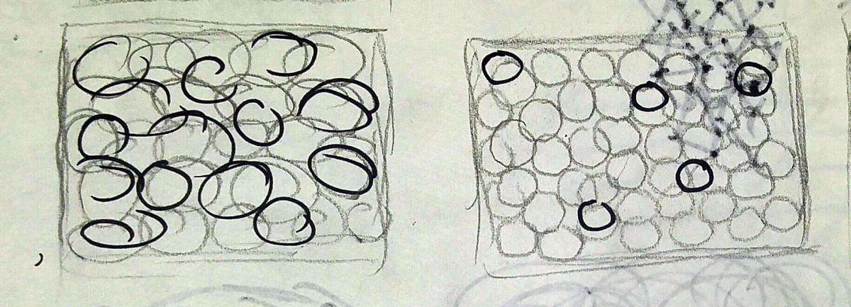
Thumbnails Sketches: ( 30 mins )
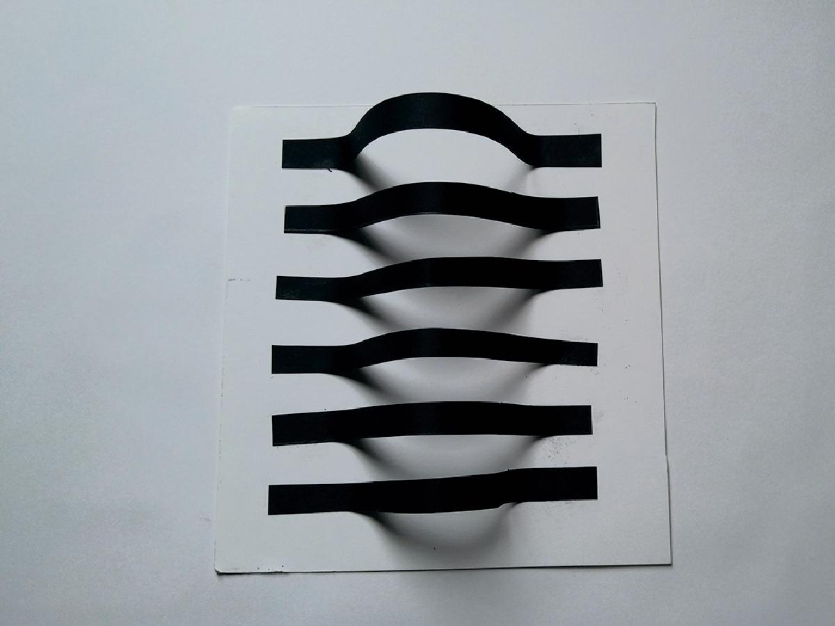
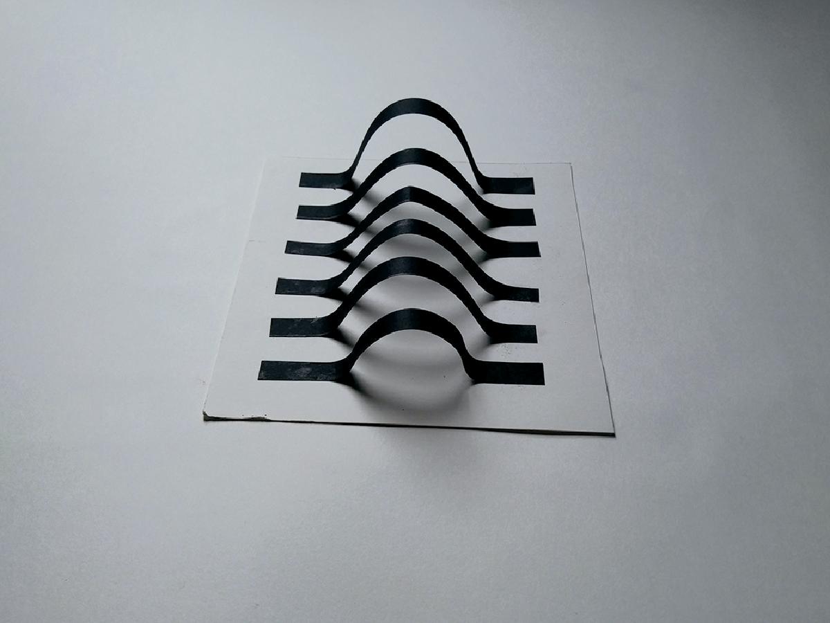
9 x 6 Figure Ground Compositions: ( 1 hour )

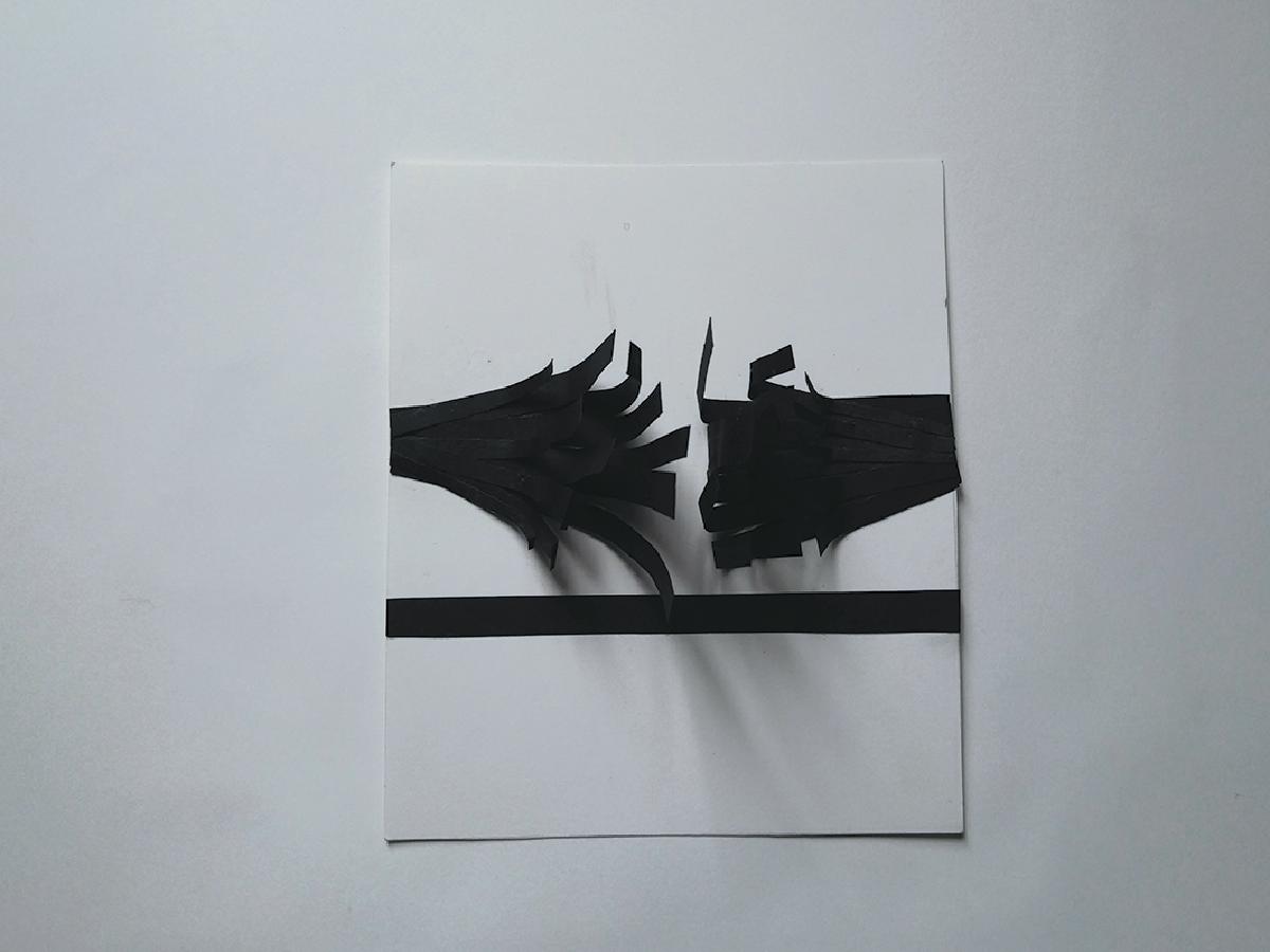
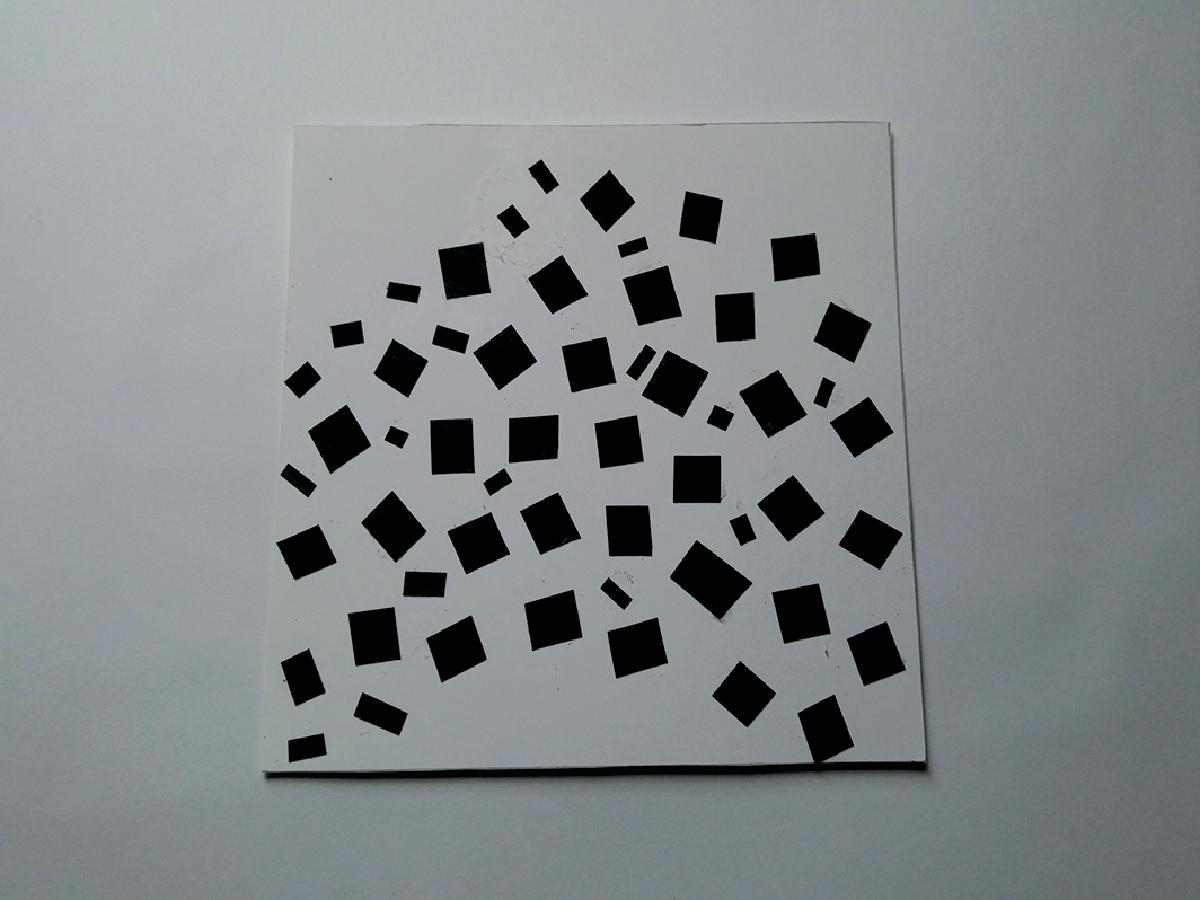
Figure Ground Black Cut-out Compositions: ( 2 hours )

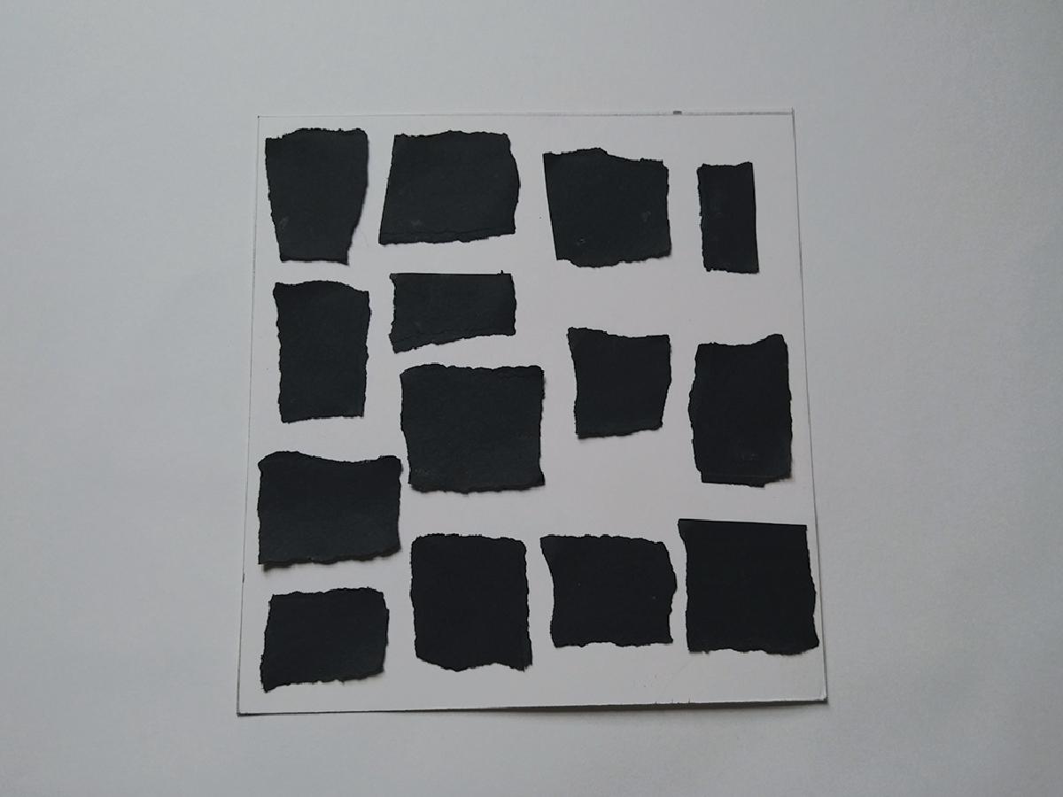

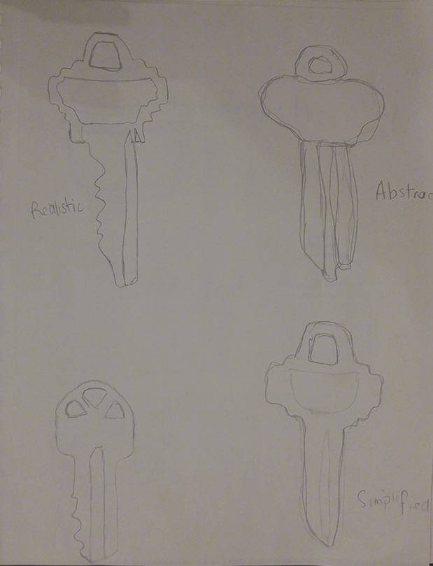
Realism to Abstraction Sketches: ( 20 mins)
Thumbnails Sketches: ( 30 mins )
9 x 6 Figure Ground Compositions: ( 1 hour )
Figure Ground Black Cut-out Compositions: ( 2 hours )
Project I
The first project in Graphic Design Principles I class was a project that would turn art forms we made physically into digital form. The physical forms of art were to express three sets of words clearly. Loud to quiet, harmony to chaos and crowded to isolated. Throughout the assignment, I had a difficult time creating the pieces that represented harmony to chaos and crowded to isolated, because they had a way of being similar to one another.
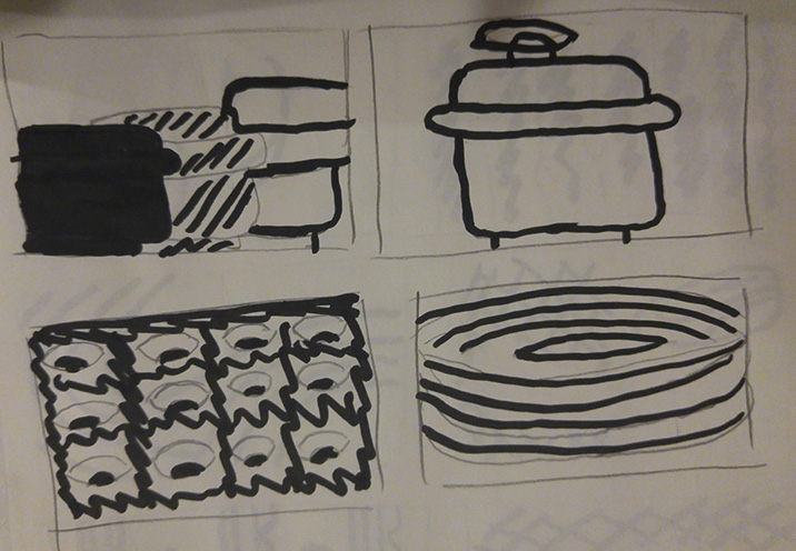
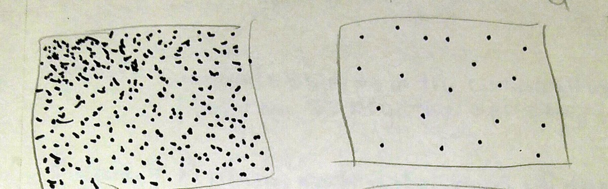
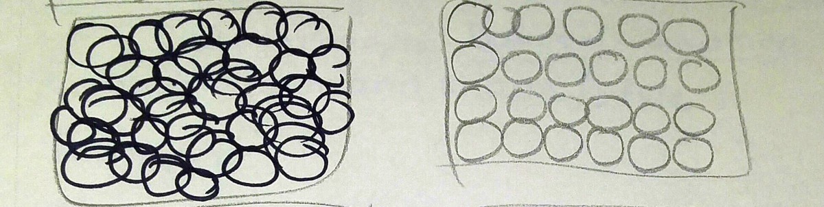
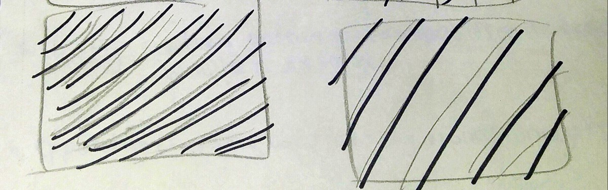
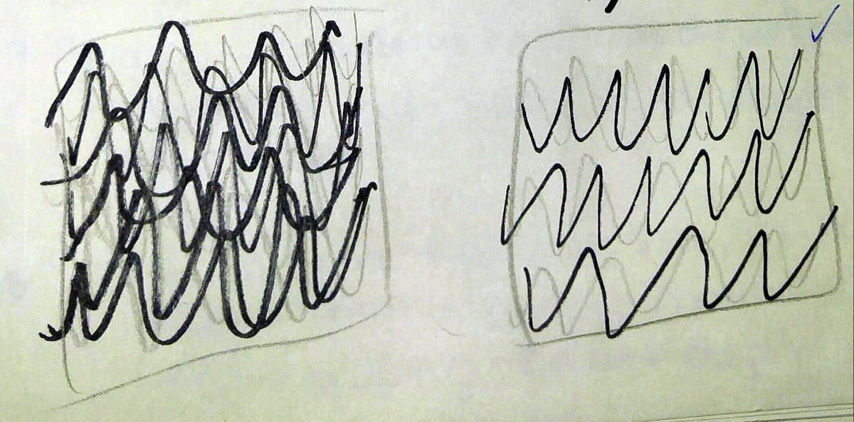
The first part of the assignment was to create ten thumbnails, five for each word. That represents those groups. After creating the thumbnails, Professor Trofimova would then help selected a set of two that she thought would be the most interesting to make. For the loud and quiet set, my favorite was the thumbnails that had grouping of black and white circles. And the Professor told me to do the thumbnails that represented raining. For the harmony and chaos set, my favorite thumbnails had these curved pentagon shapes lined up compared to failing of the page. Professor told me I could do that one, I was exciting it was my favorite of course. For the crowded and isolated set, my favorite was these groups of lines going and coming from all different directions compared to a single line only coming and going from one kind of direction. Professor told me to the set that involved a group of deformed lines compared to just one deformed line on a page.
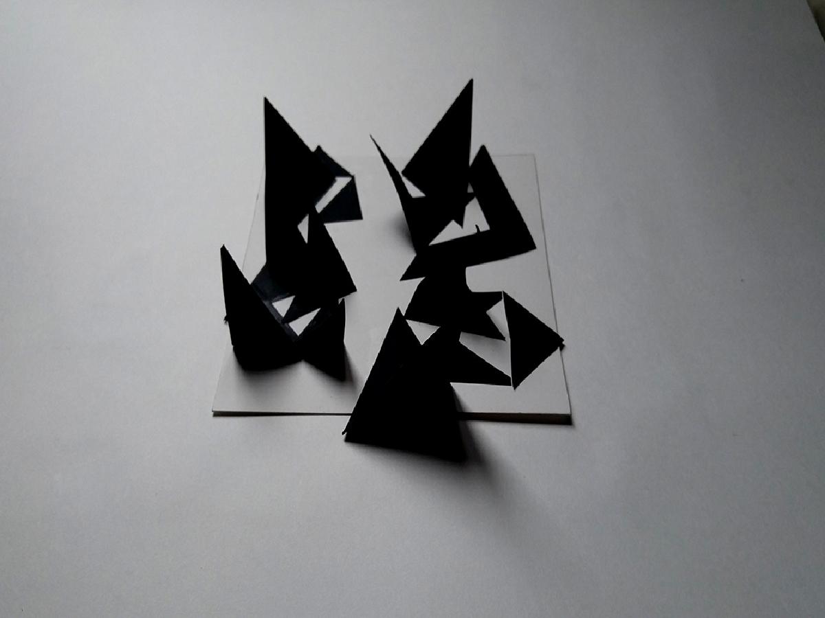
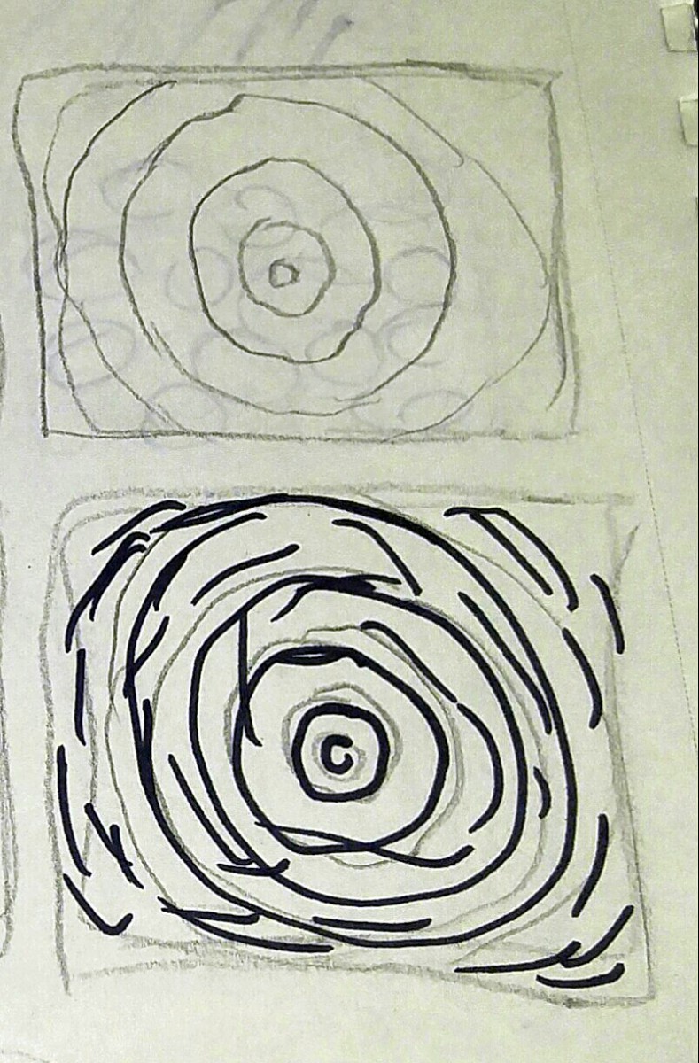
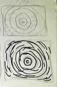
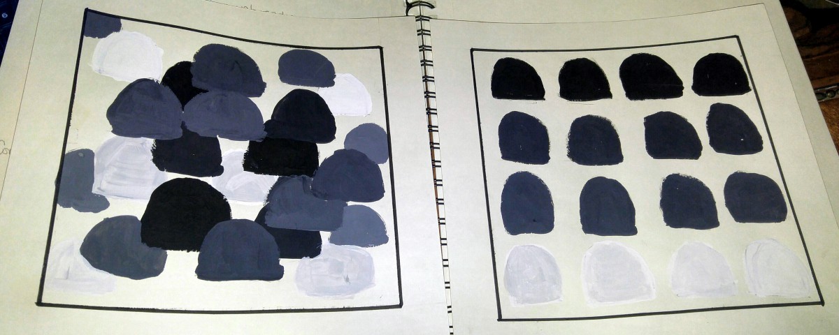
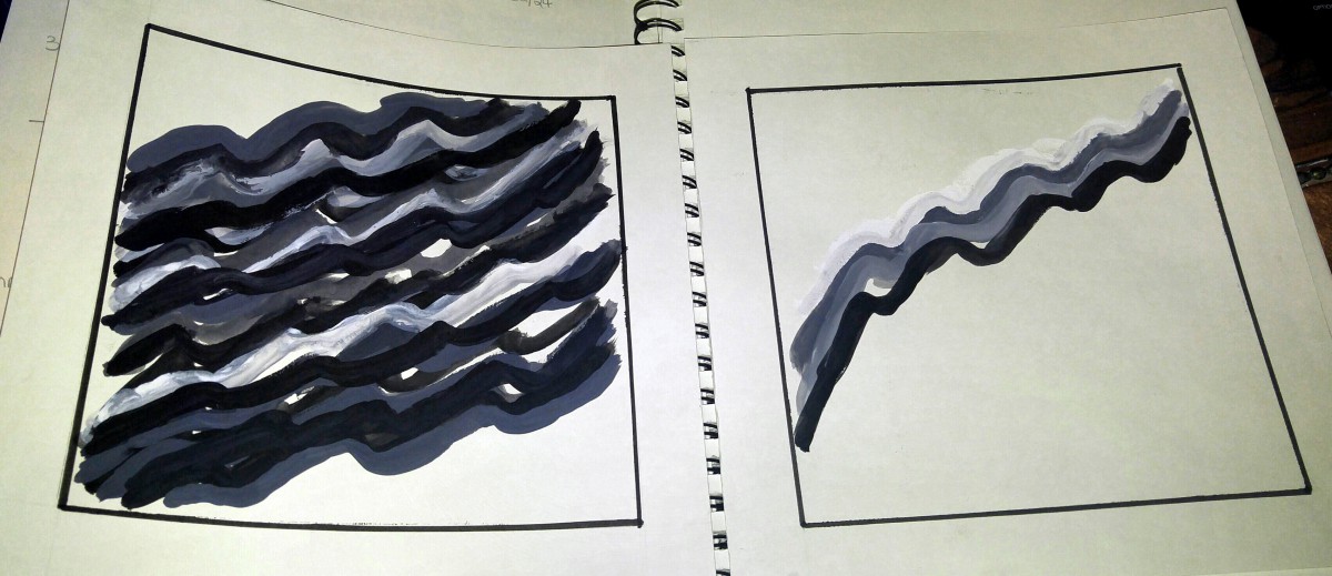
The second part of the project was the recreate our thumbnails on to 7 x 7 Bristol paper. The paper was cut from 9 x 12 to 9 x 9. Then when putting a border on it, it became a 7 x 7 framed creation. We were to use the black and white gouache paint. My first set of painting came out ruff looking, because it was the first time I using gouache paint. And did not know the affects that using water to reactivate the paint would do. My favorite set using the gouache paint was the harmony to chaos. I used black and white gouache paint to create two levels of grey to create an ombre effect on the page. The page has sixteen curved pentagon, going four by four by four by four. For harmony, the first row of four is black. The second rows of four are more black with white. The third row of four is more white with black. And the fourth row of four is white. It was balanced and projected unity. For chaos, there are no rows or columns. The black, grey and white curved pentagons were all over the page, coming off the page and going in various directions. I thought is reflected unity and gave the shapes movement.
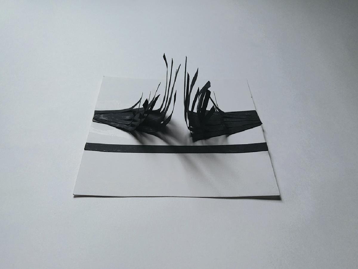
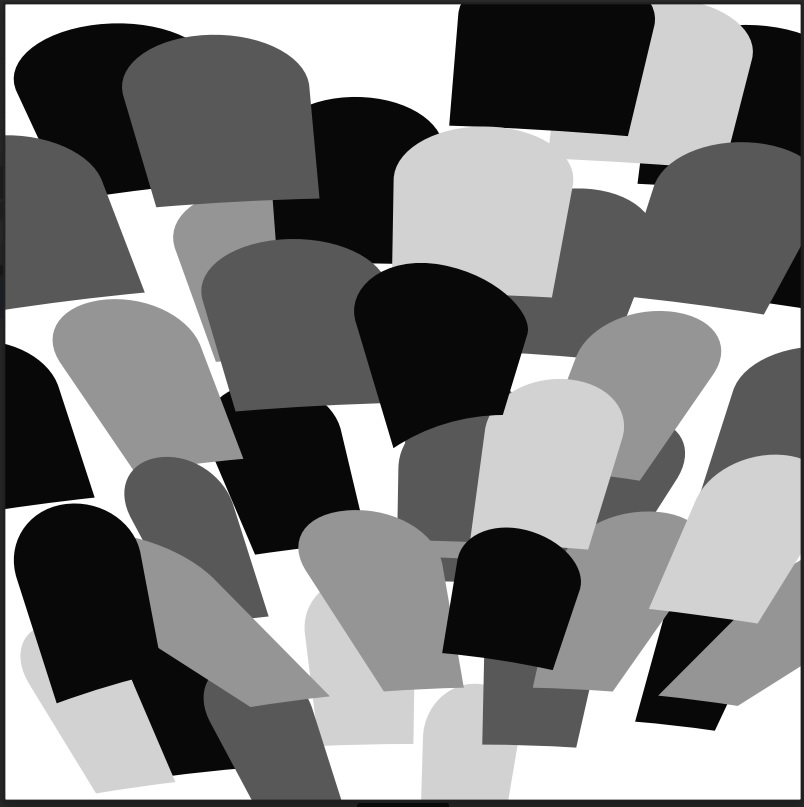
The third and final part of the assignment was re-recreating the Bristol paper art into digital forms for printing. We were to only choose the one of the sets, we approved of the most. Of course I choose the harmony and chaos set. It’s been my favorite since the at most beginning. I was not use to using Adobe Suite in general, and Illustrator was no different. I got help from my classmate Catherine in merging two shapes together and coloring. I merged a circle and a square to get the curved pentagon shape I need. I used the color picker in the CMYK setting, to choose the shades of grey to use; along with the primary black and white. Creating the chaos in Adobe Illustrator was more hectic than creating harmony, who would have guessed that. At first Professor said it reminds her of a graveyard and suggested using the warp function to change the emotion of the image. I went through a few of the warps settings and decided on of the arcs, because it created that movement of the shapes falling off the page.
All in all. I feel ready for the critique, because I can only get better from where I am now. I’ve learned that creating sketches can completely help when doing projects. Water can do amazing wonders when working with gouache paint. One cannot learn all that Adobe Suite has to offer in one day. And practice, cannot do anything but help.
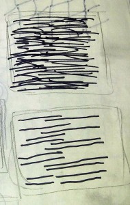
Loud and Quiet Thumbnails:
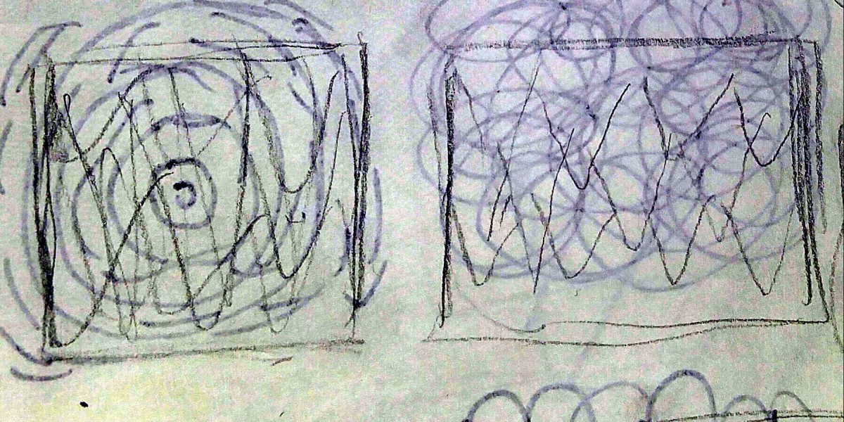
Harmony and Chaos Thumbnails:
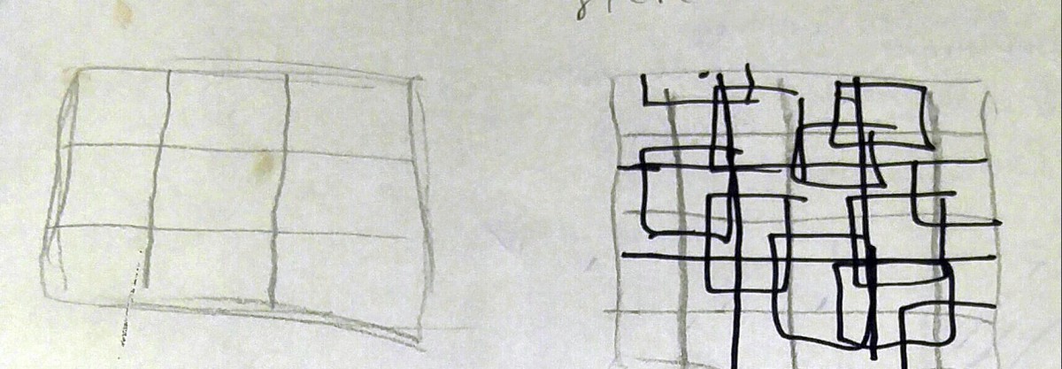
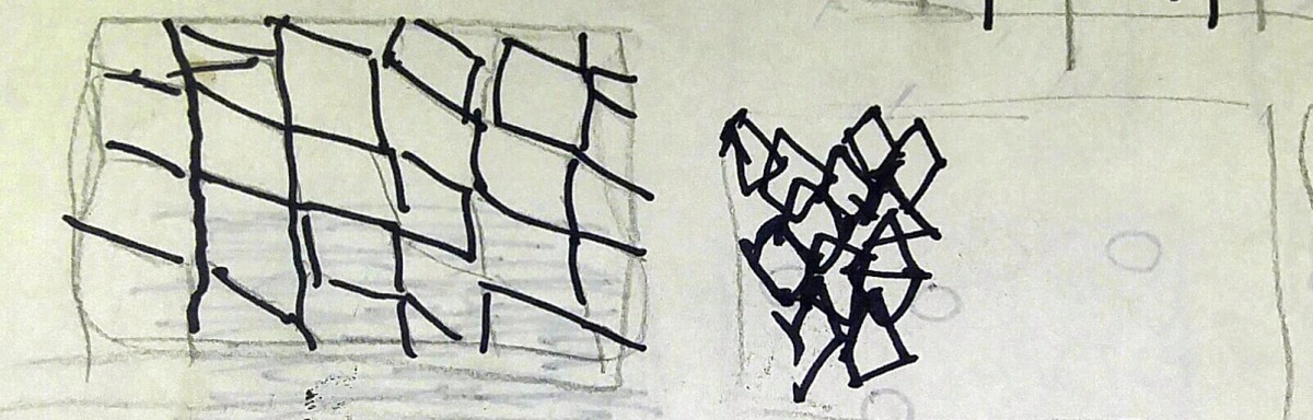
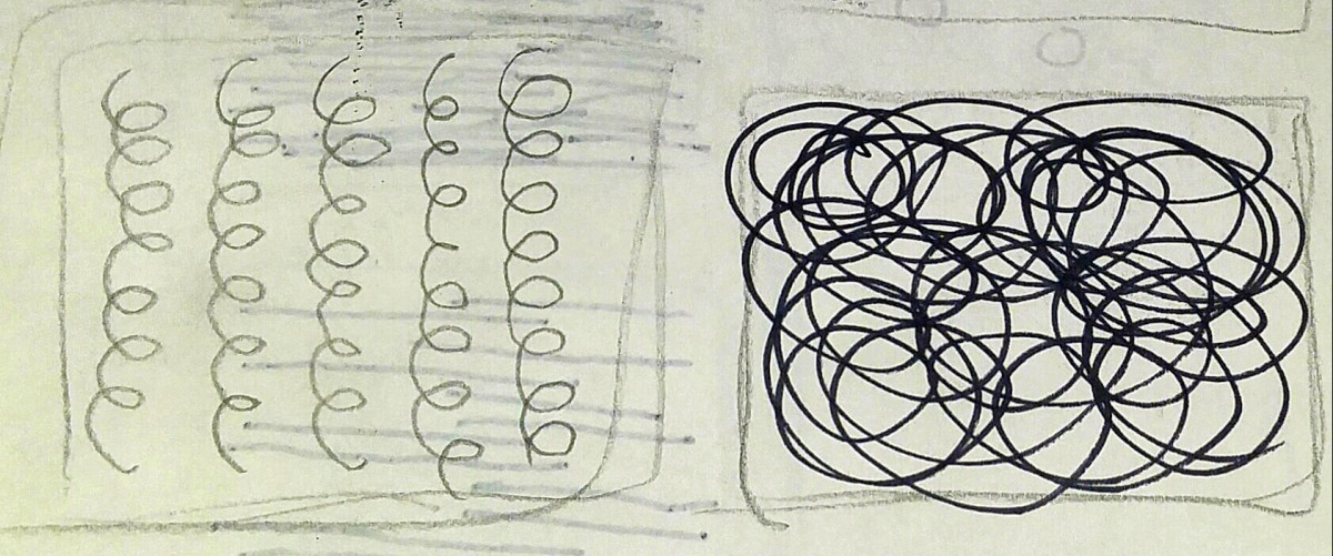
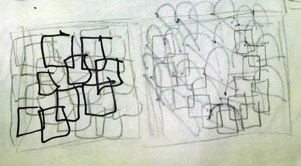
Crowded and Isolated Thumbnails:

Handpainted Art:
Digital Art:
This is the first post on your Learning Blog. Edit or delete it, then start blogging!
The ePortfolio is both a Learning Blog and an Academic Career Portfolio. Use the Learning Blog to document your learning experiences and class assignments each semester. As time goes by, add content to the Academics and Career sections to show your department, graduate institutions, or future employers how well prepared you are for your chosen career.
NOTE: Remember to add appropriate Categories and Tags to your posts. This will help your professors and other visitors find the content they are looking for. The Categories “Coursework” and “Field Trips” and the Tags “OpenLab” and “City Tech” have already been applied to this post. Feel free to make changes!
The OpenLab is an open-source, digital platform designed to support teaching and learning at City Tech (New York City College of Technology), and to promote student and faculty engagement in the intellectual and social life of the college community.

