Art book Project
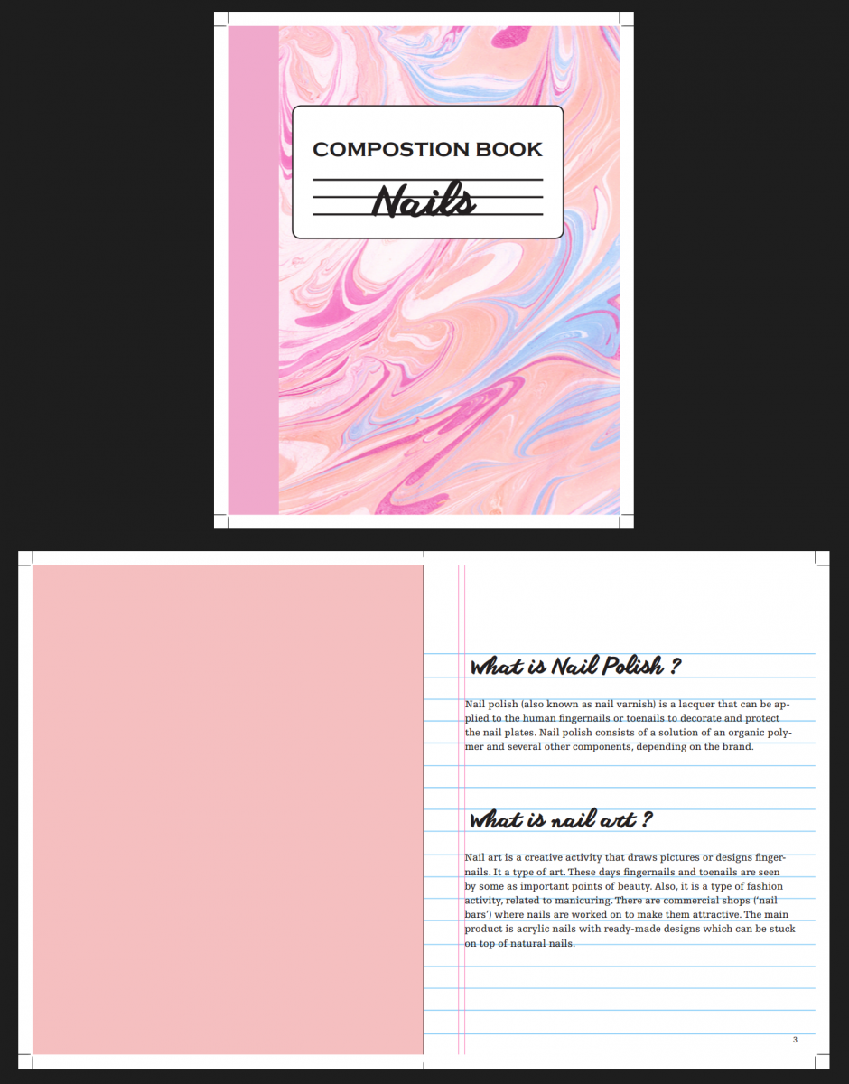
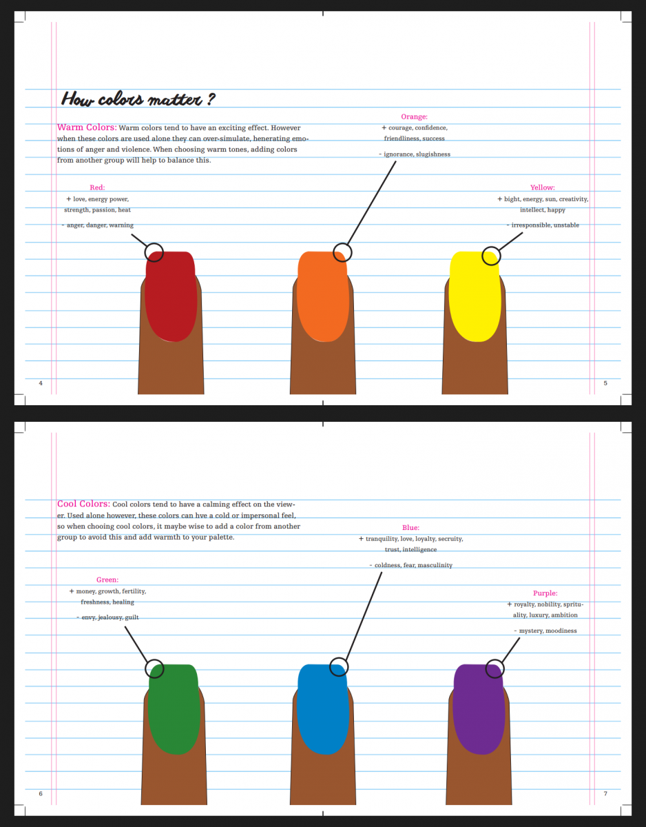
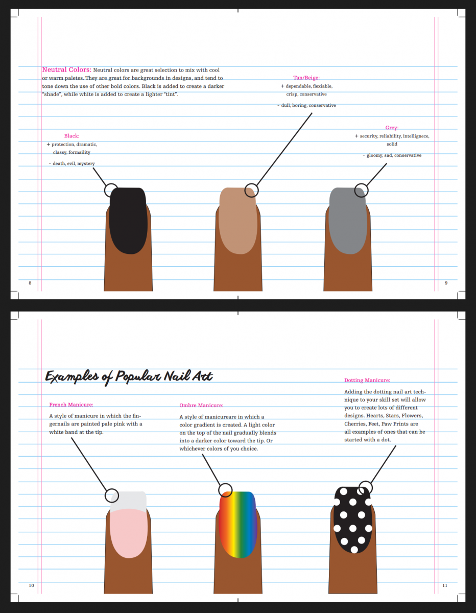
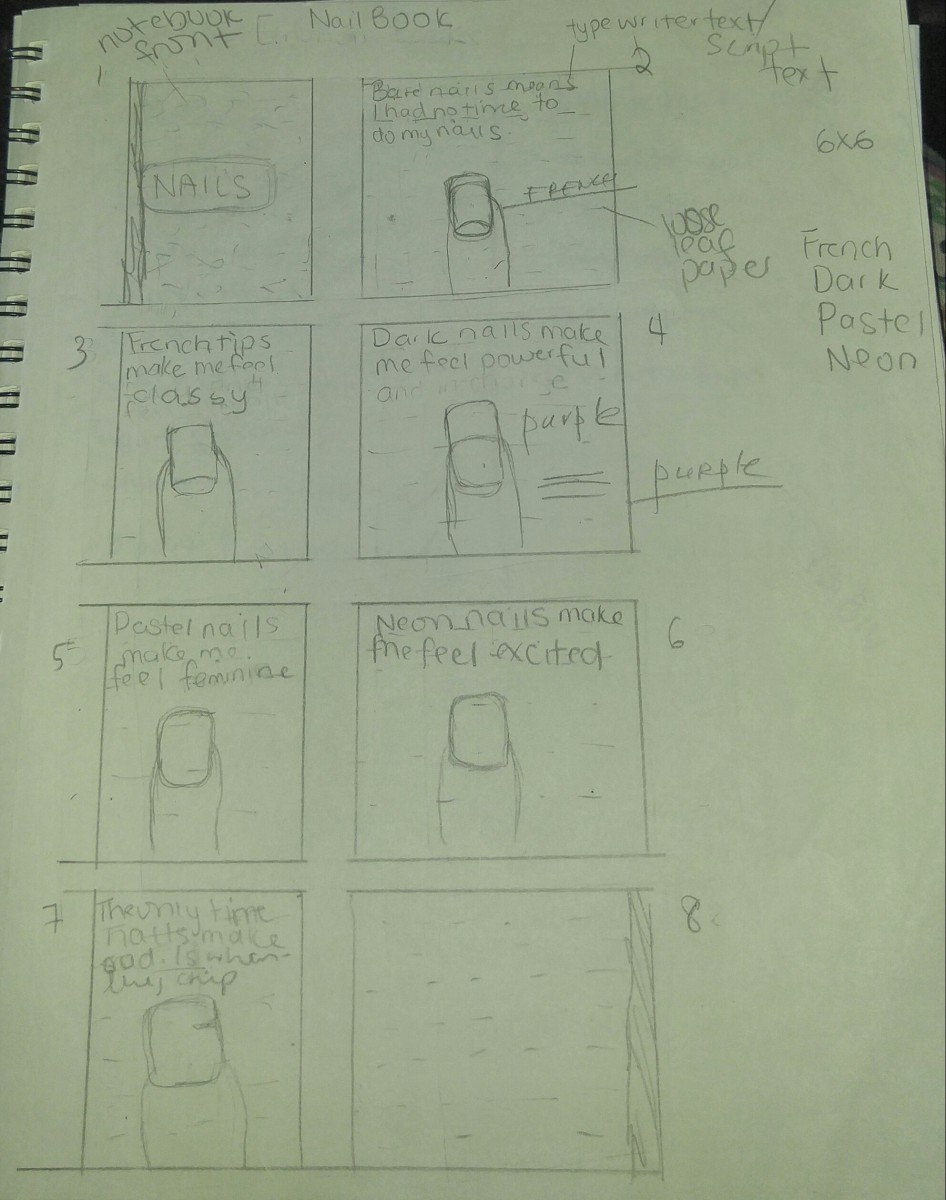
For Graphic Design Principles I class. Our final project was to create art book. Using any theme, idea or concept you could up with. In order to inspire the student body. Professor Trofimova arranged for the class to take a trip to Printed Matter, Inc. Printed Matter is a bookstore located on eleventh avenue, between twenty-fifth and twenty-sixth street. They are a non-profit organization that provides gallery opening and book printing for artists.I personally was not able to attend the class trip, due to the time conflicting with another class I had the same day; back at New York City College of Technology on Jay Street. I was able to look up Printed Matter, Inc books on Google, along with art books in general. The photographs were great, but going in store would have been better. I knew I wanted the art book concept to be personal. A part of what I feel makes me the person I am. I circulated between ideas about the drinks I have on weekly basis and want they do for me both mentally and physical. Examples, are my go-to Starbucks drinks. The Apple Juice for breakfast time, wakes me up in the morning. The Passion Tango Tea Lemonade, just on days when it’s hot. The Chai Tea Latte is Christmas cheer in a cup, warms me right up. And The Green Tea Latte taste like heaven, brings up my mood instantly. I was not sure how I actually felt about create the art to represent the drinks and have look interesting to me and others around me. That brought me to idea about involving more than what I drink, but maybe the medications I have take everyday for the various health problems. The Antidepressants` for major depression. Vitamin B, D and Iron for my anemia and low energy. And medication for Systemic Lupus. Yet, that seemed just little morbid to me. After that I look at what I felt was the most important to me. That brought me to my nail art concept. Nail art to me is part of my personality and helps me express myself physically. While giving me a non-permanent changeable option. My first sketches were simple. They talk about how each nail polish category made me feel. The darks made me feel powerful. Pastels made me feel feminine. Neons made me feel bold. French tips made me feel classy.Bare nails meant I had no time to do them. And broken nails kills the mood completely. Professor Trofimova suggest I rethink making the book so simple. Try adding in more information. Think about who the book was for. And what information I wanted to give. I started created a piece of Adobe Indesign. From the very beginning, I wanted the artbook to have a marble notebook kind of style. I found a great marble and transparent loose leaf paper background of google. And a notebook composition font, along with my script font from the website dafont. I started adding information about “what nail polish is,” “the history of nail polish,” “types of top and base coats,” “types of polish finishes,” “what nail art is,” and “how color matters.” After I was done. I was worried about there being too much text. And my classmate Catherine and Professor agreed with me. She felt like my book was too serious for nail polish and art. That was irritating. People believe that because, they see pretty colors and patterns. Everything is all fun and games. The official title for someone that does nail art is, Nail Technician. In order to be a Nail Technician, you have to go to school, study about the human body and its reactions, and earn a certification. The artbook is for people that want to learn more information about polish and art. And long or not, the information was relevant. But, my Professor wanted me to do the simplified version I said when I first did the sketch. Expect I just did pages on “what is nail polish,” “what is nail art,” “how color matters” and “examples of popular nail art.”
Sketchbook Outline:
Final Art book Piece: