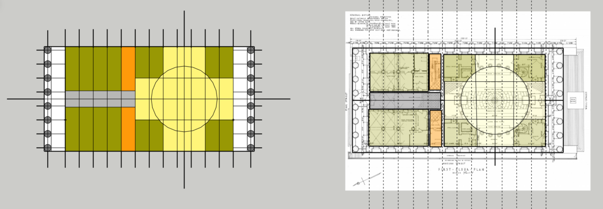
Professor Jason Montgomery demonstrated this to the students – a bit more graphic and colorful – of what we discussed ourselves. You might find it helpful to show ZONES – which you can then draft using line weights – heavy, light, dashed, etc…..Notice how he uses LIGHTER colors for areas which are spatially OPEN – as we discussed – and DARKER tones for areas which are either more solid, or are not as public and important – thereby setting up a difference in HIERARCHY of spaces…..


Leave a Reply