On Tuesday, November 26, 2019 I visited the Museum of Modern Art (Moma) for the first time ever! I was there for an hour and got see numerous works of art the very interesting and appealing to the eye of illustration and graphic design. Here are the 3 pieces of art I chose to examine and interpret.
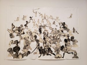
Christ’s Entry into Journalism (2017) by Kara Walker
I found this piece to very interesting because of the artist’s choice of merging historical figures into a collage of art. Figures such as Martin Luther King Jr., Jesus Christ and Frederick Douglas. Also the art doesn’t use much colors but yet still comes out effective. I was wondering what Kara was trying to convey in her art because it seems to be a clash of historical moments and figures who only tried to do good. Maybe this was a message about racism and to come together to fix our broken world.
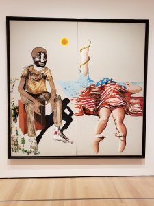
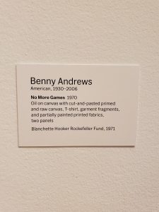
No More Games (1970) by Benny Andrews
This piece by Benny Andrews also seemed to convey a message about a broken nation and Benny Andrews was also an advocate social justice. I loved that Benny also used other materials on his art other than the oil on the canvas. I also like how the art has been split into two panels.
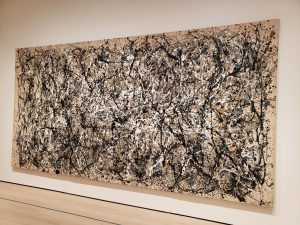
One : Number 31, 1950 (1950) by Jackson Pollock
I wasn’t able to get a good front shot of this piece but did get a chance to sit in front of it for a while and examine it for about 10-15 minutes. I noticed how with “drip” technique the artist used, the paint is evenly balanced and distributed through out the whole canvas. I felt the theme of “balance” and “holding it together” coming from it and “harmony”. At first I the word “clashing” came into mind but then in the end, everything is trying to co-exist and work in harmony which is what we need today in the world today. Living in peace and working together.


