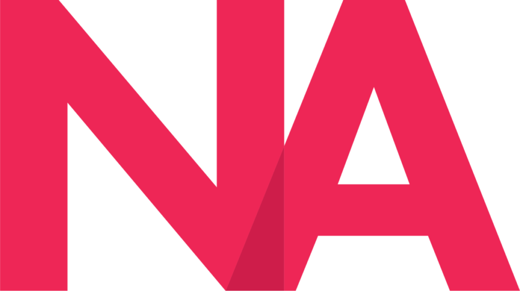
For my personal logo, I wanted to create a ligature using the initials of my name. Before I started creating this logo, I needed to draw some inspiration from my sketches.

For this logo, I chose to use combine two different ideas from my logo sketches. I wanted a part of one of the letters to cross over into the other and I wanted them to be side by side. I also knew that I wanted to use the Futura typeface for my logo. However, for my final logo I chose to use Futura PT as I didn’t have access to he regular Futura Font. As for my process on how I created the logo, I first typed in my initials (N and A) in capital and bold faced Futura PT. After placing the A at a point where the bottom of it intersected with the bottom of the N, I used the Pathfinder tool and clicked exclude. This cut off the part of the A that intersected with the bottom of the N and left an empty space. After I filled both the N and A with my desired color, using both the Polygon tool and Direct Selection tool, I created a triangle that fit the empty space I made with the Pathfinder tool. I then made this triangle the same color as the letters, went into the Color palette and increased the K% to 15%. My intention with this was to give off the illusion that the N was somewhat transparent and that the bottom of the A was crossing over into the bottom of the N. Overall, making this logo was a fun process. While I had trouble thinking of ideas during the sketching phase, I believe combining two ideas into one logo ended up being the right decision. In the end, I’m satisfied with the logo that I have created. Everything from the colors to the ligature itself feels authentic to me and I am proud of the end result.

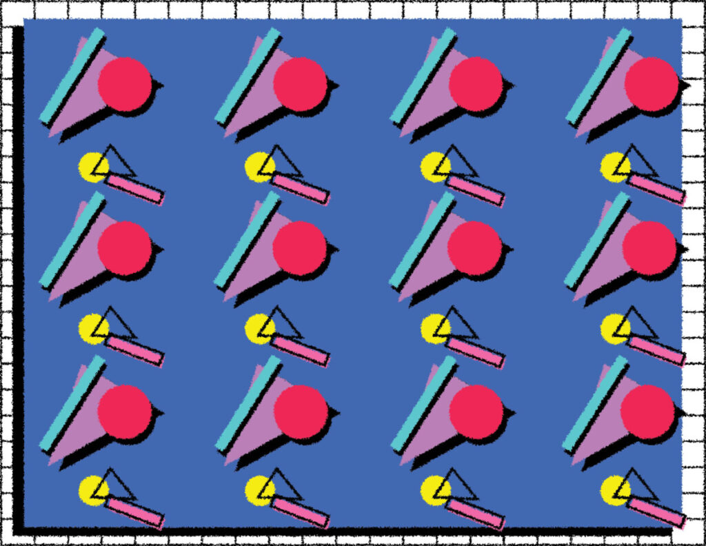
As for my banner, I chose to utilize a piece of art that I created during one of my previous semesters. For the piece, I initially wanted to create a pattern with shapes and stylistic elements that resembled 80s design. I took inspiration from 80s magazine covers, books, and art inspired by the 1980s design aesthetic. I utilized an 80s color palette for the shapes. I believe this piece represents me well because I have a personal love for the 80s design aesthetic and I believe it is a fun design that shows what I want to accomplish with my work.


