PROJECT 4 – COLOR YOUR SELFIE

GaethanJeanPierreCOLORSELFIE

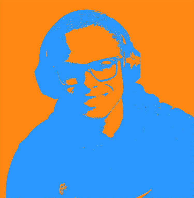
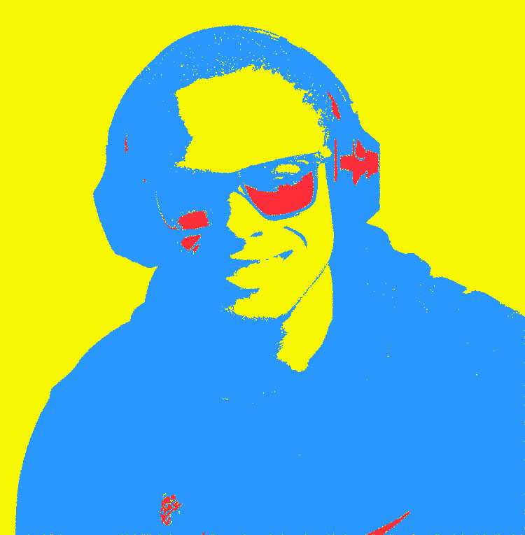
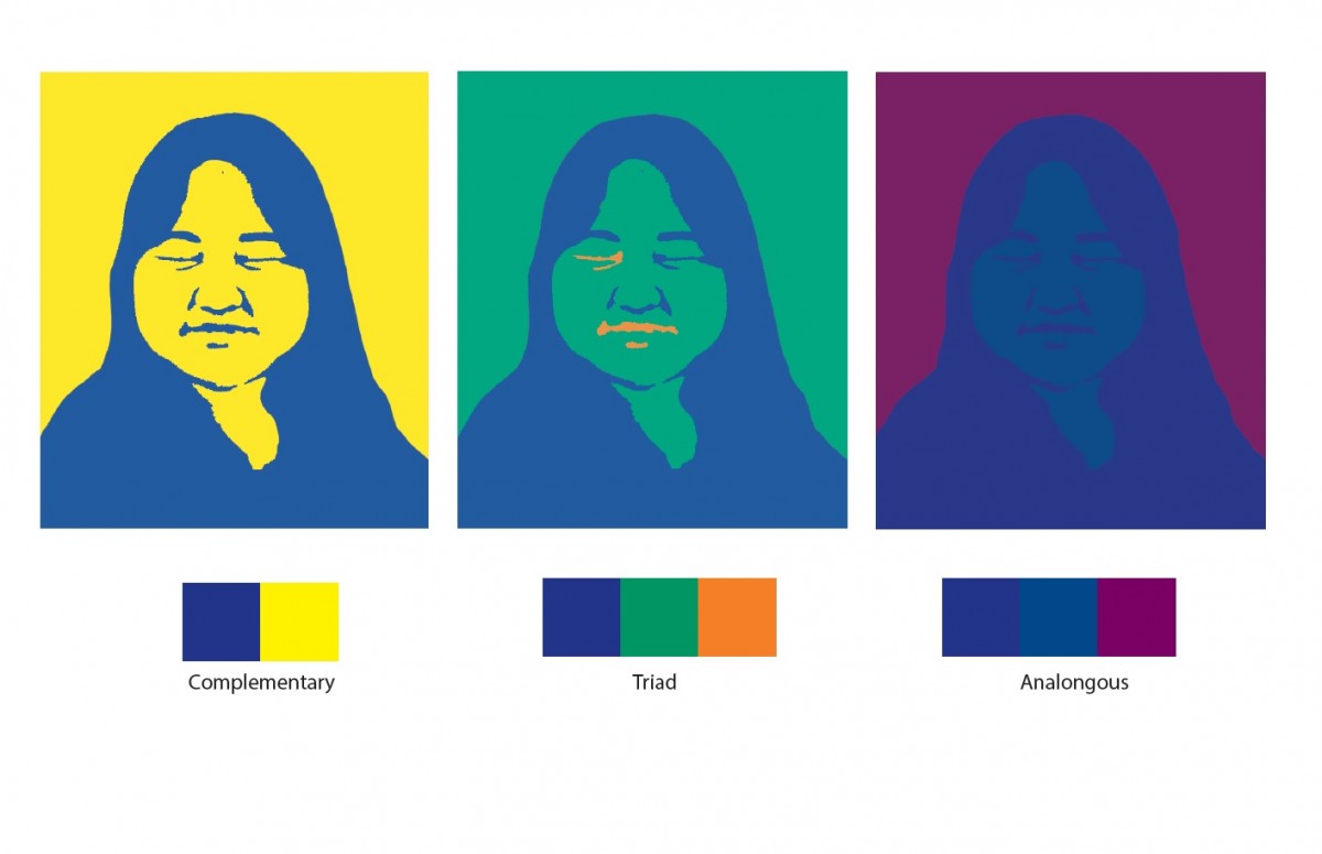
I chose the color red as my main color because i feel like it suites my personality,  Red can be taken as many different emotions and things.  it can mean out going because of how vibrant it is, it can also mean closed off because the color can also be a sign of danger and to stay away.  Overall i found this project to be very fun and hands on i enjoyed working on the computer with this one and ive always wanted to make something like this.
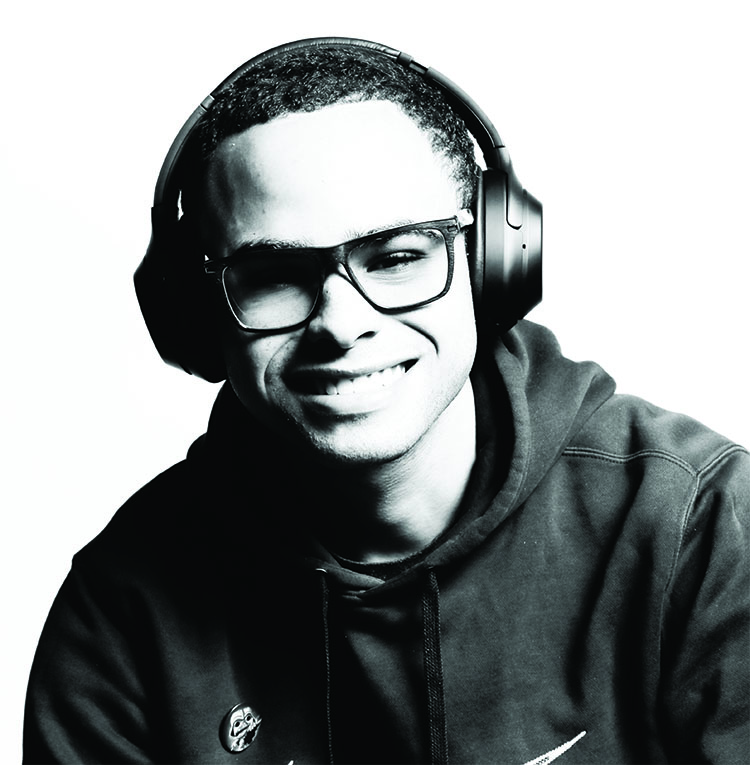
why I chose Blue

Why Blue for my composition? I chose blue because of its my way of life its the color of my birth month September it’s a color that keeps me relaxed. Blue is my way of life it’s just me it’s like the flow of water for me it never knows where it’s going but when it makes it a great impact is made no matter what.  That is what blue means to me.


In the development part of this project, the interesting part of it was finding colors that complemented set persons favorite color which in my case was blue. Finding set colors that complemented each other was indeed a fun challenge because it helped us find out what worked best threw the experimentation of this prosses. At the end of this prosses came out an avant-garde of an art piece with colors that complemented each other in a modernistic like look that is translated to the modern art we view today in museums such as the Moma or the Whitney and etc.

Project 04 -deliver

I have never learned about color before, so it was an excellent experience for me. The color that I thought and I found through CMYK color is different, so it was surprised. It was hard to me make it neat and clear via using photoshop. It was terrific that several layers consisted of one image. Depending on the foreground and background colors, the picture shows a really different feeling to me. Finding the mood what I want is also fun. Through this project, I learned how the importance of color is. I was happy to doing this project as well.

Project 4


My favorite color is violet. I like the mood of the violet. I think it represents mixed feelings: calm, glooming, gorgeous, and etc. The light tone of violet is accompanied by a pink feminine and romantic atmosphere. On the other hand, the darker tone of violet gives the more subtle and elegant the image. It is more sensual than red violet, and is also called the visionary’s color. 

Violet is a mysterious and beautiful itself so that I like.

Also, in history, violet has long been associated with royalty and majesty. Moreover, in ancient Rome, they used the violet for common funeral flower. It is is also interesting to me.

Final presentation

Complementary Composition: It was the uneasy part to understand the process and get the final result.
Triad composition: I am very pleased by the way I achieved the Triad composition.
Analogous composition: even though I get to master the process to change the color, I think I could do better on the level of the mouth to emphasis more the mood of the picture.
in general, as not familiar with photoshop, I did progress while learning through this project that colors as elements of design play a major role in communicating a mood.