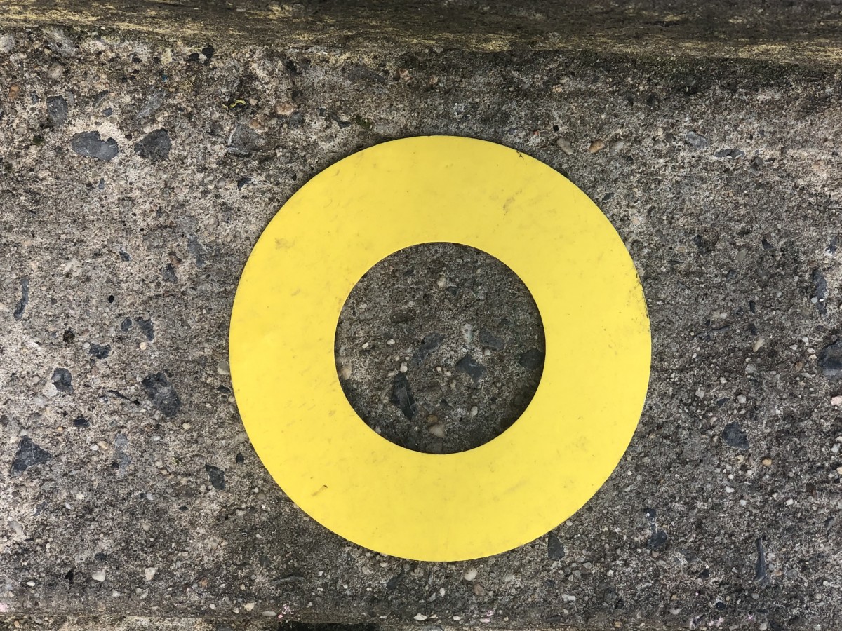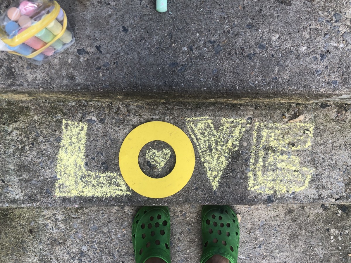
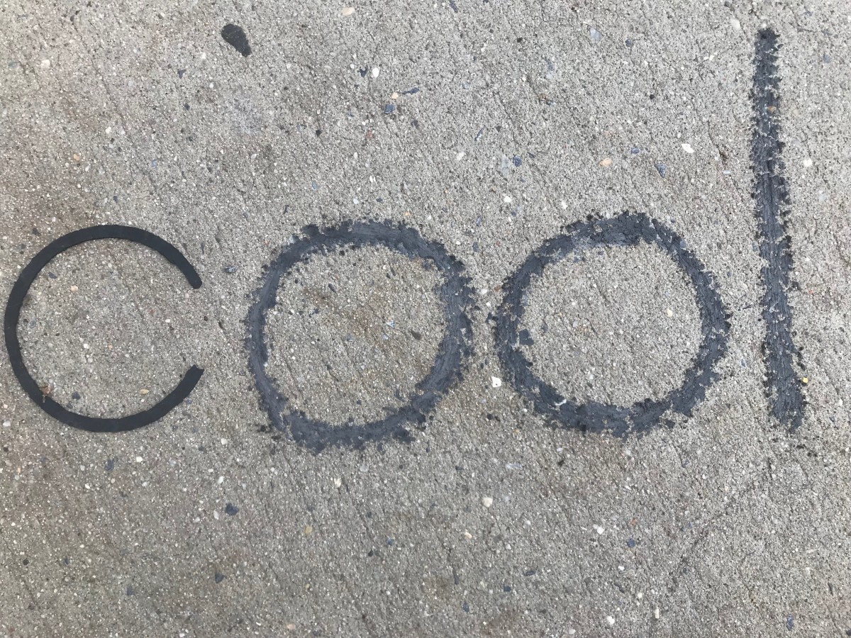

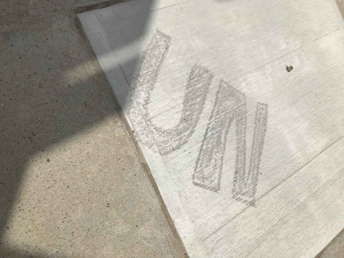
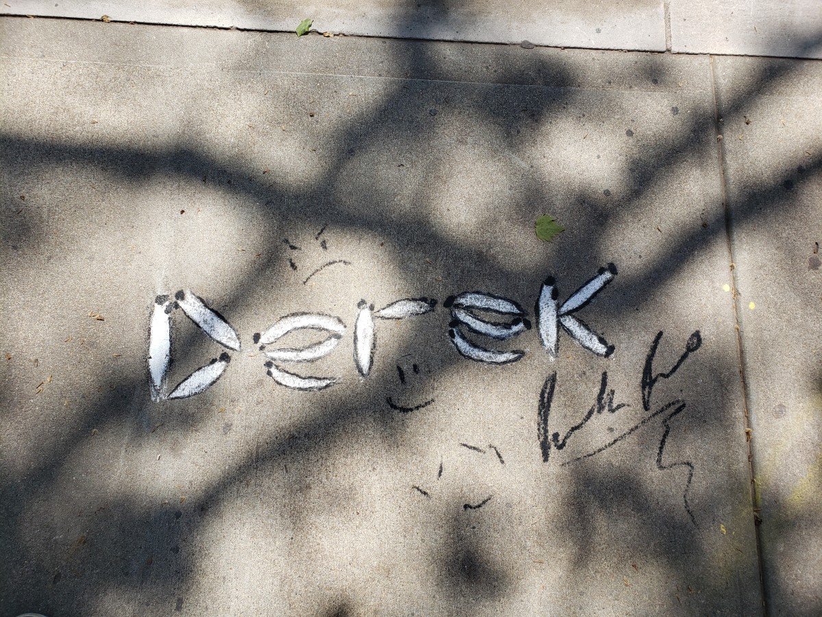
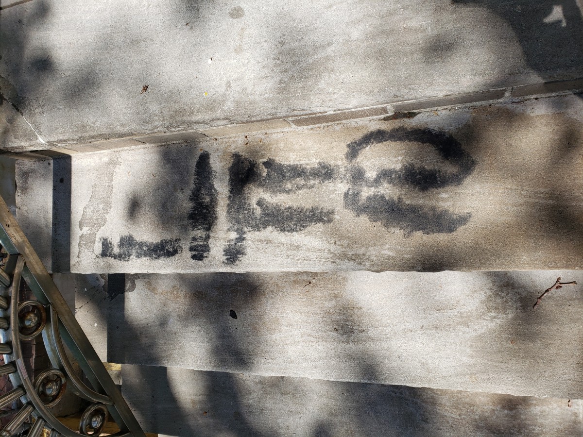
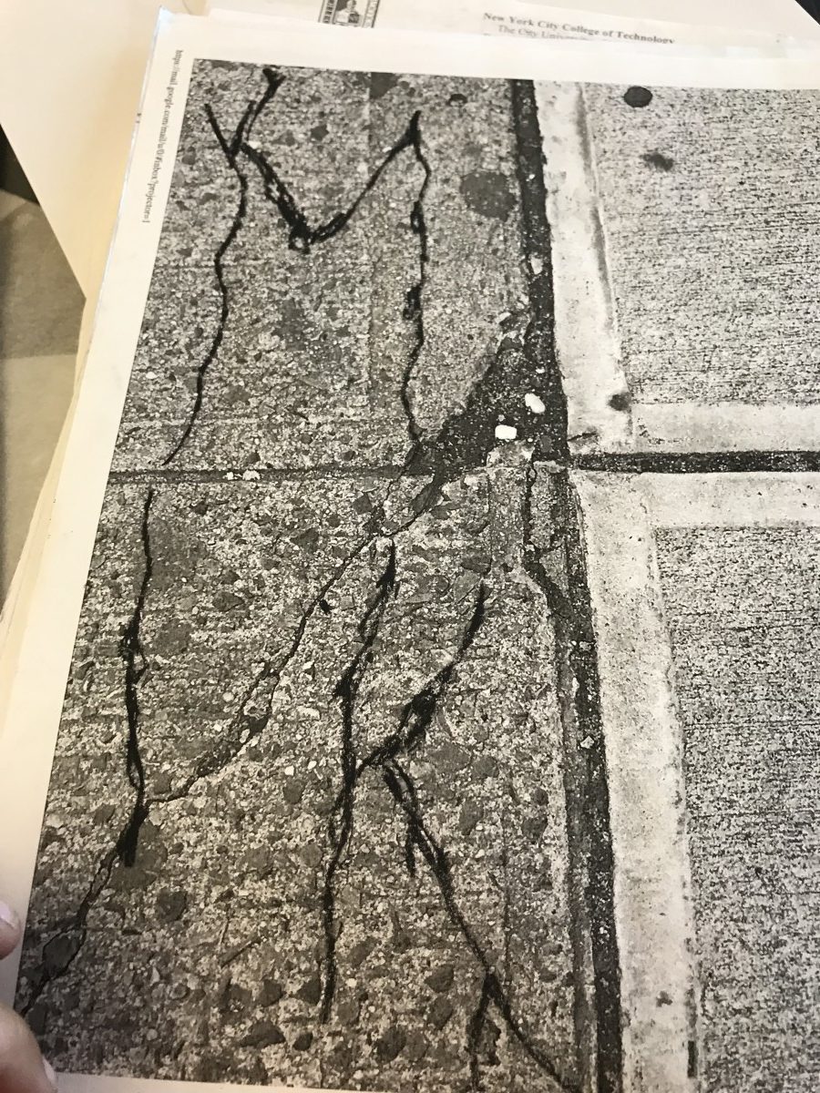
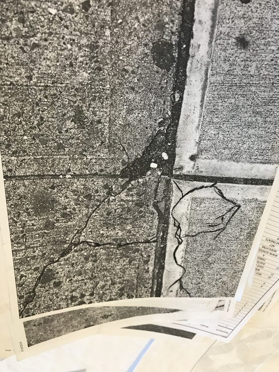
My starting point was the shape C rubber.
It was in front of a church, and when i started to chalk around it, someone passing by asked me what am I doing? and i am not allowed to do it because its the church. I answered back that this is the sidewalk and it’s for the public. He went inside and bring the priest. By that time i had finished and washed off the chalk , and left.
When I heard him feeding the priest lies i went back and i explained myself. turn out that the day before, there was a manifestation and they thought that may art was related to it. The person apologized and everybody left satisfied. Communication is key to tolerance
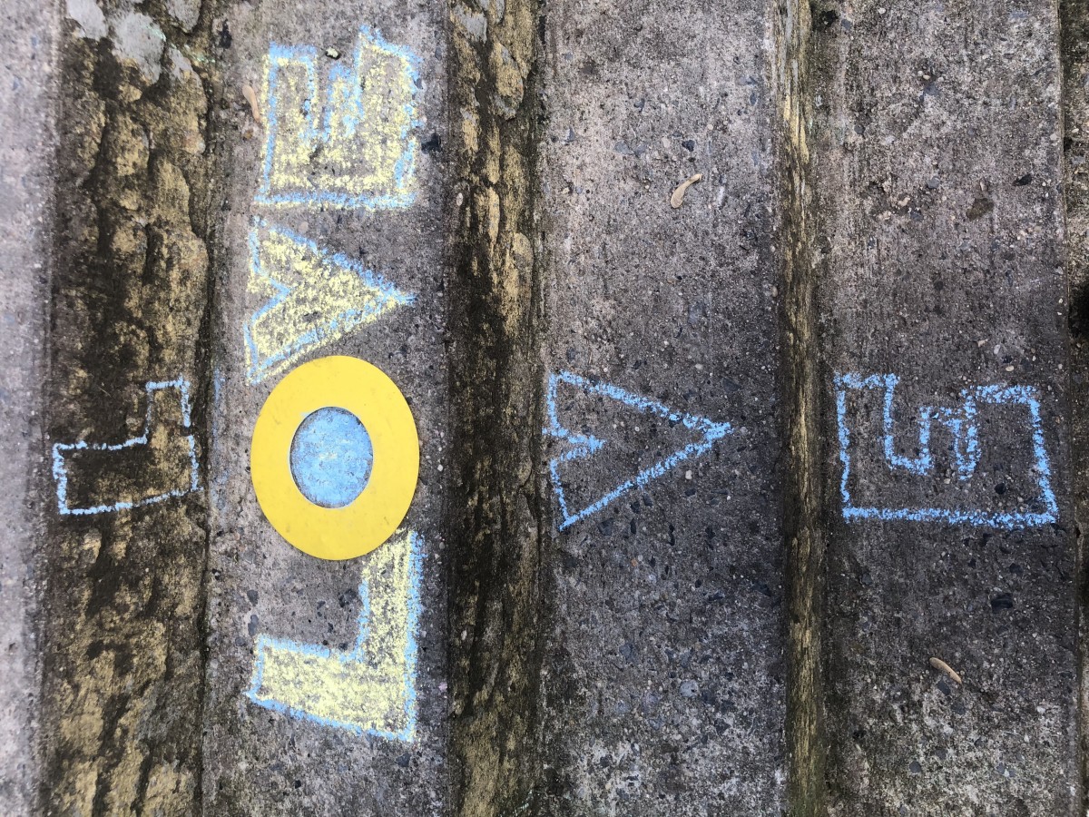
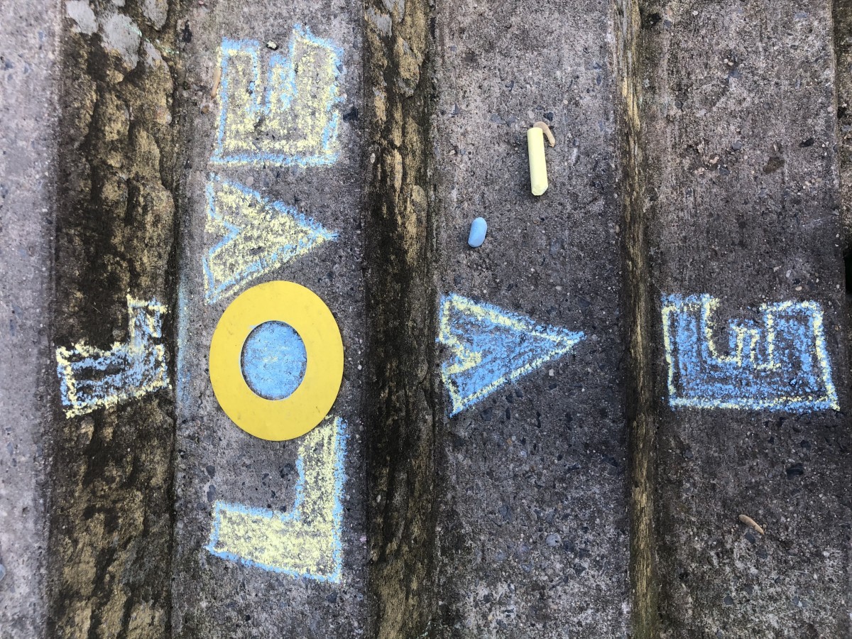
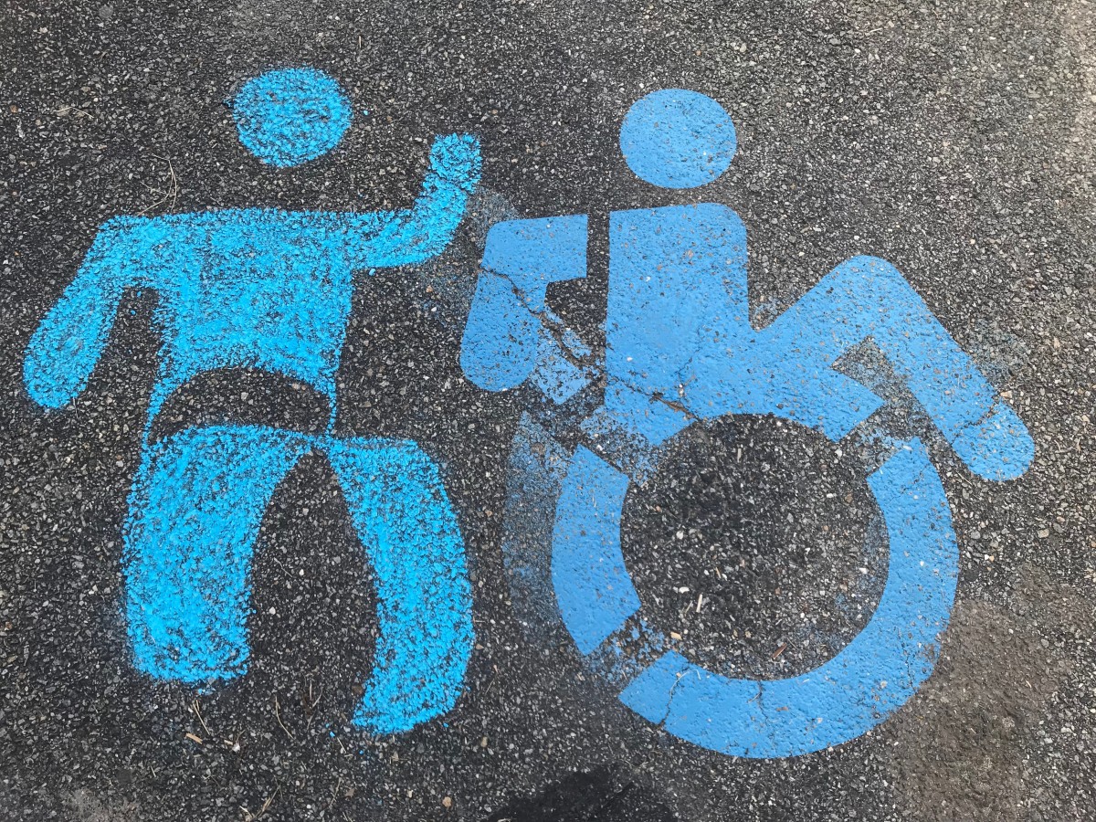
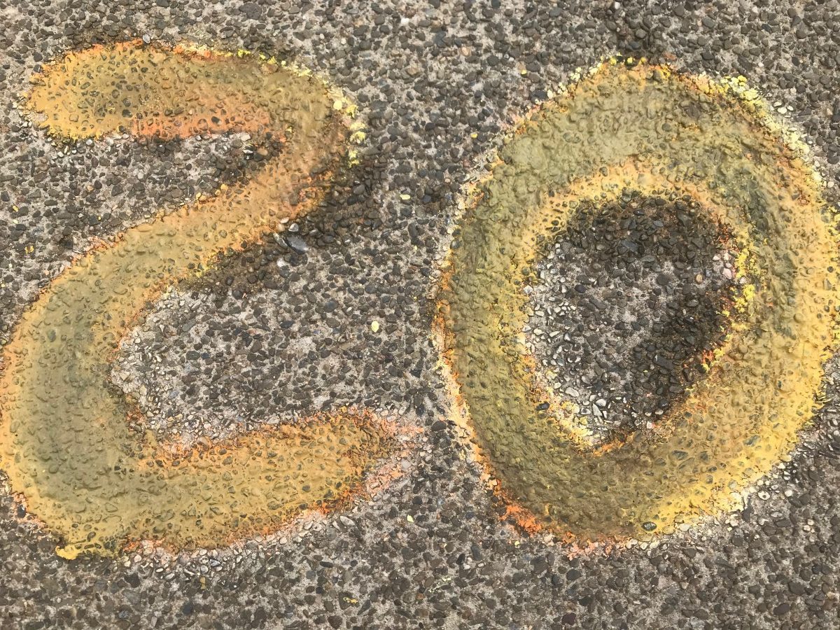
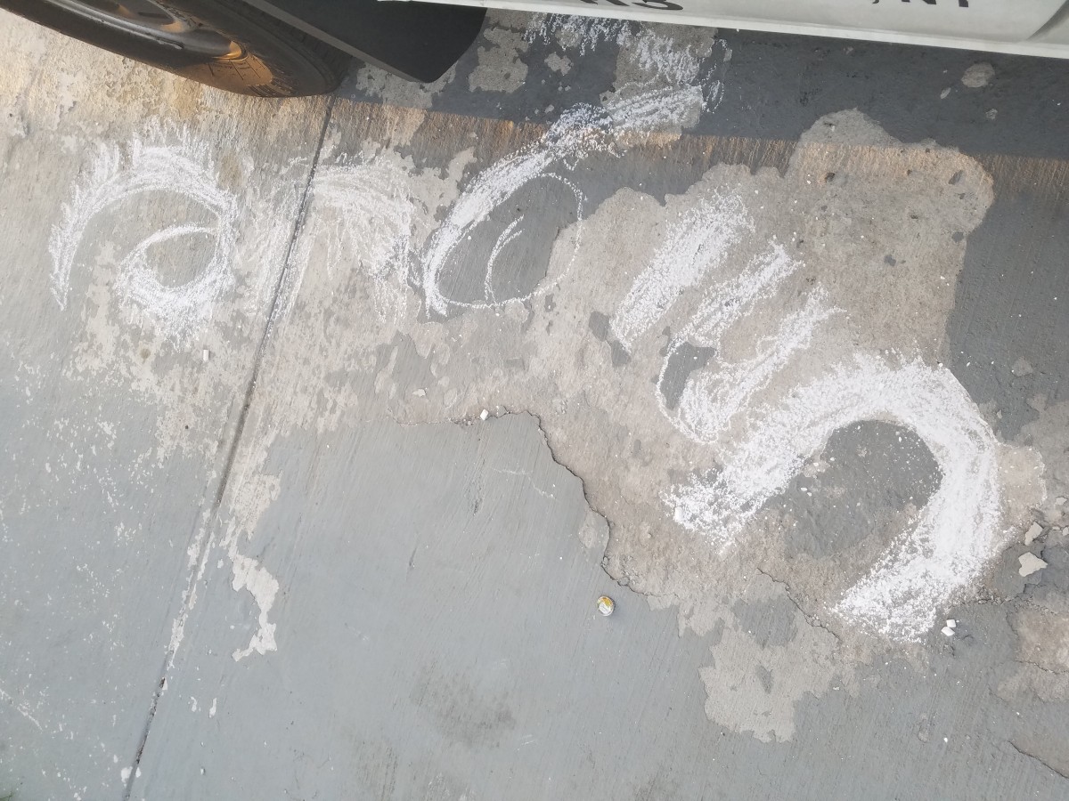
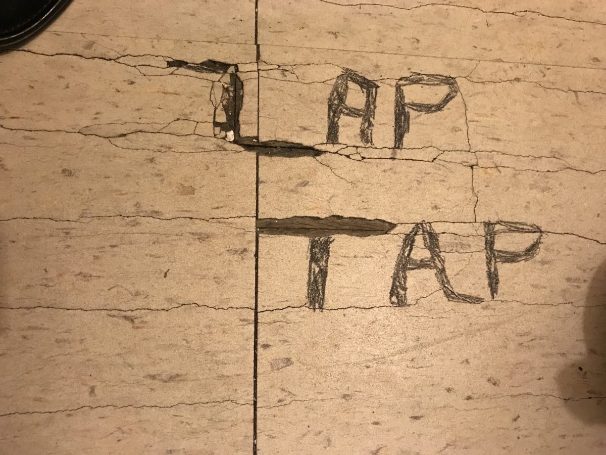
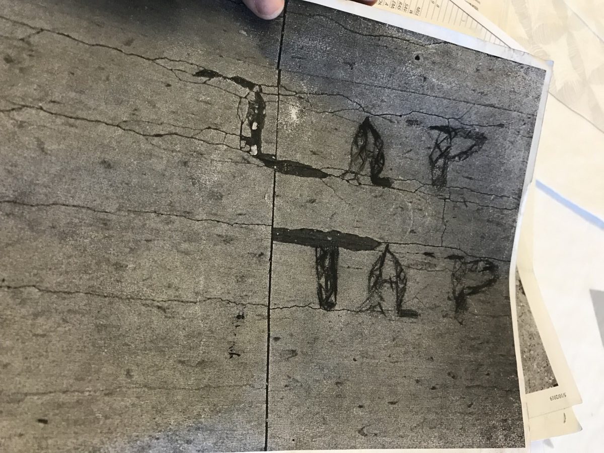
My starting point is obvious and decide to build a type based on it.
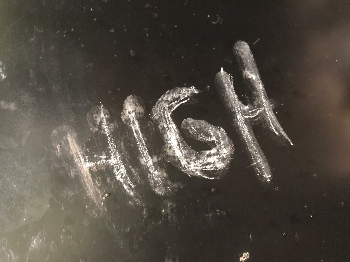
it was done on staples’ parking lot.
Believe it or not. the manager was not happy with it, and gave me a whole speech. I ended up washing it off.
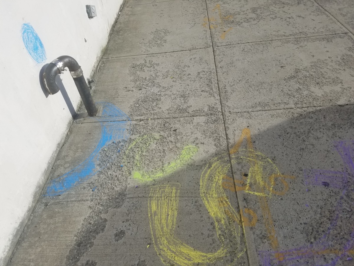
Fun was really FUN to do.
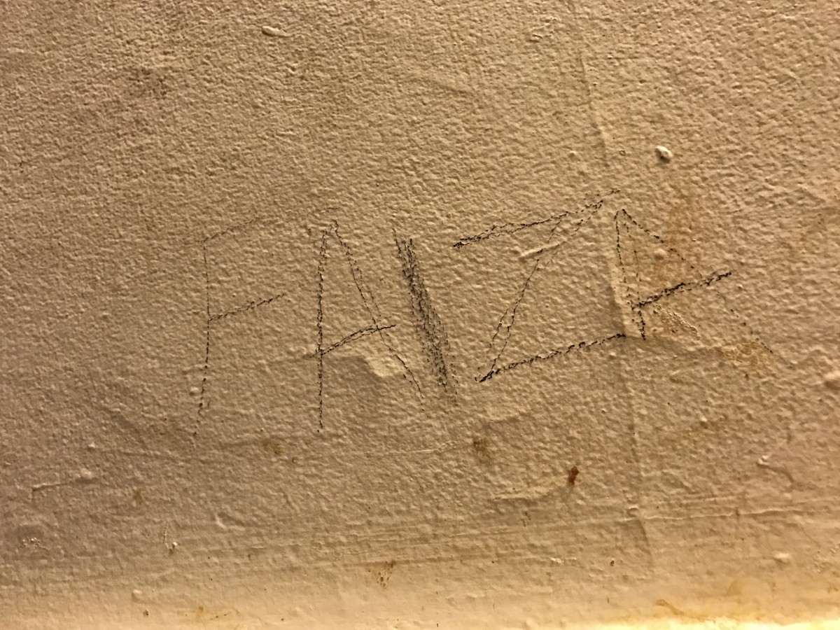
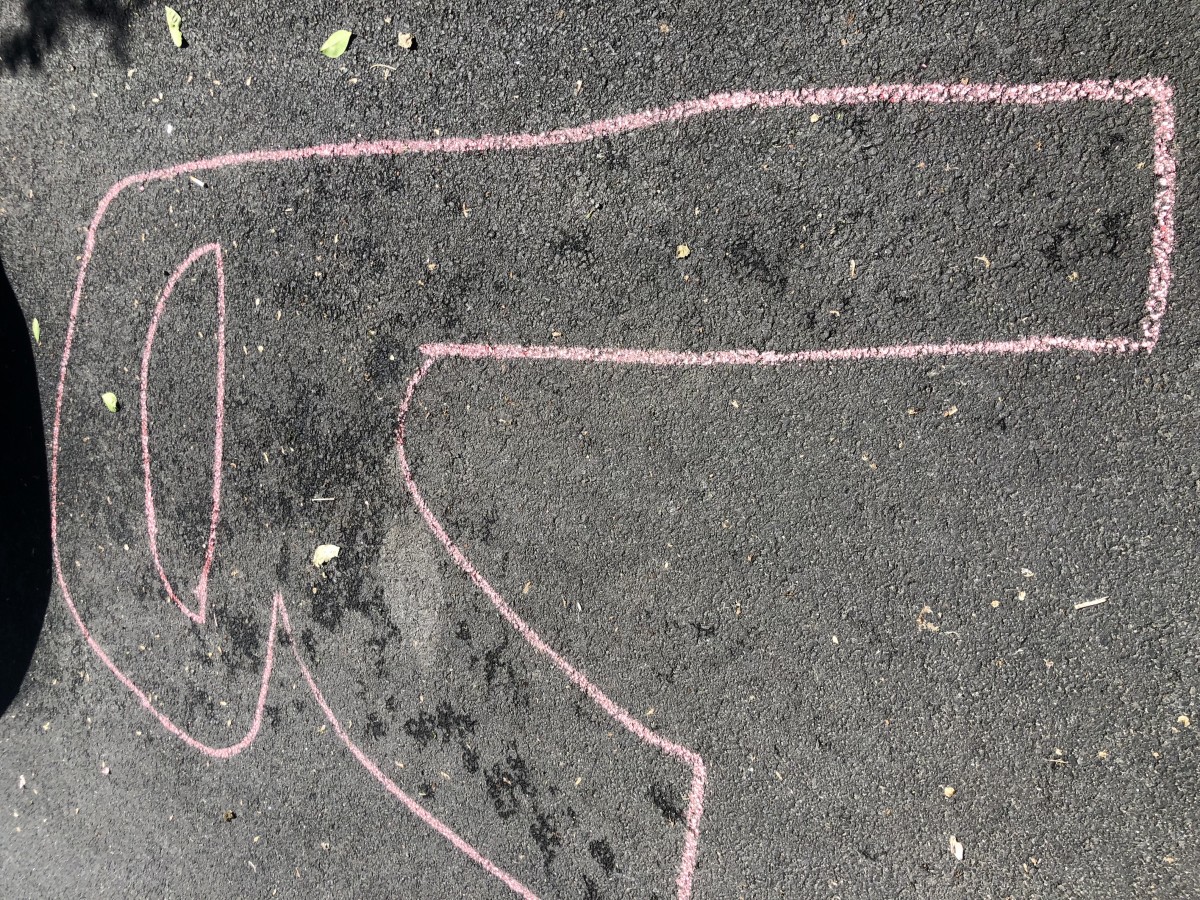
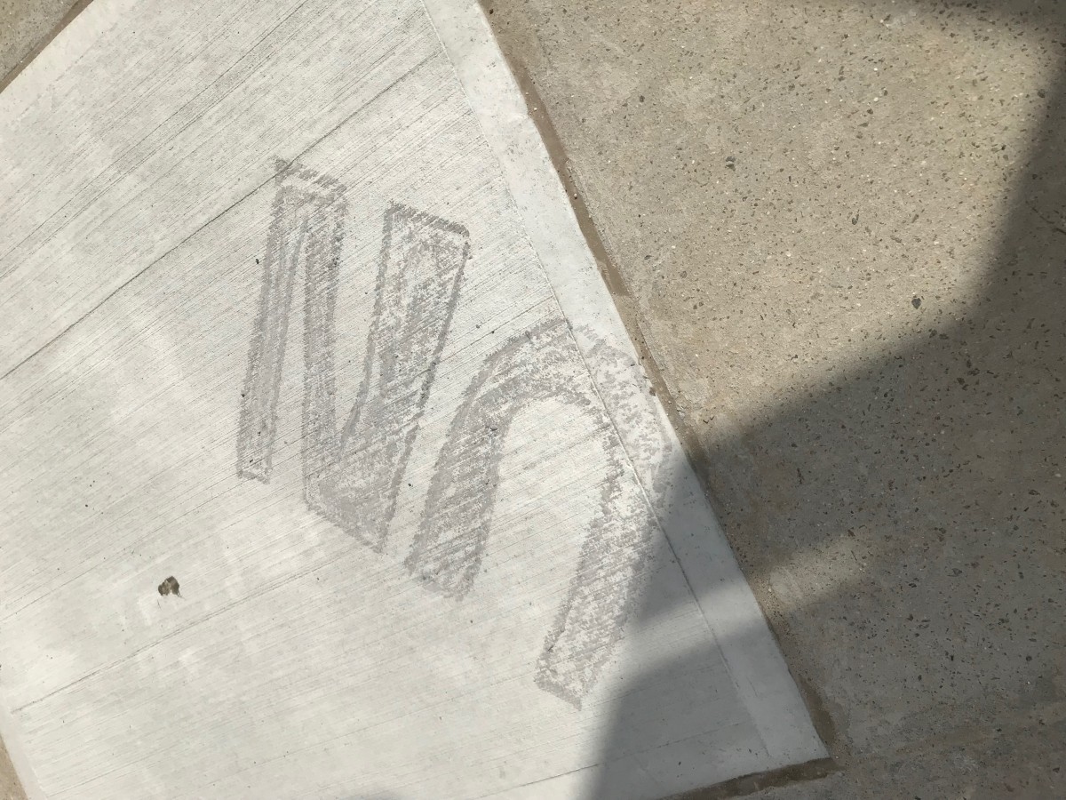
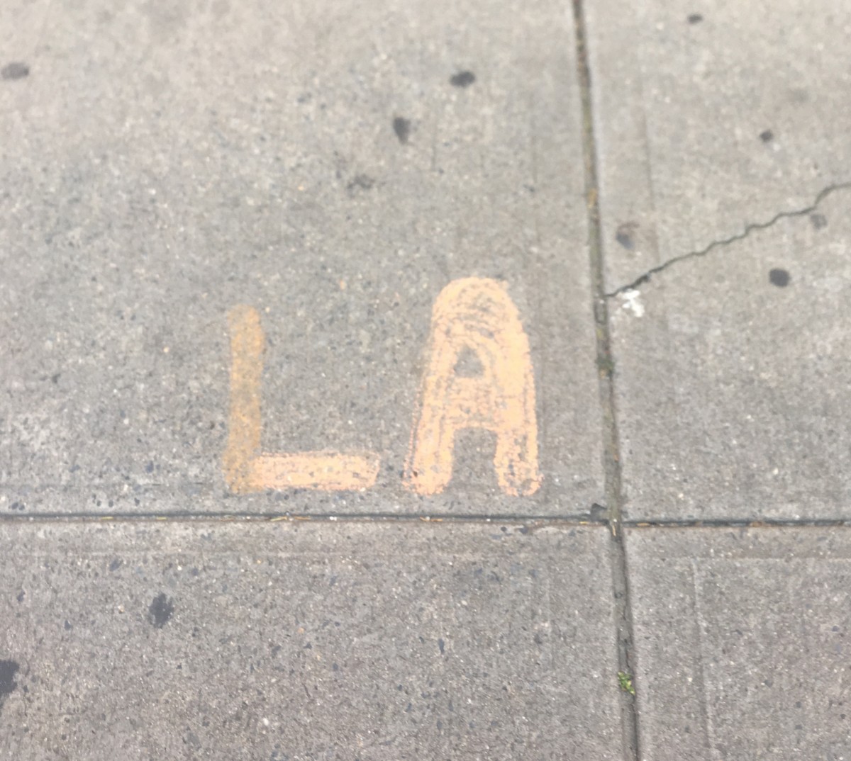
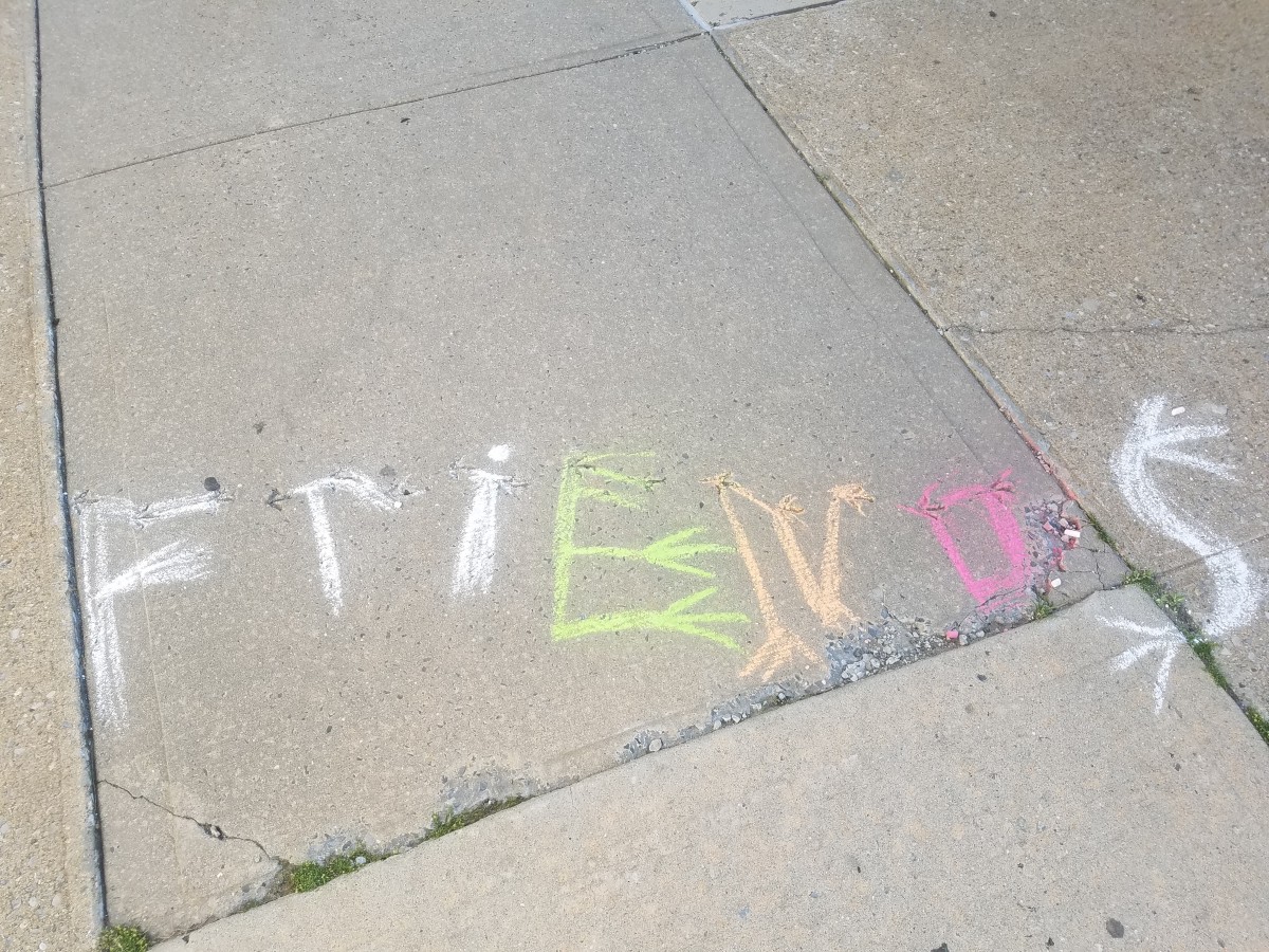
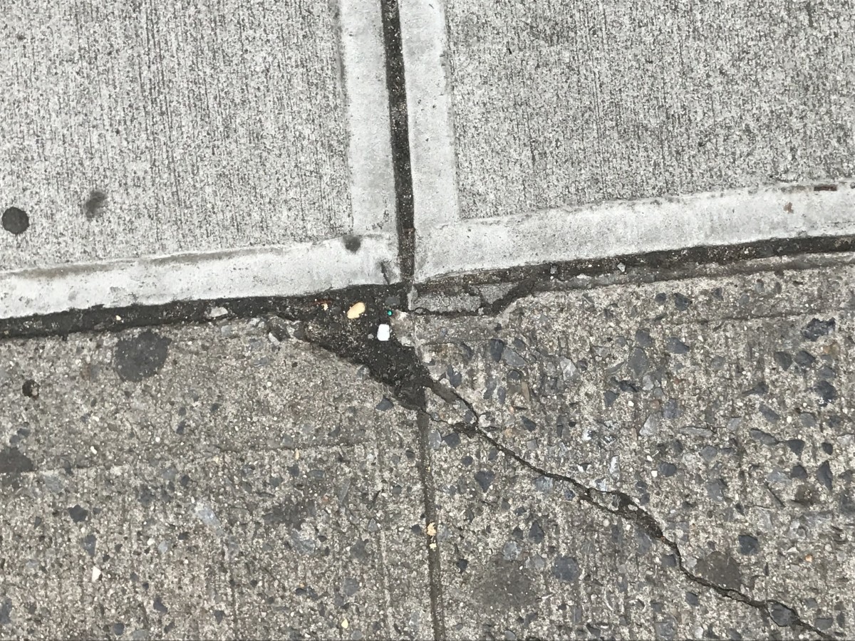
my starting point is the cast shadow of the sun over a street sign.
It looks like an F, so I find it interesting to build type on it.
The funny part is that you have to work against the clouds.
It was a cloudy day that did not help. Moreover the time in between I finished wetting the letter and took the picture the chalk dries too quickly
I wished to achieve the actual color of the cast shadow
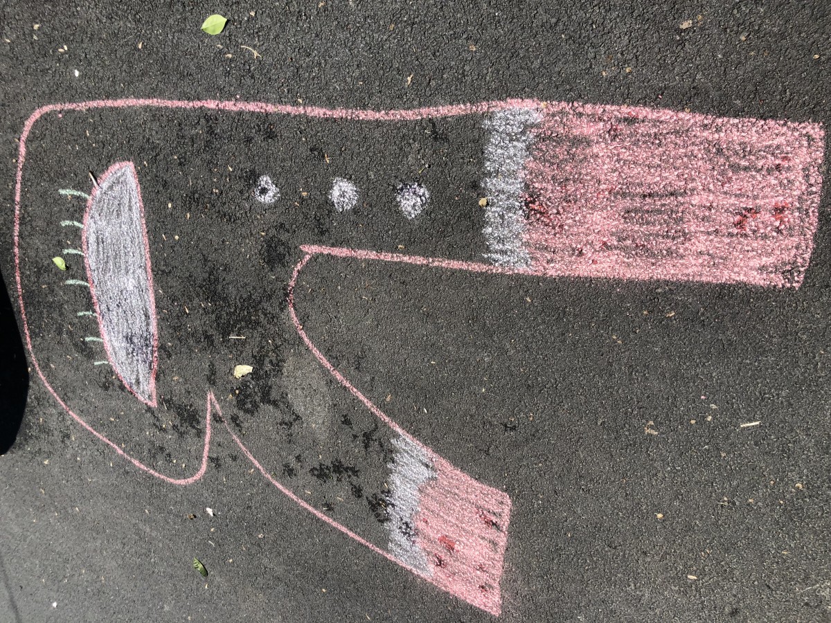
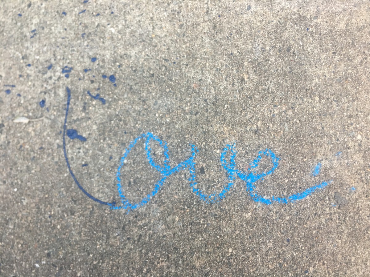
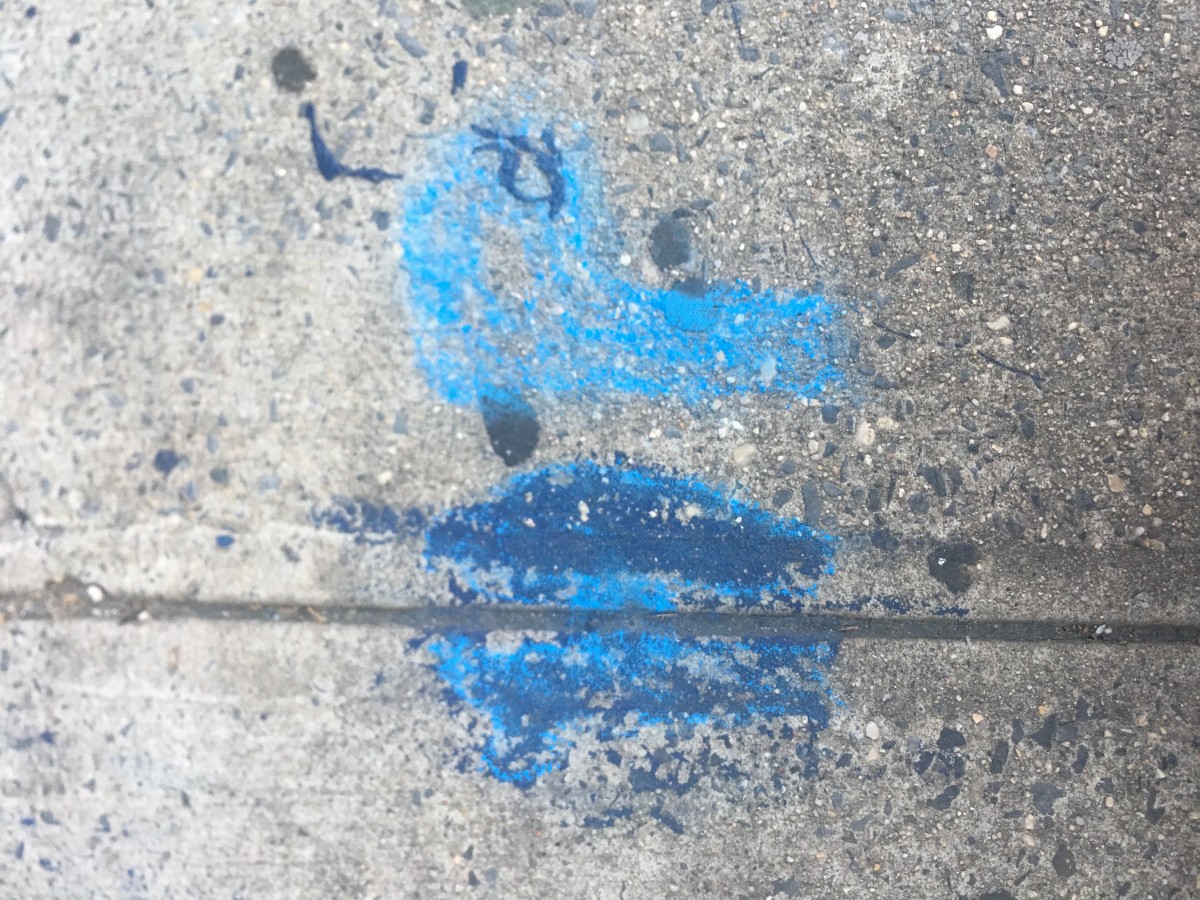
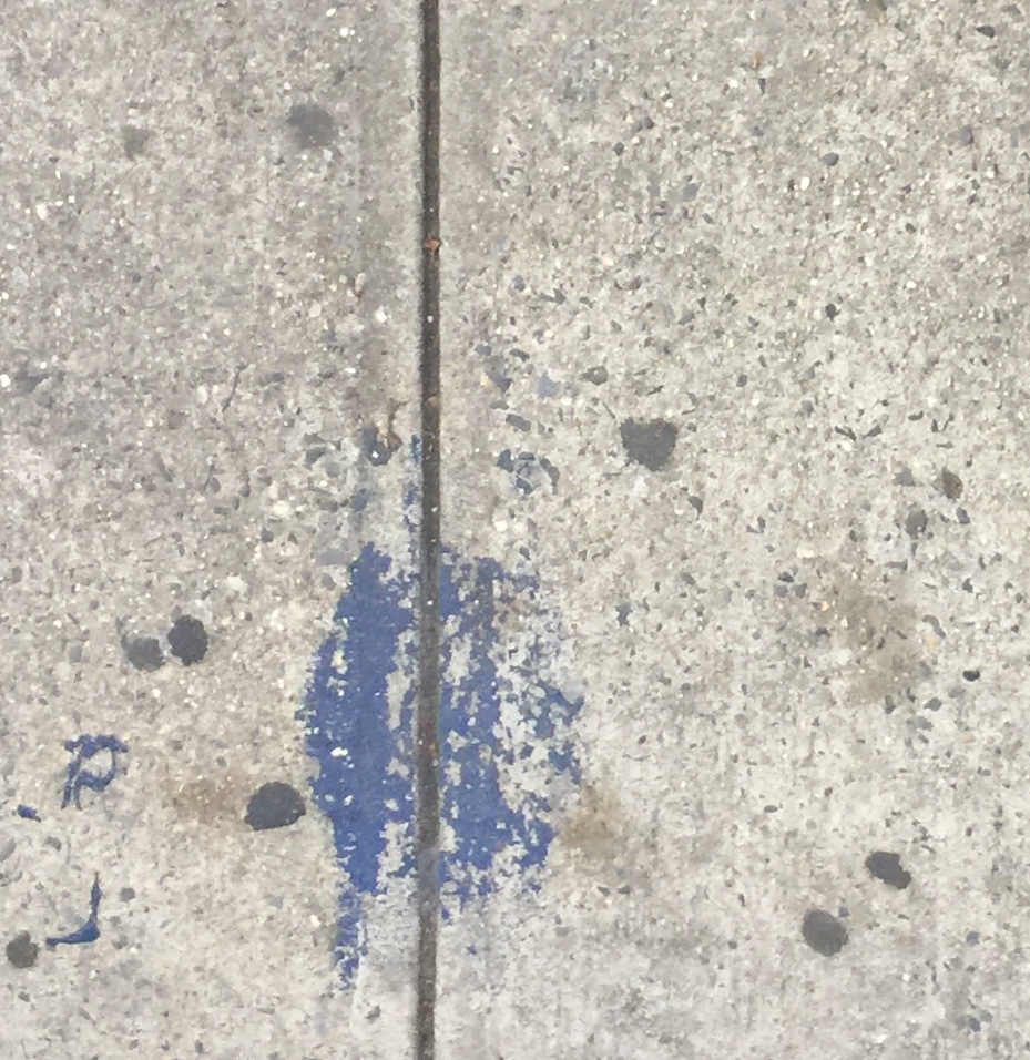
the starting point which is an Interrogation mark was in a quiet street.
I get really dirty to mix up the color and had that final result.
Averall. i am really pleased with the results.


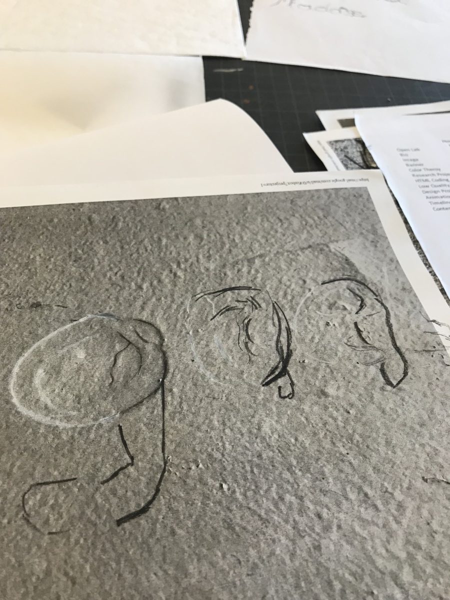
 Sketch 1
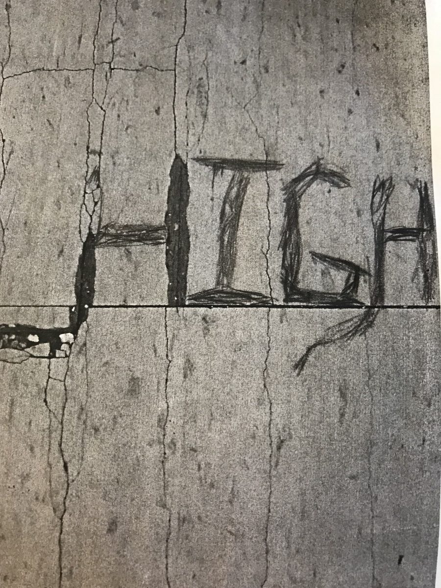 Sketch 2
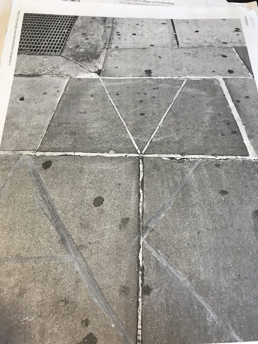
 Sketch 1
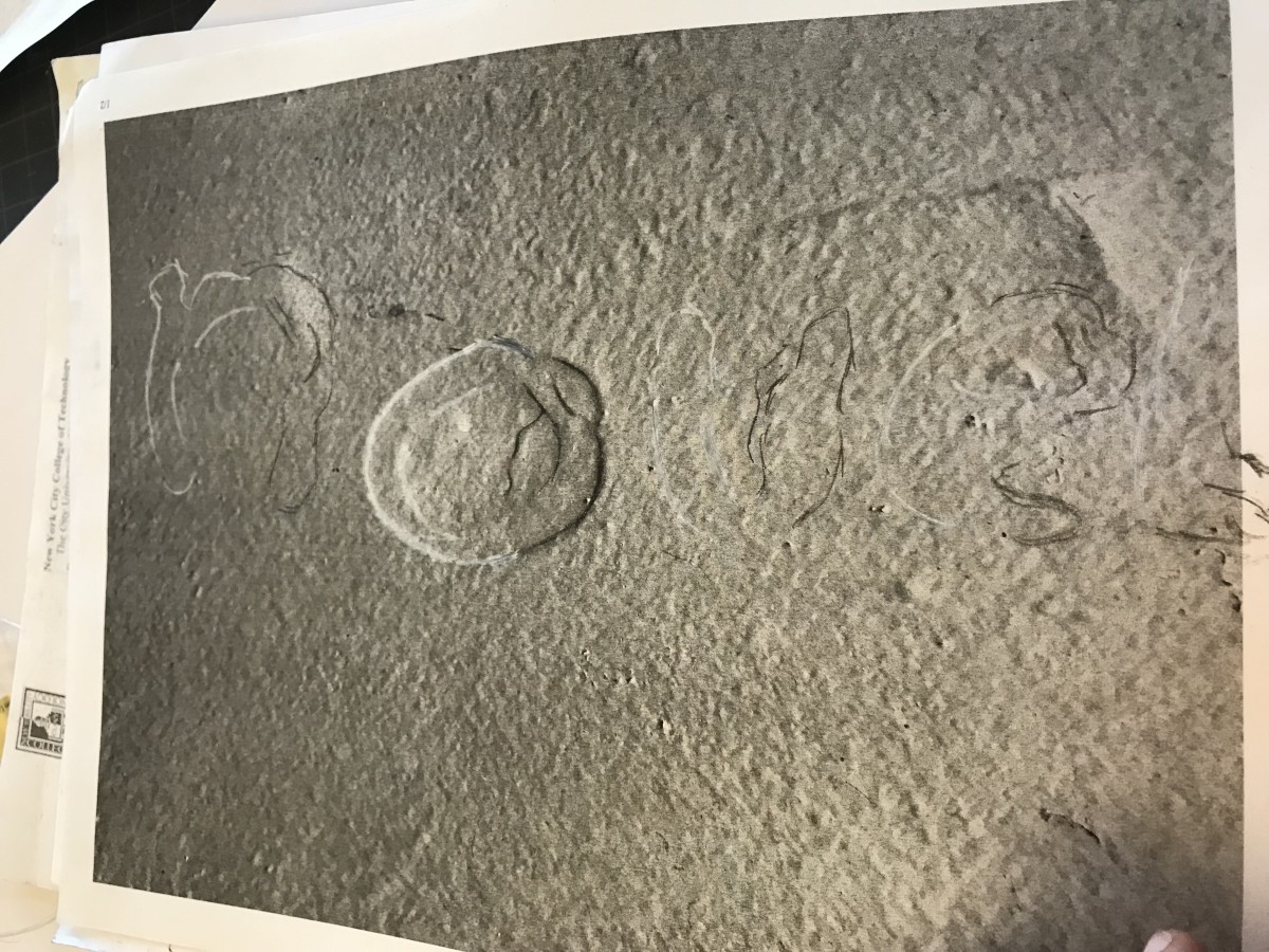 Sketch 2