Monthly Archives: February 2019
Project 1 – Lost & Found Step 4 – Deliver
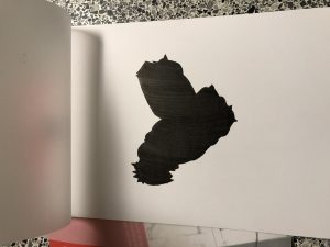
I have learned about what the graphic is and obvious, ambiguous figures. Seeing and disgusting about images helped me to understand what the concept was supposed to be. All the steps that I have done were new to me. I have never thought about what graphic design is. It was the first step to discover design.
Through this project, transferring photograph to graphic was interesting. It was the first time for me, so I could not do perfect inking that I have expected. While I reflect my final works, I think that I have to focus on detail things in my works more. I am exciting further actions that we will follow the projects.
Project 1 – Lost & Found Step 2 – Define
Project 1 – Lost & Found Step 1 – Discover
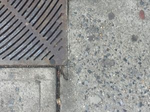
Obvious 01
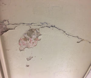
I found this crack while I was on the way to come to the class. This picture is obvious and has a 30/70 percent relationship with figure and background. I felt this crack showed how the history of the New York subway was.
Obvious 02
This picture found near the college. At first glance, the structure chaptered my sights because parallel things looked like bones of the fish. This one is also obvious.
Obvious 03
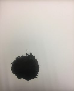
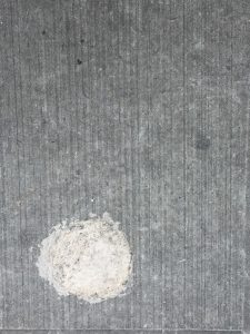
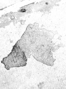
I believe that a spot would be made from painter by accident. The rough surface and almost perfect circle grabbed my sights. He or she might clear or make its brush rubbing the ground. As you can see, this is obvious.
Ambiguous 01
At first sight, the scattered salts got attention for me because it looked like snow on the ground. The object was like snow piled up in a heap. As can see, this picture is ambiguous. It has a 50/50 percent relationship with figure and background.
Ambiguous 02
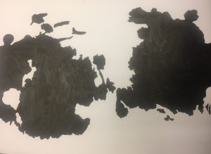
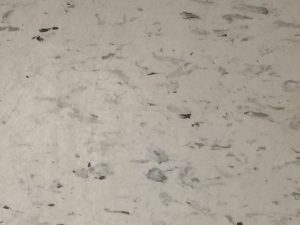
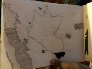
This wall looked like the practicing paper of painter. I felt as if the watercolor had spread in the wall. There were numerous touches, and some object presented a splash of paint in the water. It was like showing some of the painters’ hard work for their masterpiece. The wall also has an ambiguous figure.
Ambiguous 03
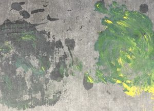
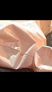
Even though it has a plat picture, the feeling of the image is very whimsical. The change of color was very smoothe and natural as if the painter was meant to be. I believe it was an intended work. The two structures against each other caught my eye as well. The photo is ambiguous.
Originals.
Faiza Hussain project 1 Step 4
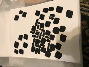
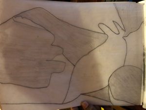
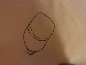
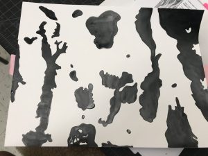
From this project, I have learned about how critical you have to be when inking. For clients and your future career, you have to make sure that if you use ink that there aren’t any white or lines showing. I also learned about how to tell if there are lines since I didn’t know that lines also include shapes if not filled in. The biggest difficulty I had was with the ambiguous picture because you have to make sure that it was 50/50 and had made a lot of mistakes when doing so.
faiza Hussain project 1 step 3
Project 1 – Lost & Found
Picture 1
Swirl – obvious
This picture is obvious because it’s a glue splatter kind of picture. The picture has a 70/30 FG and BG ratio. I believe this was created by a plumber, after finishing his job, the left over silicone on this hand, he wiped it on this wall creating this silicone swirl.
Picture 2
Splatter – Ambiguous
This picture is obvious because you can tell its a splatter on a wall. The picture has an 50/50 ratio of FG and BG. I believe someone was just messing around and the pint roller accidentally catch the wall, creating this splatter. The image consists of geometric shapes.
Picture 3
Running dog- Obvious
This is a chip on the side of a pole I saw at a car garage. I believe the chip was created over time due to the weather, or it could be that someone peeled it off. The picture consists of geometric shapes. I believe this image is ambiguous because it has a 70/30 ration.
Picture 4
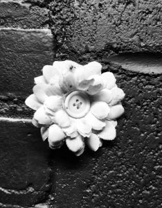
Flower on the wall – Obvious.
The Flower on the wall picture is an obvious image, it displays a white flower with a yellow button in the center sticking on a red wall. The picture consists of shapes such as circles and squares, it also consists of geometric shapes as well as organic shapes.
Picture 2
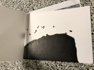
Brushes – ambiguous
This picture is ambiguous because the black rectangle looks like its hovering over the white brushes. The picture shows two brushes one at the bottom and one at the top with a black rectangle in the middle. The shapes I the picture are organic.
This project was pretty interesting. It was nice to learn about negative space, portions, foreground/background and the relationship the two have with each other. The most useful thing I’ll be taking from this project is how to properly manipulate the brush. I’m not perfect, but it is a process. For the next project I’ll most likely apply patience! Because this project took alot of patience and thinking.

 Ambiguous figure
 obvious figure