Faculty Name | Course - Section | Semester

Category: Course Activities (Page 3 of 8)

Final Project

Fairytale Folktale or Fable Reboot

Overall Description:

In this multilayered project you will reinterpret a classic folk tale or fairy tale through your own creative lens.

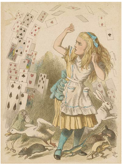
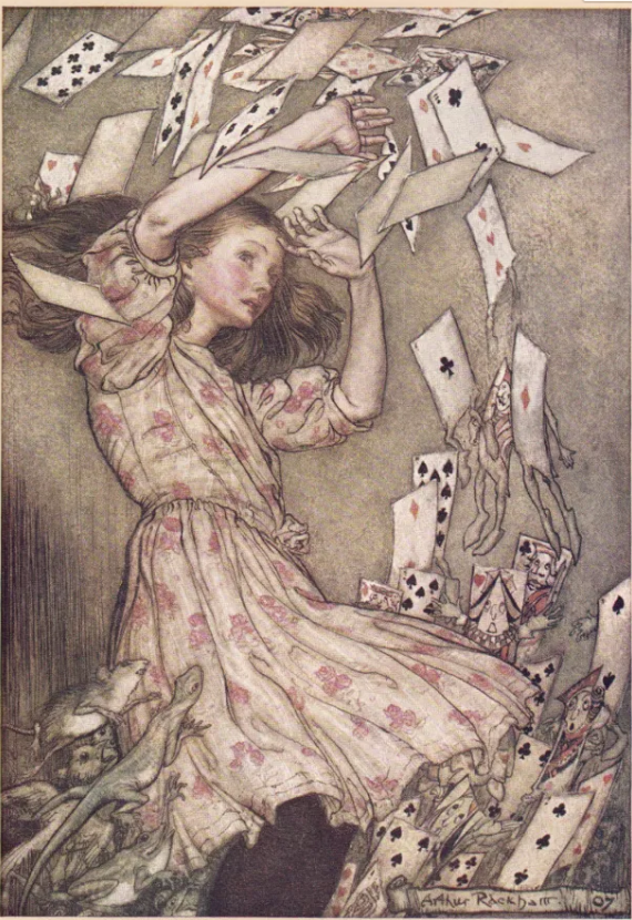
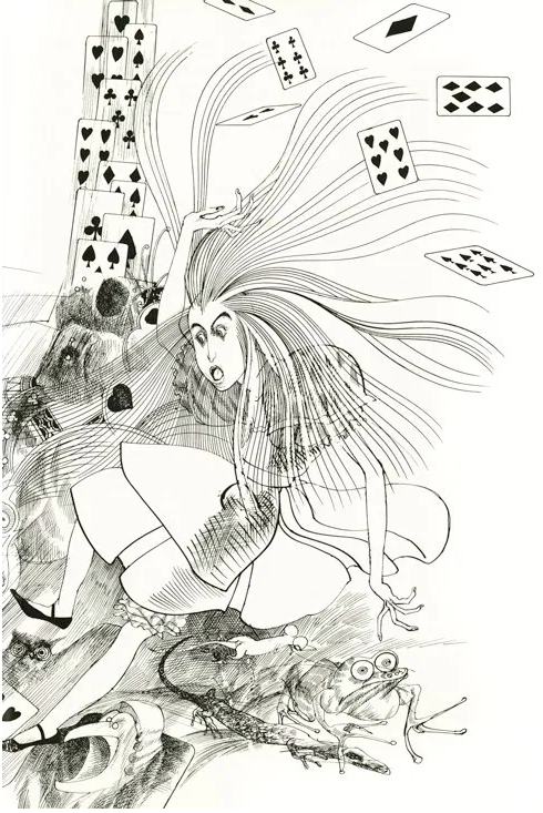
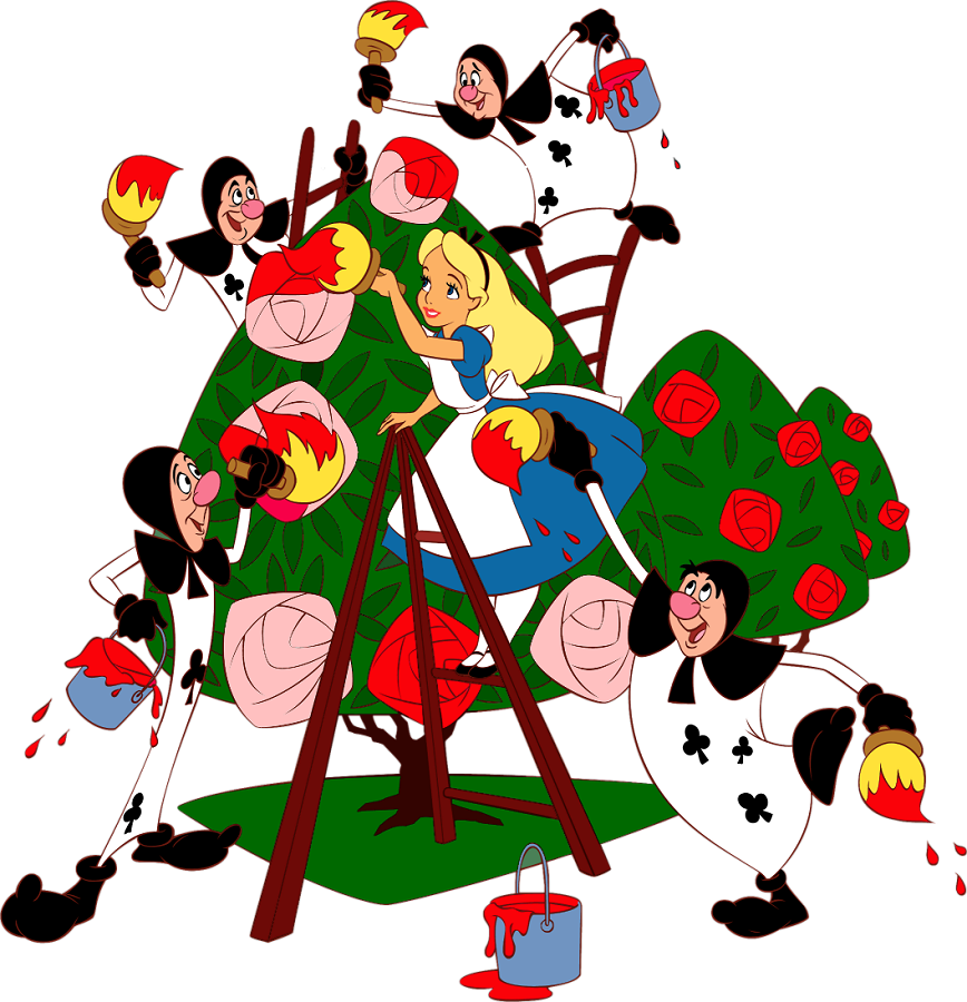
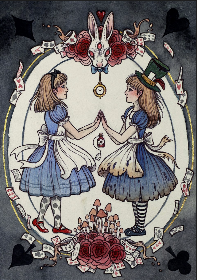
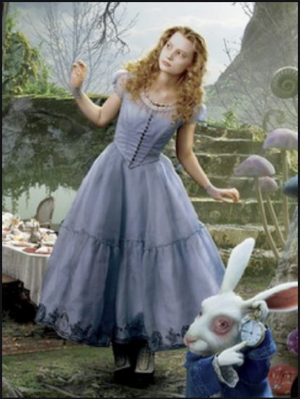
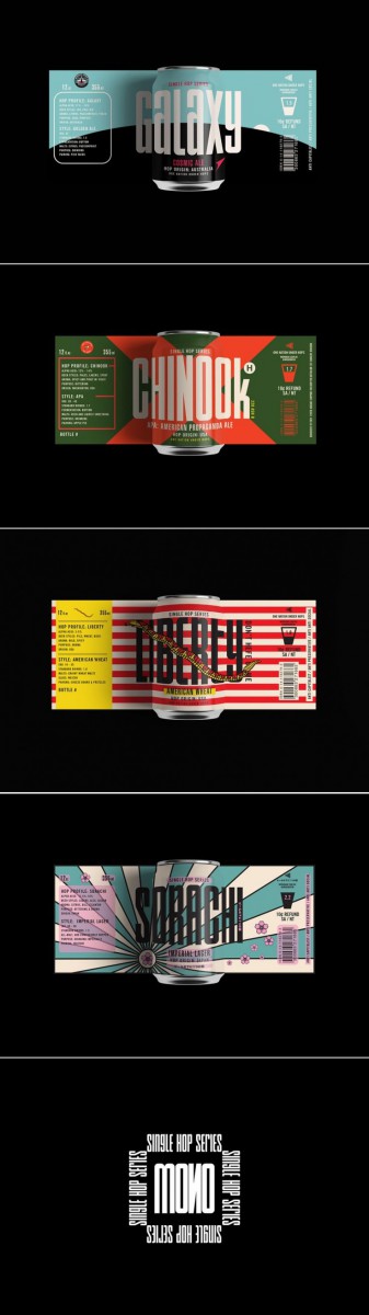
For example, Note how different artists over time have reinterpreted the story of Alice in Wonderland, by Louis Carrol.

Final Project

There are 4 requires parts to this project.

  • STORY CONCEPT
  • CHARACTER SKETCHES
  • FULL COLOR ILLUSTRATION
  • PROCESS PRESENTATION

EXAMPLES

LEARNING OUTCOMES:

Problem solve visually

Apply technical skills

Apply design concepts

Analyze content

Create original content

Apply critical thinking skills to make creative inferences

Evaluate different ethical perspectives and concepts

Respect and Use Creativity

Due Date(s)

Part 1, STORY CONCEPT

DUE WEEK 12

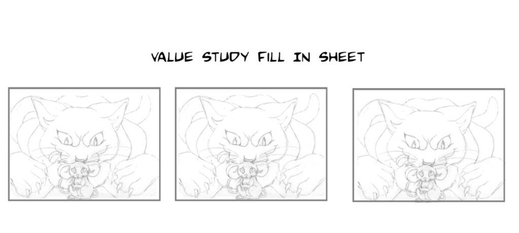
For this part of the project you will develop characters for your original story concept.

These characters and concept sketches may, but are not required to be in color. They do not need to be tightly finished.

Art can be made using any combination of traditional drawing / inking skills and digital coloring.

Part 2, CHARACTERS

DUE WEEK 13

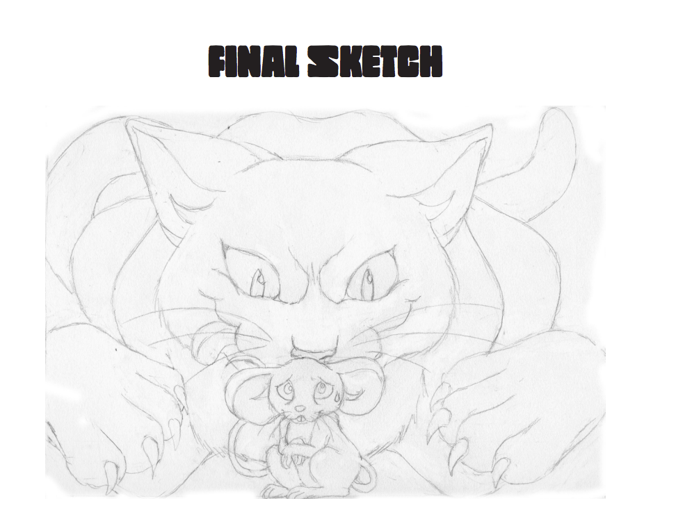
Part 3, BOOK ILLUSTRATION

DUE WEEK 15

  • Final Art can be made using any combination of traditional drawing / inking skills and digital coloring.
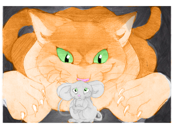
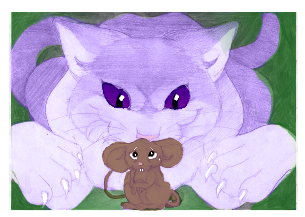
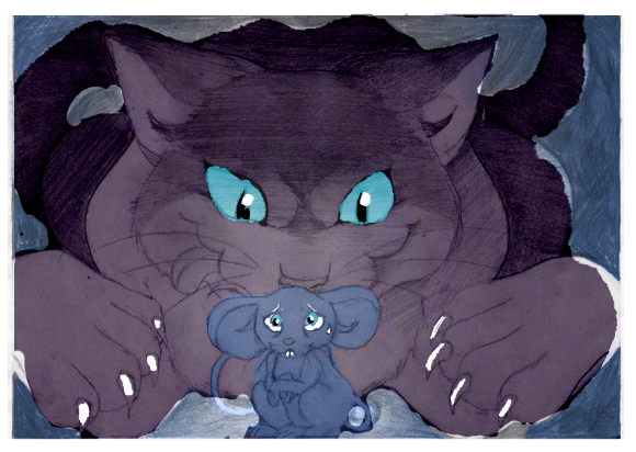
  • Final art should be Limited Palate or Black and white.  
  • Final art specs are up to the artist.

Part 4, PROCESS PRESENTATION

DUE WEEK 15

Prepare a 3 minute Presentation (5 minutes total with Q&A) on your story and your working process, guiding us through the project from inception to conclusion.

You will Present you work on the last day of class.

Submit your Presentation as PDF PROCESS BOOK

Label / Can Specs

Hello class-

As each of you is designing your concept sketches it is very important that you keep in mind the size and shape of the final art.

So the art created for a beer can like the one below, would be different than that created for a beer bottle or a wine label.

BE CREATIVE.  A label might have a rectangular or square shape, but it DOES NOT HAVE TO.  Not that the ones below do not. So when deciding on the overall shape, do what will make for the better and more unique overall illustration.   The only rule is that it MUST

BE FUNCTIONAL.  If you are not sure, use a photocopier and cut out your concept sketch and test it out on an actual bottle or box.

I’m including below some TYPICAL label templates as a helpful tool.  They are meant to print on 8.5 x 11 paper.  You don’t HAVE to use them.  Look at creative illustrated packaging for inspiration.  And really as long as it could actually work, the sky is the limit!

To get an idea of sizes:

TYPICALLY a rectangular Wine Label like these (theres also the little wrap label around the neck which you can choose to design or not!) are around 3.5″ x 4″

But you can also choose to design a wrap around image like these …

IT’S UP TO YOU. You don’t have to conform to these shapes unless you choose to.

Beer labels are typically 2.5″ x 3.5″ for the most basic, and 7.375″ x 3.125″ for a wrap around.  And again… this is your call. Wrap arounds will provide you a little more room to illustrate, but do what will work best with your design.

As for illustrated cans… which offer a larger space to play with, copy the proportions of the examples below as I was unable to find a template for you.  And again, prioritize making some really creative and well illustrated images over conforming to the examples!

Color Studies

Color Studies are a necessary step in the illustration process. The allow the artist to quickly test out different color schemes.

Ideally, these should be done AFTER Value Studies.

Instructions:

  • Refine and finalize your drawing based on feedback and suggestions you have received.
    • Do not shade your drawing. Focus on drawing clean line art only.
    • Do tape off the edges of your composition.
  • Edit your drawing by using photo editing software.
    • Scan or Carefully Photograph final art.
    • Adjust Brightness and Contrast
    • Carefully Crop Art
    • Save your Artwork as a HighRez file (to continue working on)
    • Save a Copy as a LoRez file (to post to Openlab)
  • Create fill in sheets for Color Studies using one of the following methods:
    • Using a Adobe PS, copy/paste your design to create a fill in sheet.
    • Reduce the size of your artwork, using Adobe PS or Photocopier.
      • There’s no hard and fast rule, but studies should be small enough to fill in quickly.
      • About 25% of the FINAL ILLUSTRATION SIZE usually works
    • Copy and Paste the artwork so that you have 3 or more to Fill in .
    • PRINT this sheet, so you can and fill in traditionally with colored pencils or markers, OR create DIGITAL COLOR STUDIES by using Adobe PS/ or Procreate etc. to color.
  • Color each Color Study.
    • Create one Lo-Key, one Middle-Key and one High-Key Design.
    • Consider Focal Points, Image Hierarchy, and Contrast.

PRO TIP:

*Try coloring digitally in Adobe PS on a transparent layer on top of your Value Study. Try setting your layer to “COLOR”.

Examples:

Dana Moreno Final Pencil Drawing

Color Study (1 of 3)

Color Study (2 of 3)
Color Study 3 of 3
« Older posts Newer posts »