Author: Jessica Lee
Jessica Lee- Apr 21st
Jessica Lee- Mar 31st / Apr 14th
Polysemy- the ability for a word to possess multiple meanings.
En Abyme- an image that contains a smaller version of itself; buried deep within.
Linguistic Sign- a sign of and suggested concept
Connoted- imply or suggest.
Denoted-indication.
Relay- allows you to question the image due to the text that wanders or adds dimensions.
Anchorage- ropes things back to your understanding.
Non-Coded- existing like a pile of words; non-linear, heaps of images.
Coded- certain words next to each other; dependent on the tone, delivery, and presentation.
Rhetoric Ideology- convinces you of a point that all images are filled with cultural meanings.
Meta Linguistic- sits on top of a language with a lot of communication in a picture; it is flowy and not linear.
Based on the reading it seems to be that, we take what we are aware of and we break it down to what we grew up with based on culture. For example, in the image we see the pasta brand, tomato, onion, and cheese. This indicates a classic meal with all of the ingredients that are in the image and we associate it with Italian culture, because of what is being portrayed in life that we encounter as we grow up with different people or experience.
Jessica Lee- Mar 24th
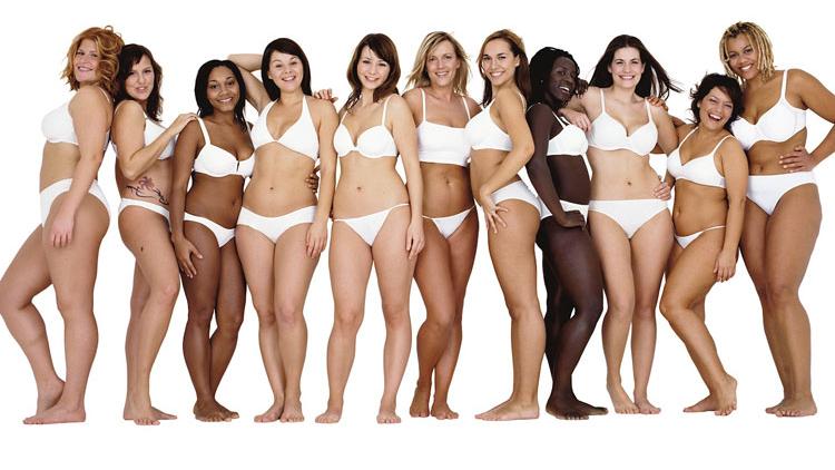
This is an image that Dove uses for advertising. As you can see Dove caters to all different types of bodies which also includes all types of genders. Their message is promoting self confidence, uniqueness, and authenticity.
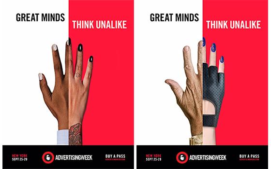
Advertising Week is a company where they want people to know that they care about diversity. For this campaign, they used different types of hands. The message for using different types of hands is that, hands are an expression of who we are, what we do, and the story that tells people about us.

Shelter came out with this ad to help the homeless. Shelter is a charity for the homeless. Here in this ad, you can see that anyone of any age and gender can become homeless.
Jessica Lee- Mar 17th
Media is heavily used to pass on messages and influence people due to the growth of technology. In “The Medium is the Message” by Marshall McCluhan, he states that “the medium is the message.” What McCluhan means by this is that anything new that is introduced to us, we absorb it and then it changes how we function, like creating new jobs. One example for this is that recently, there has been an increase of kiosks at fast food places which leads to a decrease of jobs for cashiers who take orders from people. People will use those kiosks instead of going to the counter and ordering from there.
Technology has many great benefits however, it does lead to many other negative outcomes. In McClauhan’s article, he mentions “…we want to get our bearings in our own culture, and have need to stand aside from bias and pressure exerted by any technical form of human expression.” I believe that this means, our society wants to find our own selves or find where we stand in life and doing this, we have to resist the urge to be influenced by other people’s choices due to what we see in the media. It is hard to do this, because as human beings we are easily influenced and when we see what is trending or what other people are in their lives it affects us. This is one of the negative outcomes due to technology that we go through as we are getting through life.
As designers, we are easily influenced by the media as well. Since there will be new mediums that will appear, we will have to adapt to create new designs based on those new mediums. Due to this, our “old” designs will no longer be trendy or in style. However, it is a phase in our life where we are gathering new experiences and as we do, our designs will be dedicated to what we go through and it will be due to that time period.
Jessica Lee- Mar 10th
Jan Tschichold discusses the difference between old and new typography styles, what work and what did not work, and the reasons why it worked and did not work. For old typography, Tschichold states that placing work on the central axis caused typography to be inorganic and it made everything predetermined, which made it more about how it looks instead of clarity. When he mentions New Typography, he talks about the asymmetrical principle which gives an unlimited opportunity for variations. This gives a chance for expression for diversity in modern life. Tschichold also states, “form must be created out of function” meaning that it must be functional, in which the text means communication, the emphasis, and the contents must be in logical sequence. Back then, using ornaments decreased the ability to understand communication through type, now we create functional designs which means the need for ornamentation in old typography is no longer needed.
Karl Grestner had taken art and science and mashed them together to create visual synthesis for graphic design. The way that Grestner did this was, he designed programmes, programmes are the grids. One type of grid is a typographic grid that directs composition, tables, and pictures to accommodate items in the design that you are creating. Grestner had made a diagram which broke down the basis, color, appearance, and expression to be used to make designing more automatic instead of browsing by feeling, but by criteria. He mentions if the criteria is more exact and complete, then the work will become more creative.
Josef Muller-Brockmann manages to talk about how a grid can help a designer organize his thoughts, which could help the designer to make his designs more intelligible, objective, function, and have an aesthetic quality. Using a grid system could help integrate elements of color, form, and material, as well as rationalize the creative and technical production processes. Since the designer’s work is a reflection of who he is and what his knowledge of the world is, it is helpful for the designer to use a grid which makes it easier for them to express themselves in designing the work. This helps create pieces that can be looked at for everyone and it can be used to teach other designers as an example.
Jessica Lee- Feb 25th
Art students are constantly struggling to create art that allows them to express themselves, due to the rules that have been implemented in their education from the beginning of their learning. In “Walter Gropius; The Theory and Organization of the Bauhaus,” he talks about how the Bauhaus starts off their students in a preliminary course, with practical and theoretical studies which gets the students’ gears going. This also leads to breaking down conventional patterns of thought so that the artist can access personal experiences and discoveries and see what they can do and can not do. He also talks about how students are taking the preliminary course under instructors and then in the next class they are acquainted with an apprentice to learn. There was also a mention where schooling alone is not an option to creating art, which means that you have to have talent and motivation along with the knowledge of school teachings to create artwork.
When I was reading, “László Moholy-Nagy; Typophoto” I had asked myself, what is a typophoto and what does it do? For starters, typography is a way of communication that is composed in type. Photography is a visual of that can be a visual perception. Together it means that you have typography and photography in the document, examples of this are illustrated papers, posters, and display printings. In typographic material, photography is usually the most highly effective in trying to send out a message. Meaning that, since it appears to be an illustration beside the words or a form on phototext, which replaces word, this makes it a precise form of representation, leaving no interpretation.
Today, artists are producing typophotos and are inspired by the Bauhaus’ radical movement. However the medium of art is not limited and because design is unlimited it can be applied to many things, such as architecture, furniture, and fashion. The Bauhaus has influenced all of these different areas and it continues to inspire many artists and designers today, as we still co-influence from this school.
Jessica Lee- Feb 18
Technology is a constant change in our world and it is advancing faster than we know. One thing that has an advancement due to technological advancement is, art of printing with new instruments that produce books. In El Lissitzky’s Our Book (1926), Lissitzky talks about the way that art changes along with technology and the materials that are used to create art. For example, Lissitzky discusses how modernized machinery processes are replacing manual processes which in turn changes the appearances and forms of things. He also discusses how the visual aspect of books can change due to the changes of languages, construction and style. During the civil war, Europe had printed material that looked similar to all the other countries. However, after the war, Europe saw America’s new printed matter and they were shocked. In America, the words were illustrations of pictures.
In Europe, a new form of printed matter was introduced. The form of printed matter was when Blast, a magazine that the Vortex Group came out with. This magazine had large and simple words in presentation that were all in block letters. In Germany, there was a printed document of the portfolio, Neue Jugend (1917) which became an important document for new, modernized typography. During the time of the Revolution, the traditional book had been torn from its binds, increased the size, made colors more prominent, and distributed into the streets as a poster. Europe’s intention was to have people read it closely and make sense of the message that it was trying to send and America’s intent in creating posters was for people just to get a glimpse of it.
Due to influences, children as they grow will make something new and improved due to the fact that they are being introduced to an increasing amount of children’s books appearing. Books have become accessible to people who want to read them, this will increase a different point of view to the world, to space, to shape, and to color. Since technology has advanced, books are also in digital form to be read on computers, laptops, tablets, and phones.
Jessica Lee- Feb 11
In Ferdinand de Saussure’s Course in General Linguistics, I learned that linguistics are somewhat closely related to other sciences in which they borrow and apply data. For example, in ethnography, meaning the recording of human cultures and in prehistory, it is used differently from each other. In prehistory, language is used to document and in anthropology, language is just a social factor. I also learned that the in the scope of linguistics, it can be used to describe and trace the history of the languages. It is used to trace back to the history of languages to see where the language originated from and how it is used as the times evolved.
Some might ask what semiology is and the definition of semiology is, a science that studies the life of signs within society that is conceivable to be a part of social psychology and general psychology. The way that semiology distinguishes from linguistics is that linguistics is a part of only a general science of semiology. Language can be studied in connection with how people have a connection with something and how they interpret things. The concept is that in your mind, psychology and it turns into a process that comes out physiologically, which happens between two people who are conversing back and forth.
Ferdinand de Saussure’s Course in General Linguistics was somewhat difficult to understand due to the description of how linguistic signs unites a concept and a sound-image rather not a thing and a name. Whenever we talk to ourselves or mentally recite a verse, it is clear that the psychological character of sound-images appear. We also tend to disregard what other people imagine when it comes to the associations that we grew up with when it comes to a language. Therefore, it is an interesting reading when it comes to the concept of learning how we take in and communicate in our minds instinctively and the science behind it.
Jessica Lee- February 4
In the readings, “Graphic Design Theory” by Helen Armstrong and “Counting Sheep, Period Styles, Language of Dreams and Language of Vision” by Ellen Lupton & J. Abbott Miller, I learned by communicating your art to the world, it leaves an impact on how one perceives and interprets things thus putting it into our own work. I also learned that without the basic infrastructure of archaic writing, we would not have our own version of writing since we were influenced by archaic writing. Before reading “Graphic Design Theory,” by Helen Armstrong, I knew that art was a communication device and we use it to communicate to others by making posters, ads, etc. After this reading, I learned that we as designers have a large impact on audiences, due to the fact that we are putting visual content out there. Designers who have this platform are creating content to send awareness to show what is happening in the world, thus making a new collective voice which then creates a new level that occurs.
In “Counting Sheep, Period Styles, Language of Dreams and Language of Vision” by Ellen Lupton & J. Abbott Miller, they talk about the origins of archaic writing and how it then develops into something that we use to this day, in design and in writing. One thing I found interesting was that in 260 BC, there was a librarian, Aristophanes, who designed a greek punctuation system. This system consisted of the comma, colon, and periodos, which back then was used to be used for cues for reading out loud. Today the function of this system is used differently, for example we use it for structure and not for the spoken sound. Another thing that I found interesting was that the scripts are what we use today. For example, the carolingian minuscule was the gothic font. In different countries, many fonts were changing due to what was in demand at the time for display advertising. This has happened to the bold face fonts, “when advertising created a demand for big, black types.”
Once in awhile, we can look back at the origins of design and see how far design has come. As designers, we must adapt to the changes that occur in modern design. It is very important to adapt, because ideas are constantly changing as well as styles. As time goes by we continue to change designs as new ideas and theories are made.

