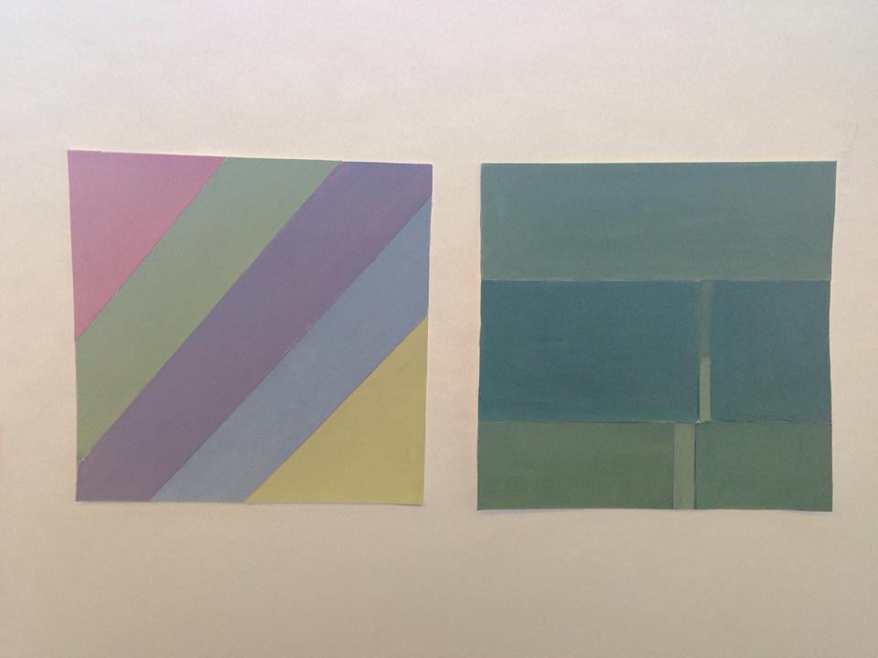
This was the simplest part of this assignment. Well, it was suppose to be, all that needed to be done was to just paint the bristol with the color by itself not adding anything to it, it is how intense the color is. I had to create my own green, my own violet and by own orange, the other primary colors were just painted on strait from the tube. It does not look as clear as it does in person, but all the colors in this collage are supposed to be saturated. (Some look muted but that is just a bad picture). This, again, was my result for the narrow and broad key value.
Creating muted colors was quite simple actually. All that I had to do was add white to the colors, and they become muted. Muted colors basically means changing the saturation and value of the color. For example, if I wanted to create a muted red, I would add white to the color red until I reach to what looks like pink, but adding white does not make look pink, it makes it look muted, which is the point. This goes for all of the colors as well. Generally I favor muted colors more than saturated or chromatic grey colors because it sets a more calmer mood, and I like that a lot. I may not have set the perfect example in my collage, but these were my broad and narrow key results.
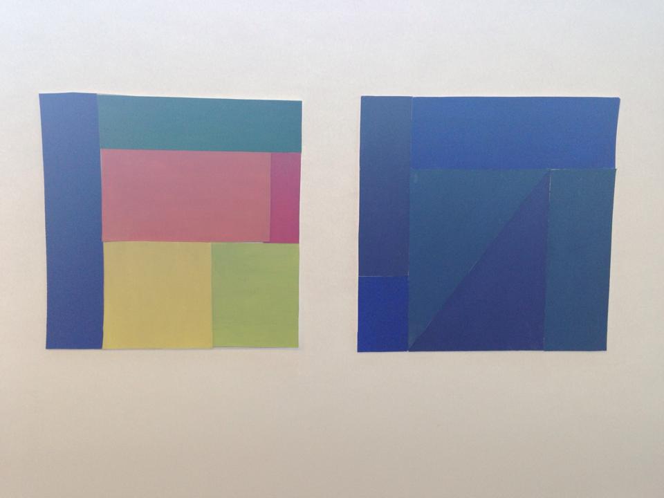
So, to come up with chromatic grays, I had to mix the compliment of each of the colors together. The result should lead to what the color is, but a little bit darker and leaning towards the color or grey value. For instance, according to the color wheel, the compliment for red, is green, when you mix them together, you get a grey, but for example, if my goal was to make it look like a chromatic red, then i would add a little bit more red than green and visa versa. Now of course because nothing is ever simple, I had to mix my own greens, violets, and oranges. But it worked out after 7 hours, and this was my result for my broad and narrow key value.
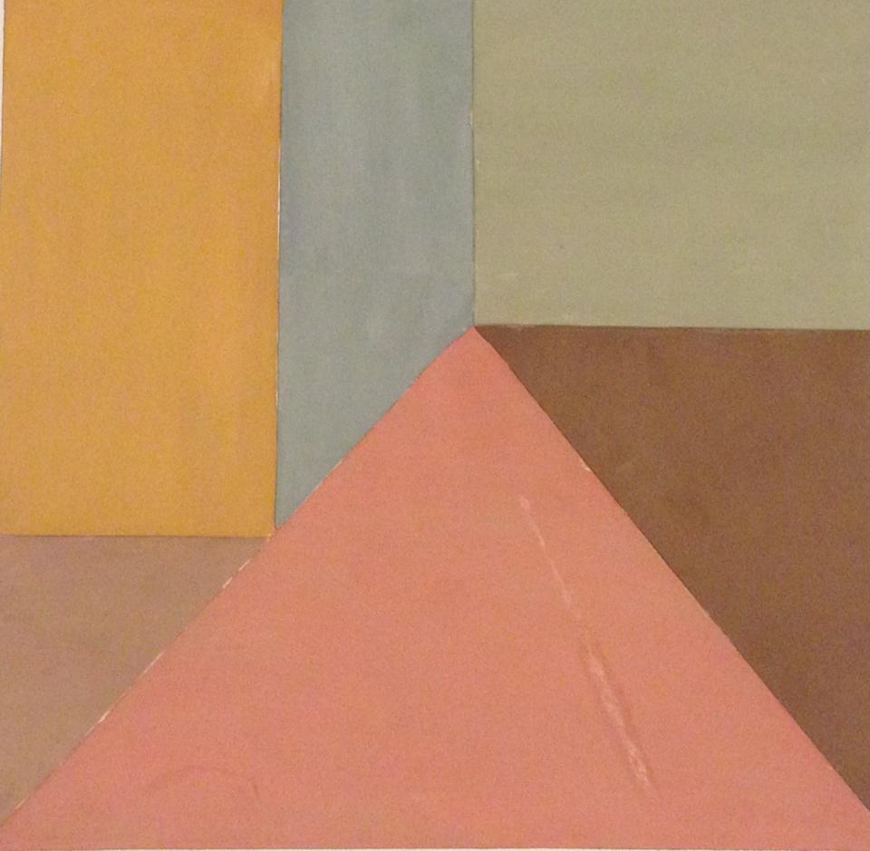
Painting with color was more fun than painting with black and white. While painting, you get a better understanding of what color really is and how it works, and what colors form together to create another color. It was very colorful…
So for both my broad and narrow key values, I added the complementary colors to red, blue, and yellow. When you mix the primary with the complementary colors you get this weird brown color, and it depends on which color you added more, so the brown may look a little red, green, or blue. At the end, my result was a bunch of muted colors that all seemed dark, so inevitably that belonged to the narrow key collage. I then converted these muted dark narrow key colors to broad, by just adding white to them. This time I used bigger shapes (and less) hence, broad. This took me 2 days to complete, but over all about 7 hours in total. It was a little difficult to put the shapes back together because A, I forgot where they belonged, and B, the glue was getting everywhere, and that was annoying. I’m about 30% satisfied with this, it not that good, but I’m a beginner, and I gave it what I got.
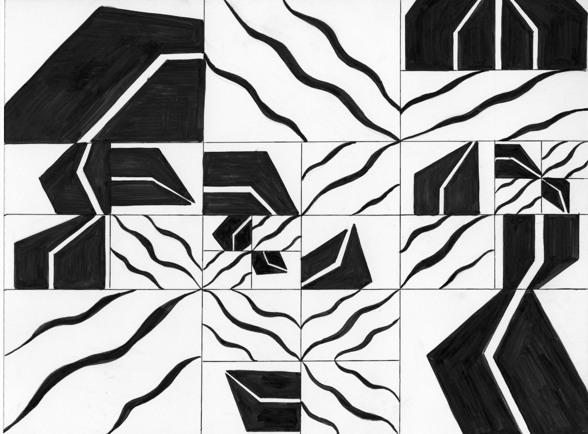
For my staccato-laggato mashup, I tried the best I can to take my final two shapes that I was going to work on and unite them together. I got to say that I was not very satisfied with this final piece just because I think I felt it was a little empty, or a little too separated. Yet again, I’m never fully satisfied with any of my work. I did try my best and used the rule of thirds as my grid and divided the grid up even more within. I also saw that connecting the openings of the staccato shapes together and the Legato waves together can unify the drawing as a whole, but with the grid can still keep them separated.
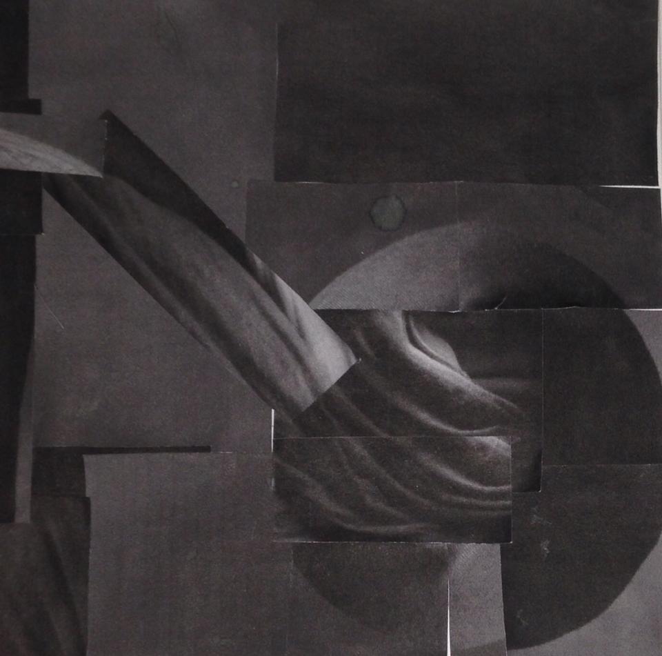
I’m a bit please with my low key value collage. My intention was for this to use a narrow range in a grayscale, which means using black, white, and mid-grey. Overall, to the human eye, it does fairly look a narrow key value, but when you search around it and really look, you can see that it used high light grays in certain areas, but it is too small and not used often to say that this was a broad key value. What you see as a circle was very unintended. I was just taping on random squares together, and because I was thinking about flow, it lead to a circle. Within the circle, there are lines that flow together in the same shape of the circle. All I had was that round circular shape, but my professor suggested that I use a line that makes it seem that the circle came from something, and is not just there. So I used another flowing line to guid the viewer to go from one place in the collage to that circle. My focal point and the emphasis in this piece is defiantly that circular motion and the lines that flow within it. This piece took my about 30 minutes to finish. I chose this collage for my painting just because there was meaning to it and a type of flow. The painting was fun to do and took me about 3 hours to finish. I became even more familiar with some grays because mixing them together to get a grey you want really shows you the differences.
In my high key value, I chose to make my collage broad. This means that I used a large range of grey from high light to dark light grey, black and white. To be honest, this did not come out as I expected because the original picture of me was actually a low key value photo, it was mostly dark, so it was a little difficult making a high key value collage with a range of dark grey. Despite this problem, I used all the high light grays in my picture, and even put in white paper to create that high key sense. I also had to keep in mind where I wanted my focal point to be, where the emphasis on the collage is, and what the movement looks like. Compared to low key collage, I don’t think these areas fully apply to this piece, but there is line movement that goes from the top of the page and as you follow it, it then bends a little to create an arc. Again, this is not my favorite, and as I was doing it, I felt it wasn’t going to be good, so it kind of shattered my self esteem, and it all just looks bad. But I think I nailed the focal point, or where the emphasis is on this because the middle part is where your eye mostly lands on, there is noting important throughout the whole collage that can distract you from that. Overall, this took me about an hour to do, considering I didn’t really like, and stopped to just stare at it for 40 minutes. This was my collage that I used for my photoshop exercise. I took my original portrait and arranged it in the way this collage was done. I am very familiar with photoshop and I love it so this was a fun exercise.
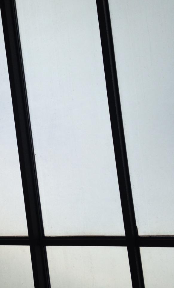
I took a picture of a window in city tech. I chose this area to represent my high key light model because I thought it was an adequate example of high key value and because there is a huge light source coming from it. It is a very simple photo because often when I think of light photos, I think of simplicity, which can convey a relaxed or even speechless emotion due to the fact that nothing is really happening. But despite the fact of its simplicity, there are geometric lines in the picture, and to twist the idea of it being too simple, I took the picture in an angle to express more emotion.
Low Key Value
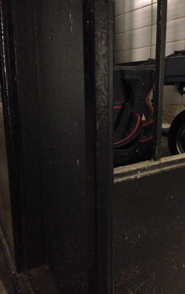
For my low key value example, I took a picture of the black staircases in my school and in the background, or behind the stair case, there is a black bag, which to me felt like it was revealing a mysterious feeling to me at least and hopefully to the viewers. I also thought this was a good example of low key value because it seems that the black is dominating over any other color in the picture, and that there is very low light source being added in, which created some sort of tension or a dramatic scene.
I tried my very best in this project. I didn’t find a very hard time finding the right shades. I started out mixing the black into the white paint to get the high key light grey, then I mixed white into the black paint to get the low key dark grey.
I had an awesome and fun time at BRIC House. I saw the Art into Music exhibition and was blown away. I love both art and music very much, and in class, we try to collaborate the two together. But when I saw professional collaboration of art and music and how modern it is, it moved me. There were graffiti writing that were put together by an artist and played around with with color so that there is a musical pattern an rhythm you can see in it. There was also a wall that had pictures of people in concerts. This really showed the art in these photographs because from what I saw, they were taken simultaneously when music was playing, so there face expressions were natural almost. We saw a video that combined hip hop music with this type of opera music that were merged together so well, and in the video you had a woman expressing her body through the music she heard.
All this was really cool and inspirational and I related a lot of what I saw with what I was learning in class (which is the collaboration of art and music), but I have to say my favorite part of the exhibition was the vinyls. I am a huge vinyl fan! I love them because they are a form of traditional, old fashioned musical aspect of the past. I tend to lean towards things that were used in the past, and in this exhibiton they had a whole stack of vinyls and a wall that consisted of them too, and they put them in such a way that it lmost appeared as something very modern. The pattern that they were stacked up in showed an visual relationship between music and art. The stacked up vinyls showed monotony because they were all in one row, while the ones on the wall had a variety of vinyls that showed different types of music, and different colors too.
Coming out of the exhibition I was that much more inspired. I was inspired to continue on loving art and music and to continue on this path of becoming a graphic designer. I loved it and I will soon visit the BRIC house again with friends who will come to learn to appreciate these types of artistic skills. I was glad I was introduced to this place.