

Harmony
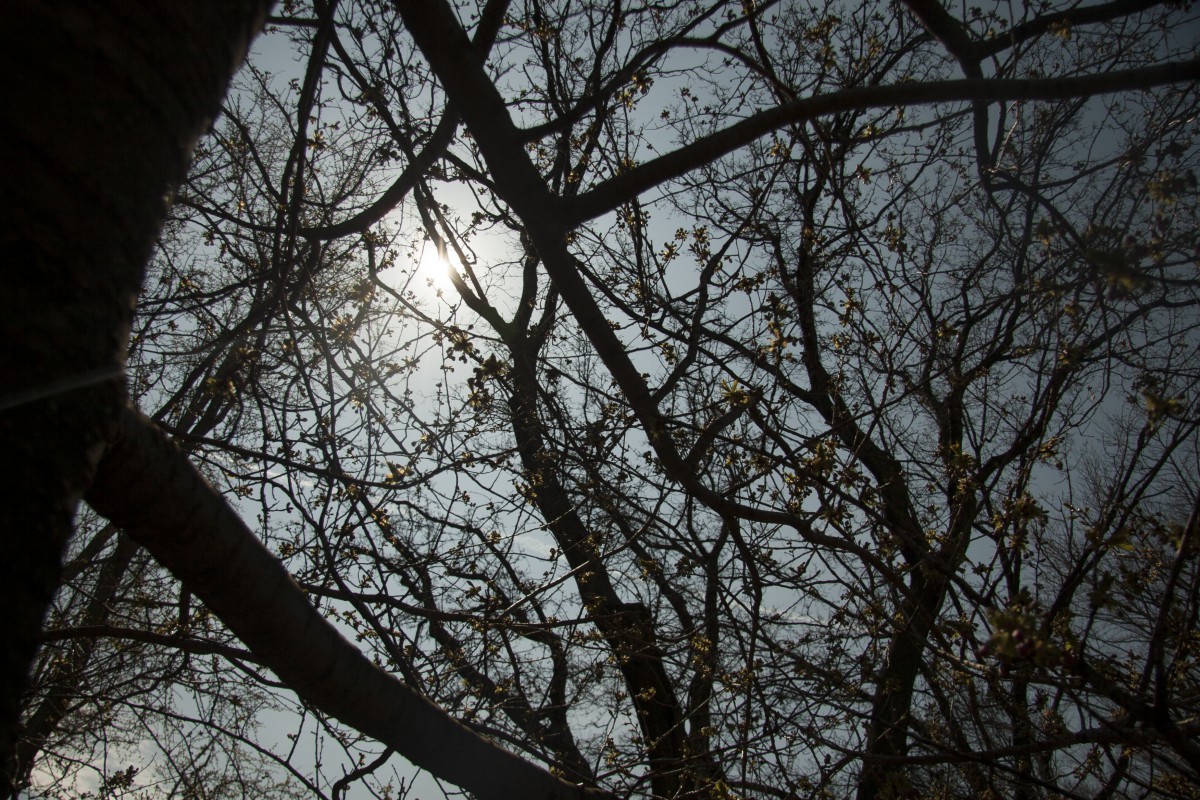
This is my final project for this class. Its all about color harmony. Basically, I had to envision a moment in my life were I felt most peaceful and comfortable. Automatically I thought of the view of the nile river in Egypt. I had to associate color to that view in my head so that these colors can be converted into a drawing. The first step was to get a picture that the colors in it are harmonized together, and can be used to display my image. I chose a photo that I took of the top of a tree. The colors associated were two shades of blue, three shades of green, and a very dark, near black green. I created a color palette based on the photo of how much of each color is in the picture, and that helped me create and use these colors in my final drawing. This was my final result.
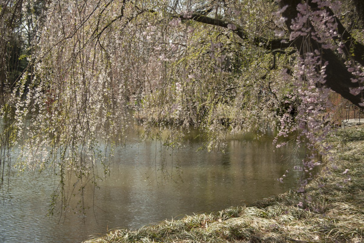
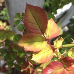
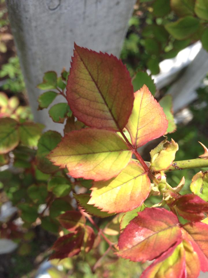
Botanical Garden
The botanical Garden is a beautiful place to take nice photography and enjoy the beauty of nature. But I learned for this project that it is also a great place to study color. In search for color, I had to go around the garden and take pictures of tint (gradient from white to a color), shade (gradient from black to a color), and compliments ( gradient from two complement colors). I was able to easily find good examples of tint and compliments, but shade seem to be the more challenging one. I finally found a flower that gave the same or close idea of a gradient from black to a color.
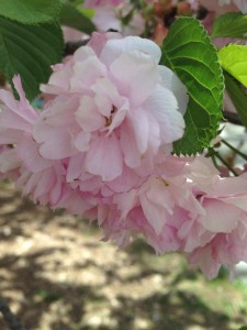
- Tint


- Tint
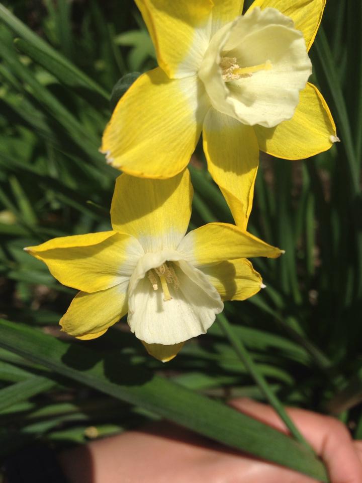
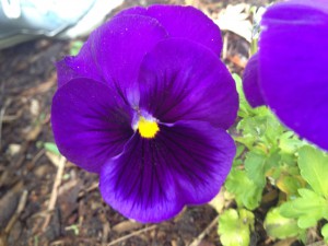
- Shade
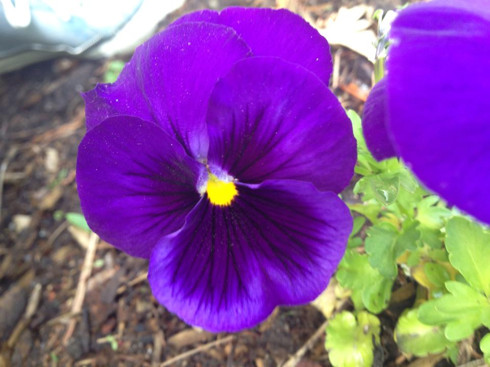
- Compliments
Color Identities: Icons
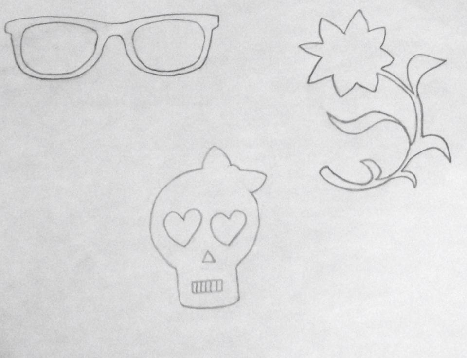
My group and I narrowed down our thumbnails together and resulted in these three icons. The eye glasses symbolize Maya, one of my group members who has a smart and technical personality. The flower symbolizes Divina, another group member who has a very happy, and artistic personality. That skull you see here is what my partners chose for me to represent my personality. No comment…
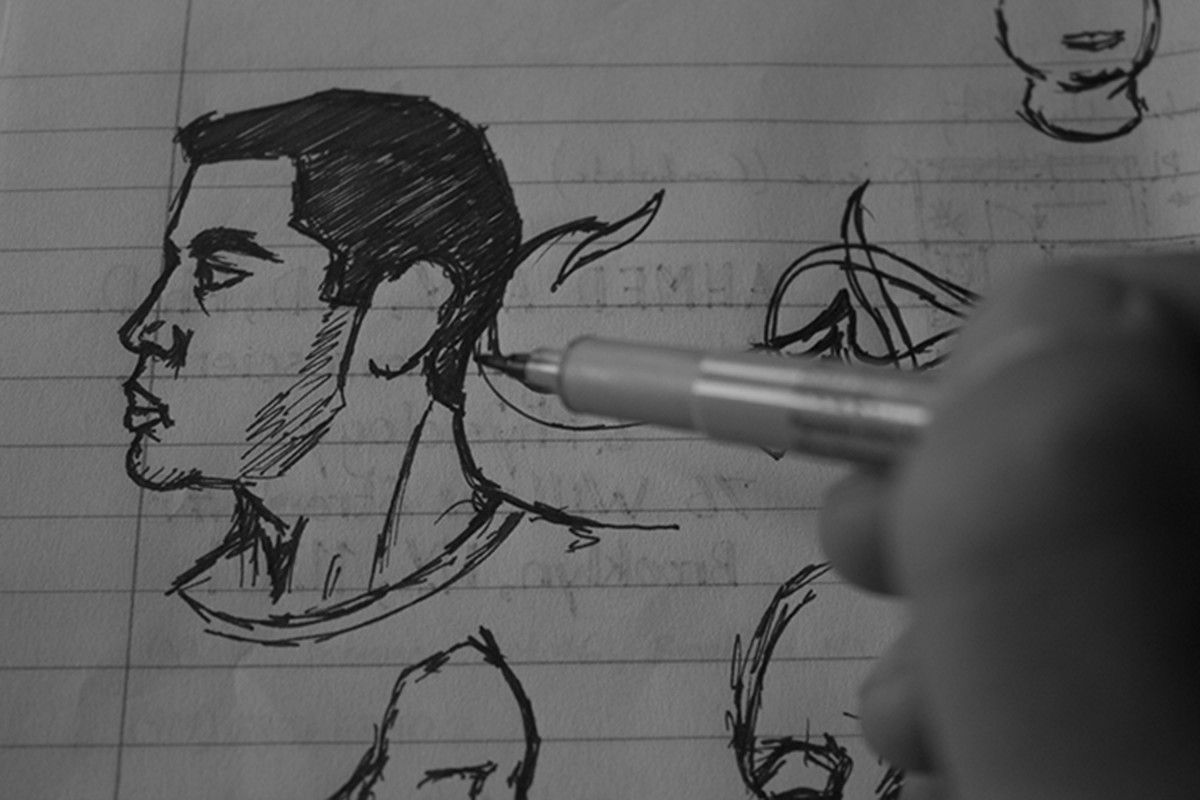
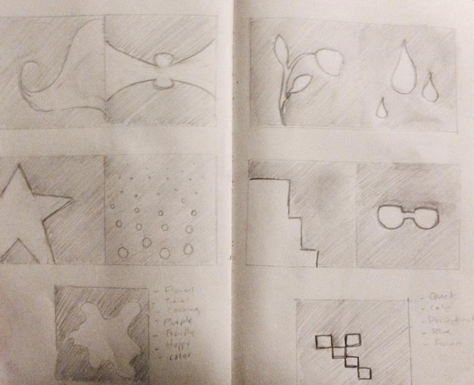
Color Interaction: Thumbnails
These are very simple thumbnail sketches that show the icons I thought of using on my two partners. The 5 thumbnails on the left tend to show a spiritual and artistic personality, while the thumbnails on the right show a more technical, independent, and simple personality.
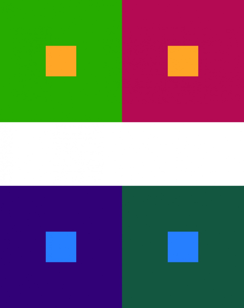
Color interaction: Hue and Value

This is a combination of both hue and value, where I use different hues for the backgrounds that also have different values. This was a simple task to complete, and I am a bit satisfied with it. As you may see, on the top set, the purple square in the muted orange square looks a little bit of a blu/greenish-purple, and that is because the square next to it is that color, so it gives us the illusion that the purple square has that same color. Visa versa, if you look at the other purple square in that same set, it looks like it is a more yellowish- purple. This also goes for the bottom set. This was also done on Adobe Illustrator and did not take that long at all. I hope you see the differences.
Shifting hue not value
For this exercise, I found it so difficult to have two different colors that have the same value. It seemed easier to my classmates to find these colors, but I don’t know why I had trouble. But there is a complete shift in color, and using these backgrounds, I added a different color to the smaller squares to create an effect. The effect in this case is having the small square in one of the color background have that effect of being the color that it is with a hint of the color from the other background square. This will make sense soon. I, again, did two sets for this piece and it was also done on Adobe Illustrator.
Color Interaction: value in color

For this piece, I simply took a color and its muted version and placed them as 2 separate background colors. I then chose a completely different color to place in each of the larger squares. As a result, you and I (hopefully) can both see that the smaller square looks brighter, or lighter in the dark background, than the other square in the light background. I attempted 2 sets for this exercise, done on Adobe Illustrator which requires a small amount of time to complete. Thinking about it takes longer than doing it.
Show and tell
Color Interaction: Value
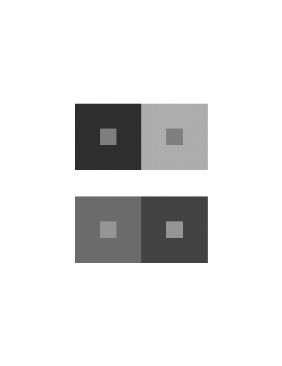
In this project, I used the greyscale key to guid me in creating a color interaction. If I go into detail with how the human eye interprets color, I would talk for hours. But, to explain how I got to my result for this piece, I basically had 2 squares with two different shades of grey, one dark and the other light, and within these squares are two little squares but are both the same shade of grey. Despite the same shade, the little square inside the dark square will appear lighter than the little square within the light square. I repeated the same process but with different levels of grey and got the same result.

