Call me a nerd but I thoroughly enjoyed this exercise. Now every time I see any type in the street, I’ll have to sit there and categorize it to it’s family, then predict what font it is and that’s how I’ll miss the bus! I could’ve looked up fonts and explained why it’s part of the slab serif, or Bodoni, or Garamond typeface, but it was more interesting to look for them myself. So I took my old “The New Yorker” magazine, and searched for the different typeface families. I was actually able to find at least one font for each of the family, in only ONE magazine. I’ll be honest, It was difficult for me to find Garamond, and I thought to myself, because this is a modern magazine, they wont put old style typefaces, but that alone was the lamest excuse ever; “The New Yorker” was first issued in the 1920’s anyway. After minutes of searching I found a font that looked closest to the Garamond font example my Professor posted. I took Pictures of all the examples I found. (They should be 5, but I added another example for Bodoni in case my example was wrong, so they’re 6). Check it out!
 So this was the example I found of Baskerville. You can tell because of those thin serifs and the relationship between the thick and thin lines and its sharpness.
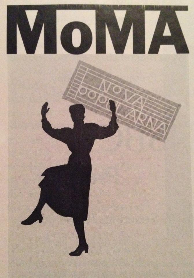
This was what I found on Helvitica. This was pretty easy to find because it is used a lot. I just used this is because it’s about MOMA, and this is design class, go figure. But usually people tend to lean towards helvetica because it so easy and clean for the eye to read.
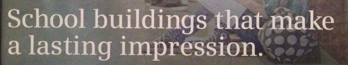
 This is the example I found on Garamond. You can tell because of the letter A. It is very similar to Baskervile, but not as sharp. In this specific typeface, the serifs flow rather than being directly pointed.

This definitely belongs with the slab serif family. It’s simple, you know it’s a slab serif when the serif looks like one big block. It doesn’t have a point at the end or get thinner, or any of that. It is just one thick rectangle.
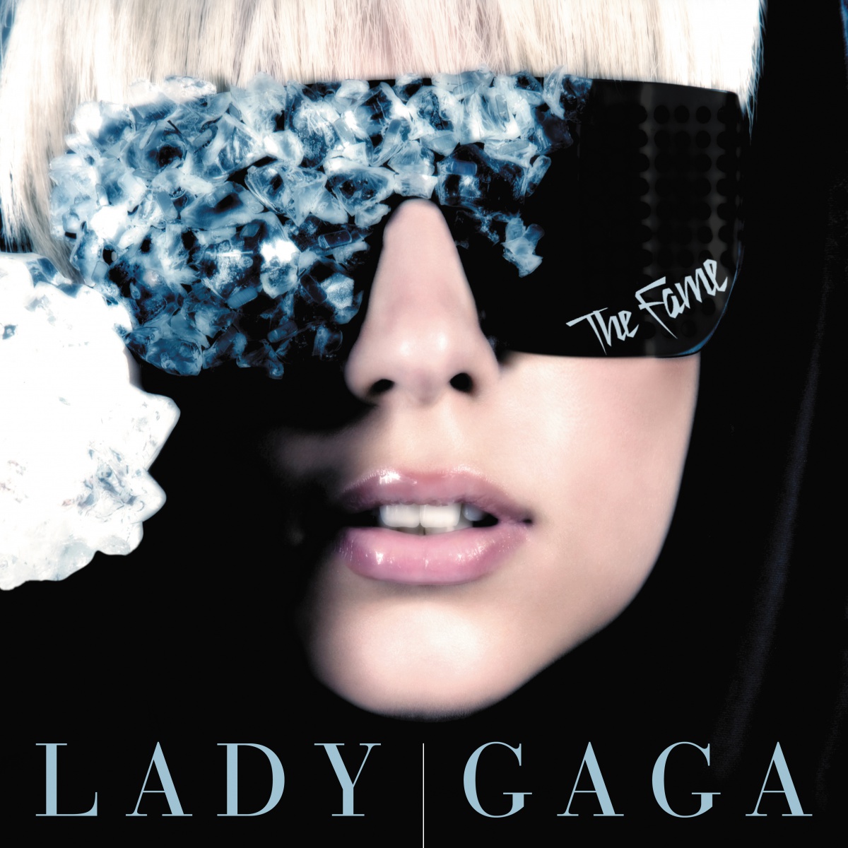
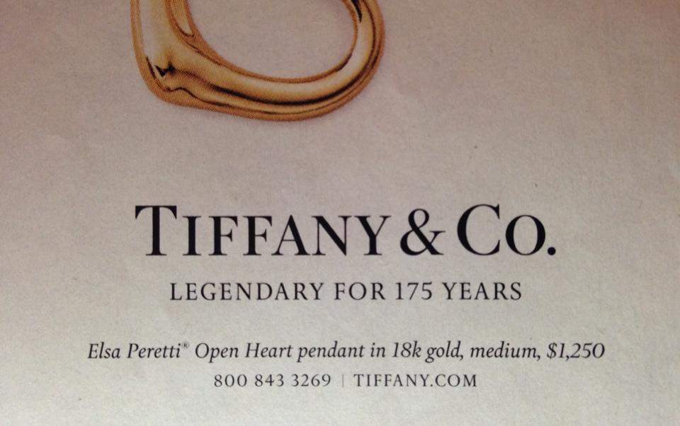
The top picture, from my perspective, looked like a Bodoni typeface. I can tell because certain lines in the letter get thin as you go around the letter. Also because the horizontal serifs are parallel to the baseline, and the serifs pointing up are just straight up and very vertical. I also found this relationship with the font on the bottom picture. Where it says “LADY GAGA”, you can tell, due to the serifs especially, that it is part of the Bodoni typeface family.