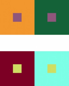
This is a combination of both hue and value, where I use different hues for the backgrounds that also have different values. This was a simple task to complete, and I am a bit satisfied with it. As you may see, on the top set, the purple square in the muted orange square looks a little bit of a blu/greenish-purple, and that is because the square next to it is that color, so it gives us the illusion that the purple square has that same color. Visa versa, if you look at the other purple square in that same set, it looks like it is a more yellowish- purple. This also goes for the bottom set. This was also done on Adobe Illustrator and did not take that long at all. I hope you see the differences.


