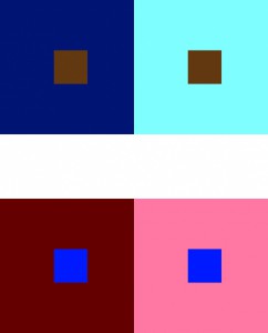
For this piece, I simply took a color and its muted version and placed them as 2 separate background colors. I then chose a completely different color to place in each of the larger squares. As a result, you and I (hopefully) can both see that the smaller square looks brighter, or lighter in the dark background, than the other square in the light background. I attempted 2 sets for this exercise, done on Adobe Illustrator which requires a small amount of time to complete. Thinking about it takes longer than doing it.


