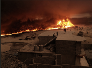
It was hard to choose a photo from Joey Lawrence. I love them all. They all felt like a movie scene and created emotion with how he composes his photos. In this photo, he used the leading line to catch the viewer’s eye from the flame being low on the left and it increased in size to the right where the people are heading to. Also, the people on the roof of the house leads to the right side of the photo. Lawrence also used the rule of thirds, keeping the most attention on the top right. Overall his work is amazing and made me a huge fan of his.
COMD3330-D230 – Digital Photography II – Spring 2020
Just Another WordPress Site


