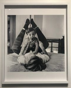
One of the photographs from the gallery that I liked the most was the one in black in white that captured what seems to be a mother and her child. I enjoy how the light comes from the left side, creating shadows that form horizontal patterns on the subjects’ clothing. The photographer did well in capturing the toddler’s facial expression just before his pacifier falls out of his mouth. What I think could’ve been done better is positioning the subject in a better area so that nothing in the background would interfere with the foreground, such as the line running down next to her right foot and the black object that is on the far right of the photograph. In my opinion, this kind of distracts the viewers eyes, from the main subject.
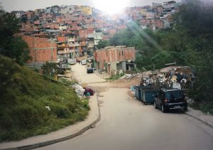
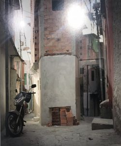
Another set of photographs which I really liked were these. They took me back to the country I was born in, Ecuador. The streets and houses are just like the ones near my grandparents’ house, small, colorful and humble. My favorite one out of the three is the one where you can see the houses from a far and a street leading up to them, which seems purposely photographed that way, in order to show the rule of thirds. The lighting works well even though there does not seem to be much sunlight when the photograph was taken. The only thing distracting, in my opinion is the black car on the right.


