The overall experience at the Cooper Hewitt Museum was very exciting. The museum uses a special pen that allows it’s visitors to virtually collect items from their visit. I found this pen to be simply amazing. I realize that use of the pen made me more engaged with the pieces in the exhibit and become more involved especially with the interactive tables.
The Pixar Exhibition was an amazing exhibit. The exhibit features the illustrators from films including Wall-E, Brave and The Incredibles which shows how the characters developed over time and how the designers trigger our emotions and beyond. In the museum’s immersive Process Lab, I was able to explore the design process through the color scripts, storyboards, sculptures and interactive touch-screen table.
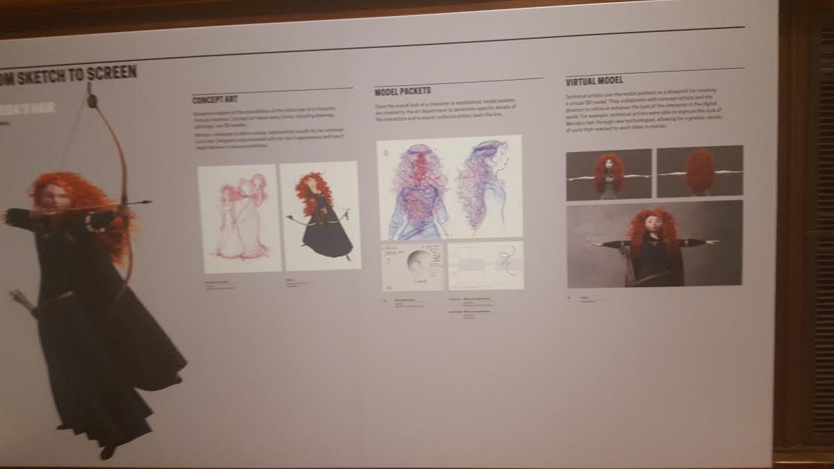
I really enjoyed seeing the creation of the “Brave” characters’ hair come to life as they went through step by step on the screen, showing it from sketch to 3D live animation and virtual model. It also highlighted the process of defining her hair to become unique and distinct to the character.
I was able to see how Pixar illustrations starts out with such simplicity but in the end forms into something much more that drives a connection to it’s audience.
Among the other exhibits, I found the Poster exhibit: “How Poster’s Work” extremely captivating as a graphic designer. It showed how various designers including Herbert Matter, Paul Rand, Philippe Apeloig and Michael Bierut, to name a few ,use the graphic design principles, along with composition, storytelling and perception in their work to make a great design. It was really interested to see how different designers used these methods to solve a problem and communicate a message visually. It was great to connect what I’ve learnt in school with what was shown in this exhibit.
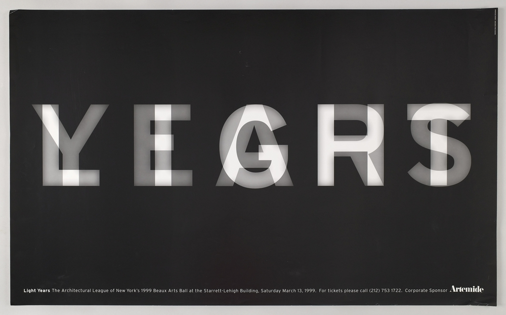
This exhibit was inspiring. Two pieces that were captivating were, Poster, LIGHT/YEARS, 1999 , Michael Bierut, 2007-12-2.
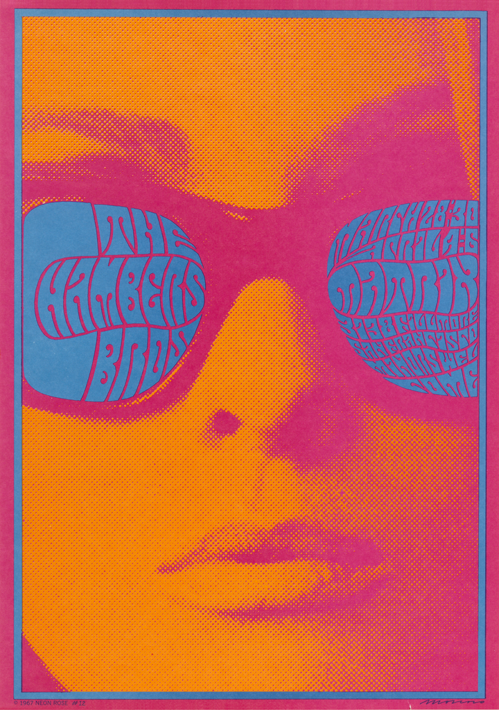
Poster, Chambers Brothers Band, Neon Rose #12, 1967, by Sara and Marc Benda, 2009-12-23. This poster was certainly overwhelms the eye with it’s saturated analogous color scheme. I was attracted to this poster because of the use of color. Color plays an important role in design, it sets the mood and can still tell a story. The color chosen works great together and helps communicate the message by captivating the audience and sending positive energy about this band.
The takeaway from this museum was knowledgable to what I have learnt in classes. It has also provided me with inspiration for future projects that I can always keep. An amazing experience.

