Tag Archives: ADV1100

Assignment #6

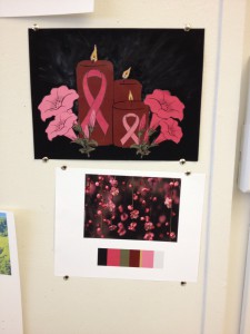
This assignment was made for someone special who passed away from breast cancer two years ago. So I took a moment where I lite a candle for her. I used paint for the background and everything else was made Illustrator. I enjoyed making this and hope she is in the sky enjoying it as well.

photo 2(10)

The bottom piece is where I got the colors from and the top piece is my finished piece.

Paired Color Identities Free-Study

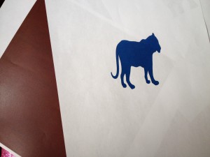
For this free study we had to work with a partner. My partner and I had to create a pair of squares that showed color interaction. In the middle of the square, the center will be a icon that represented her partner. Also the colors that is used for the outside box is a color that represents your partner and the inside icons color is a shared color.  For my partner I picked a dark red for the outside and a tiger for her. For me she picked a elephant and pick a blueish color. I had printed out just a few ideas of how our assignment would look, but the colors did not come out correct.

Paired Color Identities Free-Study (For me, made by my partner.)

Paired Color Identities Free-Study (For me, made by my partner.)

Paired Color Identities Free-Study (For my partner, made by me)

Paired Color Identities Free-Study (For my partner, made by me)

Group 4 : Shifting Hue and Value

For this assignment, I had to shift hue and value. At first I understood what I had to do, although sometimes I couldn’t see it. When I tried to do the assignment on my own, I was stuck for while trying to figure out how to start. I looked at the example posted on my professors website and then started doing a few pairs that showed this. I chose one and this was it.

Shifting Hue and Value

Shifting Hue and Value

Group 3 : Shifting Hue, Not Value

Now this group was difficult for me to understand. Sometimes I couldn’t see what others saw in the colors or I just couldn’t get the right colors. In this assignment, I had to use hue to make it look like its the same color when set to gray scale. I played around with a few colors, and my out come was this:

Shifting Hue, Not Value

Shifting Hue, Not Value

Group 2: Shifting Value in Color

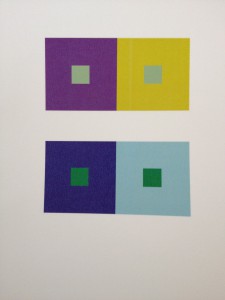
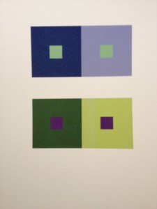
In this assignment, I had to do two pairs of squares that shift value by using color.  Value meaning light to dark. Colors that could be used for low key is violent and blue. Colors that could reflect high key value is yellow, orange and green. When these pairs are made, to check if they are done correctly set it in gray scale. The small middle box should appear different, but are the same colors in reality. The surrounding colors are different which effect the color square inside. Here is my pairs:

Shifting Value in Color

Shifting Value in Color

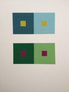
I did a extra one:

Shifting Value in Color

Shifting Value in Color


Group 1: 2 pairs of achromatic gray studies

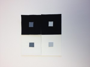
For this assignment we were only allowed to use white and black. What we had to do was pick the same values and make them look different when they are either surrounded by white or black. I wanted to we both low key and high for my center values. I tested the colors to see if they did appear different on a white or black background. After that I cut out my squares and painted them. This is a photo of it.photo

Free-Study #2 (Based on Ben Snead’s work)

My class took a field trip to the Jay St train station. We were going to see a art piece that represented Symmetrical and Asymmetrical balance. This art piece was beautiful. It was called “Departures and Arrivals”. It was based off the subway train system. This system is something that people from all over the city may use everyday. People who come from different parts of the city or world. Looking at the creators in the piece I notice a different meaning. These creators travel differently. One travels in the sky, one travels on the ground and one travels in the water. These are the three different ways that any creator in this world can travel. It could also show how a person arrived in this city. Some took a plane, some came in a boat and others were born here. These are photos are the art piece.
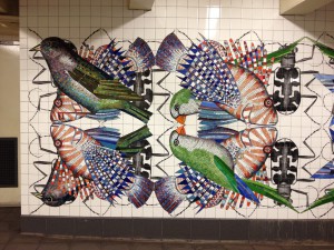
The artist used many different hues and values.
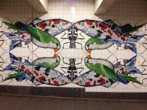
The artist used many different hues and values.

Here we see that the artist didn't make each side the same, but they feel the same.
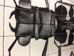
Here we see that the artist didn’t make each side the same, but they feel the same.

The pattern of the beetle was different when the fish and the bird.
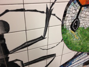
The pattern of the beetle was different when the fish and the bird.

Your can see the difference now of the creators and what they were made from
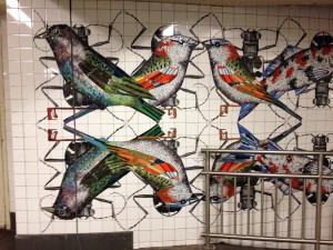
Your can see the difference now of the creators and what they were made from

This is another section of the piece

This is another section of the piece

Out of this art piece I had to create something that represented something simmiar but in my own way. I chose to stay in the train station and subway way. The reason why is because this is something that have been used by people of many places. ALl of the people we see on the train have their own story, they have their own destination to go to. I really enjoy photography, so I started out taking photos. I also had help from a friend who took a photo for me. I wanted to get someone else’s view of the train. I enjoy seeing the different ways people take photographs. Here are the two photos I choose to work with.
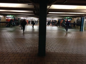
Photo 1
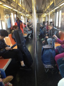
Photo 1

Photo 2

Photo 2

So what I did was paint every person a different color, which represented a train in the MTA subway system. I printed out 8×10 of each photo. Then painted with gouches paint. This is the finished product.
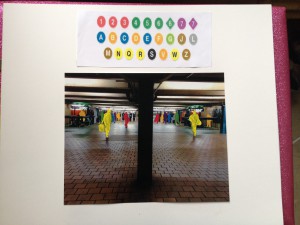
Piece 1
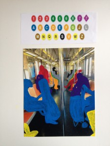
Piece 1

Piece 2

Piece 2

This has been my favorite project. I got to create something that enjoy about the city.

Free Study

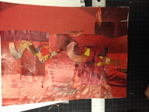
One reason why I like working in groups is because you get to listen to everyone’s ideas and opinion. You have to work together to get the jump done. My group was abit awkward at first. We began talking and started working. We were drawing, glueing, cutting out red, yellows and orange from are scraps. We weren’t able to to finish in class. This is how it looked.

What my group did in class. (The letter "I" is missing)

What my group did in class. (The letter “I” is missing)

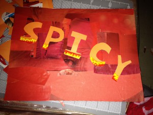
I decided that I would take it home and finish it. We felt that the foreground was distracting. Also the letter did stand out from the foreground. With this I started to think about ways to fix this. Some area were not to same red, so I covered them up. I covered the letters with a color that would make it standout. Finally I added some flames from one of my favorite spicy chips…”Flaming Hot Cheetos”. In conclusion, I think it came out well. Hopefully my classmates and group mates will agree.

photo 2(9)


Love, War, & Exile

On Saturday, I attended the ” Love, War and Exile” exhibition by Chagall at the Jew Museum. Attended it made me realize how much I miss going to museums. We were assigned to take photographs at the museum, but photographs are not allowed. So I took notes about the paintings. I focused on the colors and values that I saw.

These were my notes:

  • “The Vilna Synagogue”- lots of chromatic grays and primary colors and I found one muted pink
  • “Sleeping Talmudist”- focused a lot of chromatic grays, a few muted colors such as pink and yellow and only one primary color  yellow.
  • “Interior of a Synagogue in Safed”- used many different blues, muted blue and chromatic blues
  • “The Lovers” and “Lovers Amount the Lilacs” had a mix of muted and chromatic pinks and blues
  • “The Crucifix” used gouache paint and had lots of chromatic colors
  • “Calvary” uses many primary colors

I also saw a quote that I loved –

 “Should I paint the earth, the sky, my heart?
The cities burning, my brothers fleeing?
My eyes in tears
Where should I run and fly, to whom?”

Then I saw two classmates and we entered quickly to a different exhibition about fashion. We took a photo inside this cool mirror house.

photo(3)

Prismatic Color Studies #1 & #2

When this project was first explained, I did not understand. I was over thinking it. When I began to do it I started to understand. I have to use only Primary and Secondary colors on my broad and narrow for this study. I couldn’t mix them any further, or use white. Making the narrow was abit diffcult. For narrow, you have to only focus on a few colors. I wanted to make a high key, so my main colors were, yellow, yellow green and yellow orange. For broad you have to use all the colors.


Prismatic Narrow Range -High Key

Prismatic Narrow Range -High Key

Prismatic Broad Range

Prismatic Broad Range