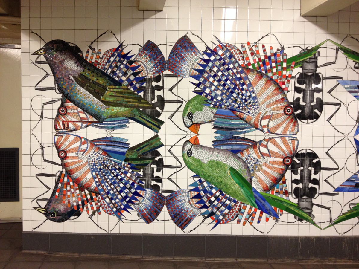
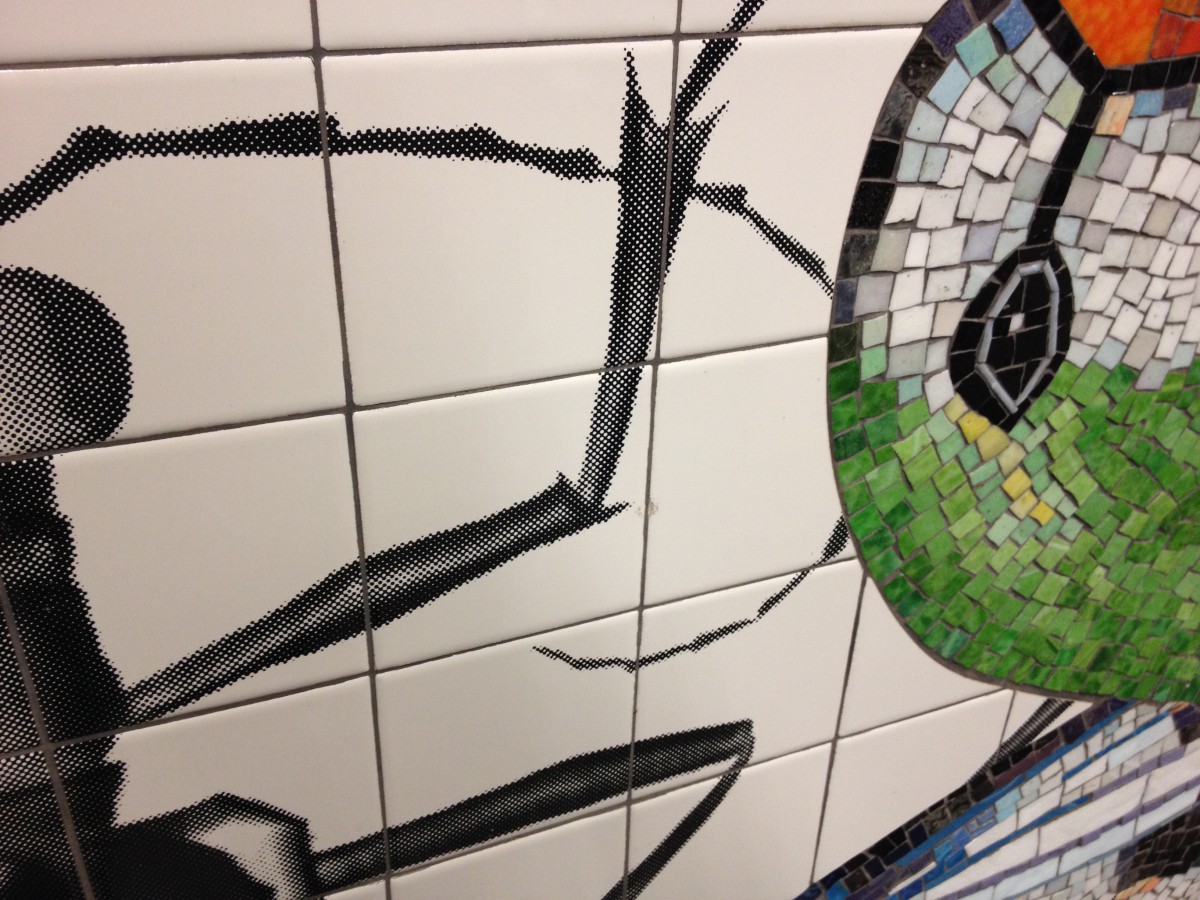
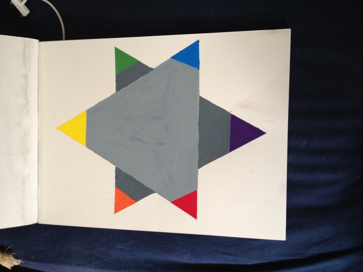
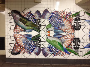
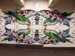
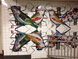
My class took a field trip to the Jay St train station. We were going to see a art piece that represented Symmetrical and Asymmetrical balance. This art piece was beautiful. It was called “Departures and Arrivals”. It was based off the subway train system. This system is something that people from all over the city may use everyday. People who come from different parts of the city or world. Looking at the creators in the piece I notice a different meaning. These creators travel differently. One travels in the sky, one travels on the ground and one travels in the water. These are the three different ways that any creator in this world can travel. It could also show how a person arrived in this city. Some took a plane, some came in a boat and others were born here. These are photos are the art piece.
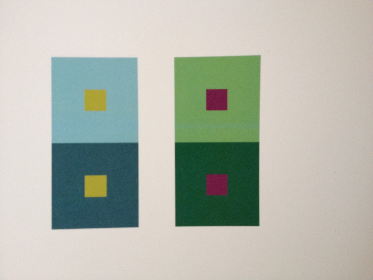
The artist used many different hues and values.
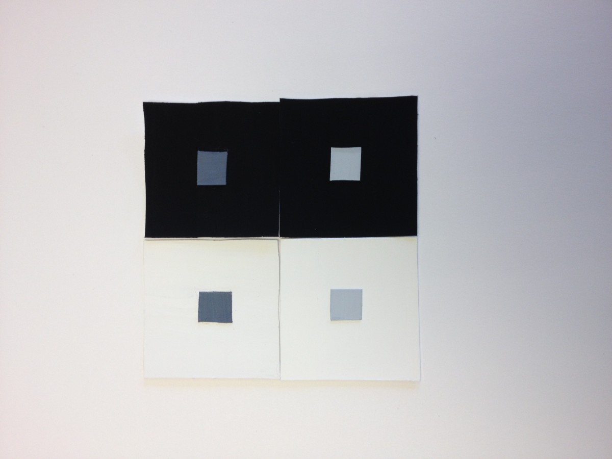
Here we see that the artist didn’t make each side the same, but they feel the same.
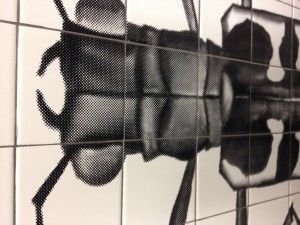
The pattern of the beetle was different when the fish and the bird.
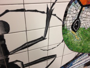
Your can see the difference now of the creators and what they were made from
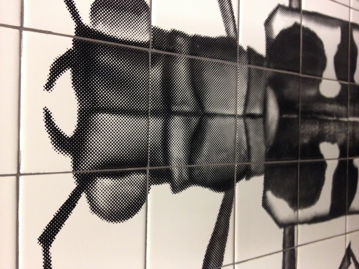
This is another section of the piece
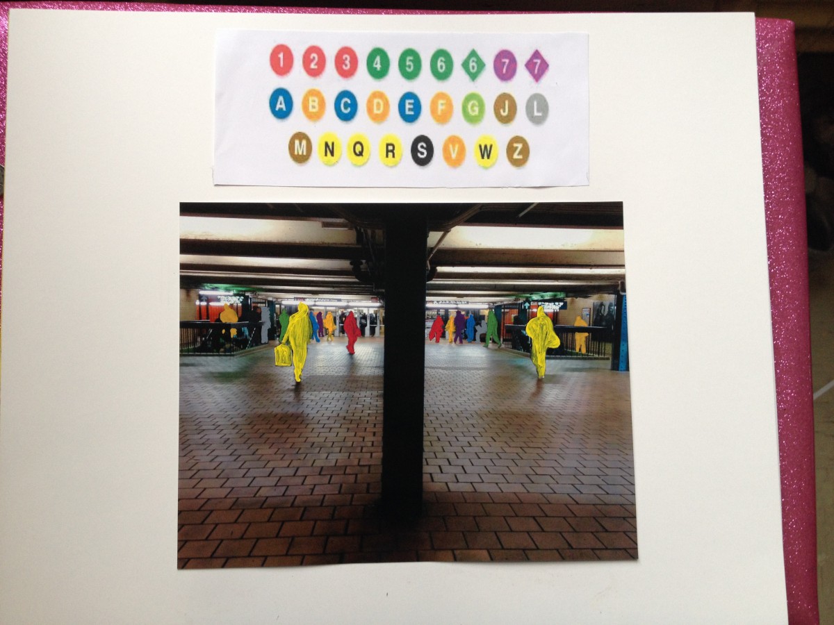
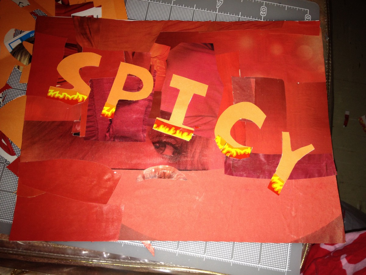
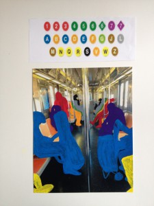
Out of this art piece I had to create something that represented something simmiar but in my own way. I chose to stay in the train station and subway way. The reason why is because this is something that have been used by people of many places. ALl of the people we see on the train have their own story, they have their own destination to go to. I really enjoy photography, so I started out taking photos. I also had help from a friend who took a photo for me. I wanted to get someone else’s view of the train. I enjoy seeing the different ways people take photographs. Here are the two photos I choose to work with.
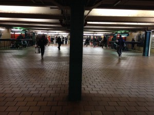
Photo 1
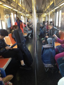
Photo 2
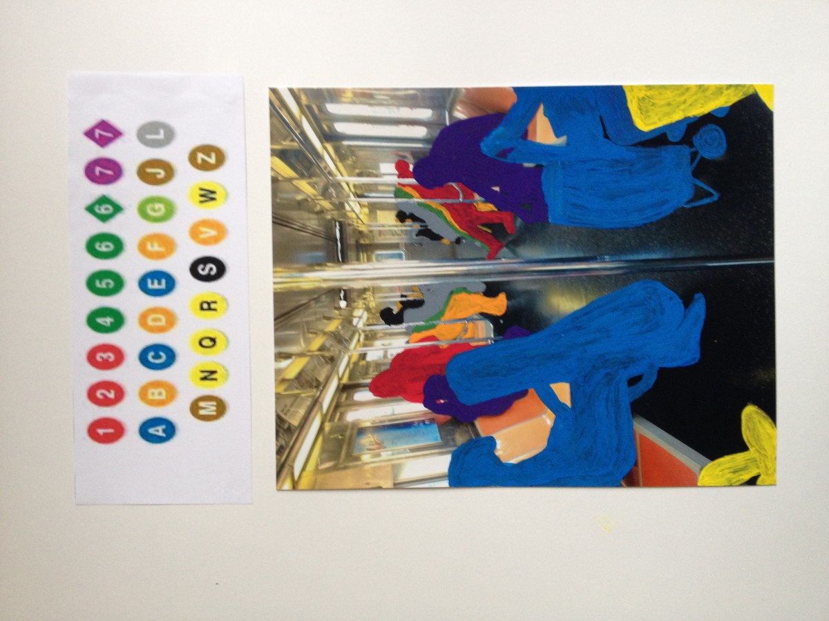
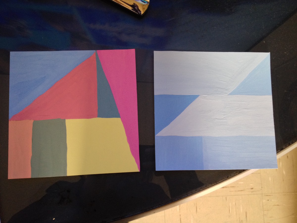
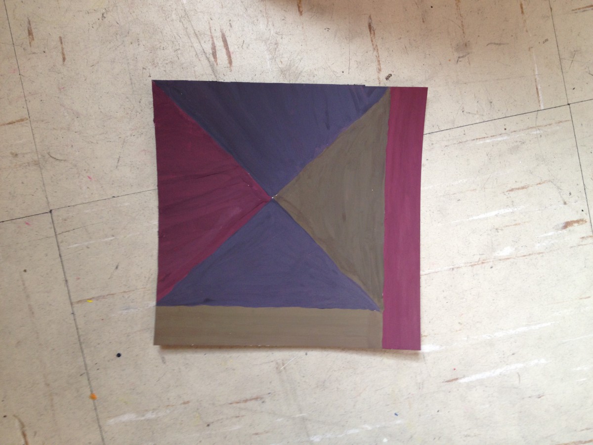
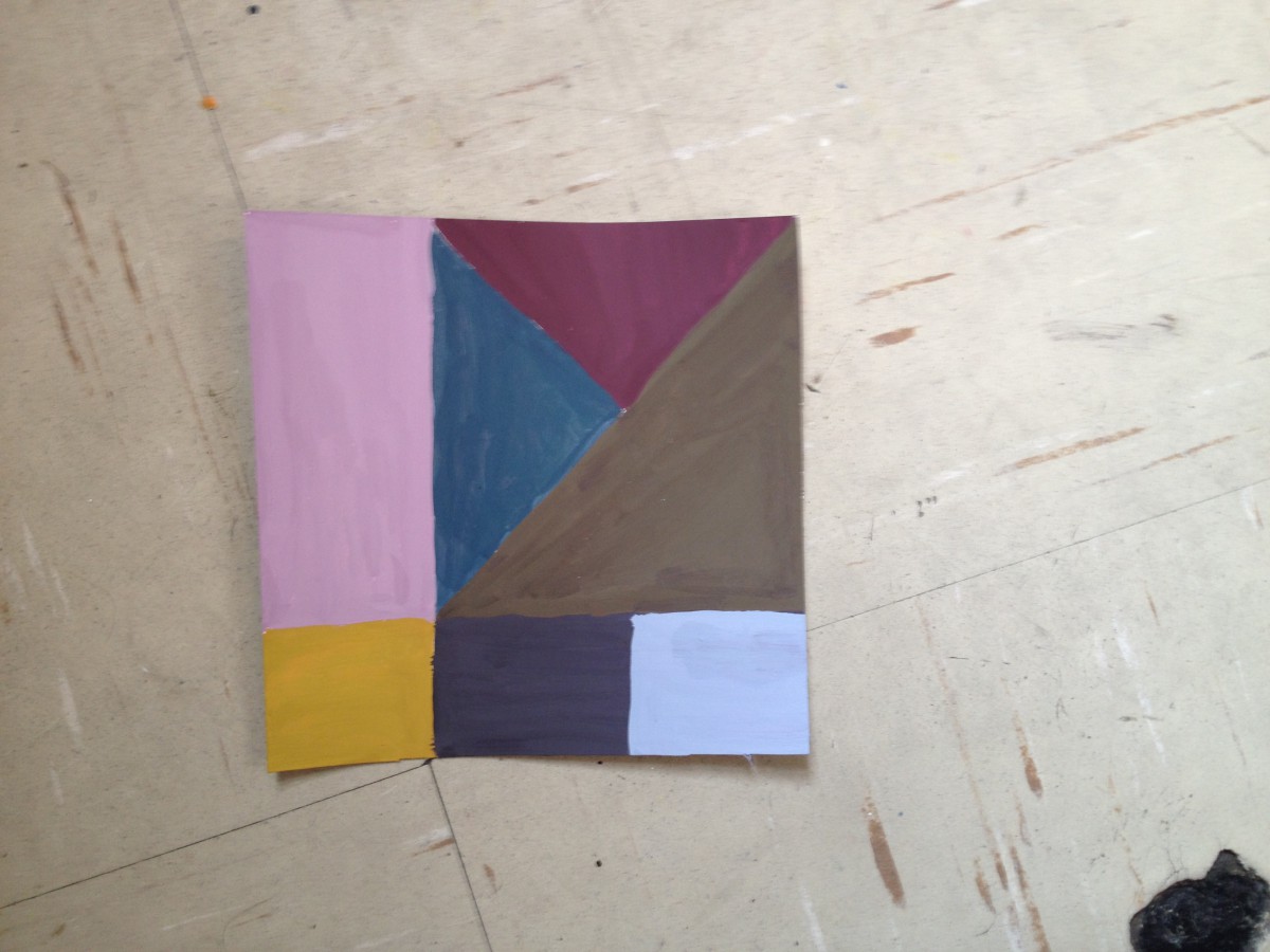
So what I did was paint every person a different color, which represented a train in the MTA subway system. I printed out 8×10 of each photo. Then painted with gouches paint. This is the finished product.
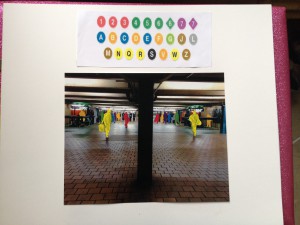
Piece 1
Piece 2
This has been my favorite project. I got to create something that enjoy about the city.