Kiara Camachos Eportfolio

Out of sight, Out of mind

Final Week at Calling All Graphics

This was my final week at Calling All Graphics, we had the week of Thanksgiving off. We had finished central market and even created digital boards for Village Market. I had chosen the pasta board and similar to the central market client, village wanted images incorporated into their boards. They didn’t have any visuals for us so I had to look for images on the internet that closely followed the pasta dishes. These boards were going to be used similar to promotional boards in order entice customers to come in and order. I didn’t know what to write into the board in order to draw someone in but I had the idea to go with a pasta pun.

After that project was done I had created a flyer for Covid-19 testing site and helped marla adjust a website that she created for a client on SquareSpace. It was an easy work week and I was honored to have been able to partake in this Internship. I can truly say that I learned from Marla and I was also able to provide some knowledge as well.


Week 12 Reviewing Apps

In class we were given the assignment to review apps in order to boost creativity. I’m not sure if we were meant to find apps that we felt worked for us or to give honest reviews on apps that we felt stood out to us upon selection. I chose to give honest reviews about the apps that stood out the most to me and if they lived up to the descriptions given by them.

The first app I chose was brainsparker, an app that provides an exercise to stretch someones creative muscles. The app contains 200 cards containing thought-provoking words and phrases and they say you simply have to shake your device to shuffle the pack and produce a new card. This app is all about the randomness and looking at what card you picked and see how that relates to the project you’re having issues with. I downloaded it on my Ipad and and tested out the cards while thinking about a project I wanted to redo for my portfolio. Essentially I looked at cards of random phrases and images to see what it sparked in terms of creativity for my project. I can’t say it really worked for me for the 30 minutes that I was using it to test it but maybe it requires continuous use. The app was true to its word and did give me random cards and when I shook my Ipad it gave me a new deck. I would give it another chance to see if it was effective but I do understand the purpose of the app. The downside is that you have to pay for different categories like color.

The second app I chose was SimpleMind, now this one was one I was excited to try. When it comes to me working on projects I like to write down whatever comes to my mind whether I did research or if I’m just jotting down thoughts. This app help you organize your thoughts into something that’s actually going to work. So if I had dozens of ideas that don’t seem to connect up with each other, mind mapping is a technique that could help. I am not the most organized person, my mind especially can be hectic. SimpleMind allows for you to to transfer your mind map across devices which can be helpful as a backup in the event that you leave one of your devices home. One issue I had was that I would have preferred a tutorial upon opening the map or even just starting from scratch because automatically an outline appears and you have to figure out where an idea can go rather than just putting down your ideas.

Week 7 at Calling All Graphics

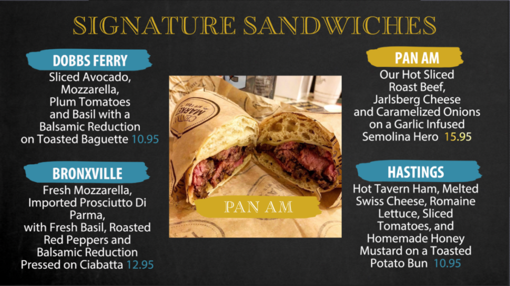
I’m closing in on the end of my Internship, I’m at 110 hours and 30 minutes, pretty accurate time keeping if I should say so myself. Marla needed us to finish the boards for Central Market so this is still a collaboration project. We have moved onto the sandwiches of the menu with my coworker doing the hot breakfast sandwiches and I’m am moving from the fry corner to the signature sandwiches.  There are a total of 8 sandwiches for the signature sandwich board and the client has requested that pictures accompany the menu items. This board was going to be a challenge because the images the client had provided weren’t labeled based off what the item was. It was difficult to tell what image what contained what sandwich, the only way Marla and I were able to identify some sandwiches was by seeing if the visuals matched the description of the sandwiches. We opted to separate the 8 sandwiches into 2 separate boards of 4 sandwiches and each one would include one distinct image that highlighted one of the sandwiches on each board.

Week 10- Nassau County Museum of Art

I used to draw with oil pastels as a kid and the one color I used heavily was the color blue and as a child, I didn’t know that blue could be interpreted with different meanings both in the emotional spectrum and design spectrum. The “Blue” Exhibit Nassau County Museum of Art intrigued me because of the title “Blue” and intrigued me to see the different interpretations of this color amongst these artists. Most of the Museum belonged to William Cullen Bryant who was an editor of the New York Evening Post, as well as a poet, lawyer, conservationist, political activist, and patron of the arts and it became an intellectual and cultural center.

The first piece of work that I wanted to blog about was “Henri Matisse. Blue Nude II. 1952″. The artist cut shapes out of blue paper and pinned them onto a white canvas to form a womanly figure. Now, this piece wasn’t my favorite but it stood out the most due to how simple it looked. When I say simple I don’t necessarily mean bad or easy to replicate because in my opinion just because a work is easy to replicate doesn’t mean it would have the same story. The reason why it isn’t my favorite is that I’m struggling to understand the challenges in life faced while creating this piece and I don’t understand the process of placing pieces to form a female figure.
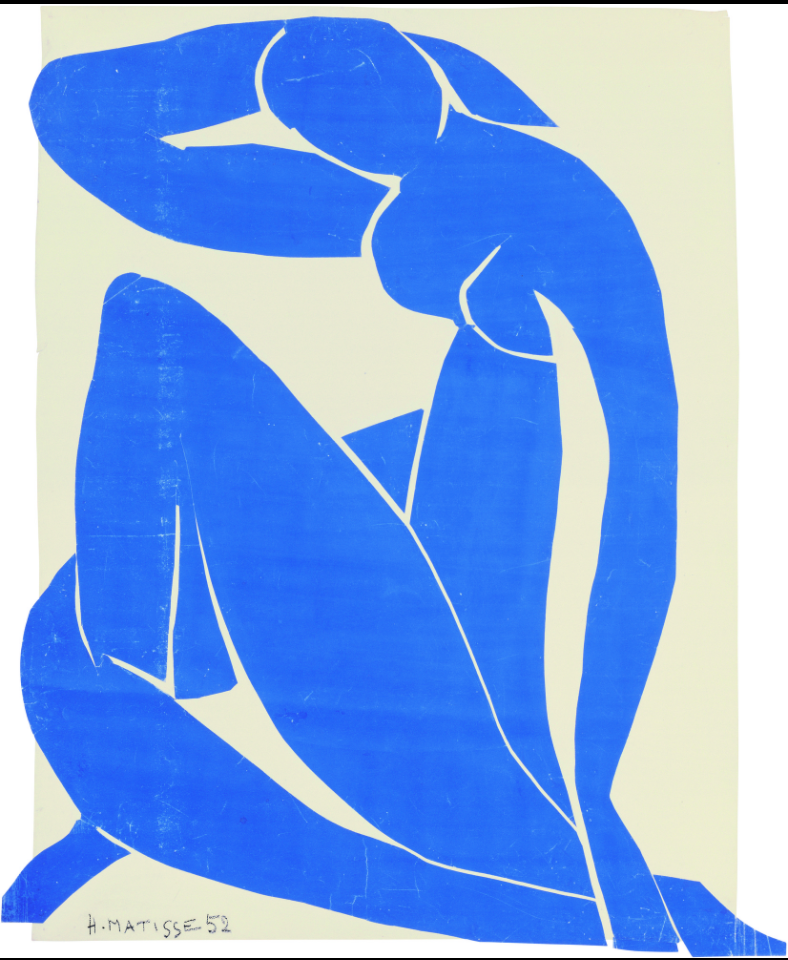
https://www.moma.org/audio/playlist/6/316

The second piece was Cao Jun’s “Poetic Water”, which came from his collection Hymns to Nature. The piece itself was created using the firm roots of Chinese aesthetics and contemporary art. Jun used watercolor for his painting and as his inspiration, he used the lakes and rivers he grew up around in Jiangsu Province, southern China. When I first saw this work, I felt surprisingly calm. The colors and abstract swirls replicate water washing up on the shore and it is such a beautiful piece of art that portrays home for this painter. Oddly enough, I have a phobia of deep water but looking at the piece pushes that away and gives bodies of water a more peaceful and entrancing view.
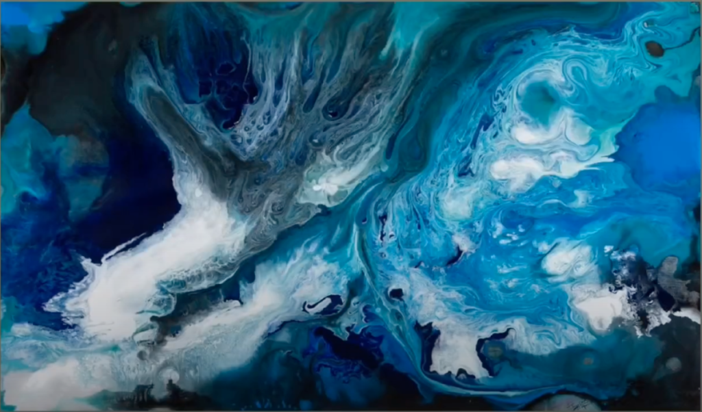
https://www.bc.edu/bc-web/bcnews/art-and-culture/fine-arts/cao-jun-at-mcmullen.html

The third and final piece that caught my eye within this exhibit was Hiroshiges “Fine Evening on the Coast”, an art piece created using woodblock print and ink/color on paper. I was already familiar with one of Hiroshiges work “The Great Wave” which was one the pieces I had learned about in Art History of Graphic Design. The work itself showed used shades of blue to depict one of many beautiful sceneries from Japan.
https://collections.mfa.org/objects/237162

Week 6 at Calling All Graphics

We are collaborating again but this time with Central Market. The client wanted a menu board broken down into pieces to place on tv’s within the establishment, so it is time to put the After Effects skills Marla has been teaching me to use. My coworkers were given different areas of the menu board and I was given the fry and chicken tender corner. We’re each going to try and do something different to give the client options to choose from. I’m hoping to move away from a textured background and possibly try a gradient or something with color to make the images pop. I believe the chicken tenders are a specials platter so it might be good to make it stand out, I will run it by Marla and the client to see what they say. This is the first time I’ve actually decided to propose a design to Marla and the client, especially since there weren’t any specific designs they mentioned.

Week 9- Part Two

The readings have kind of reinforced the importance of copyright and ethics and expanded the knowledge I had when first starting this lesson. What stood out most importantly to me was the Falling Man image and Ram commercial. The readings that came up towards that disturbing image showed many ethical concerns towards the NY Times. One author stated that he was one of many readers of the times that had called with a complaint towards the use of that visual. A common statement throughout the readings was, how would this man’s family feel about this image being shared amongst the public descriptions of it being called inappropriate and calloused were only a few terms of many.

The Ram commercial was also a disappointing form of advertising that should have been executed better, especially with different audio. I’m surprised they even had gotten permission for the audio and didn’t give specifics on what it would be used for. The commercial has nothing to do with civil rights despite using the speech of a civil rights leader. I see that as unethical of the company and it honestly appears as a red flag for a company to not go into specifics about what a licensed piece would be used for.

I haven’t used licensed work from another creative for any of my work but images such as Istock photos I’ve credited. In terms of the Fairey Copyright Hope Poster case, I felt that the outcome was fair despite that Fairey tampered with evidence at one point. I understand there were quite a few adjustments to make his work appear different from the visual that he used but the fact that the visual was still used trumps that, meaning that Fairey should have gotten permission to use that photograph. I understand AP’s actions especially if they lost compensation because of the work and therefore I am glad that there was a settlement where Fairey paid an undisclosed amount and both parties obtained rights to sell the work.

Week 9- Part One

When reading the ethical guidelines presented by AIGA there was a section titled “The Designer’s Responsibility to Clients”. The section lists what a professional designer would and would not do when working on a project set by the client. When working with a client it is important to ensure that you follow what is set in the brief and make sure you are working in a client’s best interests.

Working at my internship and working on various client projects I wanted to let the creativity flow, however, I  had to respect the guidelines that were set. If they had wanted a complementary color scheme on top of a black background instead of a textured background then I would abide by their requests because it is important to respect a client’s needs as they respect our skills to do the work. Another point made within the AIGA guidelines was to keep the project from the client confidential from the public until its completion. Though I am working on different projects for many restaurants, it would be unethical to show work to fellow designers before the project had been concluded.

Week 5 at Calling All Graphics

Today was a collaboration project with my classmate and co worker Sabrina and Marla. Village Market wanted new menu boards so we had to make menu boards that were consistent in their designs and with their menu items. Since it was a remote internship, we had to initially make sure what was going to be incorporated into these new boards. We looked at past work from Marla and took away key components that we felt would make the client happy. Once we had made sure we were all on the same page with typography, colors and design we then broke up the menus and handed each menu to another person for them to do. I had the menu that consisted of Burritos, Tacos, Quesadillas, Pasta and Quinoa. The end result was amazing and consistent menu designs.

Week 8- Adobe Max

For my networking event I chose to attend Adobe Max’s “Learning Premiere Pro Basics in One Hour” hosted by Josh Olufemii. The event took place from 2pm to 3pm and while I do admit that I was attending the online event in my final minutes of work it was necessary for me to take in the info being provided as soon as possible. The event was for beginners to learn how to use Adobe Premiere Pro and following along with video clips he had supplied to create a basketball video. I have used Premier Pro before for a video class but I regrettably I forgot what I had learned especially since it was one class and that was a year ago in the Spring 2020 semester. The event allowed me to re-learn the basics because I would be applying those skills to work and to specifically to my senior project.

It was a good thing I attended the event because Josh had made a point, he had said that video was going to become a big thing and it would be beneficial to our careers if we understood the process as well as obtained video editing skills. I made the decision to place a video as my second channel for the multimedia version of my campaign in Senior Project and I came to that decision after reflecting on what trended during the pandemic. Companies took to social media with virtual campaigns to reach their audiences because it was safer and convenient and do restrictions are starting to lossen up, my video would still be present on social media pages and online platforms.

(the screen share from Josh Olufemii through the Adome Max website)


« Older posts