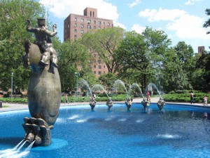
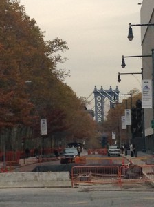
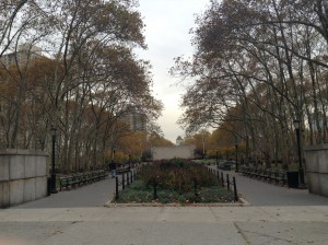
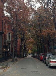
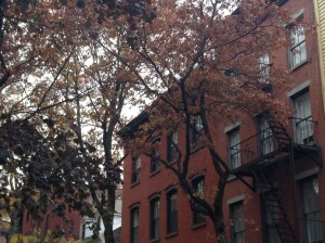
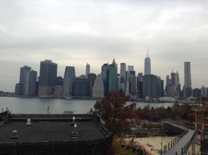
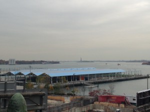
Here is a route that i came along from Borough hall to the boardwalk of Manhattan bridge. This route is meat to show the blend of nature and society and how they can fit during times in the season, in this case, Fall would be the best time to take this route. Starting from Borough Hall, you want to walk up Cadman Plaza, going towards the Cadman Plaza Park. during your walk on this route, you will begin to notice how the tree’s orange and yellow color begin to match the area around it (Picture 1), as the rest of the walk will do as well. Once you arrive at the park, you want to walk into the park, staying on your left as you will turn to walk up Clark Street. Regardless of what time your walking through the park, it will always look pleasant to the eye during your walks through it. Once on Clark Street, you want to continue walking up past the penny bridge till you on the Hicks Street (Or as i like to call it, fruity street due to the fact that the streets that intersect with Hicks Street are named after various types of fruit like Orange and pineapple). Once your on Hicks street, you want to turn right continue on straight until you land on the intersection of Hicks Street and cranberry. Once on Cranberry, you want to Turn left and Walk straight up to your destination. Through Cranberry street is the main point of the walk since it really captures the beauty of nature and society, especially with how the tree’s blend in with the color of the houses (pictures 3 and 4) When you walk straight up from the street, you should then be at your destination at the Boardwalk near Manhattan bridge, which has a very nice view of the ocean and the rest of the city. If you look slightly to your lest from the city, you can see the statue of liberty from a distance.
Latest Entries »
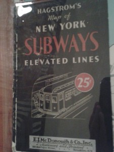
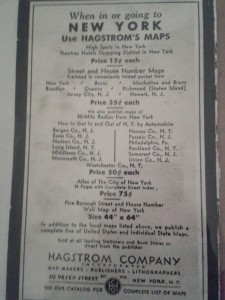
During our field trip to the Brooklyn Historical Society, we paid a visit to their library to analyze and study a few maps about Brooklyn and how its maps and streets came to be. There were several maps that were spread out, weather they be Subway maps, maps of some areas of Brooklyn, or all of New York state, they all kinda told a small story of the past. during my research, i noticed how back then they used maps a a type of advertisement for companies and what not. the map below is an older map of the brand new subway transit system, before the number and letter system came to be later on. Not only does this map have old subway routes, but it also told you a little about how the economy back then as seen by the 25 cent advertisement in one of the pictures below. also in the back of the map, i found an advertisement to the company who made the maps, also mean that the company who made this subway map has made other maps, perhaps even more of Brooklyn.
From what i can gather, the wonder exhibit is a compilation of photographs taken by City tech students in a near by graveyard in which i cannot remember the name of. The exhibit was full of beautifully taken pictures from the surrounding area. some pictures were about the gravestones, or the scenery around the graveyard such as the houses, ponds, and statues. Out of all the pictures in the gallery, my favorite one has to be the one below because its just so vibrant and just gives the area a sense of age and atmosphere. the Hue around the building just pops out and gives the picture a pretty broad look. I just love the design of the building and its structure, the person who took this picture does a great job displaying this. Overall, its a beautiful picture and i think its the best of all of the others that are displayed in the exhibit.
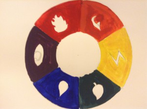
Here is my completed color wheel for our next project. I decided for this free study to use the normal color wheel, but add a little more to it. Those icons that are centered on every color are icons used in Poke’mon the card game, as each color stands for its respective element. Fire (red), Psychic (purple), Water (Blue), Grass (Green), Electric (Yellow), and Dragon (Orange). This is the second one i made after the first attempt i did in class, although when i look at it, i can see that i added too much water in some areas, and i am considering doing it over again from scratch, but in the mean time, ill settle for what I have. this took me about 30 minutes to finish.
Reading Lucy, by Jennifer Egan is a essay that’s based on a research novel about a woman named Lucille Kolkin who worked for the Brooklyn Navy yard during World War II as a mechanic for about two years. The author begins to create a bond with her as she continues to interview Lucy, not only learning about what she does and her studies as an engineer, but more of her personal life as well. Lucy then tells her about how she met a man named Alfred Kolkin and how they would send letters to each other as often as they could. Through this, they both began to create a close bond to each other as readers can clearly see that they both care about each other very much. But overtime, they began to drift apart, the only thing keeping them together was through the letters they sent. The author could tell that there bond was strong through the letters that they wrote to each other from time to time, discussing their current situations and developments. around the end when Alfred moves to a new Navy yard in California, They discuss things about a possible future with kids and a house and other things that an average married couple would do. The author soon finds out that Lucy dies years ago and is a bit crushed by the fact, but through reading her letters to Alfred along with a few online articles she found, she knows that she died doing what she wanted. In the end, she feels a bit of a reflection towards herself through reading Lucy’s letters and begins to question her future. but in the end, she concludes that you just have to live it out to the fullest.
From what i can learn about this essay is that people should live life to the fullest till the day they pass on. The author further implements this message through Lucy’s letters and the choices that she made throughout her time talking to the man of her dreams. I think its a rather personal thing that the reader can relate to with the story, for the soul fact that Lucy made the decisions that she did to be happy with herself and live life. It’s something sadly not alot of people think about now a days, people are so focused on the future, that they barley even worry about what makes them happy and what they want to do later on in that future time.
What if you Could Choose Between the Fastest Route and the Most Beautiful, by Lex Berko, Is a article that explains how nowadays with Mobile navigation apps, they only take you from point A, to point B in the shortest way possible. Berko explains that this current use of a mobile app becomes boring and non – enthusiastic. Berko wants to make a way that you can get to your location, while also being able to enjoy your walk and its scenery. He conducts an experiment with some people, showing them alternate routes and its scenery and asks them, which route would you rather take and which one looks more pleasant. After gathering the results, it was clear that most people do want to enjoy a peaceful or beautiful scenery as they are walking from point A to point B.
After reading the article, i have to agree with Berko’s experiment and say it is more lively to walk a path that has a more appealing scenary surrounding the area. It get boring going through the same path over and over again, with the same old, boring look. I would rather try and find another route that i can walk through and be able to smile at the appealing scenery that surrounds the area. I feel others should support this as well, since now adays, we live in a more depressing time. Little things like this can do alot to brighten up a persons day in their life.
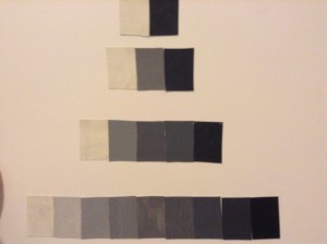
This took m about 3 hours to finish, but im satisfied with how it came out. Due to my crappy quality brushes, some of the strokes came out a bit shakey, but at least it kept its shade. The white got a bit dirty when i was pasting it on the bristol, but overall, i would say it came out well. For 3 hours, i’m satisfied with the final product.
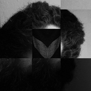
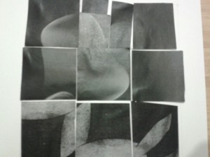
Here are my collages for Project #3
For the first One, i was making my focus the bell shaped figure, surrounded by a dark frame (disregard the gloss around it, the lighting was not the best in the pictures). As for the second one, i went for variety, although it feels a bit lopsided, but i wanna see what others think i should do before i make major changes to it. does it need more or lesss? I would appriciate some feedback.


![IMG_0368[1]](https://openlab.citytech.cuny.edu/kayala-eportfolio/files/2014/11/IMG_03681-225x300.jpg)
![IMG_0365[1]](https://openlab.citytech.cuny.edu/kayala-eportfolio/files/2014/11/IMG_03651-300x225.jpg)
