Mentors & Role Models

Images: https://clipartspub.com/images/mentoring-clipart-illustration-6.jpg

Mentors are important because they can help you grow a professional network by connecting you to others. Mentors serve as coaches that can help you during times of transition which is something I’m going through right now being a senior. It’s almost time for me to go into the real-world work field & my supervisor Is showing how to make it as smooth as it can be. I would say my supervisor is my role model at this company for a few reasons. I never really had a process for designing but after watching her process I realized how important it is to have one. Having a process will focus you & tell you what will be needed to make your designs better. Also, a process keeps you consistent and will help you meet the deadlines for projects which is important especially when you’re working for a company. She’s also a team player, she always makes sure were connected & helps on parts of the project where we are slacking. She’s also very creative when it comes to the concepts for the company, she’s very imaginative and applies that to her work. I feel I’m learning a lot from her & I’m glad that I chose this internship over the others.

The Process

Images: https://webstockreview.net/images/dinner-clipart-st-patricks-day-5.png

For St. Patrick’s Day I was required to make a social media post, I felt like I could have done a lot better. I went for the generic approach, which was a pot with gold, & I was a little disappointed in myself because I believed I could do much better. I wasn’t finished though I had  a week left until St. Patrick’s Day so I started to sketch more ideas. After doing a lot of sketching and revising I finally came up with a concept that everyone liked & I could be proud. If there’s something I learned it was that designing is a process and you don’t always get it on the first try, you must grind it out and continue to work until the project something you can be proud of.

Another thing I learned was you can’t always try to be a perfectionist, a lot of the times I get projects that require me to have fast returns so I still do good work but they’re not as good as they can be because of the time I was given. The biggest project I had so far was the mascot project so I would like to talk about that as well. I would say my performance was solid on this project, from the start I took it very serious & seen it as an opportunity to prove to myself that I could make good creations in this industry & do it at a high level. Part of the reason I believe I did well on this was because of the research & time I put into this project.

Collaborating with others

Image: https://cdn.dribbble.com/users/310943/screenshots/4202081/zremote-team-collaboration-illustration.png

One project I collaborated on was making a mascot for the company. This was an interesting project since I never did anything like this before, I was super excited though to see how this project would turn out. I work with three people one being my supervisor & the other two being people that work in other departments in the company. This project took a lot of sketching & brainstorming to figure out what the perfect mascot would be for this company. What made this project successful was how well everyone communicated with each other. Also, when it came time to show my drafts of the mascot, a lot of good feedback was given that helped me to improve my mascot designs.

Something that went bad was I was the only one who created mascots and I thought it could have been a great experience if I got to see other people make their own so the company could have multiple options. Also, everyone has different takes on things so it would have been nice to see other designers take on this task. Overall, I enjoy this project I’m a huge sports fan and love to see the mascots in those organizations & always wanted to try and create one, so I’m glad I got the opportunity.

Accessibility:

English: Collaborating with others

Spanish PDF : Collaborating with others.en.es

Audio:


What I’m Learning

Image:https://jooinn.com/images/light-bulb-ideas.jpg

I love making illustrations & at this company I’m learning how to make my illustrations up to industry standards. After being at this company I learned theirs a lot that I need to work on, but I’m glad for this experience it’s helping me grow a lot. Something else I’m learning at this company is what goes in to the start up of a company. The company is new and there’s a lot of different things that need to be done to get this company moving. They do a lot of different things like competitor research, participating in networking events, forming strategic partnerships, figuring how to increase customer retention, budget plans etc. For a company that started out during a pandemic I feel they made great progress with their business and are growing fast.

Another big topic I’m learning about is business etiquette. It’s not something that I use to put much thought into but after taking this course I realized the importance. Every week in this class we learn how to be more professional in a work setting. My supervisor told me part of the reason I gained my internship was because she felt I was the most professional out of everyone she interviewed. The way I carried myself in that interview was because of all the things I learned in class like how to dress, what to say & what not to say, & show confidence when you’re speaking. All of these helped me a lot during all the interviews I’ve had & I will continue to use these techniques.

My Workspace

Image: https://i.pinimg.com/originals/65/67/96/656796473b7a66d25feca5f20a79f15f.png

This company is very interesting because they somehow give the in person feel while were online. We are all spread out in different states and countries, so we use all types of apps to stay connected. We are online so the attire is informal people usually log on with regular T-shirts or hoodies, this gives off a relax vibe. At first, I use to wear a white button down to our meetings but after awhile they told me it wasn’t necessary. So now I wear a nice shirt or hoodie that I make sure is clean. Make workspace is a desk that holds my computer and sketch books, I like working at my desk because there aren’t many distractions, the way its positioned.

A typical workday starts off with a company meeting between the other designers to figure who designing what. We also brainstorm a lot of ideas with each other, or sometimes the company owners come and say what they would like to see us make. After that I do some quick sketches because sometimes, they want this stuff done fast and then I’ll start the work on the computer. Once I’m done, we have a folder where we put the work to be approved by the art director. Our meetings only last like 30 minutes, but the work takes a couple of hours to finish. For bigger projects like making clothes or mascots it can take a couple of weeks because the company likes to refine & have multiple drafts  for a project.

My Responsibilities

Image: https://thumbs.dreamstime.com/b/globe-arrows-13931614.jpg

I’m responsible for designing content for their social media accounts. My weekly task consists of making a couple of social media post & Instagram stories. I also get project like making clothes and mascots. My supervisor is the Art director for this company, anything that deals with design is ran by her, and then must be approved by another co-worker that’s good with graphic design and gives good insights and ideas about what to do next. The reason I chose this internship is because I was looking for an illustration position and this seemed like the perfect fit. I know most company’s have a certain style that they use & this company seemed like they fit my style of work. I also like fashion which is something that the job mentioned I would learn because they make a lot of clothes, so that made them standout to me.

I found this company on Indeed, it didn’t take long for the company to say they wanted to interview me. Since my supervisor lives in Madrid, we had an interview on Google Meets. I had one interview with just my supervisor, she didn’t ask to many questions. The first question she asked was what was I expecting to get from this internship, I said I feel like this company will give me the real-world experience I’m looking for and teach me some new things on the way. She also asked what inspires my illustration, I said what’s around me, I live in New York their inspiration all over the place you just have to find it. The last question was where my school is located, I said Brooklyn. This experience was a little weird because I was ready for a lot more questions but that was the end of the interview. About a week after I received a job offer to work at the company as a social media intern.

The Company

Images: https://www.smytheadvisory.com/wp-content/uploads/Buildings.jpg

The size of this company use to be a lot bigger but during the pandemic, they had to shut down because there wasn’t enough business happening. Unfortunately, a lot of their social media accounts either got deleted or hacked, which resulted in them losing a good portion of their fan base. This is part of the reason I was hired, I managed social media accounts at previous jobs and they were looking for people who have this knowledge and can help them grow their different accounts. They have offices in Madrid which is where my supervisor is, they also have offices in California, San Diego & Colorado. The company I work for is a private company, it’s owned by the company founders & some private investors.

The main things the company does is gift basket creations. They have various items in which you can create nice packages for a loved one or friend. The customers vary they have regular gift baskets that can contain chips, cookies, candy, fruits etc. The customers that buy these gift baskets usually are just looking for a nice gift to send somebody. I have done research and found out most of the times it’s people in the age range of 30 to 45 that buy these gift baskets. They also use to sell Cannabis edibles & oils, but they don’t sell those items as of right now because of some state laws, but the customers that buy these baskets were in different age groups. Gen z customers usually buy  baskets for recreational use while millennials use it for medical use. The company was founded in 2020, a key event in their history is when they bought their first billboard 2021. For this company I work in the social media department with my supervisor and another intern.

Ethics Assignment 2A & 2B

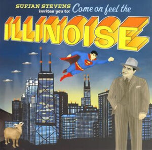
Sufjan Stevens, “Come on feel the Illinoise”, https://www.discogs.com/release/11600735-Sufjan-Stevens-Illinoise


2A) I have used other creatives work on a few projects; most of the projects consist of using photos from a photographer. Some of these design pieces would be a social media post in which case the photographer would just ask to be tagged in the post and make sure we put who took the photos. When it comes to using a photo, you must think about exclusive and non-exclusive photos. An exclusive photo is something a company or person said cannot be used for your personal work. Using an exclusive photo can get you in a lot of trouble.

There was case called Sufjan vs DC in which an exclusive photo was used, and the person did not get in trouble. In 2005 Sufjan Stevens released Illinois, his second “state concept album,” it was an album where all the songs on the album are related to a specific state. It did well when it released. In the CBR article it stated “However, when the album was suddenly pulled from stories, people believed that DC had taken issue with the whole “unlicensed usage of their trademarked character” aspect of the cover (Brain Cronin, 2019)”.

This album cover had used notable figures from Illinois including Abraham Lincoln, Ms. O’Leary’s Cow, the frequent UFO sighting in the state and they also used Superman. When people realized they used Superman on the artwork they believe that it would cause a lot of problems between Sufjan and DC. Surprisingly, DC was not upset about the situation and said that the company can sell the remaining albums they had and, in the future, remove Superman from the cover. Sufjan got lucky that Dc was so cool about the situation, but you need to be cautious about stuff like this could because things could have gone bad for Sufjan. Non-exclusive photos are photos that have been licensed in the past or photos that are available for commercial use.

I found an interesting case where a lady had taken a photo of a family and was offered money from a company to use it. In the Baller Alert article it stated “Like most people, Sinclair posted one of her photos on her IG account, a picture of a mother and her child in Guatemala. Mashable saw the photo, reached out Sinclair, and offered her $50 to allow them to use the photo for a story on female photographers. Sinclair declined, but Mashable ended up using the image anyway, making sure to credit her by embedding her Instagram post in its story, according to The Hollywood Reporter (Raquel Harris,2019).”  

You would think because the company just used the picture anyway that she would have an easy lawsuit win. Unfortunately, that was not the case because the lady posted the picture first which the court said gave away here rights to the photo. Instagram had said if Sinclair felt this way, she should have made here profile private. I do believe something should be put in place so this cannot happen on social media platforms. Plus, it was unethical for the company to still use it after she said no, it was here picture to use.

I guess as designers we just have to be more aware of stuff like this. When it comes to using photos from online, I try to look for public domain images which are no copyright images and or creative commons images. I try to look for these types of photos first because as a designer thing can get expensive so I try to budget wherever I can when it comes to my design work. Unfortunately, when you go this routine sometimes you do not find the quality photos you need, so when I cannot find a good photo then I go to stock photos which are photos that creators license out to anyone who is willing to pay their licensing fee.

Sources:

Raquel Harris , April 15 2020 ,Baller Alert, “Photographer Loses Copyright Infringement Case Because She Posted The Photo On Instagram First” https://balleralert.com/profiles/blogs/photographer-loses-copyright-infringement-case-because-she-posted-the-photo/

BY BRIAN CRONIN PUBLISHED MAR 26, 2019, CBR.com “Comic Legends: Did DC Force Sufjan Stevens’ Illinois Out of Stores?”

https://www.cbr.com/superman-dc-sufjan-stevens-illinois-lawsuit/amp/

2B) Something I learned from this is you need to be through in what you are designing especially when it comes to souring photos. Fairey was not thorough and realized too late that he had messed up. Once he realized he then tried to cover up the incident, but he still got caught, plus that means he know he was in the wrong, so he did not really have an argument. In the New York Times article, it stated “First, he had acted in bad faith. Second, the Hope Poster project was highly commercial. Third, his use of the Garcia Obama photograph was not transformative (Randy Kennedy, 2012)”. Therefore, it is important that you use original work, things can get complicated when it comes to transforming work. Plus, it was unethical of him to use the photos in the first place he knew they were not his. So as a designer who knows the rules , why even put your self in that position.

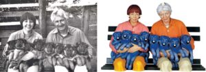
In the Hope poster Litigation article It stated “Fairey’s failure to acknowledge as much reflected the same arrogant attitude toward photography that Jeffrey Koons had shown when he cavalierly employed a photograph of a string of puppies as the basis for a sculpture that he subsequently entered into the “banality show.” Fairey’s effort to invoke the fair use doctrine should be rejected, just as Koons’ was ( AIGA)”.

Yet again the fair use doctrine does not apply to this case. The way Fairey used the photo does not fit into the fair use doctrine, for that you would need to be using it for educational purposes, analysis, or a critique. Sometimes your only allowed to use a limited amount of the artwork but he used the entire photo. Fairey’s was in the wrong from the start and should have called it quits once he realized his mistakes. After doing both entries I learned a lot about how to manage things, so you do not end up like the people in the articles above. You must make sure you check thoroughly so you do not make a huge mistake, like some of the people here.

Sources:

Shepard Fairey is Fined and sentenced to Probation in ” Hope ” Poster Case Randy Kennedy , September 7, 2012

https://artsbeat.blogs.nytimes.com/2012/09/07/shephard-fairey-is-fined-and-sentenced-to-probation-in-hope-poster-case/?mtrref=undefined&gwh=420CD791485328BCFA8E978FCF0250C2&gwt=pay&assetType=PAYWALL

https://bbhosted.cuny.edu/bbcswebdav/pid-64006887-dt-content-rid-494789193_1/xid-494789193_1


Ethics Assignment 1A & 1B

Rogers Vs Koons. https://www.pinterest.com/pin/727401777284751933/

1A) The company I work for is huge on sourcing images. I spent my whole first week learning how to give credit to things I use that do not belong to me. At this company I work as a content creator, so most of the time I create illustrations instead of using photos. I was lucky enough to have a sit down with the people at the company who walked me through the entire process of how to manage sourcing images. When it comes to the company using photos, they usually hire a photographer to come in and take photos of their product. The first thing they do is make a contract between them and the photographer that usually includes an all rights agreement.

They explained a little bit about why they wanted to have all rights agreement, but after reading the AIGA article I got a better understanding of why design companies do this. In the AIGA article it stated: “Rather, the client wants to prevent competitors from using the photography (and, of course, the design) (William Fisher, 2012).” This makes sense as companies do not want to look like their competitors or have their customers mistake them for another brand. Also, the best type of photography is original photography. Original photos that show off your actual work is the best way to demonstrate to your customers exactly what you do and how you do it. Plus using the original photography and designs make you unique and helps make you stand out from your competitors.

I have also learned that sometimes as a designer you may be required to function as the mediator between the company and photographer You must be cautions of making sure that contractual agreement with the artist is lined up with the contract you have with your client. Because of this, most designers resist clients who want all rights or work for hire because it makes the client seem like the creator of the work. When reading the Rogers vs Koons case, I learned how important it is to give credit to the respective artist. Jeff Koons is known for appropriating art and usually gives credit to the original owner but this time around he did not. In the 99 Designs article it stated: “Renowned artist Jeff Koons in the process of creating an exhibit on the banality of everyday items, ran across Roger’s photograph and used it to create a set of statues based on the image (Kaitlyn Ellison , 2013)”. According to the article Koons sold several of these statutes and Rogers eventually finds out about this and sues Koons for copyright.

Koons claimed fair use of parody which means Koons was saying he either use the work in a humorous form of social commentary or literary criticism in which one work imitates another. Koons used Roger’s artwork as if it were his own and mention nothings about Rogers, considering this Koons was in the wrong. The courts said the photos and statutes were too similar and that Koons could have made this piece of artwork in his own way without copying Rogers. The court ordered Koons to pay a monetary settlement to Rodgers.

Sources:

Sources: https://bbhosted.cuny.edu/bbcswebdav/pid-64006887-dt-content-rid-494789194_1/xid-494789194_1

5 Famous copyright infringement cases (and what you learn) 99designs, https://99designs.com/blog/tips/5-famous-copyright-infringement-cases/amp/  , April 19 2013

1B) For this internship I was not required to sign a non-disclosure agreement, but I have signed one for another internship. At this company we discussed the company’s secrets, methods, work-in-progress, and things that would hurt the company if the competitors knew. It is important that a company makes sure they make their workers sign an NDA or it could be the downfall of there company. Even when people sign an NDA, they are not always compliant with the rules. In the “Litigators at Work” article, I read: “A dental technology company has obtained a 6.8 million judgement against a former employee accused of stealing the company’s designs (Martin W Aron & Abraham N. Saiger , November 5, 2017)”. This case was interesting because this was a former employee who work at this dental technology company for years but decided to leave the company and start his own.

After two years, the company noticed another company who seemed to be following their business strategy and seemed to have duplicated the systems they were using. Once they found out the owner of the company was the former employee, they immediately filed a lawsuit for misappropriation of trade secrets and breach of the NDA agreement. At first the employee tried to fight the case but realized that he completely copied the company and did not participate in the rest of the trail, which resulted in him having to pay 6.66 million in damages for research and development that the employee originally saved by stealing information from the other company as well as $150,000 in penalties for international copyright infringement. This did not make much sense to me because there is no way the employee believed he could get away with this. It is the company’s interest to know who their competition is, and which companies are doing the same as them.

So of course, when you copy them, they will find out quickly. I read another article in which an employee breached the NDA of a former company. In the article it stated: “He signed an NDA, under which he agreed to hold all confidential information in strict secrecy and not to disclose or use the information without written authorization(Joanne Deschenaux, 2022)”. Even though this employee signed an NDA he ended up using the company secrets for his own use, once they found out they filed a lawsuit against him.

This case was a little different because the employer failed to show that the company would have received profit if the former employee did not breach the NDA. Due to lack of evidence the employee did not face any consequences. If there is one thing, I learned from this case it was to always be prepared. This former employee was in the wrong but got off because the company did not have evidence of them losing profit due to the actions of that former employee, which was their whole argument.


Sources:

6.8 million Award for Theft of Company Trade Secrets ,Litigators https://www.litigatorsatwork.com/2017/11/6-8-million-award-for-theft-of-company-trade-secrets/  , November 5 2017

Company Entitled to Nominal Damages for Former Employee’s NDA Breach ,Shrm, https://www.shrm.org/resourcesandtools/legal-and-compliance/state-and-local-updates/pages/calif-nominal-damages-for-former-employee-nda-breach.aspx, January 6, 2022


Logo History

This is my Logo History essay. I had to talk about the evolution of a logo , I chose to do the Brooklyn Nets because I believed they had a lot of interesting logo changes. I also found the reason behind why some of the logos were made very interesting .


                                                        Logo Evolution 

     There are a lot of different teams in the NBA that have changed their logo over time, for many different reasons. Some choose their logo just because it looks cool our they like the color scheme, but some teams take it further and actually have a reason behind their logo. One of the teams that do this is the Brooklyn Nets. Over the years the Nets have changed their logo a lot and seem to be going in a different direction than they were years ago. 

     In 1967 the Brooklyn Nets name wasn’t even the same. In the Stadium Talk article it stated “They were the New Jersey Americans and their logo was a red, white and blue shield, with a red, white and blue basketball in the center and “N.J.  American” spread across the top of the shield, There are three white stars on each side of the shield”, (Derek Tahara , Stadium Talk, https://www.stadiumtalk.com/s/nba-team-logos-history-3837c31588704b00). I think they had the name the “ New Jersey Americans” because they had Just joined the American Basketball Association. They were in a league with only ten other teams in it, I think they were competing for the fans, More fans means more income for the team. I think they thought the American flag colors and American in their name would give them a boost to be a favorite in the league. The 1967 Brooklyn Nets logo made a long trend of other logos that followed the color Scheme. In the Yahoo sports article it stated, “ The franchise’s inaugural logo set the stage for decades of design”, ( Shaun Powell , NBA.com, https://www.nba.com/nets/history/logo-history#main ).

The team changed the name a year later , Too “ New York Nets” after moving to Long Island. The team also took a different approach with  their logo as well. In the Sports HQ article it said, “ They replaced the American shield with a large “NY” in red letters and “nets” in a blue cursive wordmark with a basketball player playing in the color black” ,( Jesse Dorsey, Bleacher report, https://www.google.com/amp/s/syndication.bleacherreport.com/amp/1345550-7-nba-teams-that-desperately-need-a-logo-overhaul.amp.html ). As you can see they took a different approach with this logo , with taking the American off there name. Other teams felt it would be unfair because they used the league name to boost themselves and thought they would be getting favoritism because people thought they were the leagues team. 

In 1972 yet again the New York Nets started over with a new stadium , new uniforms, and a new logo. This new logo incorporated a version of the previous logo, and had a cursive typeface. Since 1962 the New York Nets have tried to incorporate the colors red, white, and blue to give people the idea that they were America’s team. The clothing that the Nets had at this time , not only represented them but America because of the colors they used. This type of advertising help the team in two major ways. The first way was it gave them lots of fans, the second way was that a lot of players wanted to play there because they wanted the affections from the fans. In 1977 the Nets moved to New Jersey and dropped the NY from the logo because of the move , the change didn’t last for long , in 1978 the logo was changed again. It was a whole new design and it lasted for a decade. This was a circular logo and had the state name and the shape of it, it still had red, white, and blue as its colors. 

In 1990 the logo became modernized their logo . Teams were getting more creative with their logo , and players on the Nets wanted something new and modern. The Nets came up with the  red ,white, and blue gradient with “ Nets” in all caps, floating above a basketball that shared the same color Scheme as it did in its ABA days. In 1997 the Nets went with a three-dimensional shield concept , they also kept the basketball that was part of every franchise logo except the 1968 logo. The most important thing about this logo is that they changed the logo color scheme. They used a navy blue, with a darker red, and added silver and gray to the outlining of the shield. 

The current Logo shows transition , The team moved from New Jersey to Brooklyn. This was a start to a new era and they thought this logo would say that. This logo had a black and white color scheme and a minimalist look on their uniforms. This logo had more of a straightforward approach. It was designed by Timothy morris he’s a primary designer for Jay-z. Jay-z  is from brooklyn and felt that the logo represented were he was from well. This was real different for the whole organization because since they never had a famous person design the logo it was always multiple owners deciding these things. The Fox Sports article stated “ It takes confidence to design a logo this stark, this obvious. Black and white. A basketball. A “B”. It’s barely anything, and it’s perfect. They pulled it off”, ( Nate Scoot, Fox Sports, https://www.foxsports.com/nba/gallery/30-nba-team-logos-ranked-030817 ). This design was so simple yet said so much , it represent change and new beginnings. Jay-z states “ The new logo demonstrates confidence in the new direction”, (Jim Edwards, Business Insider , https://www.google.com/amp/s/amp.businessinsider.com,heres-the-new-brooklyn-nets-logo-designed-by-jay-z-2012-5 ).  I think with this logo he accomplished exactly what he wanted too, and it changes the whole vibe of the team. Personel I think this was the best logo created so far, I feel in the rest of the logos they had too many things going on and some didn’t even seem as if  they were for a basketball team. This new logo really started change for the nets , they have been winning ever since this logo was created. I’m also very interested to see what they do next with the logo since they have changed it some much times im sure they will change it again. The nets note that the identity is based on New York City subway signage from the 1940s and 1950s. Something else found interesting is Jay-Z really pushed for the “B” in the logo because, It was a tribute to his wife. I don’t think that should’ve been way he used the “B” in the name, but overall I think it’s a great logo. In TorrBlog it stated “ well geeze … maybe it’s because they placed the “B” directly over a basketball. You know the abbreviation for Brooklyn is ? “BK” ( Torr , Torr Blog ,https://www.google.com/amp/s/torrblog.wordpress.com/2012/05/14/nba-the-new-brooklyn-nets-logo-branding-ugh/amp/). I feel the logo would have been better if they used the abbreviation of Brooklyn. The logo should represent brooklyn to the fullest , not BeyoncĂ©. Also a lot of Timothy Morris previous designs follow this same design and it makes me feel this is how Jay z like things and I don’t think Timothy Morris is really allowed to be creative.