Logo History Report

Logo History: Adidas

Adidas is known worldwide as one of the leading sportswear company that caters to clients ranging from famous olympic athletes to the average trainee. The company first started out as a little-known shoe factory named “Dassler Brothers Shoe Company” by brothers Adolf and Rudolf Dassler. However, a family feud split them apart, with Adolf taking full control of the business and changing its name, in 1949, to “Adidas”: the formation from his nickname Adi and the first three letters of his last name. After being able to trademark the three stripes and the brand name, Adolf has been able to expand Adidas into the success that it is now.

Original logo created in 1949. I Photo by logaster.com

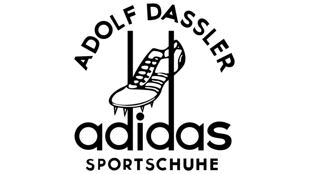
Before the feud, the two brothers released cleats that showed two stripes on the side of each cleat. This was for the mere purpose of the shoe’s bend and tightness. After the split, Adolf added an additional stripe to the two existing stripes. He realized that another company, “Karhu Sports,” had trademarked the three stripe logo. So, Adolf Dassler bought over the company to be able to have the rights over the logo. Once acquired, Adolf started using the three stripes on his footwear and his logos. During the 1920s, Adolf had famous olympic athletes such as Georg Lammers and Lina Radke wear his shoes which was a successful marketing technique because they both ended up winning medals. They were both sporting track and field shoes for the 100m and 800m race. His company’s initial logo contained the graphic image of a cleat in between two extended stems that originated from the letter ‘d’. The name ‘adidas’ sat below the cleat and it remained in lowercase san serif letters. The stems from the ‘a’ were made pointy, at an angle. The three stripes were shown on the image of the cleat. Adolf Dassler was adamant that his footwear company would be known as the three stripe company. In 1950, the company changed its logo to a wordmark in reverse on a black background. Seventeen years from 1950, the logo’s black background was removed and the pointed stems were removed from the letter ‘a’. The tittle on the ‘i’ also became aligned with the stems of the ‘d’. Although these two logos contained no graphics, the typeface remained san serif and lowercase.

The logo went through another change four years later because Adolf Dassler wanted to venture out into mainstream and casual shoes since sportswear competition started to rise. Adolf Dassler’s brother, Rudolf Dassler, was also running his shoe company, Puma, and both brothers were in an intense competition. Thus, the trefoil logo was born in 1971. Keeping the same san serif typeface and lowercase letters, a three leaf shape was added on top of the word mark. The three stripes were added as cut-outs at the bottom of the intersecting leaves. These three leaves are said to signify Adidas’ primary markets: North America, Europe, and Asia.

Logo created in 1971. I Photo by logaster.com

The Adidas logo changed yet again in 1991. Peter Moore joined Adidas as the Creative Director and he helped revamp the logo that’s iconic today. Peter Moore decided to join Adidas after visiting the company in Germany. He was known as the creative director who refreshed the Nike logo as well. While keeping the san serif typefaces, the three stripes were shifted at an angle, each stripe on top of each other, like a mountain. The message behind this new logo was to show relatability to the consumer of the obstacles athletes face towards success and owning shoes that athletes wear. Although a new logo was developed, the trefoil logo did not disappear and was used to represent the Originals series collection.

Logo created in 1991. I Photo by Adidas.com

As the new millennium approached, the company logo gained a new addition to the family, the global logo. The global logo was created in 2002 to signify that the company’s products were now being sold around the world and so the round shape was used. As always, the three stripes were used at an angle like a claw mark signifying adaptation towards change. The latest change to the logo was made in 2005 by stripping everything off except for the three stripes and the brand’s iconic lowercase name. Going back to its origins and its consistency, the logo carried the three stripes on the left side of the brand’s name. The outer black stripes align with the x-height of the text.

Up until 1978, Adolf Dassler was able to maintain the success of Adidas. With Dassler’s death in September of 1978, his son Horst Dassler took over and with his father’s trefoil logo, was able to step foot into collaboration territory. This was done in 1986 with group Run DMC where fusion between art and sports started and is now called streetwear. After Horst Dassler’s death in 1987, the company suffered a great loss and became a stock company. By 1990, Adidas would have a new CEO and creative director that were able to resurrect what Adidas has always been, the best sports company in the world.

Adidas Originals Trefoil Collection I Screenshot from Adidas.com

Adidas has now grown larger with over 59,000 employees producing over 1.1 billion sport and sport lifestyle products around the world. In 2015, thier slogan has become “Creating the New” focusing on speed, cities, and open source. I have worn Adidas shoes since my tennis years in high school. Not only did I like them because of their three stripes, but because it offered the logo in different lifestyle selections from fitness to sports and from fashion to streetwear.

Reference sources are located on the next page.

Dr. No Credits & Apple Promo Piece 2019

In the Dr. No title sequence it starts off with black and white and then proceeds into color. There are primary color of red, green, and blue being used. We also see complimentary colors such as yellow and orange. So they’re working welcome together. The shape of the circle is used continuously and no matter the amount of circles, the alignment is clear. They form rectangular or square alignments. The type remains white all throughout the sequence and is overlaid on the figures in the background. While with the circle shape, the type is aligned on either the left or right of it. In relation to sound, there is an attempt to make the circles flicker fast when the beat is faster in the audio.

In the apple sequence, the colors are complimentary to each other with colors of red, blue, etc, and circle shapes are also used. What is different is that they also used shapes that relate to the apple product or app icons. This in relation to the audio interconnected nicely because they also added actual audio that the products use. The type was also creatively used within the shapes that were created.

Visual Quote Project

In this assignment we had to choose a quote from any form of reference such as a movie line, song lyric, book, and etc. I chose the quote “Flowers do bloom even in rain falling down” from a song called LMM. This song is by Hwasa and she is a Korean artist that I have been listening to lately as she recently released her first album. LMM is a song about strength and fears, and about being able to face forward even though it seems that everyone is pulling you down. Within this quote, I see the word ‘Flowers’ as her or us, individually, and the word ‘rain’ as the obstacles coming down at you.

Before finalizing on my three pieces, I worked on some sketches to see in which direction I wanted to go. I knew I wanted to incorporate a flower because they’re seen as easily destroyed if not well taken care of. I also wanted to incorporate rain as attacks, but not leaning far away from actual rain. Here are some sketches that I started with:

Concept 1

In my first concept, I wanted to focus more on the type. I used Didot as my typeface because I like the lightness on the letters. Using the bold font, the thin stems can be seen on some letters and this resonating with me as having some fragility. In the first half of the quote, ‘Flowers’ and ‘bloom’ aretwo focal points I wanted the viewer to see so I made both ‘Flowers’ and ‘bloom’ bold. The end of the quote, I wanted the type to mimic the rain falling at a diagonal so I used italic font on ‘rainfalling down’. All the texts are stacked on top of each and both parts of the quote are on opposite sides of not only the color solid but also the page. Initially, to split up the type, I had gone with a vertical split approach and I changed it to a diagonal because I saw the ‘Flowers’ rising over the ‘rain’.

Concept 2

In my second concept, I wanted to introduce a bit of line art so I went ahead and sketched a flower and rain that look like arrows. I drew the flower coming down from the top just like the rain does because flowers usually are on the ground and it seems like the rain is attacking them. In this concept, I can show the flower blooming even as the rain falls and due to gravity, the rain would just slip away downwards. I kept the words ‘rain falling down’ are raindrops and so I also used italics to give it a diagonal visual. As for the raindrops, I gave them triangle shapes at the bottom of each one to make them look like arrows. In this case, I wanted the rain to be something hurtful to signify and enhance the sort of obstacles one has to face. Figure 1 shows these descriptions in its original form. In figure 2, I decided to add some color to complement the flower and to create an environment.

Concept 3

In my third concept, I wanted to use a photo and type to have it seem like a postcard. This is the reason as to why I have two sides. On the left I used a photo I took of some flowers I had and particularly this photo because it contained some shades of blue that give it color against a rainy day. On the right side, I also included a light blue shade to read off as calmness and strength. I wanted to emphasize on flowers blooming more and so I had the photo take over the majority of space. As for the text, the first half remained on the left side on the top of the flowers, giving it a light yellow shade so it can be legible and to correlate with the flowers behind it. On the right side, I kept the ‘rain falling down’ as italics and aligned each word on top of each other but at different starting points to mimic rain.

Thoughts on Tom Petty and Prince Video

In Tom Petty’s lyric video, primary colors red and blue against a pale white/yellowish hue. The type was between bold and script. There was contrast between the fill color used for the text against the background. There was also alternation with the colors and text. I loved that some of the text would overlap the text in the background, but it doesn’t blend because of the choice of color alternation. There was careful placement of the text fitting in with the motion graphics, as well as hierarchy. The video also had like an old style texture, almost like film. In Prince’s video, the text color and type was maintained throughout the ad. The colors were in combination with the color palette of the album and the vinyls. So, colors were mostly black and bronze. There wasn’t much play on alignment of the text, it was mostly centered and it fit below the image or by itself on a solid background. This video also gave an older vibe because actual clips of Prince singing were being used.

Riddle Me This

Pentagram’s Conundrums

These conundrums were enjoyable to see! Some favorites are “Gone but not forgotten”, “Pull yourself together”, and “two’s company, three’s a crowd”. 

  • “Gone but not forgotten” – I like the use of the white lines, one to underline and one to cross out.
  • “Pull yourself together” – It was funny because the word ‘together’ was too close to each other and that when I thought of the meaning.
  • “Two’s company, three’s a crowd” – This one was simple and straight forward. It also felt crowded within the space.

There were some others that aligned the words on their sides, and that was fun to me.

Thoughts on Obama Logo Development

Before starting the design development, research was done about previous logos. From here, search involving colors, or messages, and candidates were done. This really helps to check what kind of message the campaign is working with and what direction they decide to go with. It really is interesting that a new direction or change was the goal but they also chose something that followed tradition, for example the colors used. I like the one they chose but I have to say that I liked the 2nd final option. Maybe it connected with me because of where we are now in terms of social technology.

Gutenberg Bible Versus Books Today

Differences/Similarities

– There are no page numbers: We use numbers now to know where we left off or to find something we’re looking for.
– Illustrated Text: The initial letter seems to be used to separate paragraphs and they are hand drawn with intricate design/details. Much of the illustration used now is digital
– Separation of text: There is no separation between paragraphs or where something ends.
– The use of colors to fill in text isn’t done anymore, and the use of colors are more so with educational books or media spreads. 

– The text in columns: Usually the format with columns of text are used in magazines or newspapers.
– Big initial lettering: Although it is not apparent in every paragraph, some books do contain chapters with a big initial letter size.
– There seems to be some form of commentary or text on the side which can be found income educational books or even us when we like to notate notes.
– The margins space is reduced much smaller depending on the book but it’s still used when deciding where to place text.

Dr. King’s Major Drum Speech

After watching/reading Dr. King’s Drum Major Speech, it gave me something to think about. It resonated with me because through observation I was able to see much more within people and society. The message within the speech was meaningful and powerful. He talked about the Drum Major instinct that we all have within us. This instinct is equal to the basic drive of human life and therefore when it comes to advertisers, we are taken by the persuasion. The Drum Major instinct is our sense in wanting to be better than the other and being the first or gaining attention. In terms of advertisement, he mentions how we are taken by it and even buy the products sold to us, because we would want a better car or a better home or have the latest product. It was an interesting analogy that he also intertwined with religious beliefs as well. 

After watching the RAM commercial, I can understand the intent of using part of his speech. Maybe it was controversial because it was a truck/car commercial, and the speech was much more than that. I neither hate it nor love it, but I understand the meaning as a whole.

Thoughts on the Original Apple Commercial

I really love the commercial because it was unique. They had one message or focus to give with this ad, which was how the computer will change everyone’s lives. It was the idea that society as a whole was going up against something new, a change. They ended up playing it that one time during the Super Bowl, which also gave a whole new meaning to have commercials were run during Super Bowls. In the recent remake parody from Fortnite, you can see the message of Big Brother being portrayed as Apple. Apple is the Big Brother they’re taking a stand against.

Nassau County Museum of Art Virtual Tour

Due to the pandemic we are going through at this time we are limited from the places we’re allowed to go to. Instead of going in person our class was able to go through a virtual tour for the blue exhibition at the Nassau County Museum of Art. This exhibition displayed multiple art pieces from various artists that have incorporated the color blue.

There are three pieces that have caught my eye and recognized. The first piece I enjoyed was Yves Klein’s Venus Bleue done in 1962. This piece resonated with me because I had done a presentation on his famous photography piece called Leap into the Void. He was very fascinated with the voidness and the whole concept of capturing the invisibility of art that we don’t see until after. His famous pieces are the monochromatic with the color blue so much so that the color International Klein Blue was created. This piece, Venus Bleue, is a painted plaster sculpture representing the greek goddess in a more modern way. By using sponges and rollers he was able to apply the paint to create textured surfaces.

Another piece that caught my attention by its dreary look was Deborah Turbeville’s Unseen Versailles: Aurelia Weingarten done in 1980. This is a small print photograph measuring in 9 x 13 inches. What caught my eye was a statement that Turbeville said, “I like to hear a clock ticking in my pictures”, and this statement is something that I do feel when looking at it. The photograph has a woman laying on the ground and the color overall is a pale blue, almost deadly. The gradation of blues get darker on her making her the focal point. It invites feelings of dread, mystery, and something dark. It felt like I was in a fogging dream of fear. This image is one of many where she explores a different approach rather than the work done by other photographers who brightly lit the models.

The third piece that I enjoyed was Pablo Picasso’s lithograph Buste de Femme done in 1902. This piece was part of the series of works he has done during his blue period. I mainly thought of this piece because it is Picasso and another piece from his blue period I loved is The Old Guitarist done in 1903. For Picasso, his blue period was the reflection of poverty and sadness. It is said that the color blue is meant to calm and give a feeling of serenity, but in both pieces I’ve mentioned he uses darker tones of blues. The darker tones mixed in with little hints of lighter blues gave me a sense of distance and heaviness. I also like how he chose to paint the heads at a downwards angle, which emphasizes more of the sadness or gloom.