Parallel Lines That Show Movement: project #1

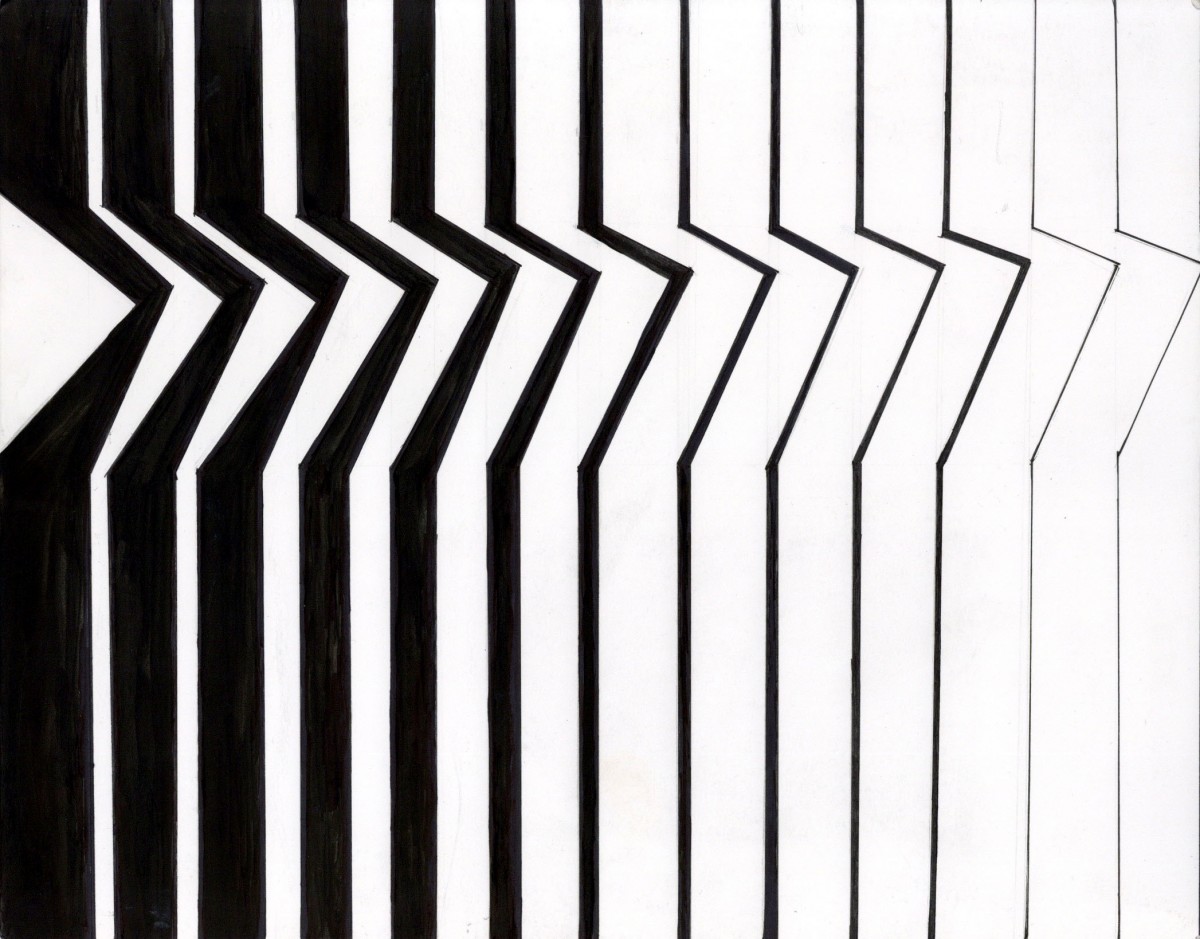
This Project was my first assignment for this course. I think for my first project it was a good introduction to the rest of the projects in the class. I found the project very interesting because I was forced to think outside of the box. I definitely think I broke out of my comfort zone in this project including all the other projects done in this class. For this project, I had to create parallel lines that showed movement. Starting with the thumbnail sketches I struggled with the first 4 that I had done. I think this project included some trial and error especially when it came to the thumbnails. When I finally had my selected composition I had to draw it on the bristol paper. When drawing it on the bristol paper I had to measure where I was putting drawing my lines to make sure I filled up the whole page. Since this was my first project for this class I was using new materials that I had no experience with. Using the FW ink to fill in the Large black areas was a new experience for me. For this project I actually had two attempts, my first one is where I messed up with the ink where I used too much of it and it spread all over the page. My second attempt was successful though. Overall I think this was a fun project to do but, If I could change one thing it would be the white triangle space on the left side. It seems very out of place to me and should have been filled in.

Texture exploration and organization: project #2

For this project I had a confused experience with it. At first I didn’t know what to do with the textures that I had found. I think what I struggled with the most was arranging them on the bristol paper. When I was arranging my textures, my first instinct was to arrange them by color. I arranged them horizontally by color for example, the last row textures are arranged by orange tones. After arranging them by color I noticed that a majority of my textures had a large focused scale and a small very detailed scale. After discovering this I rearranged them based not only by color but by their scale. The textures that have large focused scales are placed towards the outside, while the textures with a small scale were placed on the inside. Something else that I struggled with was finding textures to use. Many magazines had some good textures but many of them also had textures that resembled things such as hair or fur. For this project I think it was important to choose textures that were more abstract. If I could do this project again I think I would had tried to find better textures because some of my textures are based on things such as human hair or plants.


Composition and Transparency: project #5

My experience with this project was enjoyable. I thought this was very interesting to do because I never created a composition before the way I did for this project. I found doing the quick sketches on the newspaper in class very fun. I never thought about how you can create many sketches so quickly and it’s definitely something I would do again for future projects.  Although the process was frustrating at some points, I did enjoy it and It forced me to ask myself questions. For example, I found asking myself if the overlapping of the different shapes work together. I think the most frustrating part of this project was arranging the shapes to create a composition. I found myself having to create different arches to create a composition that fitted the requirements for this project. When it came time to paint my composition I ran into some problems. My paint mixtures for the transparencies were not accurate at first. For example, My red arch transparency had too much blue. I was able to correct some of those transparencies by painting over them, although some of them could have been done much better. The hardest transparency for me to paint was the overlapping of the yellow line on top of the circle and arch. Creating the right color mixture for that one particular transparency was the most difficult part of this project for me. If I could do this project over again I would probably have chosen a more muted yellow tone then a bright one. I also would also make the yellow line a different color. I decided to tint the background a tan-gray color because I thought it would best compliment the colors I chose such as blue, red, and orange.