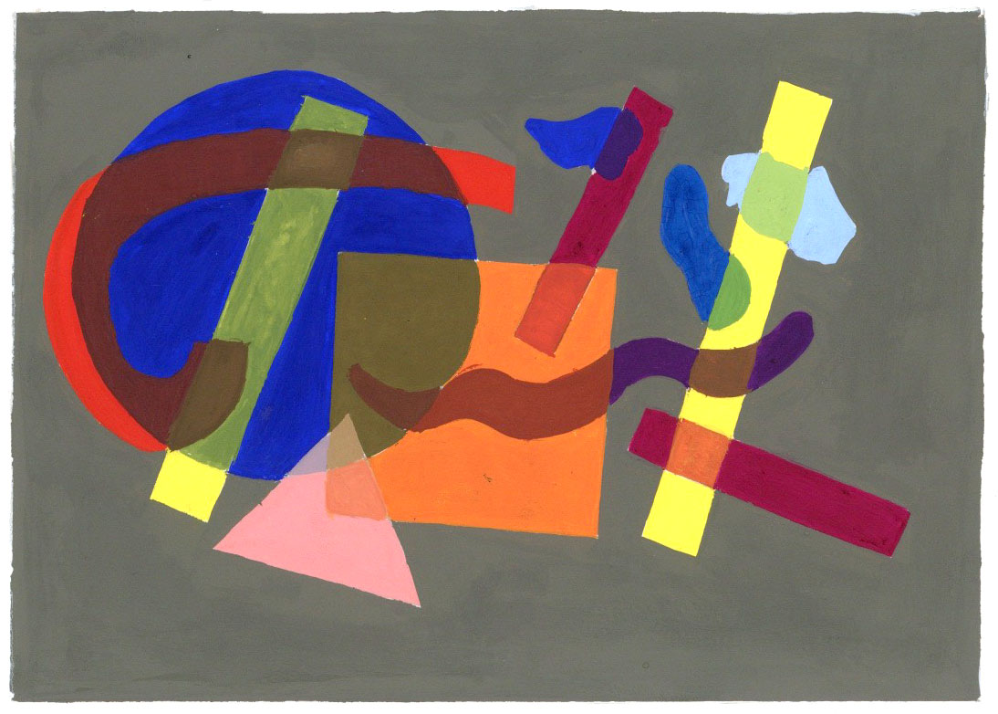
My experience with this project was enjoyable. I thought this was very interesting to do because I never created a composition before the way I did for this project. I found doing the quick sketches on the newspaper in class very fun. I never thought about how you can create many sketches so quickly and it’s definitely something I would do again for future projects. Although the process was frustrating at some points, I did enjoy it and It forced me to ask myself questions. For example, I found asking myself if the overlapping of the different shapes work together. I think the most frustrating part of this project was arranging the shapes to create a composition. I found myself having to create different arches to create a composition that fitted the requirements for this project. When it came time to paint my composition I ran into some problems. My paint mixtures for the transparencies were not accurate at first. For example, My red arch transparency had too much blue. I was able to correct some of those transparencies by painting over them, although some of them could have been done much better. The hardest transparency for me to paint was the overlapping of the yellow line on top of the circle and arch. Creating the right color mixture for that one particular transparency was the most difficult part of this project for me. If I could do this project over again I would probably have chosen a more muted yellow tone then a bright one. I also would also make the yellow line a different color. I decided to tint the background a tan-gray color because I thought it would best compliment the colors I chose such as blue, red, and orange.

