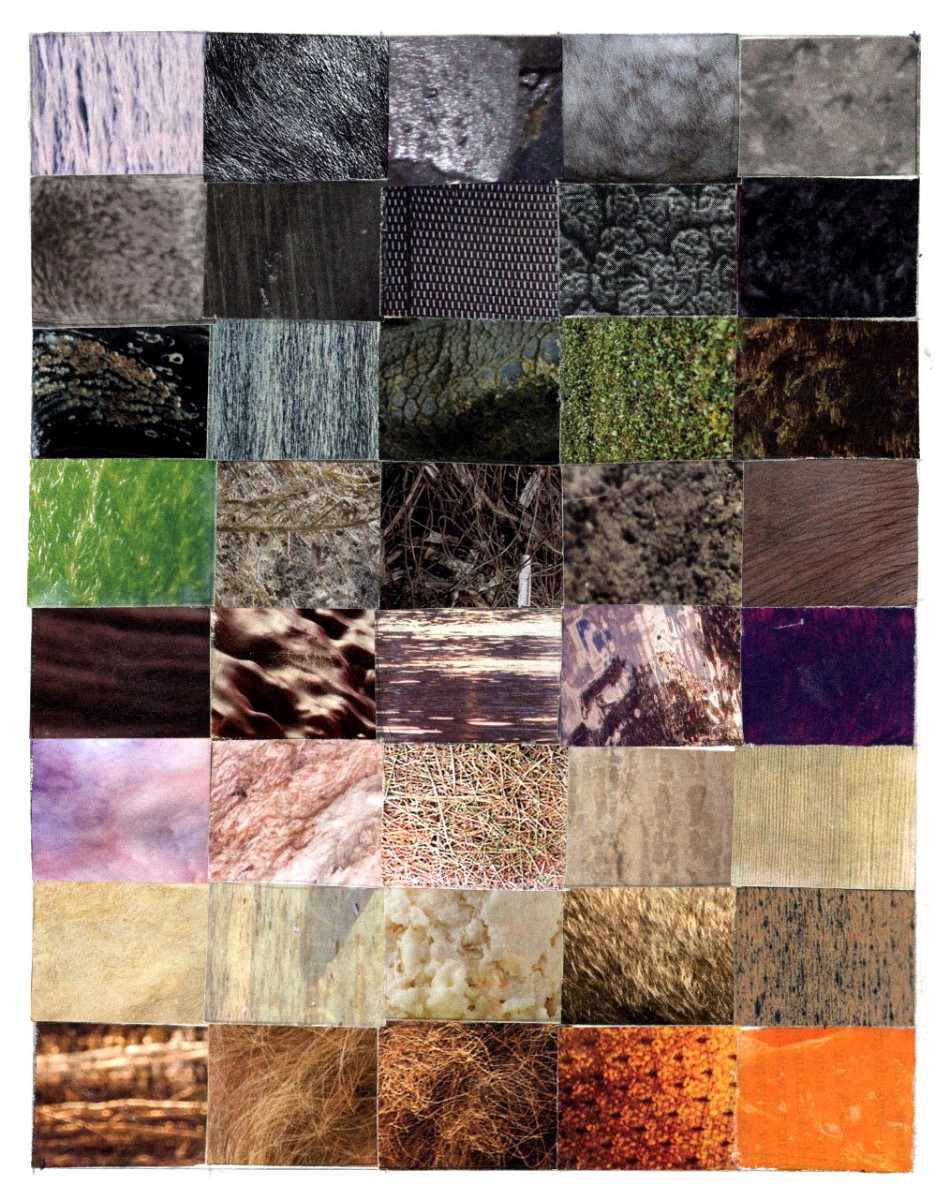
For this project I had a confused experience with it. At first I didn’t know what to do with the textures that I had found. I think what I struggled with the most was arranging them on the bristol paper. When I was arranging my textures, my first instinct was to arrange them by color. I arranged them horizontally by color for example, the last row textures are arranged by orange tones. After arranging them by color I noticed that a majority of my textures had a large focused scale and a small very detailed scale. After discovering this I rearranged them based not only by color but by their scale. The textures that have large focused scales are placed towards the outside, while the textures with a small scale were placed on the inside. Something else that I struggled with was finding textures to use. Many magazines had some good textures but many of them also had textures that resembled things such as hair or fur. For this project I think it was important to choose textures that were more abstract. If I could do this project again I think I would had tried to find better textures because some of my textures are based on things such as human hair or plants.


