Graph Analyze – Kayla Prensa

The two graphs i chose was the one that speaks on U.S. Wine Drinkers Among All U.S. Adults (2014) and the graph that speaks on The Wines we Drank in 2011 from this weeks powerpoint. On the first graph what caught my eyes and i couldn’t believe was the percentage of people that are high frequency wine drinkers. I thought that the percentage would of been a lot lower because of the fact that there’s a lot of people who prefer hard alcohol then just wine. Something else that caught my eye was the percentage of people that don’t drink any wine or alcohol which is 35%. The 35% blew my mind away because I thought that a huge amount of people drink wine after a long day of work or even just to be relaxed on a beautiful Saturday afternoon, but then that helps me understand the percentage of people who are occasional wine drinkers which is 29% of adults in 2014.

Although I don’t know much about wine. I have a sister who enjoys he wines on occasions so some of the names of the wines come natural to me. On the graph that speaks on The Wine We Drank in 2011, it didn’t shock me to see that 28% of market share by sales was Chardonnay because Chardonnay in my opinion has a light fruity taste to it and it goes down smoothly as well.

Analyze Information

Understanding Beers

A beer is defined as an alcoholic beverage. It is made from four ingredients namely; water, barley, hops and yeast. Barley is the main ingredient that gives beer its color and taste. The sugar in barley is mostly converted into alcohol. Hops lend natural preservative to beer along with bitterness and a range of aromas and flavors. In the production process, barley is allowed to germinate where starch burns into sugars, then dried and roasted in a kiln. It is then added water and malted barley.

Hops are then added into the hot, sweet liquid before fermentation takes place. The resultant mixture is then boiled in a kettle. The mixture is then allowed to ferment for 7-10 days. The fine mixture is thereafter carbonated and bottled. There are two types of beer, Ale and Lager, Ale is what is at the top fermenting and includes; porters, stouts and wheat beers. Lager on the hand is what is at the bottom fermenting and includes; pilsner, Bock and double bock.

            It is interesting just to discover how easily the beer making process is. I always thought the different types of beer are made separately. Knowing that they are only separated by the distance of fermentation in a jar is quite a revelation. And then again there can be two types of fermentation. That inside a fermentation jar and that which that can be allowed to take place inside a bottle after bottling. The simplicity in the making of beer makes one to think of starting a beer making industry just inside his house though in small portions. It was great learning process.


Wine and Beverage Management

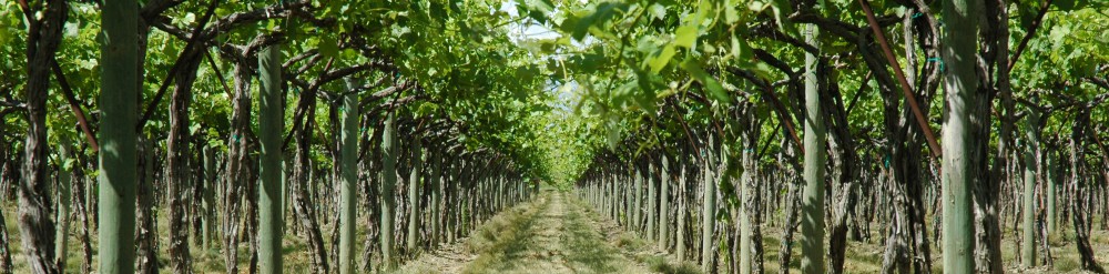
There are several factors that affect the taste of wine. These include; grape variety, soil, climate, viticulture, oenology, physical location and the luck of the year. Grape is the main ingredient in the making of wine and which determines the taste of wine. Several factors are considered while choosing what type of grape to use in particular making of wine. The species, variety, clone; cross and hybrid are factors determining the taste of grape.  Looking at the plant itself, it undergoes a series in its life cycle throughout the year. It begins with the Dormant, then the bud-break, followed by flowering, then maturity, then harvest and back to dormancy again.

Grape is grown under several types of soils. These include; chalk, sandy, gavel, flint, limestone and sandstone. It is also grown in clay, silt, sand and rock and stone. These soils should show, heat retention, fertility, minerality and drainage. Grapes enjoy where there is latitude, elevation, aspect and where there is proximity to water. Effective growth of grapes undergoes viticulture and oenology processes. Viticulture is the science of growing grapes that include vineyard management, life cycle of the vine among others. Oenology is the scientific study of wine and wine making. It includes harvesting, sorting, fermentation, blending, fining and filtering then aging. Grapes are affected by the insect Phylloxera that feeds on the roots and injects its waste into the roots.

In the production of fine wine that is of top quality, commands that the source of grapes should be high class. I have at least understood why some of these farms that grow grapes put very strict emphasis on quality growth. The care and tending of this plant is no mean feat. It is a very sensitive plant that demands an all-round care and observation.

Analyzing graph- surendra karki

The two graph I have chosen are “Total table wine consumption” and ” The wine we drank in 2011″.
The graph of total table wine consumption represents the consumption of cases of wine from 2001 to 2012.It give a clear picture, that the wine lover has never decreased in the past 12 years.The trend shows that every year there is gradual increment of wine consumer.In 2001,the consumption of wine was 207 millions cases and by the year 2012, it reached to 295 millions of cases.

The second graph, “The wine we drank in 2011” gives a clear representation of types of wines that we used the most. Chardonnay(28%) and Cabernet Sauvignon(20%) has ruled the half of the market share in the wine industry in 2011.The other major wines are Merlot(12), Pinot Grijio (11%), Pinot Noir( 8%), Sauvignon Blanc(6%) and rest 15% is ruled by rest of the types of wines. I personally think that the data given is perfect because I work in a restaurant as a server and these are the major wines consumed in the store.

Analysing Graphs

The two graphs I have picked for my analysis are the bar graph Total Table Wine Consumption for the years 2001 -2012 and the pie chart  All U.S. Adults in 2012, which illustrates the percentage of adults in the U.S. that partake in wine consumption. The first graph illustrates a steady increase in total table wine consumption in cases by the million. In 2001 total table wine consumption was 207 million cases and increases in 2002 by 13 million cases to 220 million which was the biggest increase for the years in question. The second significant increase during these years occurred in 2003 with an increase of 10 million cases of wine being consumed for that year. By the year 2012  U.S. consumption had increased to 295 million cases. This amounts to a total increase of 88 million cases of wine being consumed in 2012 when compared to 2001. In the second table it is reported from the Wine Market Council that in 2012, 25% of U.S. adults were high frequency wine drinkers, 19% were occasional drinkers, 34% did not drink wine or were abstainers and 22% drank alcohol but not wine. This breakdown is slightly different for 2014 according to  the Wine Market Council. It is now estimated that high frequency wine drinkers have been reduced to 15%, occasional drinkers have increased to 29%, abstainers have increased by a percentage to 35% and the amount of people who drink alcohol has declined by a percentage to 21%. So it appears that although high frequency drinkers have declined significantly, occasional drinkers have improved significantly and at least a wider variety of drinkers of wine is now present in the market. This is good news for wine producers all over the globe.


Analyzing Graphs – Annalise Cupo

The two graphs I chose to analyze were “Table Wine Volume Share by Color” and “Consumption by Color” in this week’s PowerPoint.  “Table Wine Volume Share by Color” gives us a visual representation of how the percentages of different colors of wine such as red, white, and blush fluctuated over the span of 18 years.  I noticed that red wine was the only wine that increased each of the 4 years that is shown on the graph.  Interestingly, the percentage of blush wine began at 34% in 1991 but decreased less than half its original percentage in 2009 when it was only 13%.  White wine seems to be in the middle of this spectrum because although the percentages slightly decreased, they remained in the 40% range out of 100% throughout the 4 years.

In the graph titled “Consumption by Color,” I found it interesting that more red wine was consumed by the younger group of people and more white wine was consumed by the older group of people.  Also in this graph, blush/rose wine appears to have a close tie between the younger and older group as there is only a 1% difference in consumption.

Analyzing graphs – Minela Dervisevic

The two graphs I selected are, “Table Wine Volume Share by Color”, and “Past Year Direct Wine Purchases, 2010”. What was interesting to me was that red wine drinkers increased from 17% all the way up to 47% from 1991 to 2009. On the other hand, white wine drinkers decreased from 49% to 40% during that same time frame. As well as blush wine drinkers. This fascinated me because amongst my circle of friends and family, the majority enjoy white wines. However I do think a big cause of this is due to health related reasons to obtain a healthy heart red wine may help. Also with a lot of meals red wine is preferred over white and may be more popular in certain communities.

The other graph, “Past Year Direct Wine Purchases, 2010”, shows the percentage of bought wine at a winery at 37% versus purchases from a winery website at 14%. I do not doubt these statistics because as a consumer, I would prefer to go to a winery and observe the atmosphere and possibly taste the wine that I am considering purchasing. It is more personable when a consumer is watching, feeling and tasting rather then behind a computer screen reading the description of a bottle. It also may be easier to sell in person when someone is speaking positively about the brand or origin of the wine, rather then not online.

Analyzing Graphs – Amanda Valdes

The two graphs I chose from the power point are “Table Wine Volume Share By Color” and “Storage”.

“Table Wine Volume Share By Color” shows what I would call a “popularity contest” proven by U.S supermarkets. In 1991, red wine was not as popular and was not consumed as much as white wine was. Over the years red wine has become more popular and consumed while white wine only decreased by 9%. Blush held 34% out of 100% in 1991 and looking at 2009 it shows that it had decreased to less than half.

“Storage” is one of the many interesting slides I’ve come across in this power point. It is interesting to know that wine was and probably still can be kept in caves. To maintain and keep your wine fresh you have to specifically lay it a certain way. It also has to be at a consistent temperature, have no sunlight, and at 75% humidity. One question that came to mind after analyzing these facts was, “Where do they store wine nowadays at 75% humidity?” I’m sure the wine seller won’t be wearing a jacket.

U.S Table Wine Drinking Frequency+Volume shared by Color

The US wine industry should breathe an air of optimism considering that Wine consumption in the US is continued to soar. According to the latest findings, 57% of all table wines drinkers in the US are labeled as the Core drinkers because they consumed the most amounts of wines, as they represent 25% of the US population. Moreover, this same group drinks and buys 93% of all the wines available for sale at that time. Conversely, 43% of table wines drinkers are considered as marginal drinkers, which mean they drink wines less often or occasionally, as they represent 19% of the US population. In addition, this exact group drinks and buys 7% of all the wines available for sale at that period of time.

Equally important, is the color of wines purchased in the US, during the years of 1991, 1995, 2008, and 2009. According to the graph, White Wine is the most preferred color of wines for consumers, followed by Red Wines, and Blush Wines, at a distant third place, and with a 95% combined between of all the 4 years cited.