Contents
Class Info
- Date: Monday 9/18
- Meeting Info: Room P114
Topic
- >> Week 3 Lecture : Information Design A Brief History
- Introduction to Project 1:
Activities and Lab Time
- >Overview about ways of organizing and arranging information: >>www.artorium.com
- >>The Data Visualisation Catalogue Take a peak at the Data Visualisation Catalogue, a project developed by Severino Ribecca to create a (non-code-based) library of different information visualisation types. The website serves as a learning and inspiration resource for those working with data visualisation.
- Introduction to Illustrator and its graph tools based on a simple class survey: >> See Week3-Files in DropBox
Homework
- Read:
- Browse research tips posted here: >>Lesson/Research
- Review Introduction to Project 1 Overview above and work on:
- >>Activities/Assignment 1: Research Due Week 4: 9/29
Please make a folder with your name and save your research word doc or PDF into the >>Project 1 Phase 1: Research Dropbox folder
- >>Activities/Assignment 1: Research Due Week 4: 9/29
- Review the following website: >>Lesson/Inspiration
Find an excellent example of each of the following (copy and paste the URL to the comment part of this blog):-
- 1 Info Graphic
- 1 Diagram
- 1 Flow Chart
-
- For additional support on creating graphs in Illustrator watch this tutorial:


so, for me my inspirations for a:
Thanks for sharing Joseph! Interesting examples. Some are so beautiful but it can be hard to decipher what the story is – what information is being presented and does it have meaning.
Infographic: https://www.lucasinfografia.com/Intermarriage
Diagram: http://13pt.com/projects/sciam/
Flow Chart: https://www.jenchristiansen.com/#/cosmic-inflation/
Here are the examples I found on Pinterest:
Info Graphic- https://pin.it/3cdOT6c
Diagram- https://pin.it/1BiKpMy
Flow Chart- https://pin.it/7bc0q38
Hi Sadman, Browse and choose designers/projects listed here >>Lesson/Inspiration I want you to become familiar with some of the work posted here. You might also be able find more context about the projects which is key to finding inspiring information design.
https://www.youtube.com/watch?v=MVmFSDlQQyU
http://www.5wgraphics.com/en/gallery.php
https://www.jenchristiansen.com/#/cosmic-inflation/
More examples:
https://www.lucasinfografia.com/Indian-success
http://giorgialupi.com/mindworks
http://www.5wgraphics.com/en/gallery.php
Some great examples. Thanks Iqra!
Here is my inspiration
Infographic –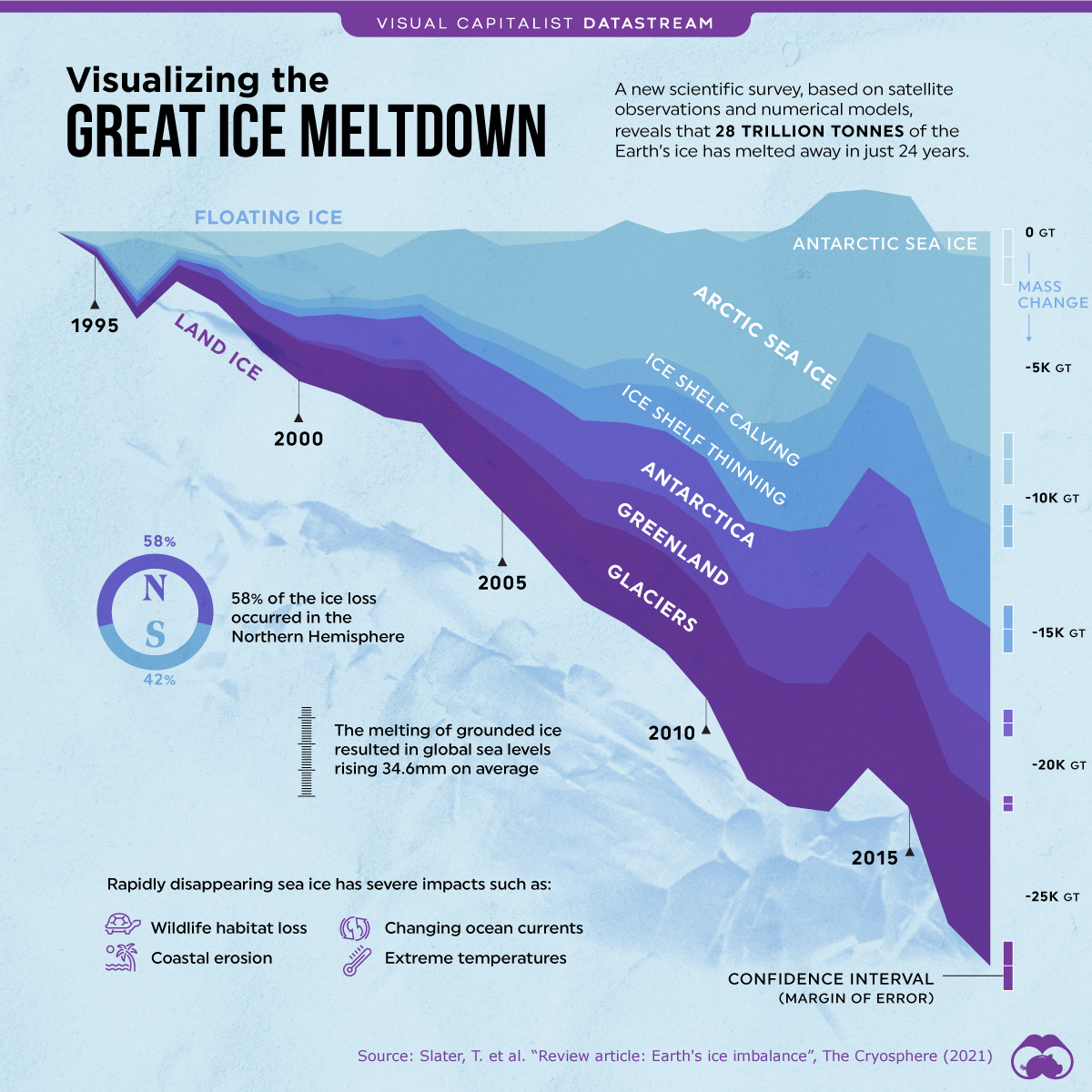 ” rel=”nofollow ugc”>
This infographic of the ice caps is visually appealing but also holds a lot of information which I thought would be good for my future infographic
Diagram – ” rel=”nofollow ugc”>
I thought this diagram was very straightforward and easy to understand. I also thought this one was visually appealing
Flow Chart – ” rel=”nofollow ugc”>
This flow chart also stood out to me because of how it was presented with leaves instead of circles. It was more creative than previous ones I have seen
Thanks Maria. Who was the designer for these?
Did you browse and choose designers/projects listed here >>Lesson/Inspiration You might also do so. I want you to become familiar with some of the work posted here.
Here is my research and a list of designs I found interesting!
https://docs.google.com/document/d/1EDO5noZkuuxLj6egWNTpOfBJnkfsm52S52o-5KwDg5g/edit?usp=sharing
Hi Angela, Thanks for sharing. Where did you find your inspiration? Make sure you also browse the list here >>Lesson/Inspiration
https://www.facebook.com/1392926107618513/posts/the-ultimate-mechanical-keyboard-infographic-by-superanked-a-helpful-cheat-sheet/2954947224749719/ – Here is one of my findings of a custom Mechanical Keyboard for an infographic
https://www.pinterest.com/pin/313422455294362957/ – a funny flow chart I found about adopting a pet.
Examples of:
Info Graphic: https://www.pinterest.com/pin/111323422030455278/
Diagram: https://www.pinterest.com/pin/618963542525052236/
Flow Chart: https://www.pinterest.com/pin/766104586627119709/
Here are my links. I thought all of these were really interesting from a visual point of view. It’s funny how many half finished information design images you can find on the web.
Info Graphic- https://www.behance.net/gallery/119300985/Infografia-direccion-administrativa
Diagram- https://worldarchitecture.org/article-links/echvm/mini-s-first-project-in-shanghai-transforms-former-paint-factory-into-a-coliving-concept.html
Flow Chart- https://www.informationisbeautifulawards.com/showcase/3485-screen-printing-flow-chart
Infographic – “>
“>
 ” alt=”” width=”” height=”” />
Flow Chart – http://13pt.com/projects/taxmap/
Infographic: https://informationisbeautiful.net/beautifulnews/636-phasing-out-hfcs/
Diagram: https://johngrimwade.com/D1.html
Flowcharts: https://giorgialupi.com/bullettin-of-the-atomic-scientists