Category Archives: Uncategorized

MAT 1190 Assignment#2


Largest Population Graph 


This is bar graph and it represents the highest populations in the world. As you can see China has been number one for years and still has the crown and the rest seem very small compared to China besides India they are basically right next to each other. This is a very basic bar graph but I just wanted to show that graphs are for everything not just in math, we will see different types of graphs in our life.

Graph Assignment

This is a very interesting bar graph, it represents the population structure in New York. The x axis of the the graph represents the population number in thousands    and the y axis shows the age rang starting from 0 to 80+. For each age group there is a four year gap in the ages. Both graphs besides each other makes a comparison between the male and female gender and their ages. From studying the graph it is evident that both male and female highest population is around 480 at ages 40-44. Whereas the lowest population is in the age group of 80+.  I chose this graph because it is very clear on the information it is representing and also it allows us to make comparison.

MAT 1190 – Assignment #2

historical-gasoline-prices-in-california-2014

CBS news recently wrote an article called “Why are gas prices going up again?” In the article it showed gasoline prices in California in the year 2014. As you can see prices dropped tremendously last year, however prices slowly started to rise again in 2015. This concerns me because I am moving to California and I can not rely on public transportation.

Assignment Number 2

CoDGraphChronological-1

http://www.vgchartz.com/article/250163/call-of-duty-a-sales-history/

the article shows that as call of duty keeps going its sells goes up. but as time goes on the buzz isn’t going up by much based off the showing of the graph. based of the last 2 releases being so close in sells. concluding the game hype has not gone up at all.

this chart is interesting because it shows how call of duty sells are on the raise and more and more player are getting the game. and the amount sells have increased by so much.

Image

Graph Assignment 2

mta_0This  graph shows the increase of MTA fare from  1904 to 2015, and it really seemed interesting to me, since I really wanted to know more about how was the price of the MTA fare in the past compared to now.  As we can see this graph is a bar graph that shows the price per trip, and in the x-axis we see the years and in the y-axis we see the fare rate. I went to the website and they gave me more information about this cool graph and it was quite saddening to see that prices were very less expensive and now the prices went up out of nowhere.


http://www.newsweek.com/mta-fare-hike-less-terrible-you-think-301348

This link above is the site where I got my graph from and it tells a lot of detailed information about the rise of the MTA fare.

Assignment #2

Animal speeds

https://www.superteachertools.net/jeopardyx/answerkey.php?game=1400529459

Here is a simple graph on top speeds of a human and varies animals. This is a good graph to teach children on how to read a graph.


Assignment 2

         GRAPHS-AND-CHARTS

Bar graphs are very interesting because with them we can compare different topics with which we can get inform and learn how different we are. In this case this bar graph is about how many people speak a language and which is the most widely spoken.


Image

Math 1190 Graph Assignment # 2


download

While looking for newspapers articles with graphs. I found the article on www.usnews.com.  The article talks about the solar wind and other green energy sources had a leap in investments last years. That 17 percent worldwide is reversing two years of decline.

The link is  http://www.usnews.com/news/blogs/data-mine/2015/03/31/solar-wind-investment-surge-reversing-2-year-decline

Assignment 2

20150328_gdc662

This graph tells which parts of Europa are the most happier. The Economist article  reported the happiness on a self-reported survey. The Scandinavians were reported as the happiest people in Europe and also retired Danish women were the most cheerful among them, the reporting happiness score was 8 out of 10. the article said that, “…geography is the best predictor of merriness, followed by pay.” meaning that money is what makes people  happy. However, it says that even the poorest people, the Danes, are the most joyful than the richest Greeks could be. The article also discusses the factors of unhappiness; procreation, money and where they live. In the southern part of Europe families that have children are more happier, whereas the British and Irish are the only people who were sadder when they have children. Debt crisis and financial woes makes people unhappy as well the place where they live, whether is a rural or urban. It was stated that a rural life is better place to live because people feel more happier there.

Reference:

http://www.economist.com/blogs/graphicdetail/2015/03/daily-chart-13?fsrc=scn/tw/te/bl/ed/statedpreferences

Image

MAT 1190 Quantitative Reasoning(2015)

imageWhile searching for a newspaper article I ran across this very interesting article which also had attached. The article titled ” Data points to behavioral health as a growing challenge for pediatrician’s “, Written by Iyve Sung informed readers about the research with Athena health.

for those who may not know Athena health is an American company that provides cloudbase services for electronic health records and more. This research explains that weather mental health conditions are becoming more common medical community is paying more attention to thembehave real health is becoming A greater component of the pediatrician’s workflow. Although pediatricians well for many patients to specialist, the front mine for diagnosis is still the pediatric practice.

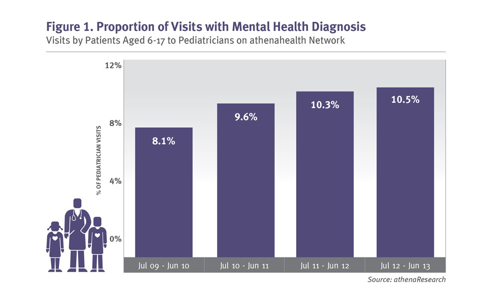
this bargraph was used in this article to show the prevalence of increased mental health diagnosis for pediatricians on anthenaNet. From July 2009 through June 2010, 8.1% of visits with children ages 6 to 17 involves a mental health diagnosis.three years later that rate increase to 10.5%, a proportional rise of 29%.

On the Y axis of this bar graph shows the preset pediatrician visit. On the X axis of this bargraph Shows The visits by patient’s age 6 to 17 in the month of July 2009 to June 2010, July 2010 to June 2011, July 2011 to June 2012 , And July 2012 to June 2013.