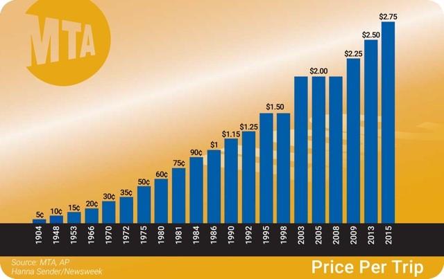
 This graph shows the increase of MTA fare from 1904 to 2015, and it really seemed interesting to me, since I really wanted to know more about how was the price of the MTA fare in the past compared to now. As we can see this graph is a bar graph that shows the price per trip, and in the x-axis we see the years and in the y-axis we see the fare rate. I went to the website and they gave me more information about this cool graph and it was quite saddening to see that prices were very less expensive and now the prices went up out of nowhere.
http://www.newsweek.com/mta-fare-hike-less-terrible-you-think-301348
This link above is the site where I got my graph from and it tells a lot of detailed information about the rise of the MTA fare.


It’s interesting that you chose a graph which seems to contradict the title of the article. Exactly how was the graph used in the context of the article. Did the graph take into account inflation? In my opinion, unless it has done so, it is misleading at best.
According to the link, the title of the original article is The MTA Fare Hike Is Less Terrible Than You Think . This very graph used in here only simply shows the increasing fare of MTA as time goes on, which can’t convey the author’s original thought, because the only used graph does not show any increasing operating cost of MTA, such as the increasing cost of electricity, laber and so on. To convey the original thought completely and exactly, we should also use other graphs besides this one, showing the factors leading to the increase of MTA fare. comment by Meizhu Deng