
This baragraph represents the population of the united states and how it has grow tremendously over the course of a 12 year span.
This baragraph represents the population of the united states and how it has grow tremendously over the course of a 12 year span.
The OpenLab is an open-source, digital platform designed to support teaching and learning at City Tech (New York City College of Technology), and to promote student and faculty engagement in the intellectual and social life of the college community.


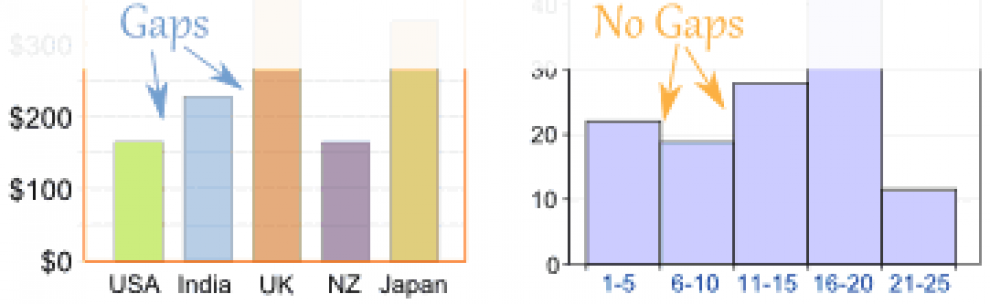
Actually, this is an great example of a potentially misleading graph. From the graph, it looks like the population has grown from virtually nothing up to its present value. If you look at the numbers, however, the population has grown by less than 10%, in other words, less than 1% per year. I know that in class, I indicated that you do not have start from 0 (and in fact said shouldn’t), but I think a lot depends on what you are trying to show. In this case, starting from 295 allows us to see that the growth from year to year is quite steady, meaning a straight line would model this pretty well.