Some Good Advice for Young Designers

Some of you may have decided to do graphic design because you thought that it would be easy. There is nothing easy about it. It is an industry that is very saturated, so if you want to stand out and go far, you will have to work at it. You will spend many sleepless nights trying to prefect a project… sometimes starting over and over again. The interesting thing is that if you are truly made to be a designer, you will almost enjoy those sleepless nights. You will be so caught up in your creative energy that you will forget the time.

A few weeks ago I came across this article, Advice for Young Designers,  and thought it was good to share.

Here is an excerpt…

In order to be good at what you do, you have to work hard. Put in the extra hours and make it as good as it can be. Do the effort and you will benefit from it. Constantly improve your craft and challenge yourself to do something that makes you uncomfortable. Trying something new and pushing yourself is what makes us grow as designers. Some of our best work comes out of it.

Please take the time to read the entire article because there are some good tips there… read complete article here.

Logo Evaluation: One World Trade Center

One World Trade Center LogoAs you may know from the construction down at the World Trade Center, a building is going up to replace the Twin Towers. A London-based company has designed a logo for the new building. Take a look at the other variations and answer the following questions. THIS IS A REQUIRED ASSIGNMENT. LEAVE YOU ANSWER IN THE COMMENTS SECTION.

Take a look at the different variations… (click here)

What is your perception when you see this new logo? Do you like it or not? What about it do you like or not like? Of course the events of 9/11 were very tragic, and even almost 11 years later, memories are very emotional for some. Does the logo evoke certain feelings or emotions for you? Do you agree with some of the comments in original post?

NOTE: ADD YOUR COMMENT ON THIS PAGE, USING THE REPLY BUTTON AT THE END OF THIS ENTRY.

Students, if you  have not visited the construction going on down at the WTC, I recommend you take a train ride down there. As residents of the city, you should at least know what is going on. ONE WORLD TRADE CENTER is the address of the new building replacing the Twin Towers. The name of the building is the Freedom Tower. Don’t get hung up on 9/11. Answer the questions in light of the design as a designer.

A Lesson in Letterpress

Here is an article that gives a very good history of letterpress printing. Letterpress 101 offers a video demo of the letterpress printing process and an essay that reviews the history of printing—starting with the Gutenberg press. As you read the article you will definitely recognize a few familiar names. Are you surprised that a press as primitive as the letterpress is still used? Considering what we’ve learned so far, what type of projects would this press be best suited?

Using a Typeface to Improve a City’s Image

Can a typeface really help to improve a city’s image? There are a few people in Chattanooga who think so. It’s a project of a few designers and brand specialists. The city has begin going through a comeback and the designers want the city to accentuate the city’s potential to become the “Silicon Valley of the East Coast.”

Excerpt from Can a Font Help a City Make a Comeback?

Known in the 1960s as one of the country’s filthiest cities, Chattanooga has managed to clean up its act and its image in recent years, with a redeveloped riverfront and an artist relocation project. But the city’s “brand” is out of date and doesn’t live up to the creative energy on the ground, according to the team members.

Take a moment to read the full article and tell me if you think a font can help a city rebrand itself. If New York City had it’s own font, what aspect of the city would the typeface design portray?

Western Typefaces—A Quick Look

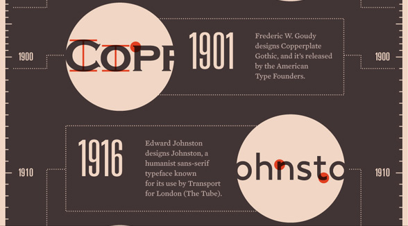
infographic of typeface history

I came across this really cool and informative infographic about the history of typefaces. I highly recommend checking it out. The design of this is great too. It’s easy to follow, and as I mentioned, it is full of information.

The infographic below presents a history of typefaces, incorporating fun tidbits from tech, pop culture and the web. Do you know what font the Google logo is? What about Facebook? Take a peek below to learn these and more.

Take a look at the full image, A History of Western Typefaces. Also observe the way the type in this design is used and the elements that lead you to follow information.

Code Academy and Code Year 2012

If you are interested in learning to write code, here is a good introduction. Code Academy has a project to get as many people to learn coding during 2012 as possible. Once you sign up, you get a new lesson each week and you can go at your own pace. I’m way behind but the first few lessons proved to be refreshers for me. The first lessons deal with Java Script, which proves to be a bit fun.

Check it out when you get a chance… Code Academy

In the Cloud

If  you’re looking for a way to keep your work with you, and not worry about losing your USB drive, try using services like Amazon Cloud Drive. You get 5GB of storage for free and the ability to access your files from any computer. Dropbox is another service and it offers 2GB of space for free. It allows your stored files to sync on your computer and other devices.