Hi
Some Good Advice for Young Designers
Some of you may have decided to do graphic design because you thought that it would be easy. There is nothing easy about it. It is an industry that is very saturated, so if you want to stand out and go far, you will have to work at it. You will spend many sleepless nights trying to prefect a project… sometimes starting over and over again. The interesting thing is that if you are truly made to be a designer, you will almost enjoy those sleepless nights. You will be so caught up in your creative energy that you will forget the time.
A few weeks ago I came across this article, Advice for Young Designers, and thought it was good to share.
Here is an excerpt…
In order to be good at what you do, you have to work hard. Put in the extra hours and make it as good as it can be. Do the effort and you will benefit from it. Constantly improve your craft and challenge yourself to do something that makes you uncomfortable. Trying something new and pushing yourself is what makes us grow as designers. Some of our best work comes out of it.
Please take the time to read the entire article because there are some good tips there… read complete article here.
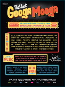
The Great Googa Mooga
I was intrigued by the design for the recent Great GoogaMooga festival in Prospect Park. These were created by Mark Miller & Dave Franzese, who worked on the branding for Bonnaroo 2012, which is a huge music festival that takes place every year. The team said that for the Great GoogaMooga posters, they were inspired by Brooklyn Bodega storefronts. I really love this style of vintage typographic design. What do you think?
Class ePortfolio Projects – Spring 2012
Please add the link to your ePortfolio site in the reply section of this post.
Nice way to make fonts
Something interesting..
hey during my countless hours of patrolling the internets I came across an interesting article regarding advertisement.This article provides examples of clever photoshop ads that I thought was interesting to share
Anyone one you guys like?
http://psd.tutsplus.com/articles/inspiration/cleverly-photoshopped-print-ads/
blog i think everyone should follow
hello i just thought i share a terrific blog I follow in the graphic design business
Justcreative.com by Justin Cass is very informative blog with design tips and information about whats going on in the design business. He also provides from other websites and blog that are also informative and helpful.
The Power of Makeup
ePortfolios
Your ePortfolio project will be due in a few weeks. Ask questions during class, but also use the Getting Started section of OpenLab for more information.
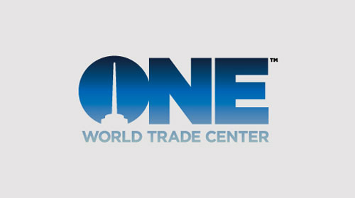
Logo Evaluation: One World Trade Center
 As you may know from the construction down at the World Trade Center, a building is going up to replace the Twin Towers. A London-based company has designed a logo for the new building. Take a look at the other variations and answer the following questions. THIS IS A REQUIRED ASSIGNMENT. LEAVE YOU ANSWER IN THE COMMENTS SECTION.
Take a look at the different variations… (click here)
What is your perception when you see this new logo? Do you like it or not? What about it do you like or not like? Of course the events of 9/11 were very tragic, and even almost 11 years later, memories are very emotional for some. Does the logo evoke certain feelings or emotions for you? Do you agree with some of the comments in original post?
NOTE: ADD YOUR COMMENT ON THIS PAGE, USING THE REPLY BUTTON AT THE END OF THIS ENTRY.
Students, if you have not visited the construction going on down at the WTC, I recommend you take a train ride down there. As residents of the city, you should at least know what is going on. ONE WORLD TRADE CENTER is the address of the new building replacing the Twin Towers. The name of the building is the Freedom Tower. Don’t get hung up on 9/11. Answer the questions in light of the design as a designer.


