Training: 6th and final day

Thursday, June 11, 2015

What did I Learn?

Today was my last day of training. The group and I got a lot of work done. In the beginning of the day we were, yet again, brainstorming about the app project we’re working on. As we were all assigned a role in the making of the app, and after collaborating ideas, we all started individually working on designing the application. I was in charge of gather the students’ content information and setting the typeface and creating good visual hierarchy within the “pages”.

What were my challenges?

Yesterday’s challenge was coming up with a name for the app. Today’s challenge was creating a logo for the app. We all sat for about two hours brainstorming and sketching ideas for the logo. Raciel is ultimately the one in charge of creating the final logo design for the app.

How did we help each other?

Like I mentioned before, we all collaborated ideas during the first two hours of the day. The way the app is being designed is by giving each person a specific part of the app to design. Mandy is in charge of the layout and where things go on a page of the app. Raciel is in charge of the logo design. Willian is creating the icons that will symbolize certain ‘to go to’ pages on the app, and finally, I am in charge of creating the students’ profile pages. Despite the fact we are all assigned different part of the app design, we all exchanged or ideas do that there is unification and visual harmony in the final presentation of the app.

Day 6

Thursday, June 11, 2015

What did I learn?

Today I learned the importance of consistency. I was in-charge of designing the icons for the app project we are working on. I had to make sure the each icon were similar to each other. some important aspects that should be considered when making consistent design are the width, the corners and the amount of detail in the design.

What were my challenges?

Today’s challenge was coming up with a logo with our app. We must of brainstormed for about a hour coming up with different ideas. It is always hard to choose an idea when there are so many great concepts. I believe we all came up with some good concepts that could fit, but ultimately we left it up to Raciel to create the logo.

How did you help each other?

Once again we had a brainstorming session, this time is was about the logo for the app. We were able to come up with some great ideas such as including a magnifying glass as an element of the logo.

Other comments:

After creating some of the icons, I sent them to Mandy and she put them onto the layouts. It was starting to look really good and has the potential to become something real. This makes me more encouraged to finish this project.

Training: Day 5

Wednesday, June 10th, 2015

What did I learn?

Today, I presented my element project. Based on critique and feedback from both my trainers and William, I was satisfied with my presentation and final project. From the suggestions they gave me, I knew I had to do minor adjustments to both my presenation slide, and my final emelemnt peice. Overall, I think my project was well presented.

What were my challenges?

In today’s training, we al started brainstorming ideas for an Application we will be doing for the First Year Program. The App will be a way for first year students to collaborate with their mentors in a contemporary and formal manner. I think the most challenging part of our discussion was naming the app. We all had various ideas, and through inspiration and brainstorming, we finally came up with the name Find My Mentor. (Although, I loved Mandy’s initial idea of naming it Reach, which she later found would not work).

How did you help each other?

William and I collaborated with the trainers today most of the time to work on the App idea. We exchanged ideas and worked together to create categories, layouts and fun ideas for our Application. We were each assigned a role, including Mandy and Raciel, so that the design process can be less time consuming. My role was to gather profile content for atleast 5 Mentors (or upper level students) and at least 5 First Year students.

Day 5

Wednesday, June 10, 2015

What did I learn?

Today I learned the importance of presentation. Presenting causes you to really know about your project. It is easy to allow for your work to just be displayed, but to explain your thought process on the project requires more attention. Also presenting allows for you to receive feedback. With the feedback I received I was able to touch up my project and make it look better.

What were my challenges?

Today’s challenge was coming up with a name for the new project we are working on. It was very difficult to decide what it should be. We came up with many great names such as: Reach, Mentor Me, and Find My Mentor. We came to the conclusion of choosing Find My Mentor.

How did you help each other?

Today we bounced a lot of ideas off of each other and decided for our project we were going to create an app. The app is going to be for new students to find mentors for themselves. We are each in charge of something different. I will be having to work on the icons for the app.

Other comments:

This new project seems like it can turn into something real and would be so exciting if it did.

Inspiration

Where does your color inspirations come from?

My Color inspirations comes from the idea of color theory. I believe that color theory sets a standard that is most practical when it comes to design. When thinking of a palette to use on a project I instinctively apply the use of color theory.

Who is the visual artist that you identify yourself with? Why?

There are two artist that I like to identify myself with and they are Banksy and Paul Rand. The reason I identify myself with Banksy is because I learned from his work the meaning of art being conceptual. Art was a last minute choice I made when graduating from middle school. I was pressured into thinking that I would have to make a definite career choice for the rest of my life, so I choose art. Not knowing much about it entering high school, I viewed art simply as drawing or painting portraits or landscapes. After being exposed to Banksy’s art I realized the importance of art having meaning. Now it is always in the back of my head, how important it is to give meaning to your work. The reason I identify myself with Paul Rand is because much like him, I like to be experimental with my work and try new ideas. Due to him stepping out of the norm and trying out new things, he was considered ahead of his time. I always like to look at my work as a new project entirely different from the last. I believe the more experimentation you do with design the more you learn.

Insperation

I get inspired by many things that surround me. I’m inspired by designs, music, people, Ads, movies, celebrities, photography, and the list goes on.  Some people may have that moment when they’re designing and they feel stuck, and they look back at a specific picture, or design and they’re automatically inspired and motivated to continue. Personally, I get motivated from different things at different times. I will say, though, that my older brother, who is a medical student but a freelance artist, inspires me. I always take his critique and feedback to consideration. He always has respect for the work I produce and motivates me to continue. I also think that I inspire myself. Every time I create a design, I look at myself at a better stage than where I am. Motivation and inspiration come from different places, but it’s that one factor that keeps me moving forward.

Training: Day 4

Tuesday, June 9, 2015

What did I learn?

I got a lot done in training day. Today, I actually earned a few things about Adobe Illustrator and InDesign that I never new before. Today I officially completed my business card and made it ready to print. In addition, I completed a few banner updating and adjustments for Blackboard, Openlab, and iTec.

What were my challenges?

Today, I didn’t face a lot of challenges, rather than asking questions. When I was updating the banners for Fall 2015, I noticed that the dates on the banners didn’t match with the dates for the fall academic calendar. I had to double check and match them so that the information is correct and I’m not misleading anybody.

How did you help each other? 

I received a lot of feedback from Mandy and Raciel today. And I’m also glad to say that I received a review from Professor. Jordan. With her critique and thoughts on my Openlab Header designs, I was able to narrow my work down even more and create new idea. I’m very inspired by the team here at Faculty Commons.

Day 4

Tuesday, June 9, 2015

What did I learn?

Today I learned a lot. I learned about the print system that we have here at City Tech, that is mysteriously located in the basement. I also learned a bunch of new shortcuts and tricks to designing faster. I also had a bit of a self reflection and reminded myself of knowing when to take a different approach on a project. Sometimes the amazing concepts that we come up with might not come out executed the way we intended.

What were my challenges?

My biggest challenge today was taking a different approach on the Banner project we have been working on. I was so focused on one approach that I tried to force it to make it work. Fortunately I was able to move on and come up with more approaches that were better executed.

How did you help each other?

Mandy taught me a couple of new tricks I can add to my repertoire, that help me maximize time when designing. I also received a lot of good feedback that I will take into consideration when finalizing the banner project.

Other comments:

Today I had my first meeting with my client and I believe it well successful. I am looking forward to working with them

The Design Process

1 Brief

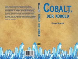
The element I chose off the periodic table was Cobalt. I plan on making a on book cover that pays homage to the discoverer of the element and its origin. I plan to have this designed to print.

2 Research

From my research on the element I was able to find out cobalt is a metal that was discovered by Georg Brandt. It’s name came from the German word, Kobald, which means goblin. It is silvery-blue and number 27 on the periodic table. It is used for magnets and jet engines.

3 Concepts

-All text in German because of the element’s name of origin

-Title: Cobalt, the goblin; Wordplay between the element and it’s name of origin

– Author: Georg Brandt; use the discover of the element as the author for the book

-Use Germany’s national bird as a logo for the publishing company

-Have metal crystals at bottom of page to directly represent the element

-Use black letter or edgy fonts to convey  vintage look of book cover

-Use scroll texture to convey medieval look

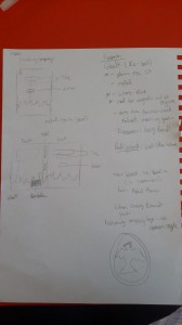
4 Sketches

20150609_083654

5 Execution

I initially started this project working on a 11 in. x 8.5 in. canvas and then decided to change it to 13.5 in. x 10.25 in. canvas.  I did this because it was looking more like a poster instead of an actual book cover.  I used Metal Mania for the Header on the front and Georgia for the rest of the text on the design. I used images off Google such as the scroll texture for the background, barcode, German eagle, and metal crystals. I made a .5 gutter for the spine. I stuck to using a blue color palette for the text because that is the color of the element. I created the bodycopy myself in English, then I translated it into German.

Cobalt Book Cover

Design Process

Tuesday, June 9, 2015

Brief

There is probably some special reason of why Silver has the Ag symbol on the periodic table. I never looked into it, but it was interesting enough for me to choose Silver (Ag) as my Design symbol. I was initially going to use the Ag symbol to make a poster, but I thought more into it, and was compelled to make a logo and place it on a business card.

Research

For my research, of course, I looked up silver, learned a lot about it’s basic structure, and found Silver related compounds. I walked around the campus taking pictures of anything silver, and noticing the same gray shining in every piece. After I knew I was making a business card, I worked on making a business card for a silverware company. I researched different silverware companies and visited the Oneida website for reference.

Concepts

After looking at silver and studying it for a few hours, I lost the sense of color, and there was nothing in my brain but a gray-scale. With that in mind, I had the idea of creating a value based business card, rather than color. I also figured that it made more sense, due to the fact that it is a silverware company, and at first glance, I don’t want it to be mistaken for a Diner business card. After embossing, and beveling the letters, and after drop shadows and lighting, I saw that too many effects were being applied, which distracted me away from the actual logo that is in the business card. The logo is fairly simple and minimal, but has a strong feel to it. I wanted to separate the back of the business card from the front, so that one can appreciate the logo and the strength of the typeface.

Sketches

When it comes to sketching on paper, I can either make very few thumbnail sketches, or I can fill 4 pages of thumbnail drawings. It all depends on the project I’m working on. For this project, I felt like sketching anything that came to mind at that time, which were mostly logos of the symbol and different ways of writing them, along with a couple of sketches of what I wanted my business card to look like. Generally, my sketches are just different layouts of the same idea.

Execution

I used InDesign to create my business card. I usually create my logos on illustrator, but this logo was strictly typeface so there wasn’t going to be any Illustrator needed techniques. I used the pen tool to create the shapes on the business card and the type tool to create my type and logo. In addition, I had to adjust the leading and kerning to make the type and card as a whole attractive and legible

.FC_elementdesign_summer2015_2 FC_elementdesign_summer2015_22