Tag Archives: ADV 1100
Value Added Portraits
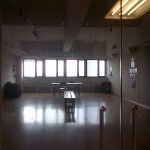
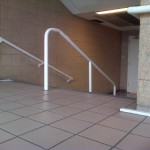
This assignment was part of the gray scaling. This part included going around City Tech and taking pictures of places where it shows high key and low key tones of black and white. The purpose was to identify what causes what to be darker and what causes what to lighter. In other words, what is the reason for it be high key and/or low key.
The first image is low key. The reason why its low is because the place and how much lighting is actually there; there’s enough lighting to know that its an empty room. All the way where the windows are at give it the HIGH KEY tone, but it’s very dim because the darkness looms over more than the light space in image. The mood that it sets is, dark, sad, depression, loneliness, hard times, anger, darkness within oneself, and for some the need to just lay immobile forever. It also gives the feeling of power, strength and sternness. Strength in a positive way, because the color black symbolizes being able to direct and having the ability to take control of any situation. For some it can also symbolize happiness.
The second image is high key. Its very bright, very few dark spots and it symbolizes plenty of moods. The significance of the brightness indicates happiness, joy, eagerness, togetherness, happiness, love, luminosity and in religious terms peace. As well in political terms, truce and the stripes of not only the American Flag. Also for example, the Dominican, Puerto Rican, Cuban, Panamanian, Japanese and European flags, just to name a few. The VERY few dark corners of spots that are present represent that even if it’s super bright there’s ALWAYS going to be some kind of over shadowing of SOMETHING. That can represent secrets, untold stories, and facts that people are not able to notice even if it’s standing right in front of them.
Grayscale (Assignment #3)
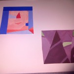
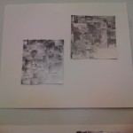
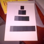
This here Gray scale was completely and entirely challenging to make. The reason why is because of the mixing of the black and white gouaches. The first image was my first attempt at making the gray scale was honestly a complete fail in my eyes. It was hard trying to get the colors right in between and the middle; most in between (first image); because it was so dark, it made it even harder to get the right shades and make the point that needed to be made. The first gray scale took me about an hour or less to make, because I figured it was going to be easy but in the end it wasn’t.
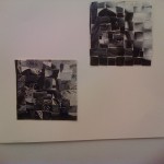
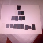
The second gray scale (second image), is a much better improvement than the first one. The shades and highlights look better and its more clear where it descends from. At the second attempt at making the gray scale, I actually took my time to make it and was even more challenging than the first. With the second gray scale, I was able to add more color and define what shades go in between each one. The last row, the one of nines wasn’t as hard as I thought it’d be, because I made it easier for myself to make a the colors look like they follow behind one another. The first six little squares, from right to left, was the hardest because because it’s the side where the colors descend from darkest to mid – value. The other half of the bottom row of squares was the easiest because there really wasn’t much mixture needed to be done. Only making sure that it follows the previous and that not too much paint or water was mixed within, because the outcome would be watery, and that’s not what is expected of this gray scale.
This assignment was challenging, mind – bending, hard and frustrating to work with. The rigid steps that needed to be followed, the mixtures and most of all, making sure that the brush strokes weren’t noticeable was the hardest part. The hardest because, once you start painting, the brush stroke is going to instantly noticeable and you’re going to want to be keep brushing it several times until it’s not noticeable. Instead that’s going to make it worse. The less strokes and the smoother it looks the better. On the second attempt it was actually harder, ’cause I wanted it look extremely smooth, nearly perfect; but of course nothing is perfect. Now the way I aligned them, isn’t the neatest ever, but that was because I wasn’t really paying attention to it at first. AFTER realizing the mistake I made, it makes me want to re do the entire thing over again. Thanks if you took your time to read this! 🙂
Topographic Map
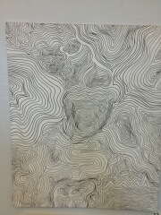
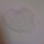
This image right here is a topographic map. The main point of this assignment was to put together the way my name sounds and draw into different kinds of lines. Before beginning the process, the professor gave us a lecture and showed us example about HOW and WHAT topographic maps look and are created. From my understanding of the lecture, what I was able to grasp was that Topographic Maps are very rigid and consistent. What they are mainly based on are actual plate tectonic maps; the lines represent land, mountains and other geographical features. After the given lecture, we the students, started off by doing sketches of what our names would look like in topographical features. Not only our names had to incorporated, but as well where we come from, what we like, our favorite things and what has meaning to us. All of this had to be put into our topographical map, in our final drawing of it.
For me to create this topographical map was not as challenging as I thought it’d be. We were given instructions and ideas based on how it COULD look. In the end, EVERYONE had a completely different outcome. Here in my topographical map, I was able draw in many things that very deep meaning. In the center of the image it forms a heart and flower shaped center. What this symbolizes is that I am a very sweet person, very intellectual and an unusual deep thinker (but when it comes to art, I rather do it freely than think about what I have to do). In the bottom right corner, I put the map of the Dominican Republic. It’s not very noticeable at first, but take a closer look and you’ll be able to decipher what it really is. The map represents where I come from, where I live part of my childhood and how important it is for me to remember where I come from.
At the top right corner my flag, the Dominican Flag, is drawn there. Not very decipherable, but it’s there. Again, another representation about where I come from. Now the left middle corner, represents waves of the ocean. The significance of is that I can be a very calm person, smooth talker and at the same time aggressive. Aggressive because not all waves run smooth on the ocean, there’s always a force behind, the reason why it moves. Now above the center of the image, where the heart/flower shaped center is at, there’s this small thing above it that shapes a wine a glass and the petal of a kind of flower. The reason why it shapes a wine glass is because it shows that I can be sophisticated at times, and that I am easy going. As mentioned, it also shapes a rose petal. The rose petal represents the softness and my very delicate core (heart). On the outside I may seem like this really tough and outgoing person, but I also have a soft and super sweet side.
The bottom right corner, where the image starts getting sharper than the rest, represents Music and a heartbeat. Music is the way of life for the kind of person I am. Putting that into this made me realize that very detailed, how much of thinker, and how much of an interesting person I am. At first I didn’t think that this very simple image would have so much meaning behind it, but as I keep looking at it and analyzing it, it makes more sense as I go. I love it. I’m glad I made this topographic map. This will now be a way for to explain and represent myself, one day when I get recognized by the world.
What was most difficult and challenging was drawing over the lines creating fine lines to make it look like an illusion or a vision manipulator. Just giving it a quick look, you can see where I refer to when I say vision manipulator. Now referring back to the inking, it took me about an hour or two fill in the entire thing, but to make it less stressing for myself I did it part by part, taking small breaks in between. Challenging was the inking part because there are so many fine lines and I really didn’t want mess up any of it. I tried to create it in a way that it doesn’t look too messy or there’s too much going on. I’d say this is one of my best works done so far is this course. The requirements were met, and hope to get a good grade on it. Thanks for reading if you did, or just probably skimmed through it. Either way, thanks! Leave your comments below! 🙂
Staccato and Legato Patterns.
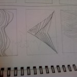
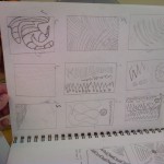
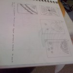
The process if this project was challenging at times for me, for the simple reason that normally I don’t think when I draw. So for this assignment thinking thoroughly had to be done. I got the assignment done. For the pictures above. the way I figured my named would sound is sharp and straight to the point. The way I pronounced it was like making sharp stops at every syllable, symbolizing Stacatto patterns. For the legato patterns I said my name out loud in a smooth flowing sound, where it sounded as if it were a stream of water. It helped me understand more the way my name actually wound like in drawing form. The way I am going to use this experience is by starting to think more and seeing towards drawing what really matters and what ways can I economize to save time and really review what I’ve done so far.
View from my Window (Assignment #1)
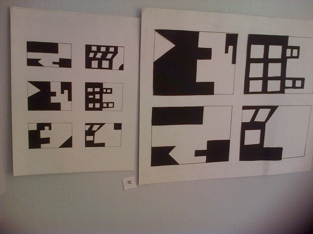
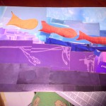
To complete each part of assignment no. 1, I did as follows. When it came to drawing what was outside my window, it took me about two hours or less. This part was a bit frustrating for me because it was night time when I drew that view, so much detail wasn’t visible. Now for the second part, which was to draw twelve thumbnails, a quick ten to fifteen minutes process, was easy, but the catch was we had to draw in shapes, no lines. As well to draw quick and without thinking. Third part of this assignment was to to choose the best six thumbnails and pass them onto Bristol paper, to make a final drawing of the thumbnails and ink them. Of course, for this process, certain instructions were to be followed. This part took me about two days to complete, four to six hours, to make sure the margins were right and that the detailing was at its best. Doing the brush part alone, took me three hours and a half straight, to make sure no mistakes were made.
Based on my fellow classmates’ critiques, I was able to choose the four most successful thumbnails, put them on the Bristol paper, make the cut outs and make sure that it was done right, following all given instructions. In the end of this project, I learned that from hard work, success and patience come easy. I am one of those people where patience is not my ”best friend”. I honestly did not think that this project would be so extensive; I had thought it was going to be something that would be done quick, just to show our abilities in Art. I learned new words that I’d never heard of and that group work is essential for this kind of project. Reason is because we are able to receive critique based on what has been done so far, and as an artist, I believe critique, suggestions, comments, and opinions are important because it will help us all become better at we want to be.
Aural Topographies: Visualizing sound (Assignment #2)

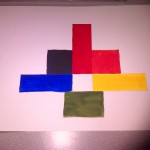
I hear a techno kind of beat. Straight or jagged lines, the bass sounds like heavy circles being dropped and electronic sound that would look like squares being placed on something. There is a pattern where it goes from low to high and it represents lines going up and down in a kind of curved motion. There are some vocals that sound like ovals being drawing smoothly. Now sound starts to vary and it may just look like a bunch of heavy dots being placed on a flat surface harshly. Sharp edges and smoothed out circles to slow down the sound.
A steady line, then it goes up and down because now the bass has been introduced. The bass adds a thickness and heaviness to sound, almost unbearable but it looks like a really big geometric shape, as in a rectangle. Now cut of lines to make it look like dashes to separate sound in a way. Now it sounds as if some words to be sung, but they are being played by a piano, giving it a feel of smoothly upward drawn lines.
