Value Added Portraits

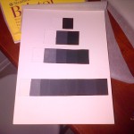
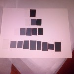
This assignment was part of the gray scaling. This part included going around City Tech and taking pictures of places where it shows high key and low key tones of black and  white. The purpose was to identify what causes what to be darker and what causes what to lighter. In other words, what is the reason for it be high key and/or low key.

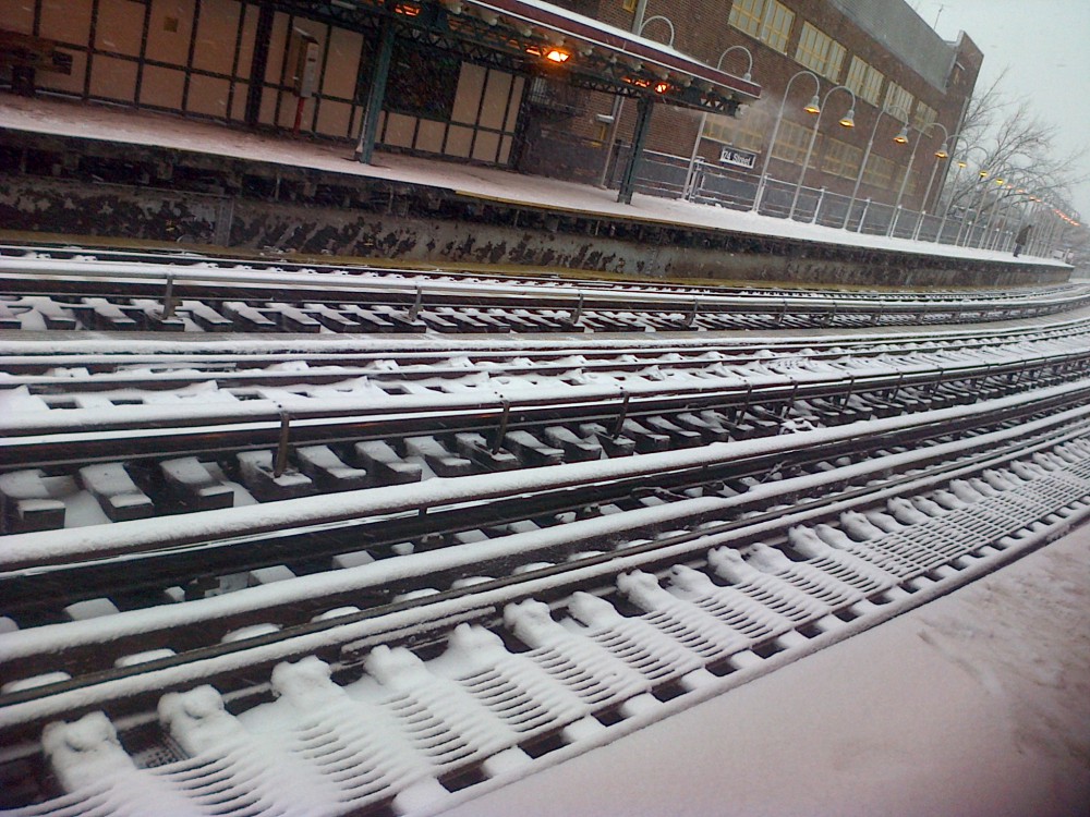
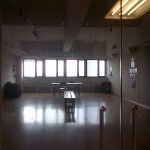
The first image is low key. The reason why its low is because the place and how much lighting is actually there; there’s enough lighting to know that its an empty room. All the way where the windows are at give it the HIGH KEY tone, but it’s very dim because the darkness looms over more than the light space in image. The mood that it sets is, dark, sad, depression, loneliness, hard times, anger, darkness within oneself, and for some the need to just lay immobile forever. It also gives the feeling of power, strength and sternness. Strength in a positive way, because the color black symbolizes being able to direct and having the ability to take control of any situation. For some it can also symbolize happiness.

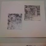
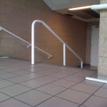
The second image is high key. Its very bright, very few dark spots and it symbolizes plenty of moods. The significance of the brightness indicates happiness, joy, eagerness, togetherness, happiness, love, luminosity and in religious terms peace. As well in political terms, truce and the stripes of not only the American Flag. Also for example, the Dominican, Puerto Rican, Cuban, Panamanian, Japanese and European flags, just to name a few. The VERY few dark corners of spots that are present represent that even if it’s super bright there’s ALWAYS going to be some kind of over shadowing of SOMETHING. That can represent secrets, untold stories, and facts that people are not able to notice even if it’s standing right in front of them.


Grayscale (Assignment #3)

          This here Gray scale was completely and entirely challenging to make. The reason why is because of the mixing of the black and white gouaches. The first image was my first attempt at making the gray scale was honestly a complete fail in my eyes. It was hard trying to get the colors right in between and the middle; most in between (first image); because it was so dark, it made it even harder to get the right shades and make the point that needed to be made. The first gray scale took me about an hour or less to make, because I figured it was going to be easy but in the end it wasn’t.

           The second gray scale (second image), is a much better improvement than the first one. The shades and highlights look better and its more clear where it descends from. At the second attempt at making the gray scale, I actually took my time to make it and was even more challenging than the first. With the second gray scale, I was able to add more color and define what shades go in between each one. The last row, the one of nines wasn’t as hard as I thought it’d be, because I made it easier for myself to make a the colors look like they follow behind one another. The first six little squares, from right to left, was the hardest because because it’s the side where the colors descend from darkest to mid – value. The other half of the bottom row of squares was the easiest because there really wasn’t much mixture needed to be done. Only making sure that it follows the previous and that not too much paint or water was mixed within, because the outcome would be watery, and that’s not what is expected of this gray scale.

            This assignment was challenging, mind – bending, hard and frustrating to work with. The rigid steps that needed to be followed, the mixtures and most of all, making sure that the brush strokes weren’t noticeable was the hardest part. The hardest because, once you  start painting, the brush stroke is going to instantly noticeable and you’re going to want to be keep brushing it several times until it’s not noticeable. Instead that’s going to make it worse. The less strokes and the smoother it looks the better. On the second attempt it was actually harder, ’cause I wanted it look extremely smooth, nearly perfect; but of course nothing is perfect. Now the way I aligned them, isn’t the neatest ever, but that was because I wasn’t really paying attention to it at first. AFTER realizing the mistake I made, it makes me want to re do the entire thing over again. Thanks if you took your time to read this! 🙂