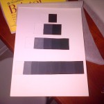
This here Gray scale was completely and entirely challenging to make. The reason why is because of the mixing of the black and white gouaches. The first image was my first attempt at making the gray scale was honestly a complete fail in my eyes. It was hard trying to get the colors right in between and the middle; most in between (first image); because it was so dark, it made it even harder to get the right shades and make the point that needed to be made. The first gray scale took me about an hour or less to make, because I figured it was going to be easy but in the end it wasn’t.
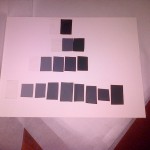
The second gray scale (second image), is a much better improvement than the first one. The shades and highlights look better and its more clear where it descends from. At the second attempt at making the gray scale, I actually took my time to make it and was even more challenging than the first. With the second gray scale, I was able to add more color and define what shades go in between each one. The last row, the one of nines wasn’t as hard as I thought it’d be, because I made it easier for myself to make a the colors look like they follow behind one another. The first six little squares, from right to left, was the hardest because because it’s the side where the colors descend from darkest to mid – value. The other half of the bottom row of squares was the easiest because there really wasn’t much mixture needed to be done. Only making sure that it follows the previous and that not too much paint or water was mixed within, because the outcome would be watery, and that’s not what is expected of this gray scale.
This assignment was challenging, mind – bending, hard and frustrating to work with. The rigid steps that needed to be followed, the mixtures and most of all, making sure that the brush strokes weren’t noticeable was the hardest part. The hardest because, once you start painting, the brush stroke is going to instantly noticeable and you’re going to want to be keep brushing it several times until it’s not noticeable. Instead that’s going to make it worse. The less strokes and the smoother it looks the better. On the second attempt it was actually harder, ’cause I wanted it look extremely smooth, nearly perfect; but of course nothing is perfect. Now the way I aligned them, isn’t the neatest ever, but that was because I wasn’t really paying attention to it at first. AFTER realizing the mistake I made, it makes me want to re do the entire thing over again. Thanks if you took your time to read this! 🙂

