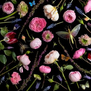
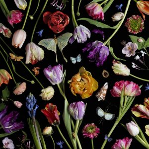
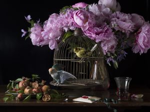
Paulette Tavormina uses still life to inspire her because the way she takes her pictures mostly the frame is cover up with flowers and bugs. But it isn’t clutter, but more filled in with shapes that flowers or bugs make. In a way it’s best describle to be like a jigsaw puzzle. She uses everything to fit in perfectly. I saw like the different colors from each flowers because it’s be to be pop out more because she uses a black background. I also like how picture are able to create this movement but using the stems of the plants or flowers just to make your eye wonder all over the place so wouldn’t focus on one thing. I also like the different sizes of the flowers and bugs. Just to fill in on some of the empty spaces. But also it makes it seem to be more random and more lifely. That’s one of her styles she does. The other ones are mostly like paints are something on the table. In this one she has flowers and bird cage fruits next to the bird cage in this picture can tell that there is two lights one from the left because mostly everything on the left is very lit up. and one in the right because the glass reflection . But the way that it picture is taken I think that left lights are very close. Compare to the right to side where pictures is much darker. But I think that light is much further back.But I think these types of still life is very nature just because we have flowers,bugs,fruits, and animals in her photos. But mostly enjoy her work with the flowers filling up the whole frame of the photo.
Inspiration Gregory Heisler
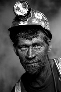
In Gregory Heisler photographer we can see that most of his photos are in black and white. The usage of light are two lights. We have the main light and the over the top light. Can tell by the way the face us light up. And the subjects eyes, we can see by the refection from the eyes. And th light is going directly forward. The second light is over the top light because you can see in the picture that top of the helmet is brighter than the face. I also like how the person is able to give a smile making the picture to not be so serious. Is makes the person to be welcoming. Like this person seem hes’ friendly. I also like the way the person has a weird pose, but seems to be working because it makes him to be a very relax person because of his shoulder is leaning to one side. Also can tell that Heisler wants us to look at this person and focus on him, because the background of this picture is blurry. The man he is very clear and sharp, but the background is blurry and out of focus. Like we’re not suppose to pay attention to it. Also this picture shows the personality of the man. We can tell that he is a construction worker by the way he is dressed. You can tell that he a much older man because he as bread going. But the man smile tells us all that he enjoys he’s job. Because it isn’t force, but it has a naturnal feel. And being a construction worker is very difficult, and hard, and dangerous. But looking at this picture it looks like he really enjoys what he does and he doesn’t regret it or he doesn’t mind the working conditions
Inspiration Andrew Scrivani
So the two picture I picked from Andrew Scrivani is the apple pie and the radishes. The reason why picked the apple pie because It looks delicious and they picture looks well balance in colors nothing is over powering with the apple pie. I like the red cloth is red and white. Yet that red isn’t very strong. I like how the photographer made the choice to cut one of the pieces out. I even like pie is placed even the silce that is next to it. But it’s not over taking the bigger pie. Also for the image that looks interesting I picked the radishes with it’s dull wooden background and the reason for that is to make radishes to pop out more. In this picture there is only light source. This could be the main light or natural light. The wooden background makes the picture to be more natural just because the brown has a much darker shade.
Inspiration Tim Wallace
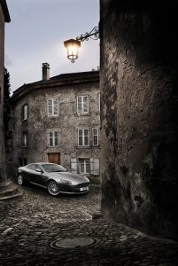
The reason why I picked this picture to talk about is the way the car is taken. Tim said in his video “You want it to have a tone or mood” meaning you a person who is looking or wanting to buy a car to feel something. The way to capture that mood is by working with the lights. Just like in this picture. The car is the brightest thing in picture because that’s what the photographer wants us to focus on because everything is dark. The lamp is giving this illusion that its lighting the whole car. What makes this picture successful is the idea that car is waiting you for you, because it at the bottom of street. Also this street is very narrow so the direction is going in one way. To me it feels of getting a reaward or if I keep going on this path I might get this great car. This pictures tone or mood is excited, hopeful just way the car is parked, the loaction, the way it’s shot and of course the lighting. Now Tim tries different angles in both his lighting and the camera. It’s important to take high-end car photography just to bring mood from the picture. You don’t want the car to be stale or boring. Also keep in mind about the background of the car. Like in this picture I know there is light behind the car to light up the building so it can be lit up in picture. So the surrounds you have to keep in mind with that. Just like this in photos where the building is framing the car. Also keep in angles of the when shooting to keep the photos interesting.
Tim Wallace Car photography
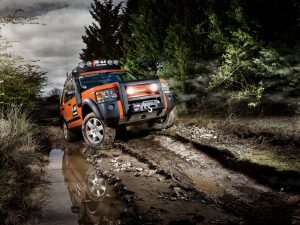
I think this image of this Land Rover G4 captures the emotions very well. This image just yells freedom and adventurous which is perfect for the type of car that it is. This car was meant for off-road driving in many different type of terrain and weather. It also has a feeling of hope because of the lighting around it gives its surrounding a bit more darkness while keeping the car ver well lit. While the head lights are turned on giving more light to the mud road in front of it while the slightly low angle of the car gives it a feeling of power and control that the car has over the road. To capture the emotions for a car means it has to be within its environment, which I’ve noticed in a lot of his other images as well.
Each car he has taken pictures of all have a different background with different lighting for all to have different emotions and stories to tell.
Inspiration Post: Richard Foster
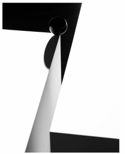
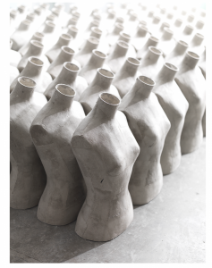
Richard Foster is a sought-after still life photographer because of the dynamic feel his photos have. The photos also has an artistic feel to them making the still life more interesting that will catch the eye. Some people that shoot still life might make the products simple and plain only but Richard Foster I believe puts more thought into his photos where he may use patterns like the photo on the right or give it a asymmetrical look like the photo on the left. The lighting for the one on the right makes the mannequins pop more.
Inspiration Post: Philip Lorca-Dicorcia
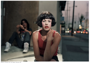
In this photo the way the light brings out the subjects face really makes the photo interesting it’s almost like she was caught doing something and the expression really shows it. The composition might make the photo less interesting but I think the subject being in the middle while someone on the side tells a story of what is going on. The location goes hand to hand with the subject as of course part of the location is at a corner but you can also see the street behind them that brings out that 90s feel.
Inspiration Post: Tim Wallace
Tim Wallace made these photos successful because of the way he lights the cars. The tire in the first one has a subtle light to it that gives it a luxury look to where you can see someone well dressed coming out of it. As for the one below the bronze just like the black tire has a good look to it because of the light. The white really pops out capturing the emotion of the high end photography.
Inspiration for My Final (Gregory Heisler and Nick Fancher)
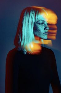
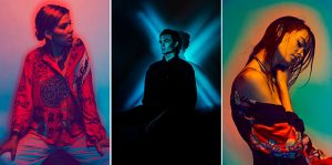
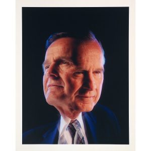
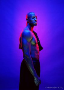
When I was brainstorming ideas for my final project the first image that popped into my head was a portrait by Gregory Heisler. I remember the image was so striking because it utilized the color cross lighting method. The subject was an athlete facing one side and looking into the camera. He was shooting on a blue background illuminated by a red rim light, with blue and red cross light filling the shadows and defining the subject. I was also intrigued by Heisler’s portrait of George Bush showing the subject with two heads. This image made me think he was trying to portray Bush as having two sides or a split personality. I wanted to use this in my concept because my piece is about facing challenges in life that take us to completely different headspaces as if we were different people entirely. But it is through determination and perseverance that we’re able to pull ourselves out of those dark spaces to realize our potential. Gregory Heisler is an advocate for breaking technique or thinking outside of the box because he believes constantly relying on just technique can be limiting. Continuing my research, I went on looking for more images using this method and stumbled onto Nick Fancher. Fancher is a photographer, author, and educator specializing in dramatic lighting and bold color exploration techniques. His experience ranges from commercial and portrait photography to fine art. He is most known for his work method using minimal camera gear and shooting in unconventional locations. When I looked at Francher’s work, I was inspired by his use of colored cross lighting, and shadow. In one of his panels, there are three images, one with the subject lit in mostly red with a gradient background, the second with a subject illuminated by a blue X shaped lighting and the last with a subject on a green backdrop lit by a yellow rim and cross light. Visually these images are eye-catching and add a sense of wonder to the emotions of the models, this is an effect I hope to achieve in my own work.
Nick Fancher
Gregory Heisler
Inspiration of Philip Lorca diCorcia
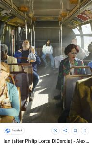
Philip Lorca diCorcia is a well known figure and street photographer born in 1951. He grew up in Hartford,CT attending the University of Hartford in the 1970’s. Corcia later moved on to Boston School of the Museum Fine Arts, rounding out his education at Yale. In his early work, he photographed friends and family making the images appear candid, when actually it involved hours of staging and utilizing lighting techniques. His objective was to blur the lines between the everyday and fabricated scenes. In the 1980’s, Corcia worked as a commercial photographer creating spreads for clients like Esquire, The New York Times and Harper’s Bazaar. From 1990-92, he traveled to Los Angeles working on a series he called Hollywood. The subjects consisted of prostitutes, hustlers and drug dealers which he paid to pose for him. Corcia would name the photos according to the person he photographed and how much he paid. He went on to photograph larger crowds in New York, Tokyo and Paris, setting up flashbulbs in the area waiting for the perfect moment. In his more recent work, his subjects range from pole dancers to the New York metropolis exploring the topics of identity, reality and artifice. His style has been described as combining documentary with conceptual photography. Philip Lorca diCorcia is a recipient of the Guggenheim Fellowship and has had many solo expeditions at the Museum of Modern art (MoMA), Centre National de la Photographie in Paris and Reina Sofiá in Madrid. He currently lives and works in New York. The image below is titled “Ian” depicting a young man with long black hair sitting in the back of a bus. The man who I assume is named Ian is looking into the camera, the image is balanced with passengers on each side. Although the subject is in the middle of the scene, my eyes are also drawn to the passengers in the background. The man falling asleep holding a goldfish in a plastic bag perfectly still and a woman with blue eyeshadow and a floral blazer looking down in her lap or also possibly sleeping. It makes me start to think about which elements or subjects are real in the scene and which are orchestrated by the photographer.

