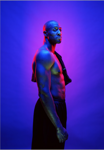
Gregory Heisler’s images are amazing because it uses a very harsh but gentle lighting style for the subject. The images that are his vibrant photos made me think and feel that the subject added the vibrance to the background. Different emotions are convey throughout each portrait. The light he uses in one particular image (right), he uses a front light, hair light and back light. Those lights plus the background make th e image beautiful and amazing. The emotion on this young man’s face is priceless and is glowing.
Author Archives: Deanna King
Michael Paul Smith
Michael Paul Smith uses front light to covey a story within his still life pieces. In his pieces he is able to bring out the lighting of every part of his still life. Each still life has a different story but it looks like it was all done outside. Being able to bring light through a vehicle is unique and using reflectors to capture the art of still life is beautiful. I was able to see the focus of the black car and it looks like the light is hitting all sides of the car.
Liebowitz/Erizku
Anne Liebowitz uses the lighting style of rembrant to bring out Demi Moore’s facial features. The lighting style brings out the look of her body against a really dark background. Also, it looks like the features of her hair is also coming out. The use of front light is amazing as well. It is hitting every part of her body making it look natural.
Erizku uses the lighting style of short and front light. The front light is is bringing out natural features of her body and also making it easy for us to see a different lighting style that is on the flowers. We know that Beyoncè is a natural born icon but in this image she looks like an everyday woman.
Final Project Proposal
I am doing an ad campaign which is a continuation of my senior project. My topic is called FEM (Female Empowerment Mentorship). This mentorship targets young women from ages 14-24 and factors in the support that is not there for them. Their community does not support their goals, school career and/or their personal lives. The meaning of community is also in the household. Some young women are not supported with a single parent household, two parent household with demanding jobs and an abusive household.
My audience are parents ages 30-50 and young women ages 14-24. The mentees will be ages 24-34. My images include people for the campaign.
My idea for the ad campaigns are:
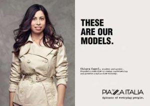
-Incorporate harsh but gentle factors (Putting percentages of whats going on in the community and putting a face to it)
-Use each letter to show young women what the program is about
-Doing portraits of mentors and mentees and how they can benefit from one another.
Avedon and Mannion
Richard Avedon uses natural lighting in most of his portraits. His subjects use their face to convey a message to him. The emotion and the feeling in their face sets the mood for the portrait. With his portraits being about sex, money, drugs and/or emotion, Avedon gives chance to the subject to use the body as a symbol for their life. For example, the lighting on the image is great. Even though we know they are not in black and white, the image takes you for a great ride while making us still interested.
Johnathan Mannion uses front lighting in his projects of urban icons and album covers. When taking an image his artists uses various emotions in their body movement. His use of natural lighting when taking an image outside is emaculate. Being able to use the light of the outside to get the strong lighting on their hair and body is a special skill. I enjoy learning that Mannion was responsible for all the artists album covers images. I listen to most of the albums that he produced.
Two K’s of Photography
Yousuf Karsh portrait work is very intriguing to the eye and it captures a story. His portraits gives people what his life is about. One image that stands out is the image with his mentor. You can tell in the way that the photograph was taken that his mentor was apart of his long career as a photographer. It portrays the meaning of support and balance that Karsh had. His black and white portraits are keen and meaningful to a photographer that enjoys doing black and white portaits.
Nadav Kander portrait work is very different from Karsh because his portraits are very political. His portraits are very emotional and you feel cold when you look at his photos. Based on his website, his portraits are chosen based on the current time. It does not require one to look in the camera or even be engaged with it.
I plan on emulating more of Kander’s idea of portraying emotion in upcoming assignments.
Inspiration Post
Dawoud Bey’s portrait style can be categorized as Environmental Portrait photography. Dawoud Bey uses natural lighting than is in the area of the image being taken. Instead of using forced lighting he adjusts to the specific person he is shooting. Ultimately the image that Dawoud is trying to convey is each person’s life story. The emotion in their eyes tells a person what they have been through and what they are trying to accomplish in their life. Some stories are more harder than others but at the end of the day everyone is trying to do better no matter the struggle they had. In my photoshoot, I will try to convey the same theory of making it in life and using the correct facial expressions and gestures to get an amazing picture that tells a story.


