In the photograph of Demi Moore, Annie Lebowitz took a natural and simplistic approach. Lighting is minimal but strong and dramatic. Lighting most of her face and filling in other places. I feel this image brings out more of the purpose behind the shoot. She is naked / natural and that makes it feel very authentic. With the photograph of Beyonce, Awol Erizku created this shot using straight forward lighting. All the elements in the photo consists of mostly flowers all over the place. It has very captivating imagery. Although very different from the Demi Moore photo it captures a sense of nature and naturalistic vibes as well.
Monthly Archives: May 2018
Inspiration: Michael Paul Smith
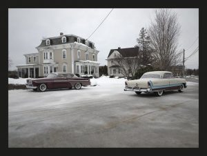
Michael Paul Smith’s work is extremely compelling because his work is very intricate, every little detail matters when it comes to shooting one of his car scenes. Every little detail about his shoots is important but he mentions how the most important factors are the camera and the natural lighting because they make the photo come alive. Its important to look at these factors for him because it makes the photo look real and makes the scene look more authentic. With the correct camera to take just the right photo and just the right lighting to make the scene look more realistic which make his photos as captivating as they are. After taking some pointers from Michael Paul Smith’s work I think considering both the camera being used and the amount of lighting being displayed would have a significant impact of the photos that I will take.
Inspiration: Richard Foster
Richard Foster’s work is very detailed; he captures such detail in his photos with just one simple shot. After looking at his work it is quite obvious how much is put into each of his photos because he not only focuses on a particular image but he uses his background to captivate the image as a whole. He uses color of the backdrop of incorporates other features into his photos that make the image captivating overall. He uses such small detail to help make the photo that much more compelling because it adds a certain essence to it. With his still photos you can just grasp so much depth and detail which is interesting because the picture being taken is just of a simple item but depending on the angles and the lighting along with other aspects of taking the photo make the image much more appealing overall.
Inspiration: Gregory Heisler
Gregory Heisler is such an interesting photographer because his work changes from one concept to the next. His photos may seem the same but in their own little way they differ from one picture to the next. One of the photos that stood out the most was listed as another photo on his site, it’s a picture taken of a diner. This photo is set at night and is taken from an overhead angle but the photo has this blurred aspect to it as if someone took the photo in passing. The sign is so captivating because the red light shines bright, the photo almost has this old school vibe that comes across when looking at the image. It is such a beautiful photo taken without much being involved in the image overall because just the sign and the angle it was taken made the photo come out so well. He made such an impact with a simple photo any story can come across from the single image.
Inspiration: Philip Lorca-Dicorcia
Philip Lorca-Dicorcia’s photos are very intriguing in the sense of how he set to capture a particular message through his set up with his photos. One of his photos that stood out the most to myself on this specific collection was one that featured the young man by the name of Tim who was 27 years old at the time living in Orange County, California. In this particular photo you see this young man standing in what looks like a hotel room just staring out the open door of the room, he’s still and it can almost be felt that he is hesitant, hesitant to walk out that door and have to work as a young man in the prostitute business. He stands there with his hand against the wall, his body casting this shadow giving the idea that he wishes to stay back while he continues looking outside which almost appears to have a blurred affect to it which goes to make this impression that the world outside which he was looking at is filled with so much of the unknown.
Gregory Heisler
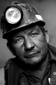
My favorite portrait of Gregory Heisler in the Tab of Miners. I looked at all the picture and decided to photo 9 from the miners. This image was so interesting to look at because of the eyes. He has the straight face of being miners and the image has a lot of contrast. His eyes are most interesting part of this image. The eyes looked astonished and there is a really powerful focus. The is no background focus which great for the image. The hat is creating dark shadow above the eyes. The dirt on his face helps again to the eyes only. The lighting styles are front light which hitting right in the face. If I had to point out the what I look at first is his eyes, light on his head and then dirt on his face and finally his beard. The no expression face is actually attractive to look at it.
Final Project Proposal
For my final project i decided to do a campaign about the importance of having enough sleep. This idea was inspired by my well being and I noticed a significant change between having a goodnight sleep vs. lack of sleep and how it relates to your everyday life. How it affects the way you think, the way you act and the way you look. In my photos i would have people suchas my classmates to yawn, fall asleep and be really energetic! Really energetic due to having enough sleep.
The article I’m using to link my project is https://www.healthline.com/nutrition/10-reasons-why-good-sleep-is-important#section1
Inspiration: Michael Paul Smith
Michael Paul Smith’s photographic style consists of creating scenes using macro photography that do not appear as such. He does this through careful placement and camera angles and the result is nearly indistinguishable from the real thing. Smith’s illusion of scale is that seems easy enough to do, but from previous experience is extremely difficult. Regardless I still appreciate his craft in using smaller objects to create the “bigger picture” so to speak.
Inspiration: Greg Heisler
Greg Heisler’s portrait photography can be easily characterized by its deep emotional quality and high contrast aesthetic. In the shots, his subjects are almost always making direct eye contact, which helps establish this aforementioned emotional connection. This quality is very apparent in his portrait series featuring photographs of coal miners. The portraits are composed so that the subject’s facial expression is all the viewer really has to engage with.
Inspiration: Richard Forester
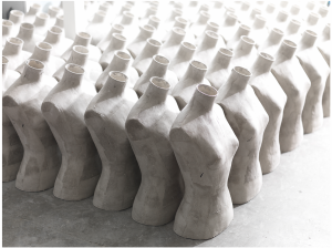
Forester’s still life photography is very influenced by flat, geometric shapes. Created by either the figures in his compositions or shadows cast by those figures, or a combination of both. One photograph of his that I think illustrates this perfectly is his perfume photography for Stella McCarthy. In this photo, the perfume bottle is seemingly suspended in a flat white plane. Dimension is created by the shadow made through the refracted(?) light from the glass. The shadow itself also creates an interesting shape which helps balance and stabilizes the composition. An example where the object itself in the photograph creates the movement and pattern in the composition is in his series of photographs of mannequins.


